For Part 1 - Refer - Nothing Phone (3a) Pro | In depth review - Part 1
NothingOS

I really want to love this experience, and I do as well in a lot of ways but personally, I find that it lacks an overall polish that I am used to from my current daily driver. Some of these can surely come down to personal preference. But here are my thoughts nevertheless.
What I Like -
UI Consistency
The NothingOS experience is quite easily recognizable with its distinct but lightweight skin over a close to “stock” or pixel-like Android experience. You get the Material You design language, native google apps for your calls and messages, and overall a very clean and minimal look as seen on Pixel devices.
Design Language
Despite the similarities to vanilla android, Nothing has its unique launcher, lockscreen, icon theming, and the N Type font for an overall minimal but playful aesthetic. I also like the introduction of the serif style font in certain menus. It feels contrasting and classy.
Nothing pays attention to details such as how the display transition originates from the point the user double tapped on the Homescreen, as it turns to black, displaying the AOD.
Another example is how it transitions between the AOD and the lockscreen smoothly blending into each other by fading the background while the lockscreen clock scales to meet the AOD and vice versa. A similar seamless transition can be seen with the Time on the status bar in the notification pull down and the expanded quick settings pull down menu as well.
Integration with ChatGPT
For those who use ChatGPT a lot, there are neat little integrations, such as quickly sending a screenshot to ChatGPT or in the form of quick access tiles.
Compatibility with Ultra XDR
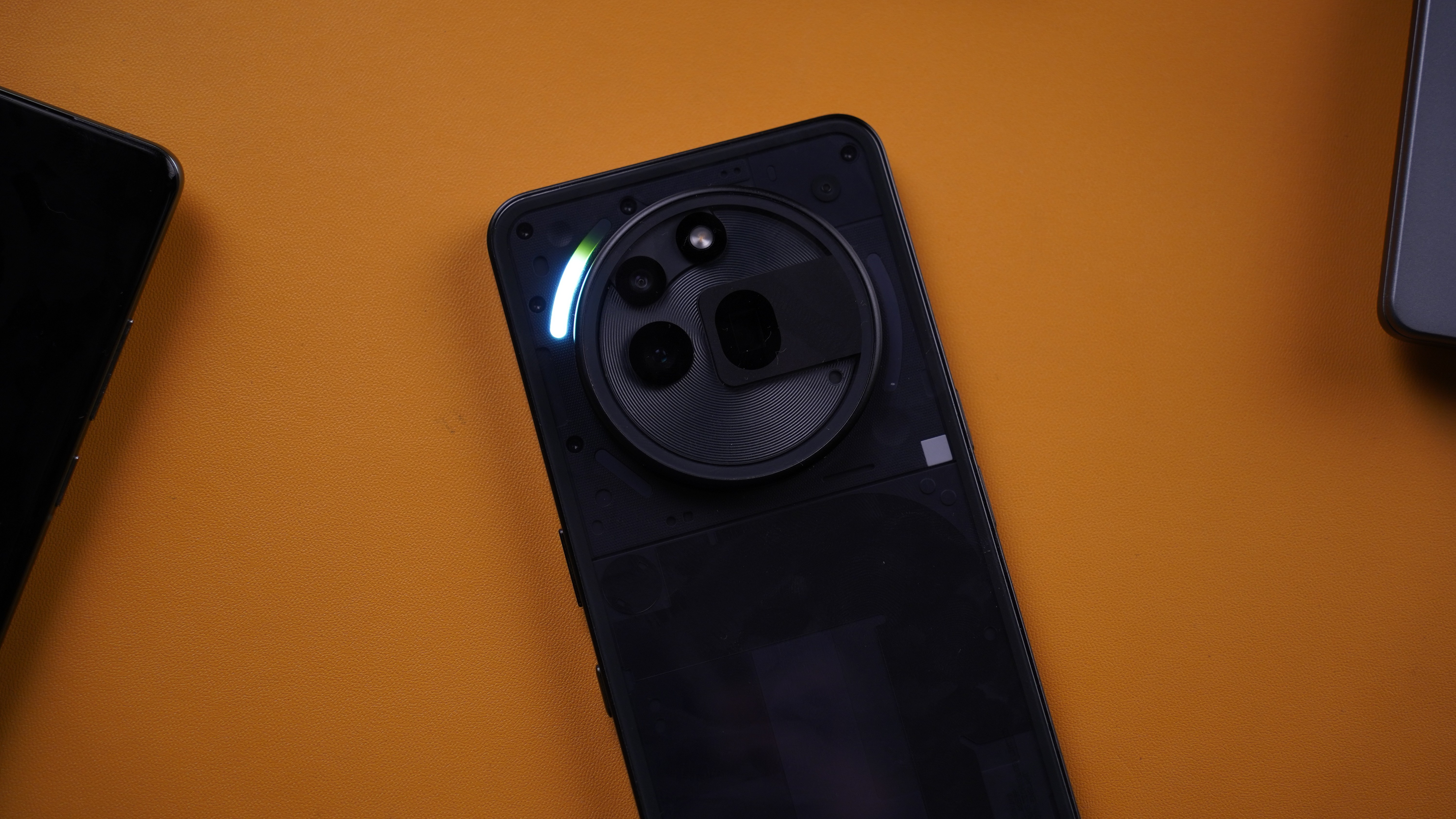
Nothing uses the Ultra XDR format for HDR shots used on Android devices and have stuck to the Ultra XDR branding/format instead of rebranding it for the same feature which could get confusing. Present in both Front and Rear cameras and is visible in the details menu.
Nothing Lockscreen

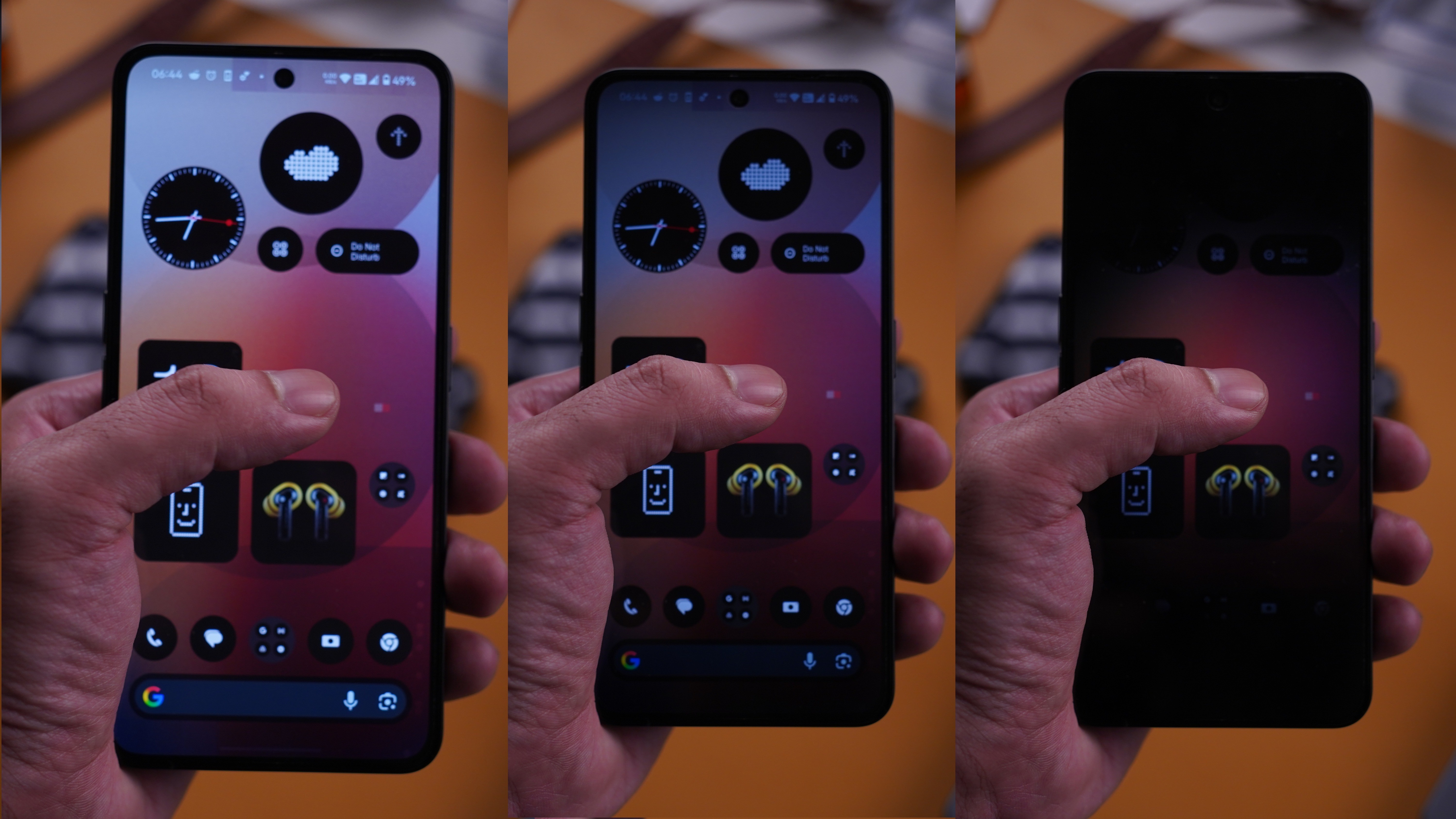
I absolutely love that there are widgets on the Lockscreen. A 4×2 or 4×4 grid can be enabled for the lockscreen and within this grid, Widgets, and Quick Settings tiles can be placed. This helps with things like adding a calculator icon, or a minimal 1×1 compass etc which adds to ease of convenience. I like how you can also have quick access to the calculator without having to unlock the device.
Nothing Gallery
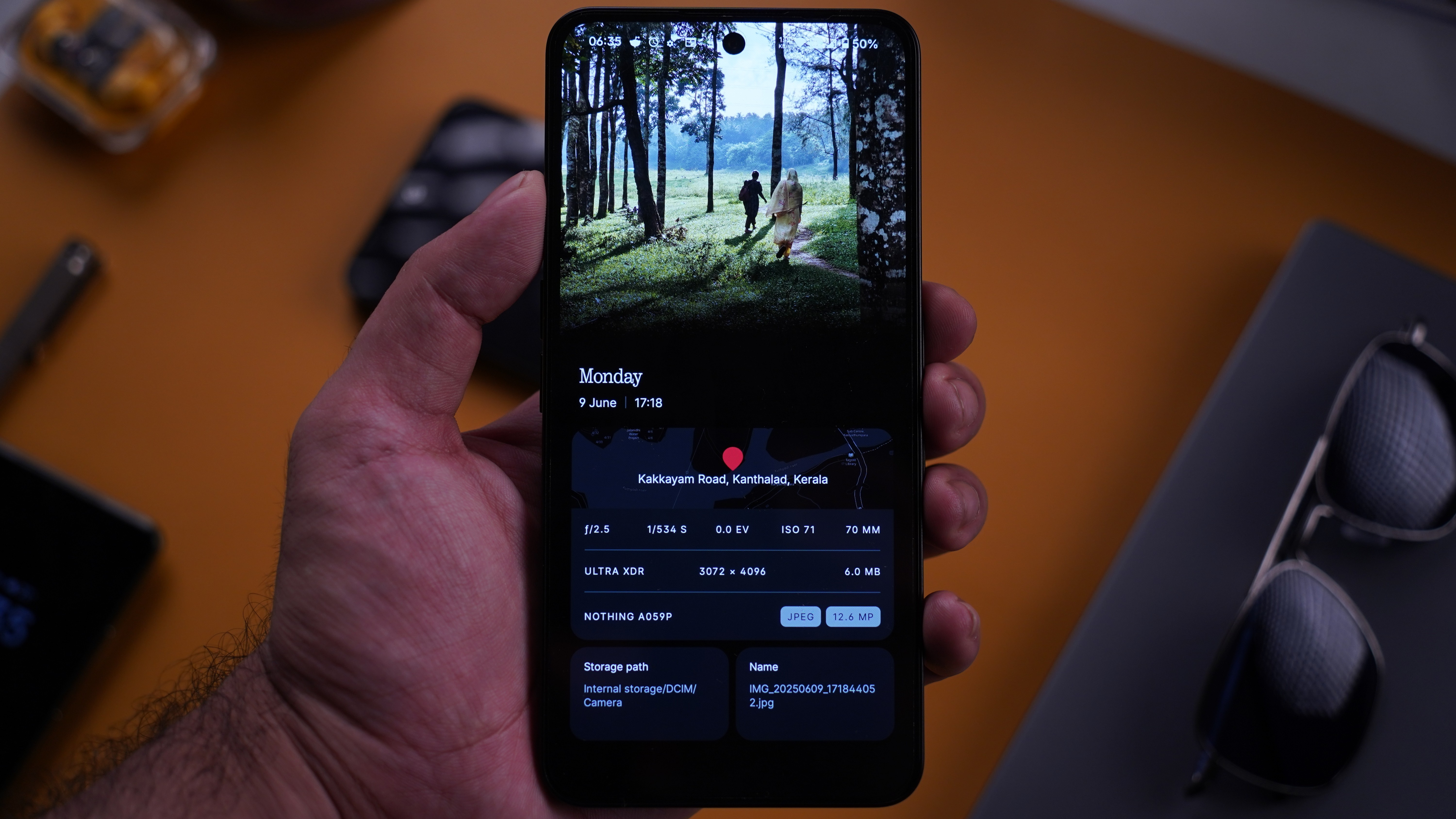
Nothing recently introduced their Gallery App and it is a nice take on an otherwise basic app that could also have been plain. But Nothing has taken the scenic route here and it shows. Looking into image settings to view info is a boring activity but this app beautifully showcases it in a card style layout. It looks great and it makes viewing and understanding quick important bits of information very digestible and pleasant to look at in this format. It requires just a simple swipe up from the image preview and you can still continue to browse sideways without having to exit the details. I think this is a very nice and unique touch and I am quite happy with this interface. There’s also a minimal but slightly interactive map for geotagged photos that can take you directly to the maps for quick navigation.
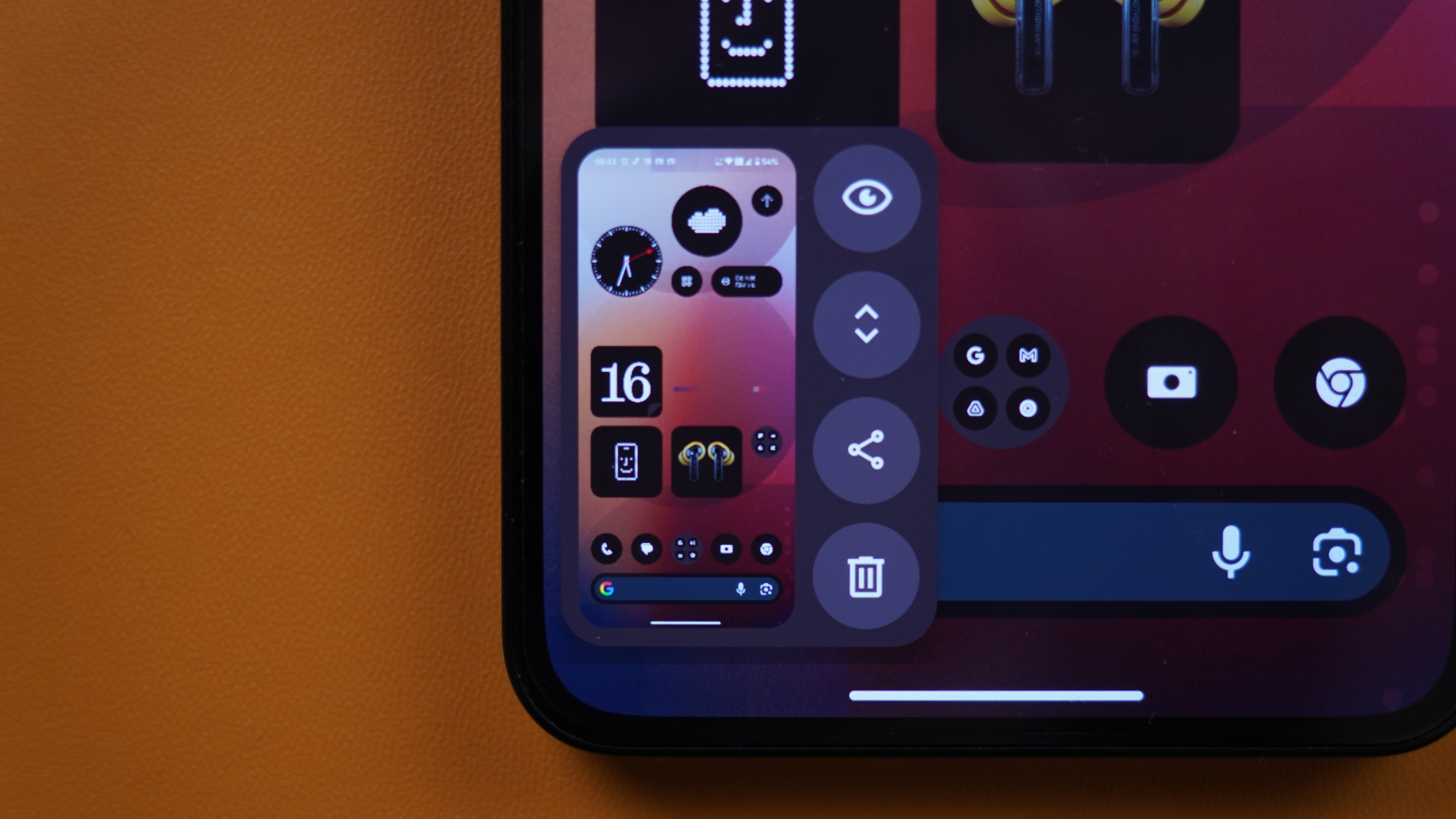
Recents Menu
I also like this screenshot button in the recents menu to quickly grab the screenshots of any app that is open, with a single tap, without having to enter the said app. Another advantage is that, oftentimes, apps that have been closed for a while might have to reload if you open it at a later point. But with this feature, if there is any important information that is already visible in the recents menu in the app preview, you can quickly save a copy of that app preview by tapping the screenshot button. It works fast without breaking the flow as it doesn’t enter or exit any other screen while taking the screenshot.
Battery Usage menu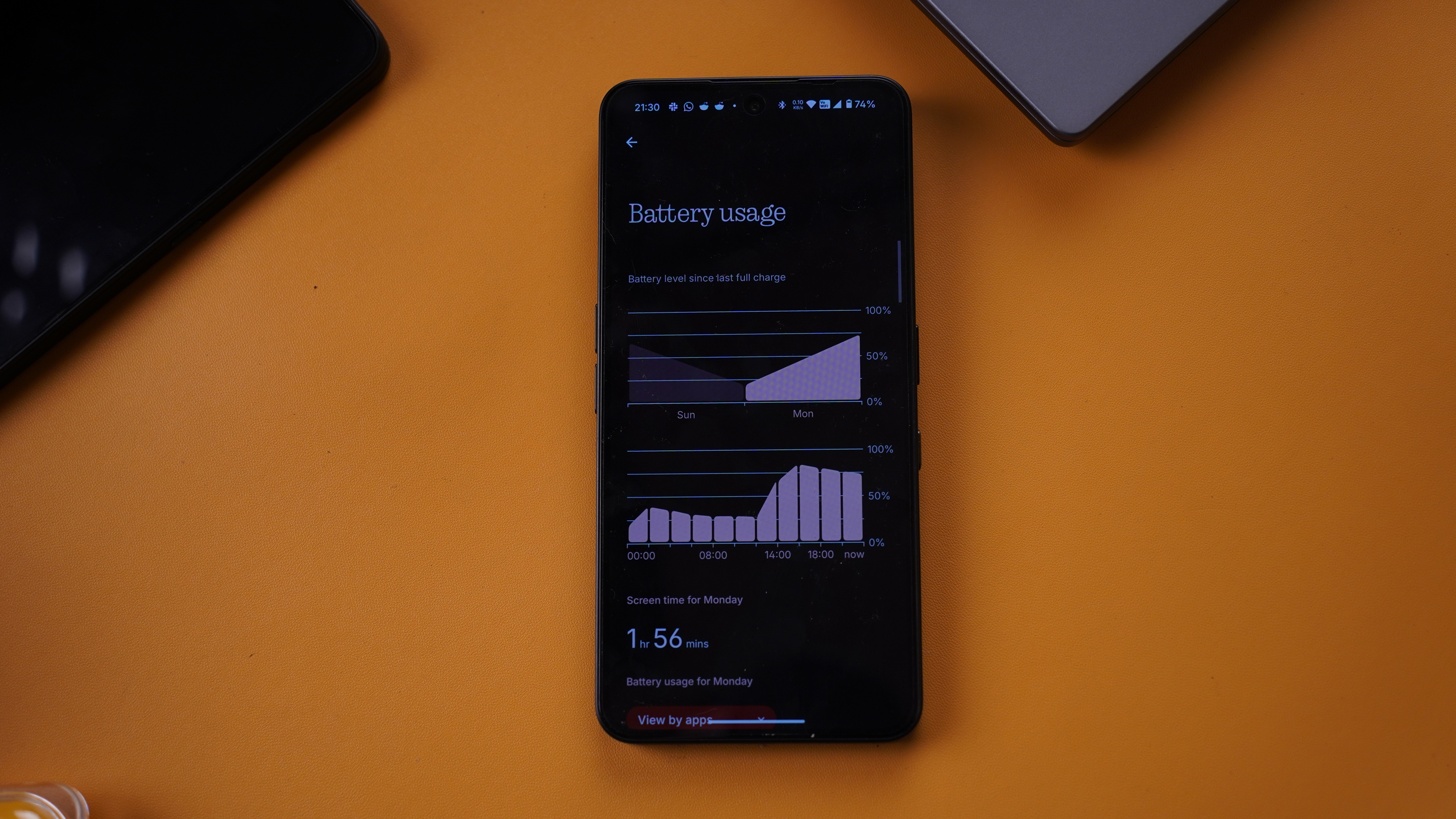
I love that it shows the battery usage grouped by the systems, such as display, CPU, ambient display etc. This provides useful insights, such as the impact of brightness or outdoor usage on battery life.
Day-wise and hour-wise breakdown gives excellent granular details.
Widgets
A lot of the widgets are unique and functional. I particularly like the Nothing X widget, which shows important info and has some quick settings for Nothing wireless audio products. Similar to the About page where the device thumbnail matches the exact color of your device, Nothing matches the actual color of your Audio product to the device preview image as well, whether in app or widgets. Thoughtful and nice to have.
Again, being able to have any of the widgets on the lockscreen is very welcome.
—
What could be better
UI Issues that I felt could be worked on to enhance the overall experience, intuitiveness, and ease of access.
—
Recents Menu
Clear All button (Recents Menu)

It is at the left most end after fully scrolling the recents menu to the extreme left. At the end of the list, the user needs to swipe to the left to find the button (if they didn’t scroll fast to the end, in which case, it would show up).
Clear All option can also be activated by long pressing any individual app preview. But unless the user knows about this or remembers this, it is not very intuitive.
The app icons on the top of the preview have further options that you see only when you tap on the app icon. The placement at the top, along with no other indicators to suggest that an options menu hides behind the icon, makes it unintuitive to access.
A horizontally swiping app icon list could have been provided to quickly navigate between open apps without having to scroll through the recent apps to see through all of them.
Suggestion
There is plenty of space below the app previews in the recents menu to include a persistent clear all button visible at all times. Maybe make the action customizable to the end user. Let the user choose between single tap to clear all, a long press to clear all, and double tap to clear all. Could give users control over the long press on how long to hold it in case of long press activation.
—
Notifications grouping
Issue
Notifications from multiple apps gets grouped together, and it is not sorted by time either. I am not sure what the sorting is here.
Suggestion
Offer options for notification sorting and grouping to the end user with a couple of presets for ease of use.
—
Glyph status
Issue
While the glyph hardware does a neat job of showing the live status of certain apps, While I am using the device, I would like to see a visual notification bar to see the status quickly without having to turn the device around.
Suggestion
Enable Live notifications in the notifications dropdown. Even better if it lives in the status bar like a dynamic island/live alerts. Swipe across the front camera to bring it back, or flick the device gesture as if shaking it slightly in place to bring back the pop up. Maybe offer an option to sticky the live notifications in place.
Alternative minimal implementation suggestion - A ring around the front camera cutout in the status bar that shows the live notification status. Users can set the colours for the ring for supported apps. Or Auto select based on App icon color, along with a notification alerting the user that they might have to change the color of one app’s ring so that it is distinguishable where two apps have similarly colored icons. Optionally implement the ring inside general app notifications to use when the device display is off and the AOD is disabled.
—
Game Dashboard
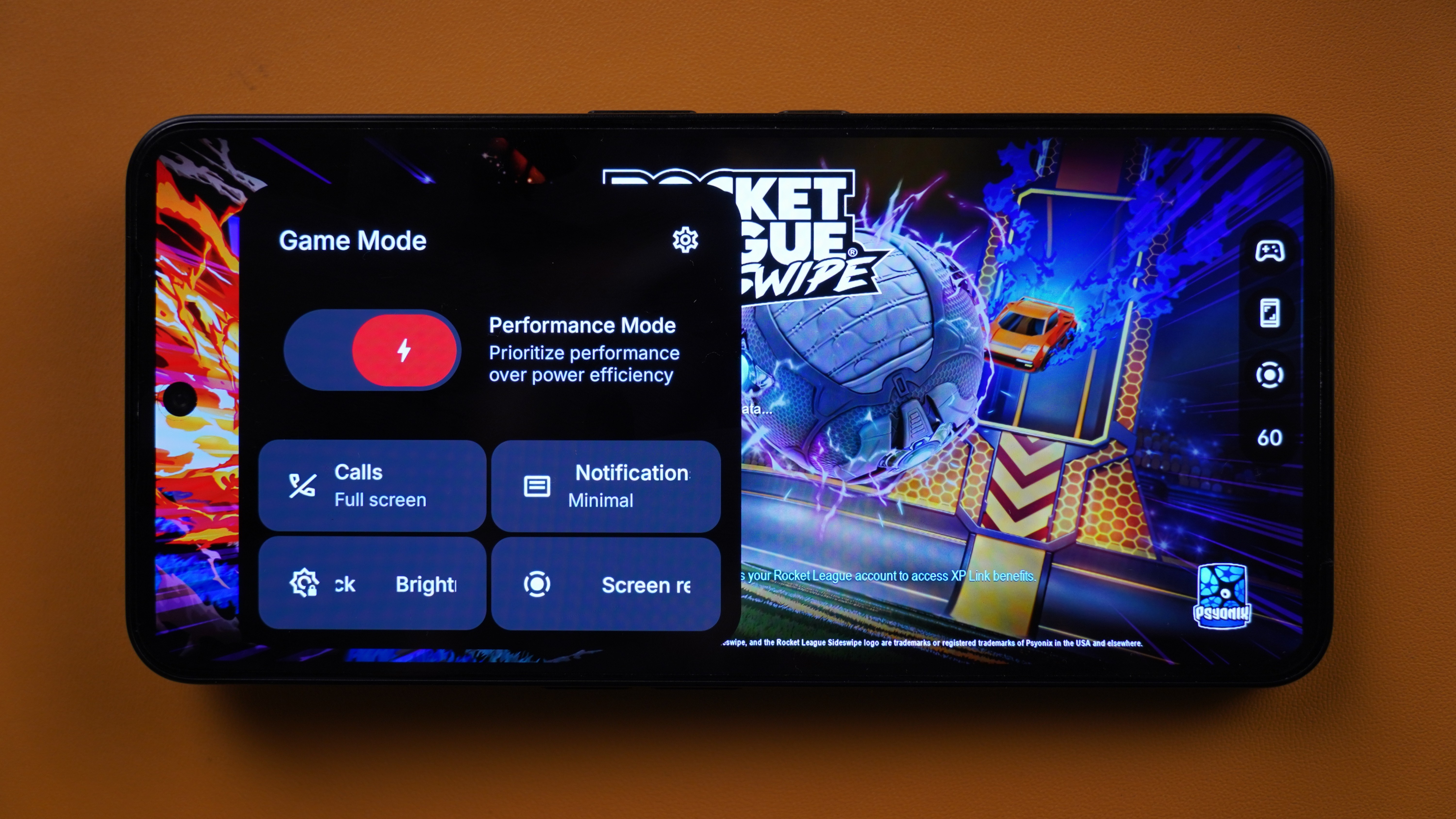
Issue
The current implementation is basic.
Suggestion
Feature requests -
- Toggles for System usage/CPU Utilization,
- CPU Temp,
- GPU usage,
- Battery Temp,
- Network utilization and ping,
- and RAM usage.
- Provide options to adjust touch input sensitivity.
- Performance modes for battery saving, balanced, and performance.
- Brightness sliders,
- auto network switch between Wi-Fi/mobile data.
—
Customizations
upl-image-preview uuid=05fb6b0e-9027-48c4-968c-6f058098ba11 url= alt={TEXT?}]
Issue
- No split notifications and quick settings menu
- Single-handed use optimizations are poor/non-existent
- No ability to customize the complete layout and placement of quick settings
- No option to add a volume slider to Quick settings panel
- Changing the brightness of the devices takes two swipe downs as compared to other skins which usually shows the brightness slider in the first swipe down itself.
Battery Usage Menu
Issue
- No battery health percentage.
Battery Saver Menu
Issue
Battery saver menu does not provide the user any options on what kind of optimzations they would like to be activated when the battery saver mode is enabled.
Suggestion
For example, the user might might want all the regular optimizations except reduction of the refresh rate to 60hz. If providing customization options feels like a lot of work, then instead of capping the refresh rate to 60hz, the battery saver mode should change the actual setting to the “Standard 60hz” mode instead of capping the currently selected mode to 60Hz.
UI Animations, Transitions, and Layout
In 2025, smartphone manufacturers have already started moving toward smoother animations, transitions, and an overall satisfying experience in the way the UI is presented and interacted with. I find this lacking on NothingOS. While it has slightly improved over the past few months, it is still behind other Android alternatives such as OxygenOS/HarmonyOS/HyperOS. While all of those alternatives have their own space to grow, they are noticeably ahead in the above regard.
From scrolling in menus to app opening and closing to animations in recents menu, plugged-in effect, fingerprint unlock, notification drawer, and quick settings, practically all system menus could use an animation redesign or an alternative option that users can select if Nothing would prefer the current look and feel.
There is currently a break in the transition from AOD to Lock screen when viewed after a few seconds. This is different from the smooth transition of the same when viewed immediately after the device goes into AOD. After the initial few seconds, the device enters a deeper AOD state and this state currently does not transition seamlessly into the lockscreen, instead, it fades in and out into the lockscreen as compared to the initial seamless transition.
Inconsistencies such as this gives it an unfinished look. It might have to do with battery optimizations perhaps. But even if that were the case, I would still advocate for leaving it up to the user whether they want a seamless experience with enhanced transitions. Perhaps include it by default and turn it off in power savings mode.
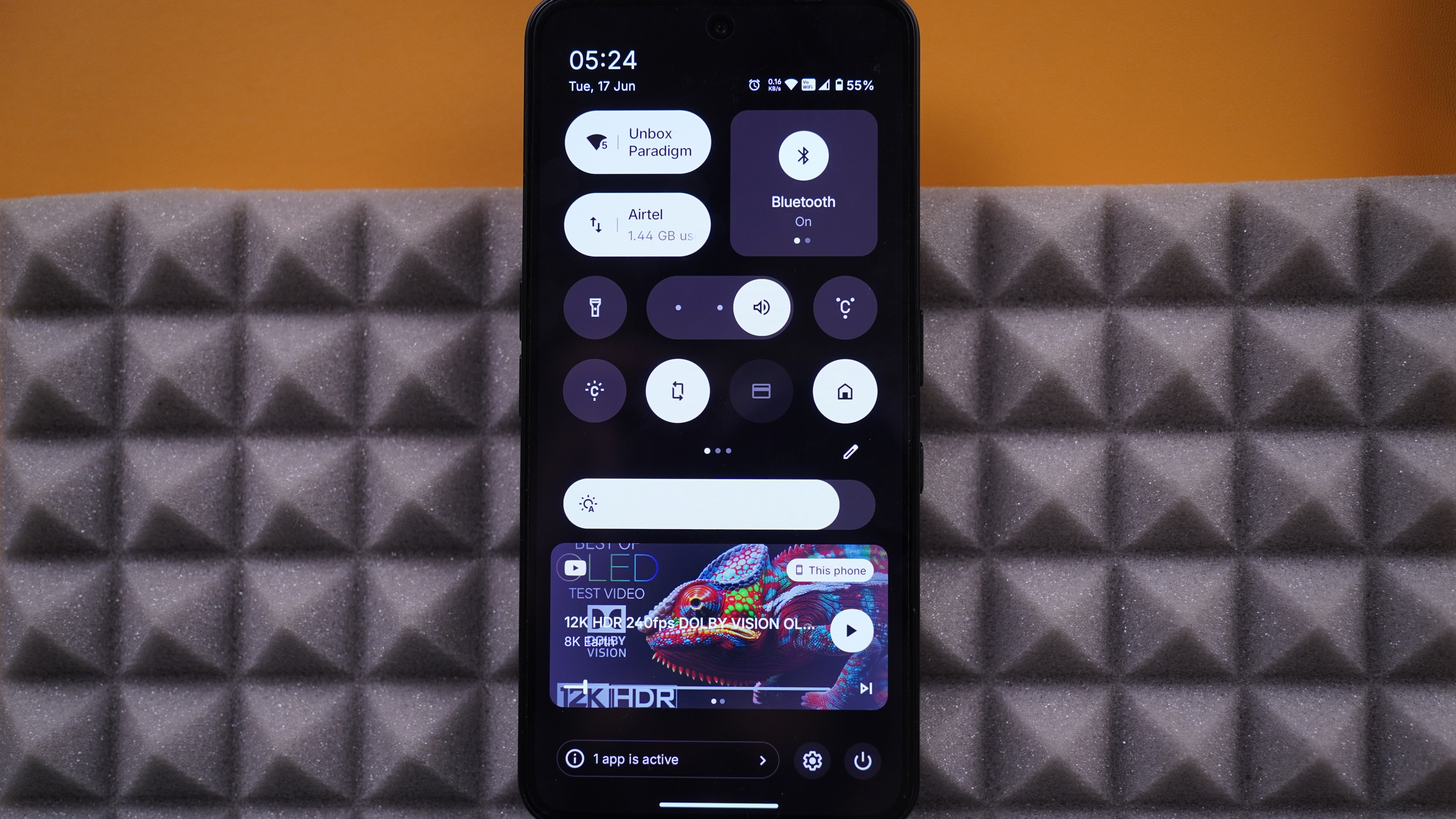
The current quick settings panel has 2 sections, with the top section being customizable, where a layout of 4×4 icons is provided. Below it is the brightness slider and then a media player which is horizontally swipeable for switching between other active apps that may be playing media.
I understand that Nothing must have had reasons for this layout, however, I also feel that users should have been given the option to rearrange this layout so that the quick settings tiles can be at the bottom half of the screen where it is more within reach while media controls widget could have been on the top or built into the quick settings tiles, for ease of access. The top half could have been a larger clock or any other visual info or widgets, that the user does not have to or need to frequently access.
Display HDR
Issue
Enabling maximum brightness for HDR Content is a basic and standard feature that should have been enabled by default for the best HDR experience. Instead, it is an optional toggle inside the Display settings in the Settings Menu.
Suggestion
An easy to access HDR Brightness toggle could have been provided in the quick settings panel.
AOD (Always On Display)
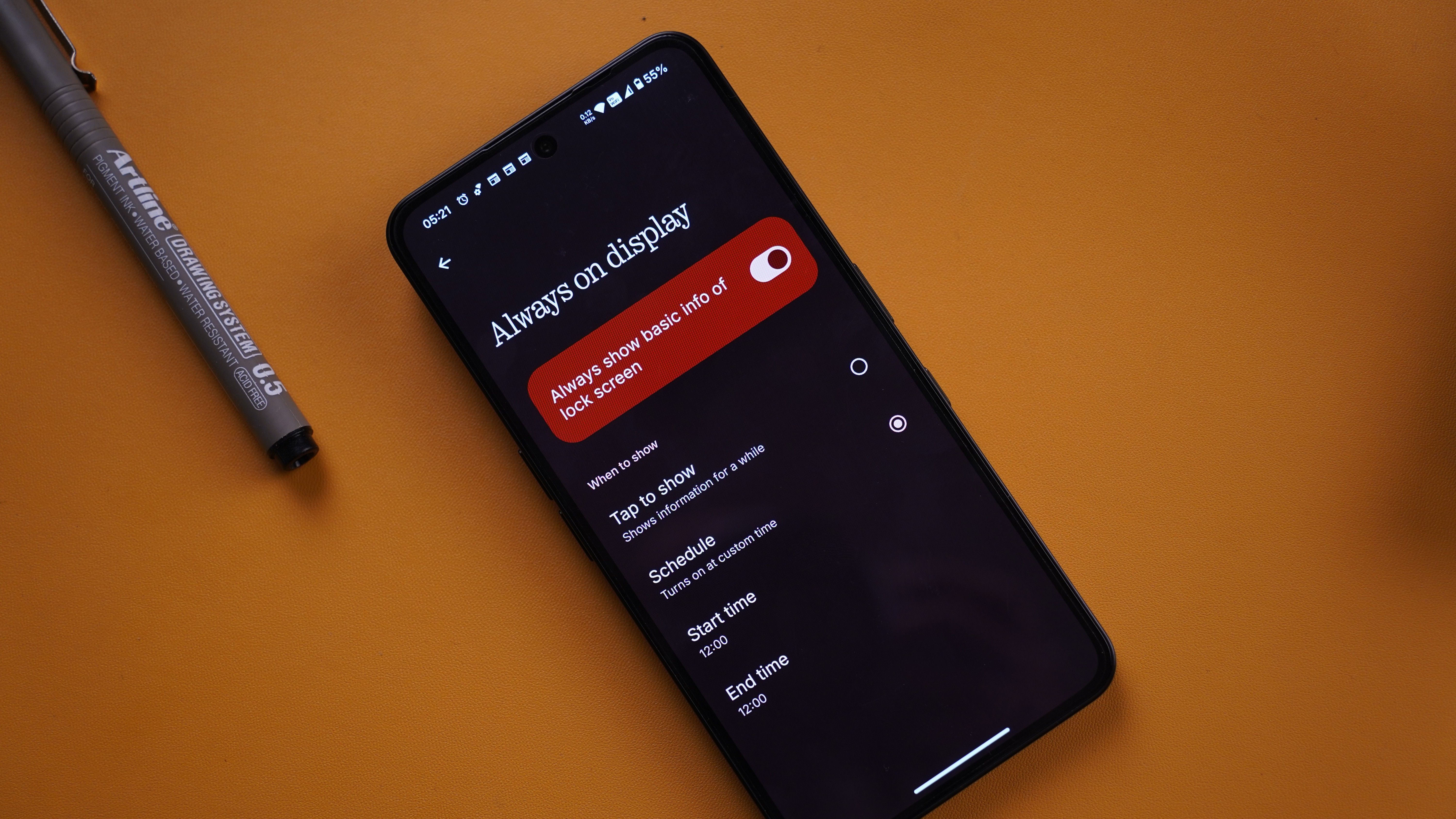
Issue
- There is no option to have an Always On Display in its literal sense. The two options available are to either show for a while or to set a custom time. I have to set it to custom time and set a start and end time that adds up to 24 hours to simply have an Always On Display. That just doesn’t make sense to me.
- The AOD has no customization options. The user cannot select the items to be displayed in the AOD.
- When an app like Spotify/YT is playing content, it shows up in the Lockscreen but loses the widget as it transitions to the AOD. A minimal widget could have been provided to see the now playing content without having to tap the device to turn it on. Optionally interactions with AOD widgets would further enhance the experience for simple actions such as pause/previous/forward.
Device Setup
Issue - The device setup when switching it on for the first time requires setting the device up with an Indian SIM card. While I understand unauthorized export concerns, It should be ultimately up to the user what SIM is being used to set up the device with.