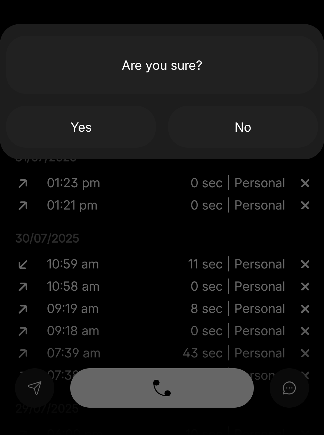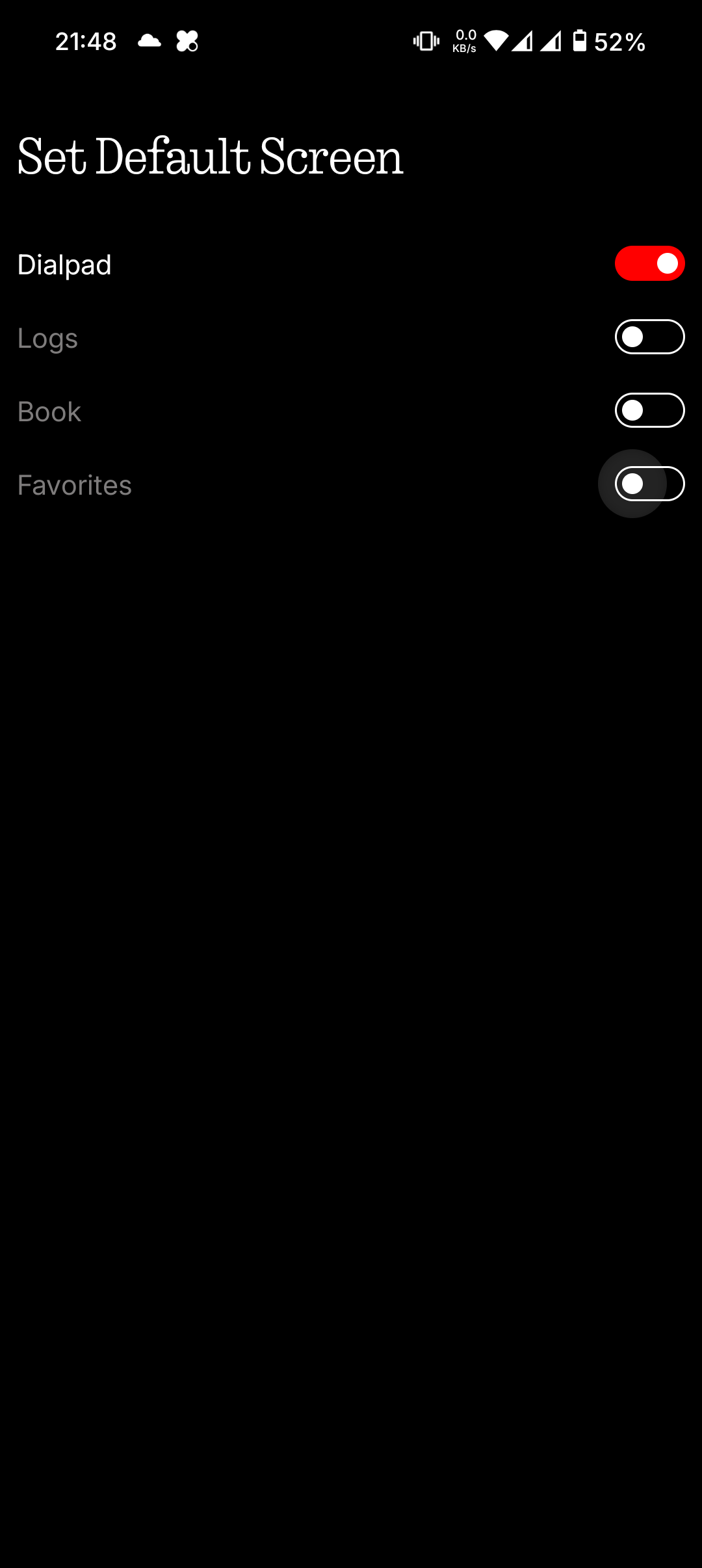

@Ali Fakhruddin Why the options have to be a toggle switch? it should be an actual dropdown or radio buttons. This occupies more space and not the right thing to use toggle switch in this.
Also in the second screenshot popup, the confirmation text also looks like a button and the contrast is not good for even the buttons.
Also if you see the log history below that, you have given a delete option with x mark. Let it be some other icon which represents delete and also it looks too clumsy when you have too many logs in a day.. only for missed call have some red added.
Sims can be represented as icons with sim numbers and text in the second line. it will have some breathing space