Hey everyone,
I wanted to start a discussion about the design of the Nothing Phone (3). I get it, the design is polar and some people will like it and some won’t, but honestly most people around me who are Nothing fans also didn’t like it. And you have to agree it’s nowhere close to how iconic and eye catching the designs were for the Phone (1) and Phone (2), and don’t get me started on the weird periscope lens! The biggest disappointment was that the company decided to get rid of the most iconic feature, the Glyph Lights, for the new Glyph Matrix, but I think they both could be together.
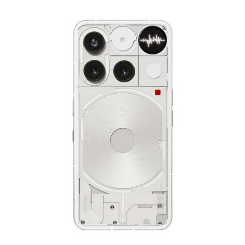
To share my perspective, I made a quick redesign concept. I’m not a professional editor and I only used a basic editing tools, so please excuse any mistakes or imperfections. But this is how I would have liked the Phone (3) to look:
Integrating the Glyph Matrix for more precise notifications like showing logos or even contact names
Keeping the classic Glyph Lights just for general notifications like the old times
Retaining the charging animation light which I really liked in NP1 and NP2
Using the central light around the wireless charging coil for smart features like item tracking, similar to how Nothing Phone (2) had it
I feel this way the Nothing Phone (3) could have been a proper balance between innovation and the signature design language we all admired in the earlier models. What do you all think about the design itself? and should Nothing consider combining both Glyph Matrix and Glyph Lights in future models, maybe the Phone (4)?