Hello
I believe nothing OS design and development teams are very talented and very innovative in their design choices.
However, when I saw the trailer I was deeply disappointed to see only
Secondary features :
- amoled black
- you know which AI you use in essential features
Design changes :
- New app icons because older ones were inconsistent (os4 ones are still not)
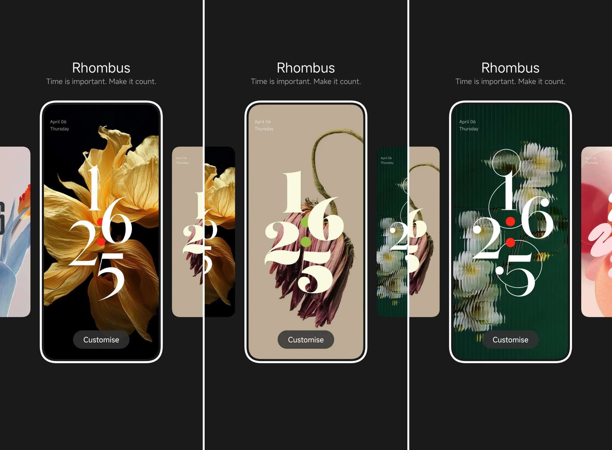
- 2 new clock fonts
- new colors?
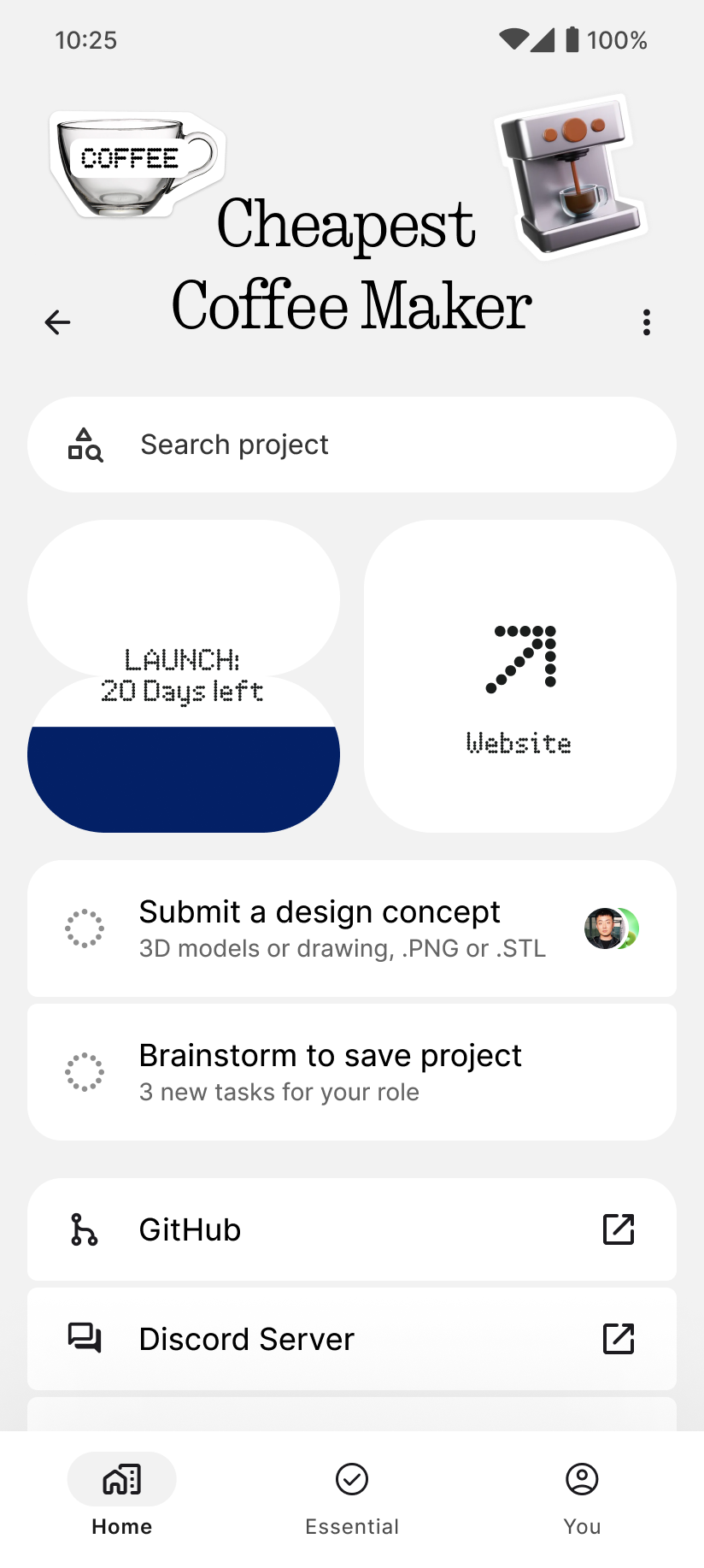
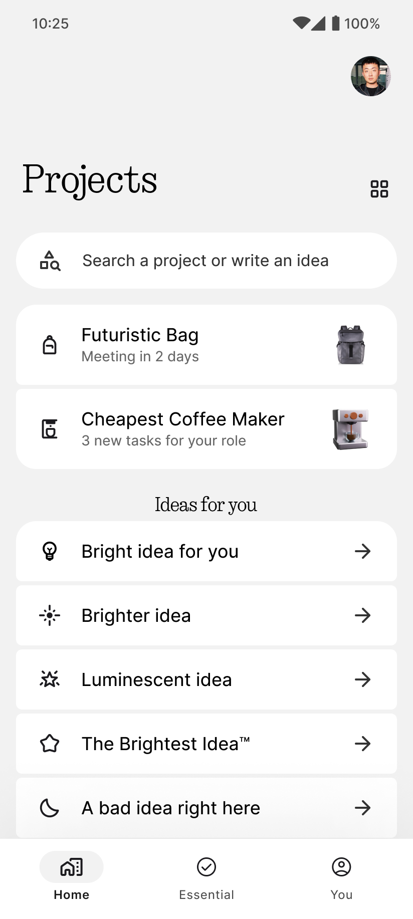
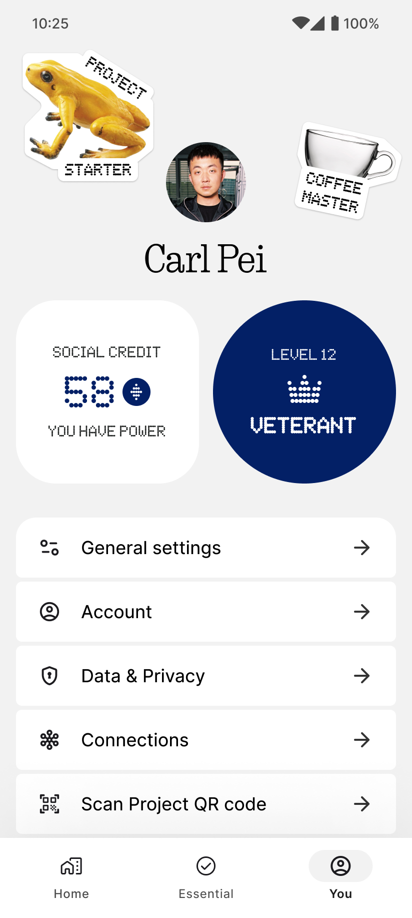
- more UI components made by nothing but killed the magnificent essential space’s checkbox
And I think these are not enough to say that some new secondary features, some design adjustments and 2 new clock fonts are enough to say this goes from nothing OS 3.5 to 4.0.
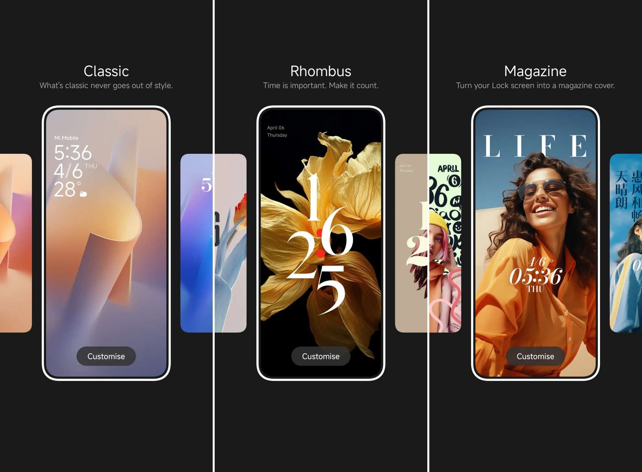
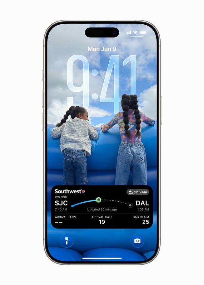
People are not blind or has no regrets when they switch to nothing. We still see that iOS and all other OS have cool and sometimes innovative features releasing each year : liquid glass, depth effect in lockscreen, lockscreen that looks like a magazine cover, resizable clock, material 3 expressive, nice blur, amazing animations, useful apps…
I’m not saying nothing should release all the features others do, but at least make some, and innovate while delivering enough features to make it logical to say it’s a completely new OS
Thanks for reading and listening to feedback 😁
AirCactus500
Phone (3) user