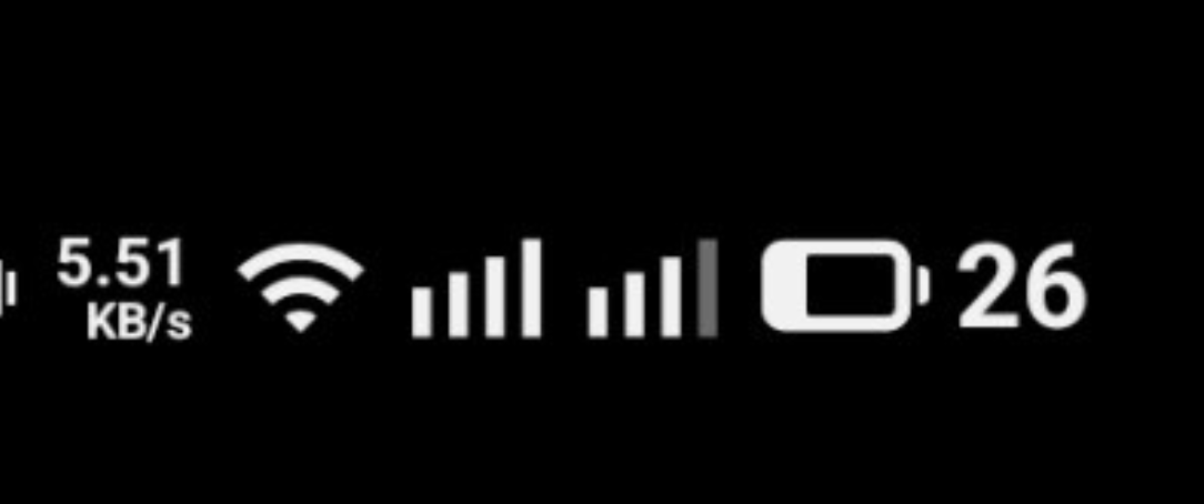
offcolor Deep Analysis 🫡, I respect that sir, I agree with you, new status icons doesn’t feel that polished, but Pixels’ Android QPR1 design are the better, hope they adopt those.
Btw, I didn’t get what you meant by the inconsistent spacing?
Arw you pointing out the empty spaces in battery and Signal icons, but aren’t they vary depends on signal strength and battery percentage, how can they be consistent, I’m getting wrong idea here ig
Will be glad if you explain
Edit: I don’t own a Phone (3) but I got the screenshot and ig, the signal icon is bugged for you

And now, instead of making the status bar more coherent to Nothing Design, it looks inconsistent
Wifi icon - pointy
signal icons - blunt (curves might look good and consistent)
I’m not a professional designer but tha doesn’t look good to me, maybe subjective, just shared my opinion