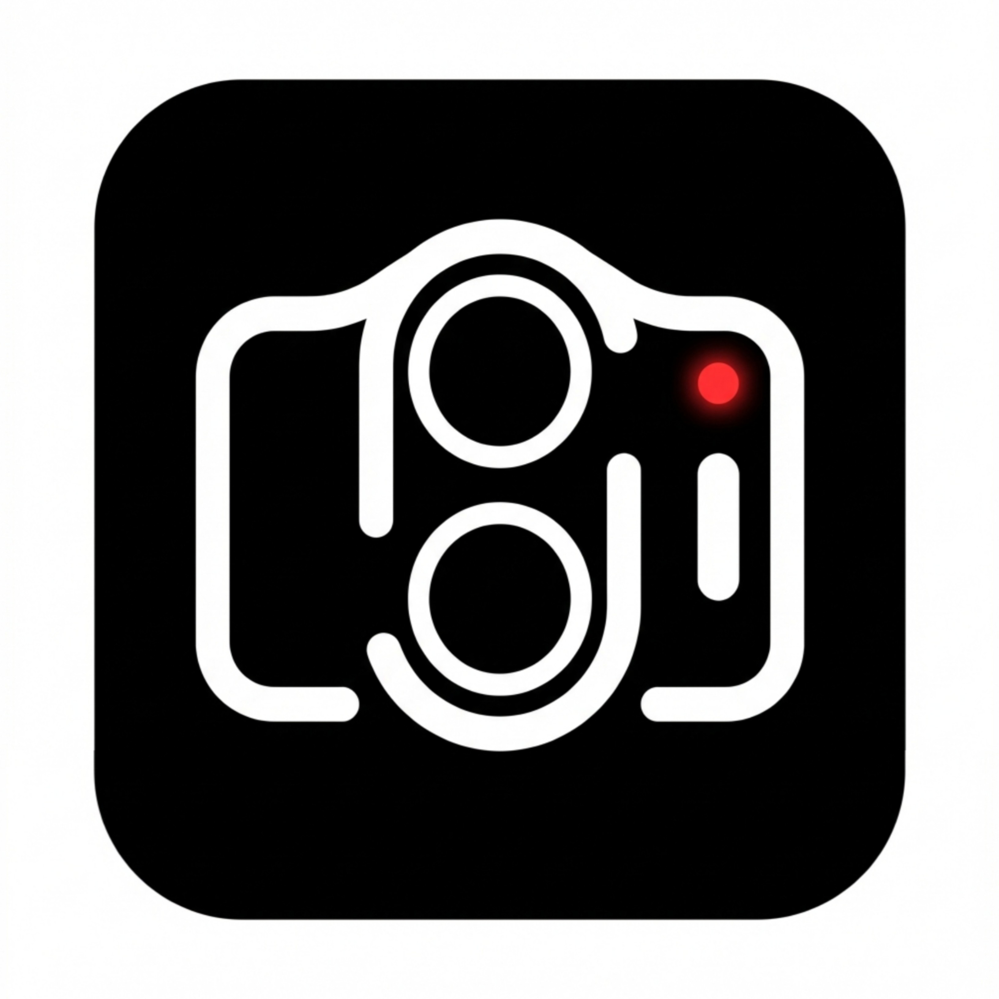
I’ve created this as a fan-made, non-official design concept, not as a suggestion to change or replace the existing Nothing Camera app. My idea is to imagine separate manual/professional camera apps for each Nothing phone series, where every app has its own icon designed directly from that specific phone’s camera module layout. This logo is inspired by the Nothing Phone (2) camera hardware — the lens placement, surrounding Glyph flow, and mic position are all taken from the actual module design. I used the red dot as a video recording indicator at the rear mic position, with the flash placed just below it for visual balance. The overall form is enclosed in a boxy, rectangular camera body to reference classic vintage cameras, which also complements the vertical lens alignment and Glyph geometry of Phone (2). The lower section subtly resembles a DSLR grip or battery compartment. I followed Nothing’s clean, minimal, and honest design language throughout, exploring how the hardware identity of each Nothing series could translate into series-specific manual camera app icons, purely as a fan design exploration