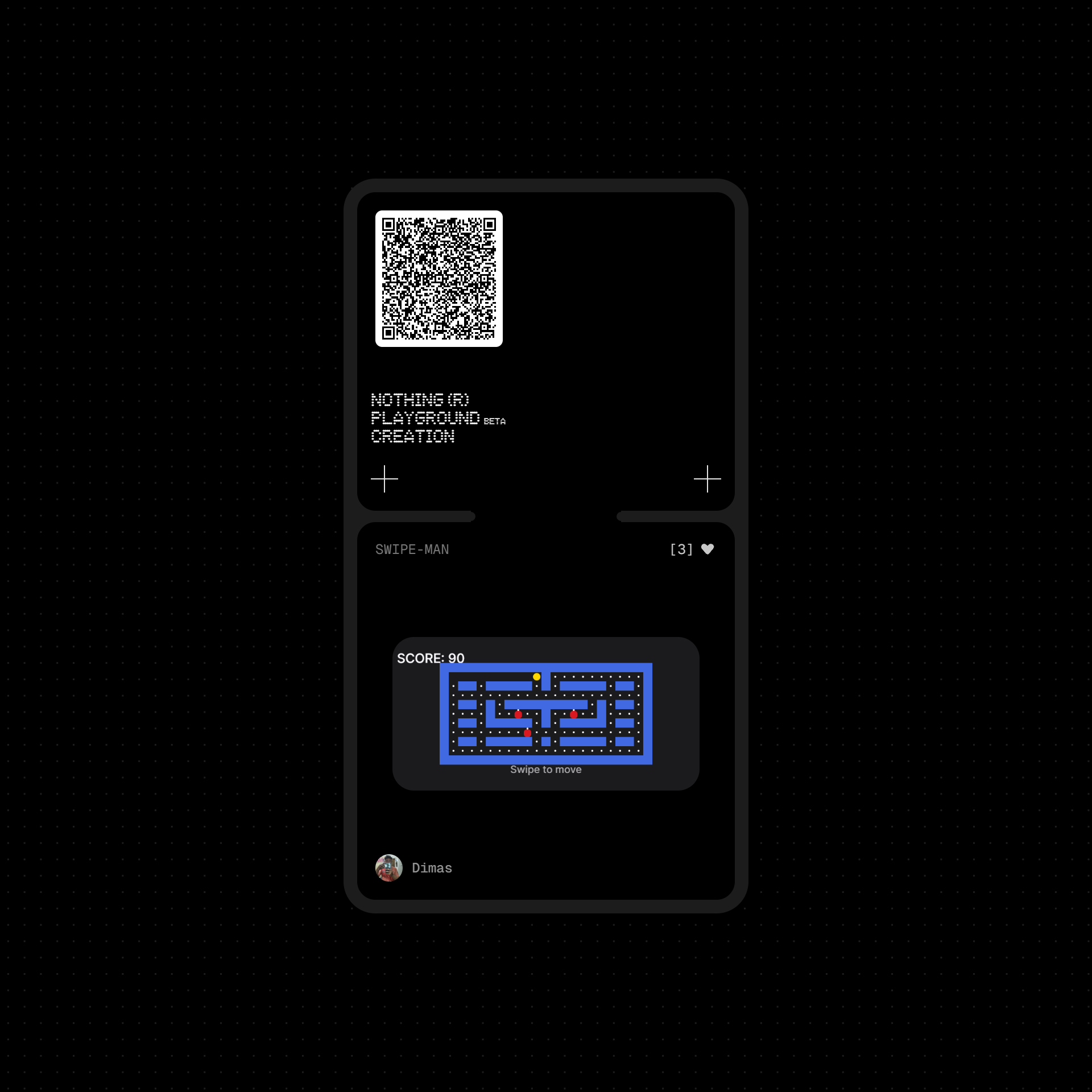
I recently published a small arcade mini-game on Essential Apps called Swipe-Man — a minimalist matrix-style survival game.
Interestingly, this one was built using a very simple prompt.
Previously, I experimented with more complex, highly structured prompts (some AI-assisted) to create feature-rich widgets. While they looked more detailed, the results didn’t always feel as polished or engaging and some didn’t make it through publishing.
This project taught me something important:
Simplicity in interaction often matters more than complexity in structure.
For small, homescreen-sized experiences, clarity beats over-engineering.
A clean mechanic, focused design, and responsive control can outperform something technically more elaborate.
In this case:
Swipe-based control felt more natural than tap-heavy interactions
Scoring based on avoided blocks made progression intuitive
Speed scaling every 15 points created tension without overwhelming the player
It was a good reminder that building for Essential Apps is less about how complex the prompt is — and more about how clear the core experience feels.
Curious to hear from others:
Have you found that simpler concepts work better on the platform?