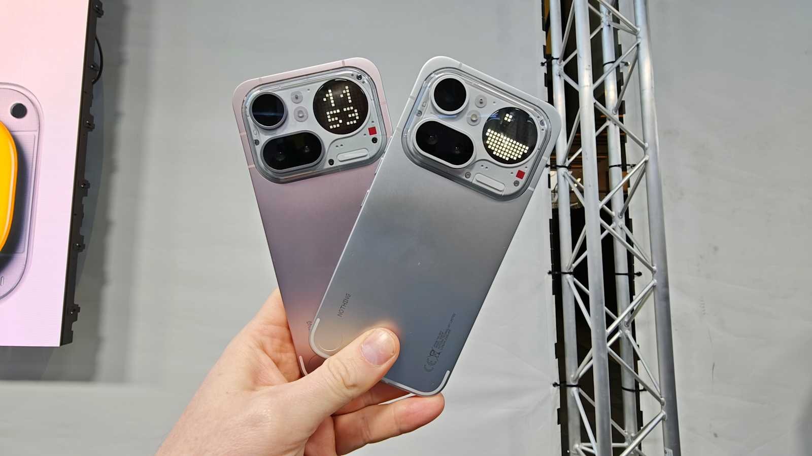
I love the Nothing Phone (4a) Pro more than the Nothing Phone (4a) because of how the design philosophy has evolved. It’s no longer about making the entire back transparent — instead, the transparency is focused around the camera bump where the Glyph Matrix lives. This makes the camera area feel like the visual center of the device, giving it a bold and futuristic identity while keeping the rest of the back clean and minimal.
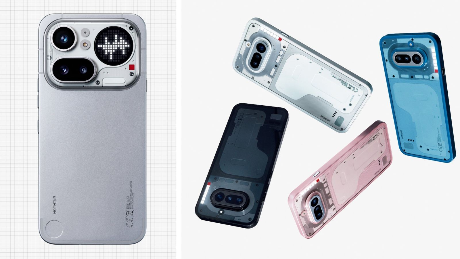
The simple back design actually makes the phone look more refined and mature. By reducing unnecessary visual noise and highlighting the camera module, the design feels more intentional and balanced. It still carries Nothing’s signature identity, but in a more controlled and premium way — where the focus is on function, interaction, and a strong visual statement.