I’m really happy to have received the Phone (4a) Pro as part of the community review program. Below, I cover my first impressions of the device, discuss some comparisons to Phone (3) and share my first days experience. Safe to say, I’m a fan of the (4a) Pro, I think it can really shine for people looking for a premium experience without needing a flagship!
Unboxing:
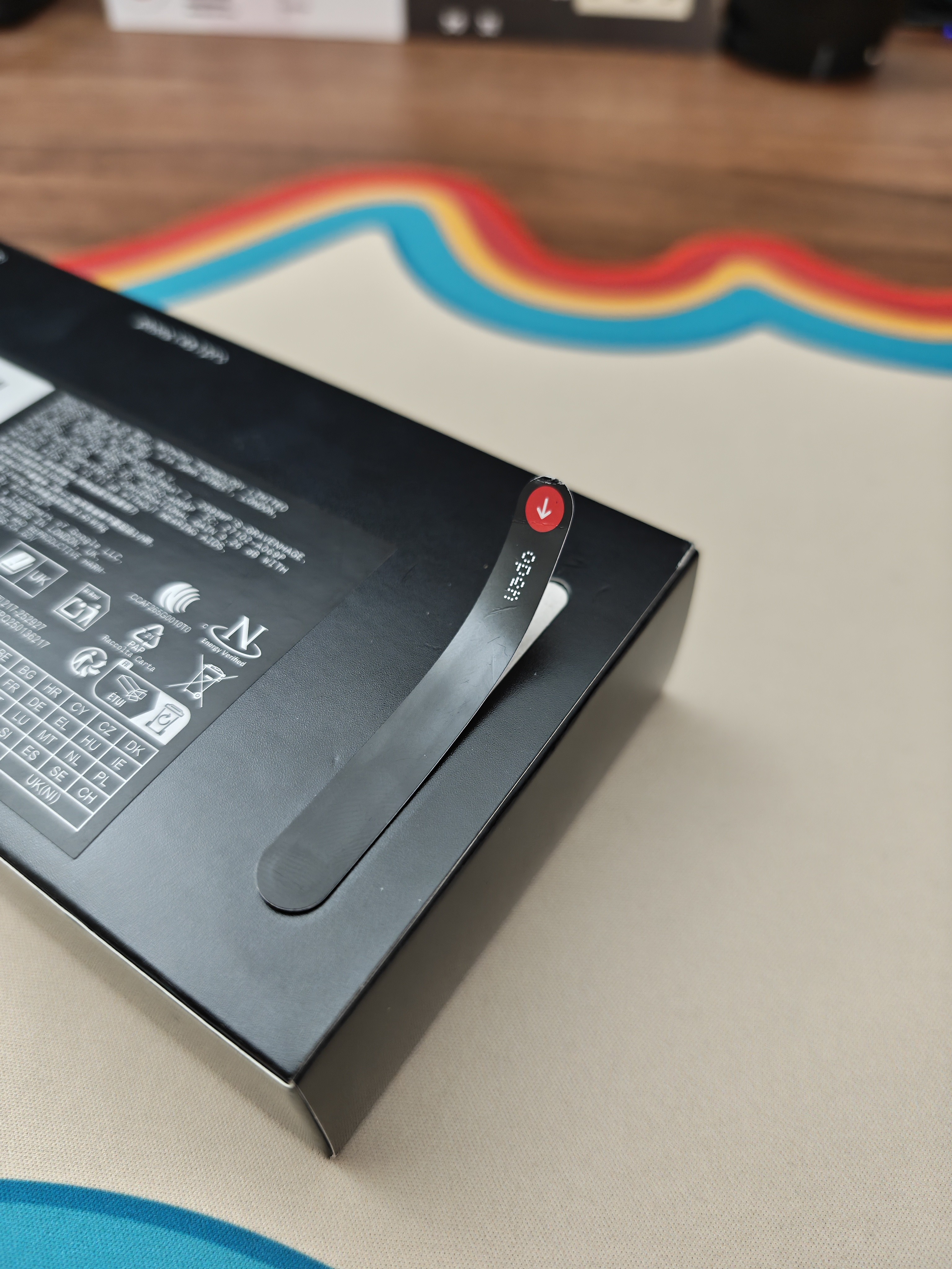
The design language of (4a) Pro is clear from the moment the box arrives, as always, Nothing’s design of the box echoes what the phone is about. There is also experience of the strip that feels like unsealing a fresh Pokémon ETB. permanent “crack” of the seal that builds an intimate moment making the device feel like its yours before you’ve felt it. This tactile experience is something Nothing refuses to overlook, and is a clear choice to ensure each user has this experience when receiving their new device.
Inside the box:
Clear Case: A nice inclusion that lets you protect the phone day one without hiding the design.
The SIM Tool: My favourite “extra.” The transparent element is totally unnecessary, yet perfectly encapsulates Nothing’s obsession with detail.
C-to-C Cable: A solid cable being a fair compromise now that bricks are a thing of the past.
Hardware & Hand-Feel:
Coming from Phone (3), the first thing I noticed was the thinness of the device, at 7.95mm thick. Pair this with the cold touch of the metal body and it is a delight to hold.
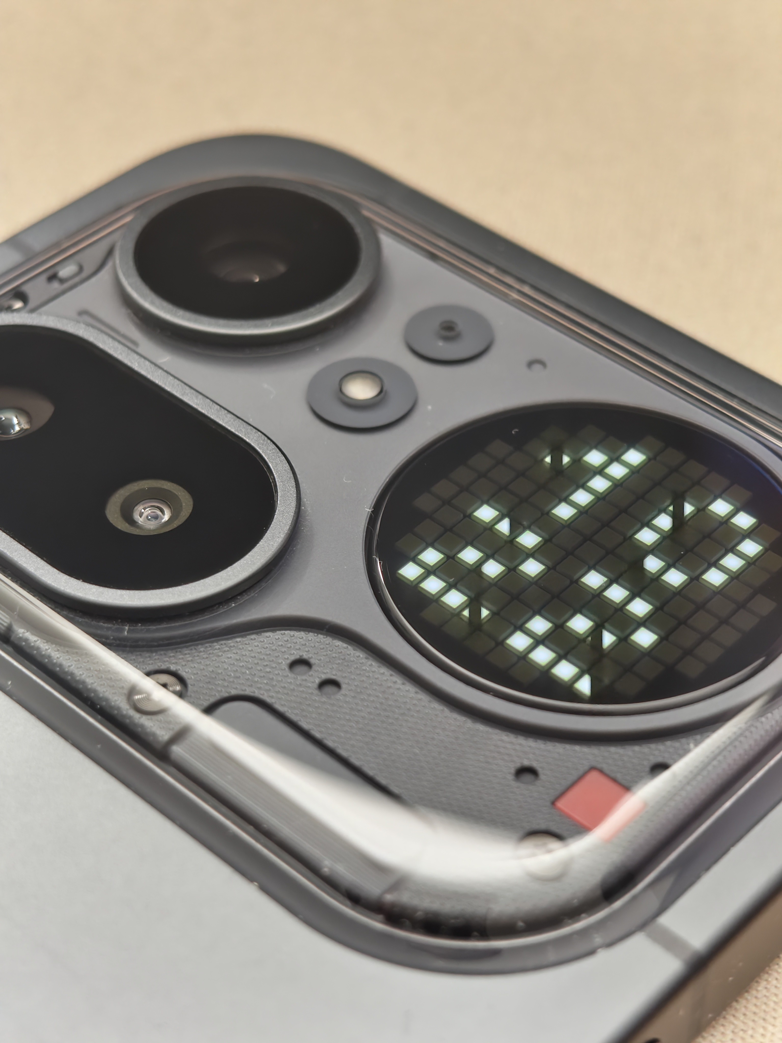
The transparent “island” around the camera bump helps to blend the transition up to how the camera sits out from the phone. On the (3) the cameras sit proudly from the surface, this is fine with how thick the phone is, yet, the cameras on the (4a) still need that same depth and with the thinner body of the phone, the transparent island helps to bridge this and feel more natural as well as to allow Nothing’s design language to come through.
The (4a) Pro has changed up the button layout from the (3a) & (3) series.
- Left Side: Dedicated entirely to the Essential Button.
- Right Side: Home to the volume buttons and the power button
This puts all functional controls on the right, ensuring the Essential Button is only triggered with actual intention, something I often accidently do on my (3) quite frequently.
This is also my first time with a black Nothing product, I have an affinity towards white tech, having a white steam deck, skewing lighter with keyboards and the like. However, the black metal screams premium which is amplified by the unibody design. The transparent elements being isolated as the island is something that when revealed, I initially bounced off of, missing the Nothing design being plastered all over the device. Yet this restriction of the Nothing transparency gives it an air to breathe against the rest of the device.
One other element that is often not discussed on many phone reviews, the antenna aesthetics. I think Nothing have nailed incorporating the antennas on the (4a) Pro, little lines protrude from the island and around the phone body, with the bottom of the phone being “underlined” by an antenna with a slightly different material making it stand clear
Glyph Changes:
The glyph matrix is less resolved than the (3), this does mean that the individual LED elements can be seen clearly from a distance or at a glance, but also restricts the display’s versatility, with initial set up of my essential notifications having to work around the lack of some glyph elements that I had access to on the (3). This has the silver lining that with less versatility, each glyph usage is intentional and is quick to learn without guess work. That said, the less resolved matrix works really well with the black PCB components around the island, the lighter hue of grey when off fit well with the elements around it, I’d be curious to see how this looks with the white PCB elements present on the White and Pink models.
Display & Experience:
The screen on (4a) Pro is nothing short of awesome, the 93.4% screen-to-body ratio is immediately eye-catching and means that all content displayed on the screen looks phenomenal. The experience of using the device is snappy as ever and Nothing OS shines through completing the experience and can do for days thanks to the larger battery.
Transitioning to the (4a) Pro is a sleek experience, even down to the Essential Notifications I had set up on my Phone (3). This is critical in the first day or so, especially for anyone new to the Nothing Ecosystem, and Nothing has nailed this in my opinion.
Summary:
In summary, (4a) Pro exemplifies the best of Nothing’s (a) series so far, with some caveats delineating it from the flagship of (3) within the first day. (4a) Pro is a delight to feel in the hand and offers a premium within the (a) series, this continues the Nothing design language, integrates the functionality of the Glyph Matrix and provides a really nice physical platform for Nothing OS to shine on.
—
I’m looking forward to using this device more and writing some more specific reviews soon! What would people like to hear my thoughts on?