I took like some hours to make this graphics so please enjoy!
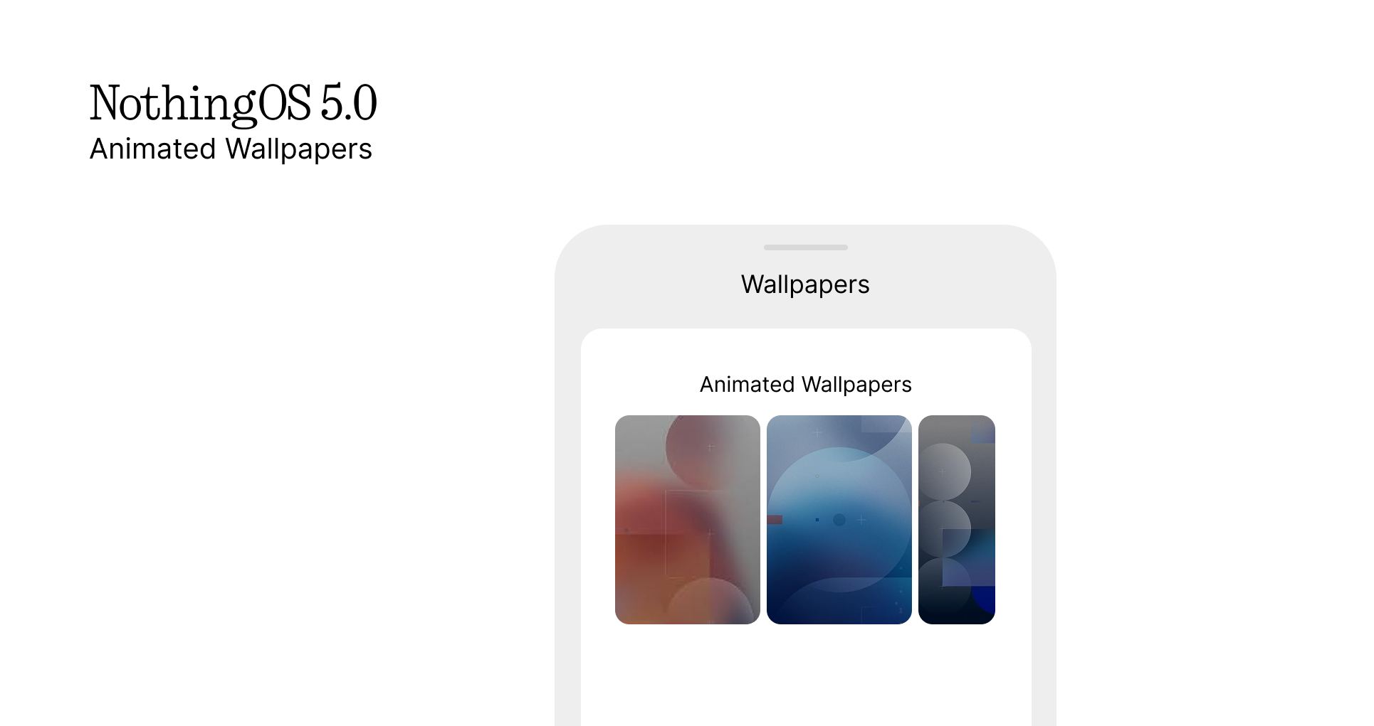
The first thing that I thought of is Animated Wallpapers. Stock Wallpapers now move and do stuff.
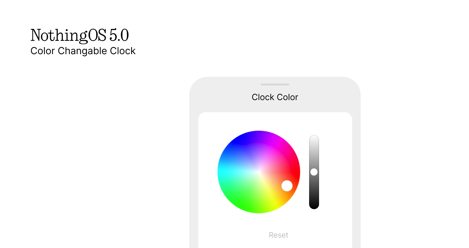
Next we have changable color for the clocks! This would end the conflict when the system doesnt detect the white wallpapers and keeps it white, it also could remove the black tint that is added to lockscreen wallpapers
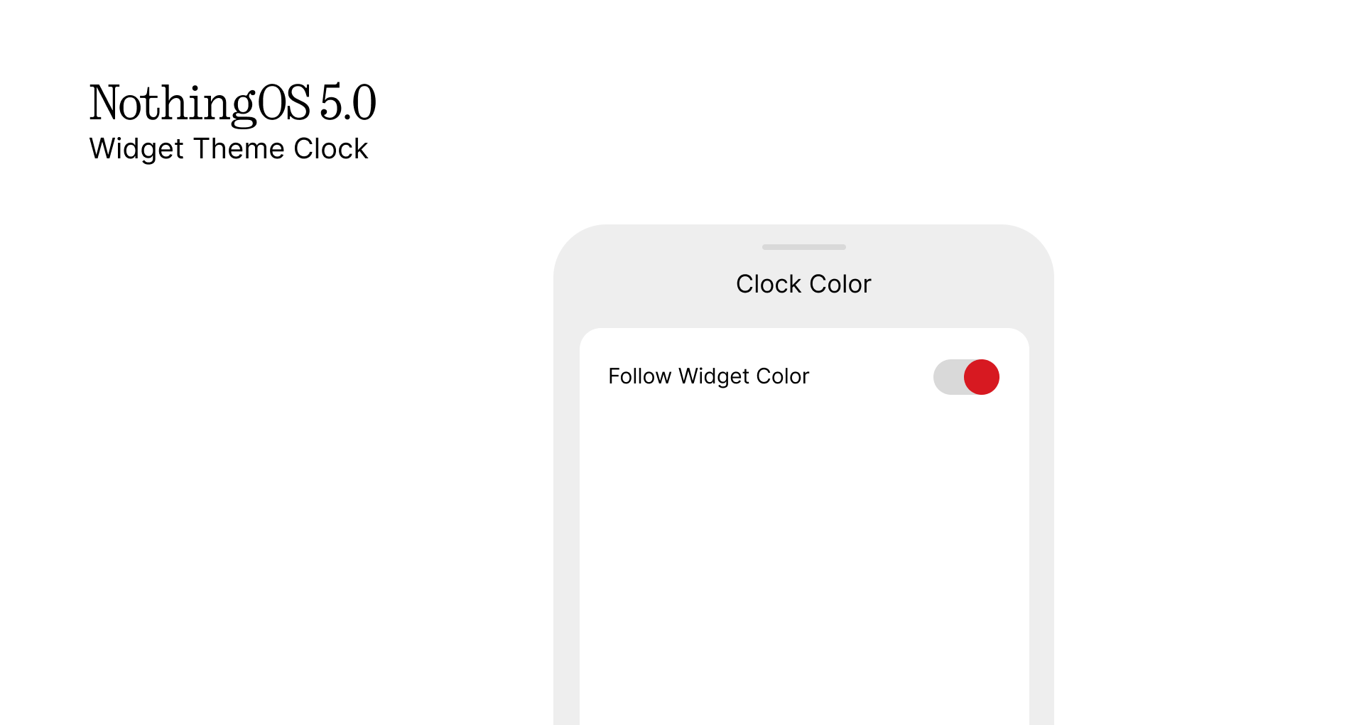
But to make the tinted widgets in the lockscreen fit the color of the clock, you can now do that.
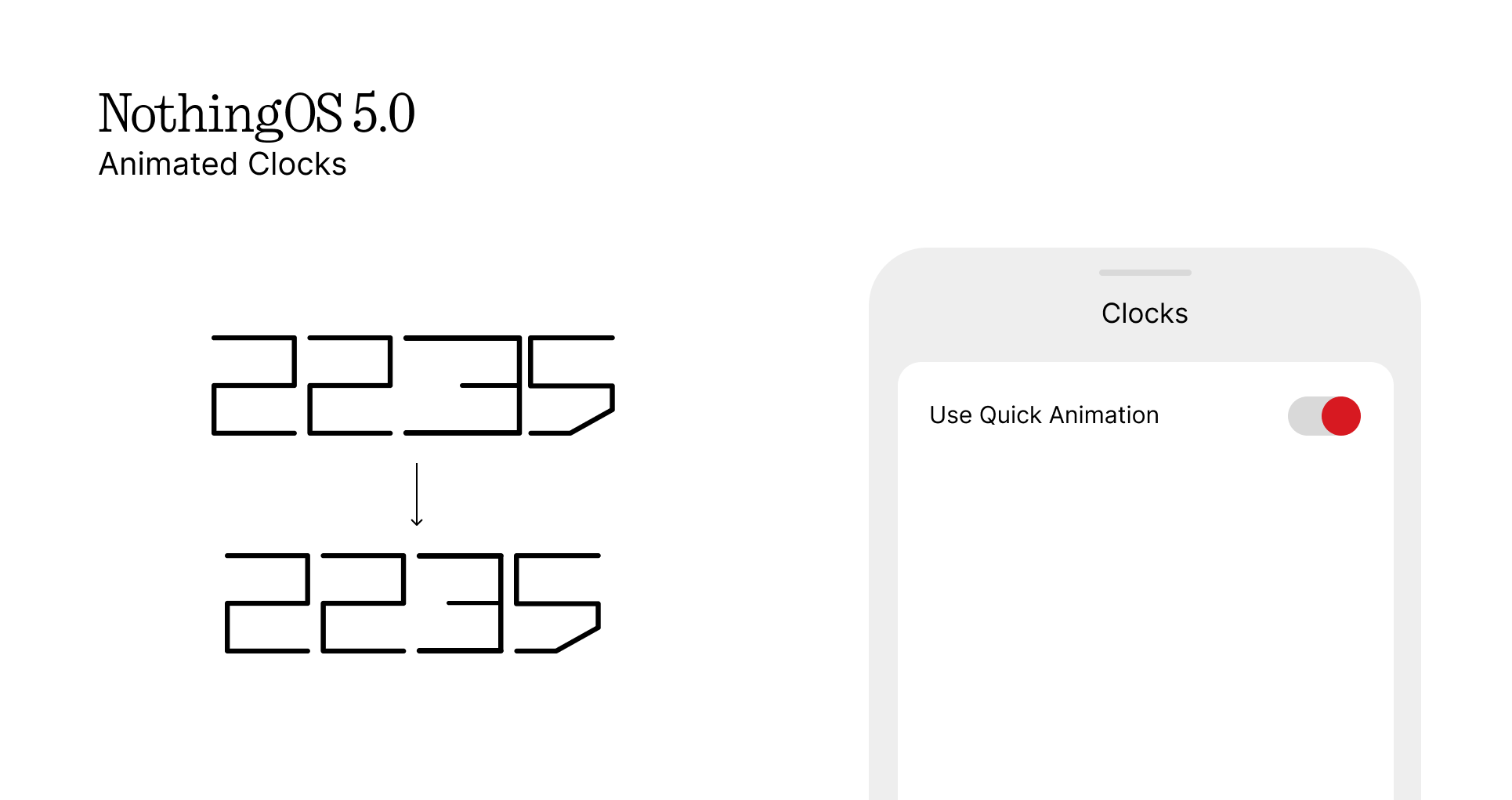
Now the lockscreen clocks have animations as they turn on, just like NP3a C
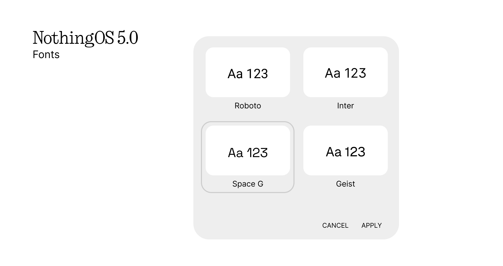
Moving on from the lockscreen, imagine 2 more fonts like Space Grostek which is used in nothing community website here, and also Geist which all fit Nothing Aesthetic
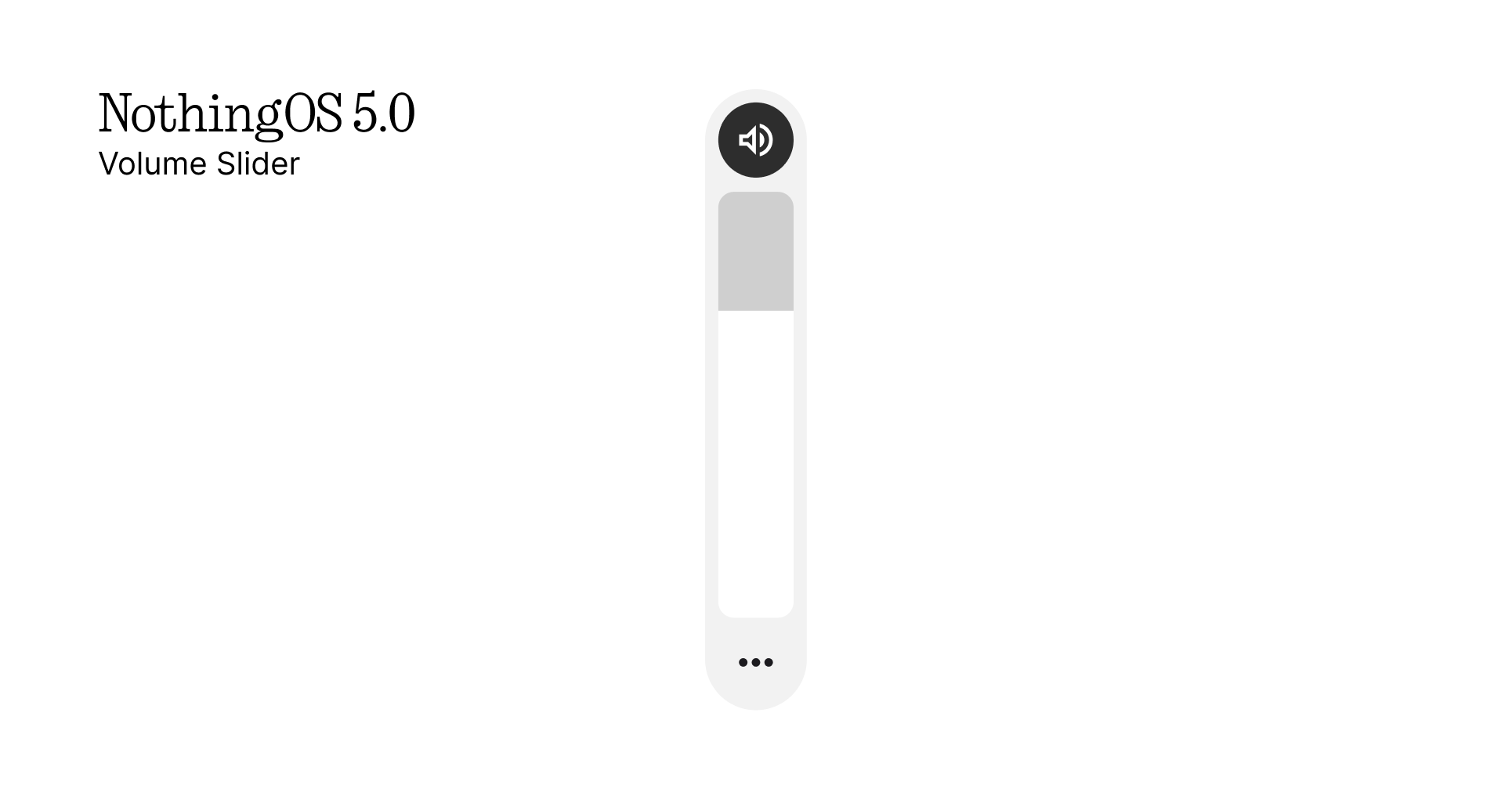
Then what if we had precise volume? Its always in chunks as of now, but imagine this
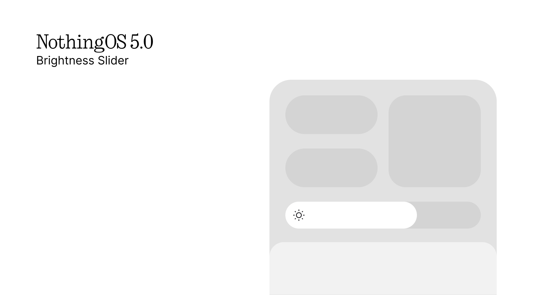
Now for the brightness slider, you have to double swipe to edit it and why not have it in the first swipe in the controlls
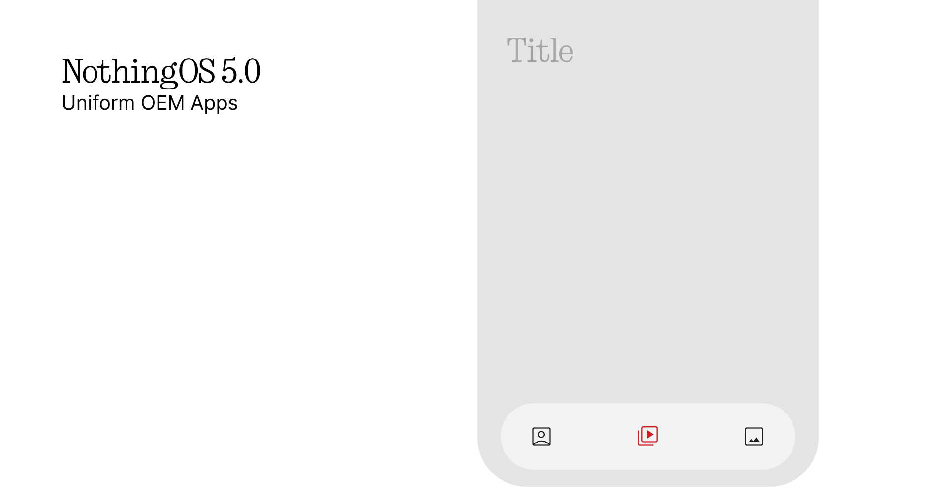
Also for the OEM apps… its really un-uniform. One App has different navigation, another app has different fonts, but with the simple navigation set up like the gallery app, it will all feel uniform and complete as an OS
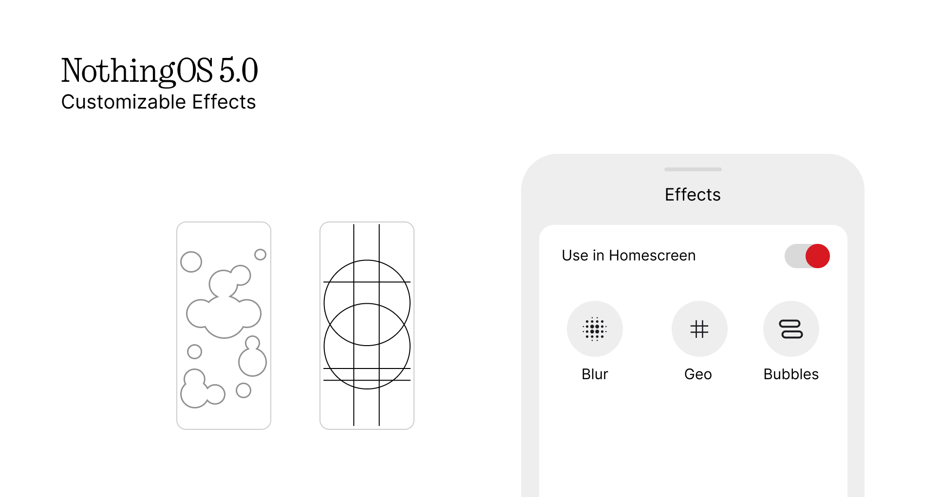
Now back to the customization, why dont we have more addons like the glass? Imagine patterns like nothingOS wallpapers for all images used as wallpapers. Now we can use atmosphere effects in the lockscreen, we can use blur to wallpapers
These changes and updates would make nothingOS look better in customization and usability. Thanks to all my friends and fam. Take care!
hj