Nothing OS today looks very different from the software we shipped with Phone (1).
Nothing OS 1.0 stayed intentionally close to Android. Dot-matrix typography, monochrome graphics, widgets, sounds and the first Glyph Interface controls introduced Nothing’s identity in the places where it made sense.
Nothing OS 2.0 pushed that identity much further. The monochrome home screen, Nothing icon pack and expanding widget library made the system more recognisably Nothing, and more functional with it. Widgets became controls rather than decoration. The Glyph Interface could carry useful information without requiring the screen.
By Nothing OS 3.0, the visual identity was settled. The work moved to everyday parts of the experience, from the lock screen and app drawer to multitasking, while layouts and motion became more consistent across the system.
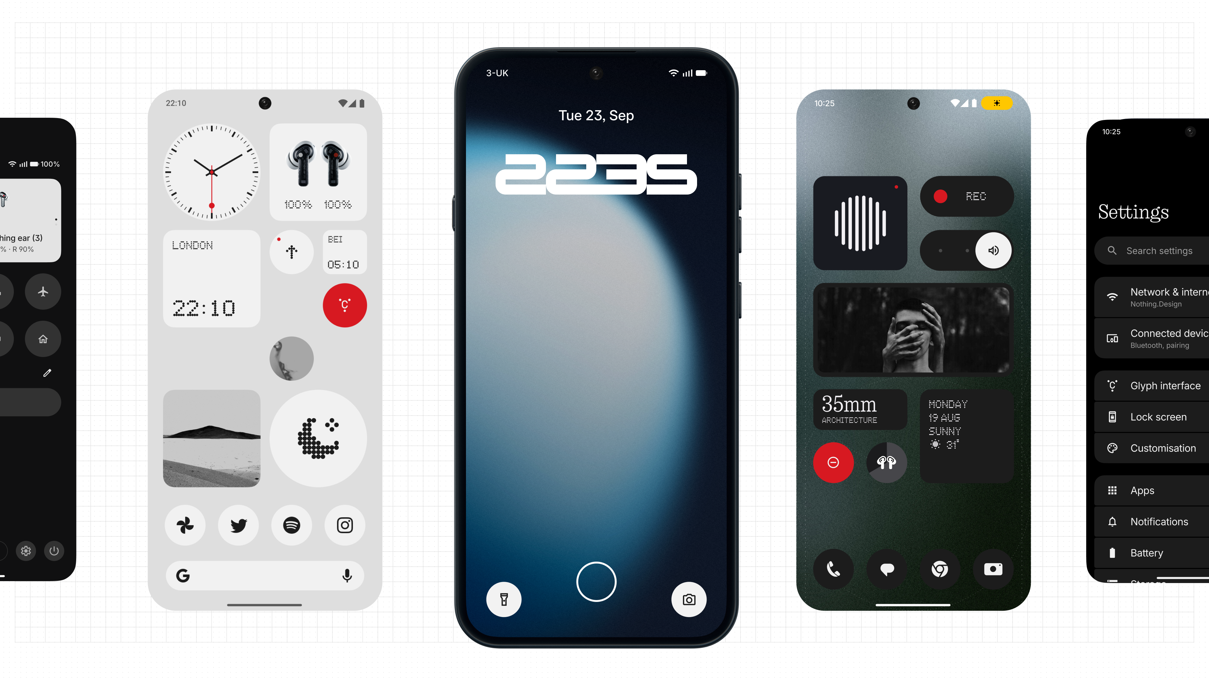
With Nothing OS 4.0, the emphasis started shifting towards usefulness and creativity. Essential AI tools introduced new ways to capture and find information, while Playground opened more of Nothing OS to things people could create and share.
Four years on, the design system is carrying far more than the one we drew up for 1.0.
What Nothing OS is for hasn’t changed. Software that cuts through an increasingly overwhelming digital life rather than adding to it, with AI that earns its place by being useful and a design system you would recognise anywhere.
What has changed is how much of it people should be able to shape themselves. Nothing OS 5.0 is the foundation for that.
“Nothing OS has grown massively since 1.0. With 5.0, we had an opportunity to look at the foundations again and build something that still feels like Nothing, but gives us much more flexibility for what comes next.” - @Dan🧑💻 (Software Product Director, OS / AI)
Evolving the Nothing design language
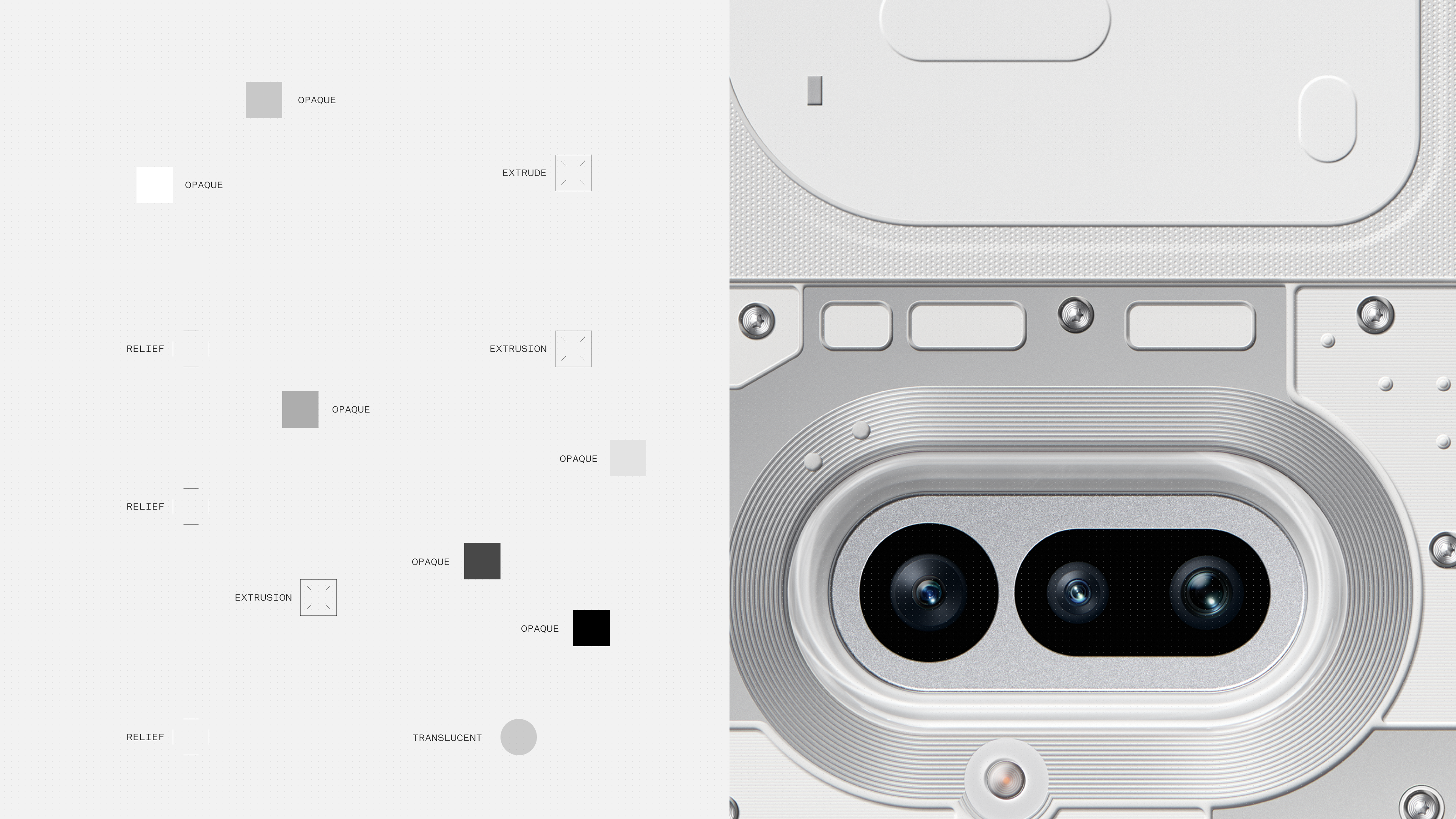
Nothing OS 5.0 evolves the design language we’ve built across hardware and software. What makes Nothing recognisable carries forward, though not every part of it stays exactly as it was. What surrounds it has more range now, because there is a great deal more for it to describe than there was in 1.0.
Most of that comes down to hierarchy. When a screen holds a lot, small differences in depth, contrast and colour are what move your eye to the thing that matters in that moment. Three changes in Nothing OS 5.0 widen what we can do there.
A new software material
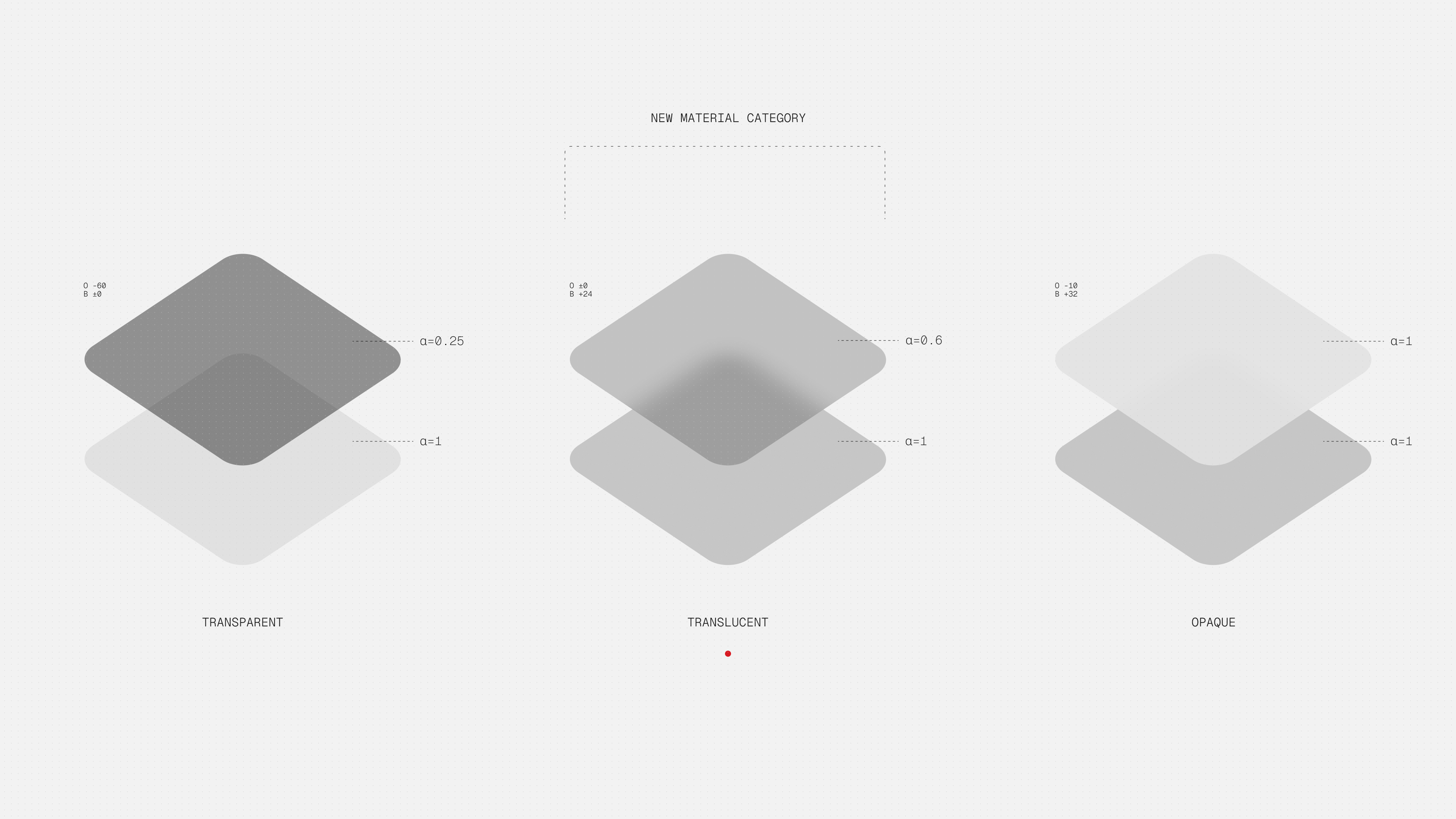
Transparency, layering and exposed details have always been part of Nothing hardware. On screen, we have shown that character flat, through graphics, typography and colour.
For Nothing OS 5.0, our design team developed a new software material that combines transparency with a subtle frosted effect. The outcome is more layering and depth, while keeping the interface clean and focused. You can see what is in front and what is behind, which matters more as more of the system shares one screen.
Geist becomes the system typeface
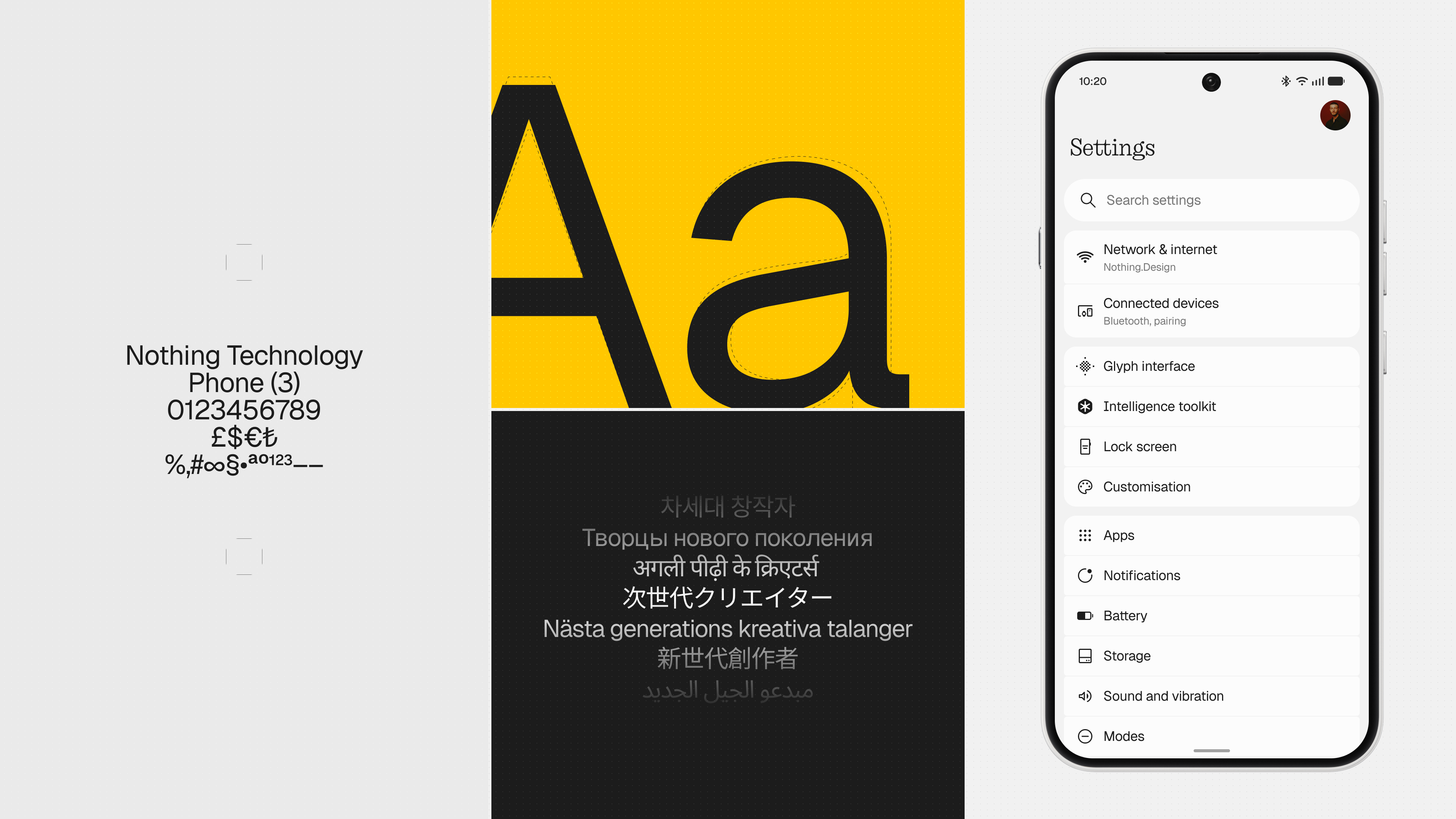
Geist gives everyday content the clarity and versatility it needs as our software ecosystem grows. It also connects Nothing OS more closely with experiences such as Playground, where Geist Mono is already part of the visual language.
Our dot-matrix language remains an important part of Nothing’s identity, but we decided to use it more intentionally, where it can define character rather than compromise readability.
A new colour engine
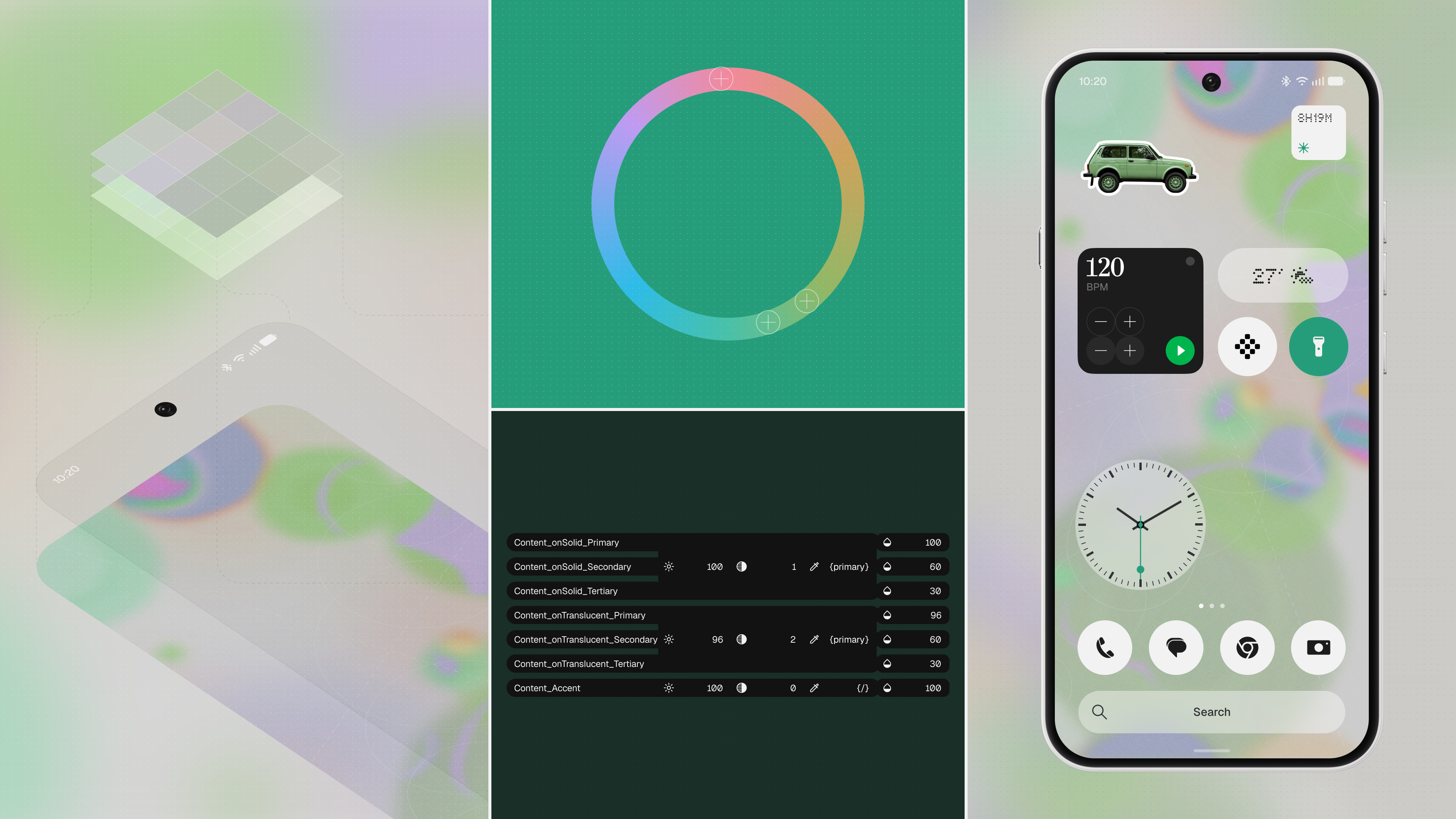
Personalisation has been part of Nothing OS from the beginning, but traditionally that has meant choosing from options already designed for you. Themes we made, icon packs we drew, wallpapers we shipped.
Alongside our Classic theme and Android’s Dynamic Colours, we’re introducing a new colour engine designed around a richer, more expressive visual language for the future OS experience.
It takes cues from something that already belongs to you. Your wallpaper. Its colours carry through icons, widgets and controls. Change your wallpaper and those elements move with it, while Nothing’s predominantly monochrome character stays underneath.
The same thinking extends beyond colour. Lock screens become more expressive, surfaces gain more depth and motion responds more naturally to your gestures.
What the homescreen has to hold now
What lives on the homescreen has changed with every release.
In 1.0 and 2.0 it was apps and widgets. By 4.0, Playground had given people room to create and share their own experiences. With Nothing OS 5.0, Essential Apps Builder moves onto the phone as an app. You describe what you need in natural language, create an AI-powered widget in a few clicks and put it directly on your home screen.
That is a different kind of thing to design for. Not software we made for everyone, but small tools people make for themselves, sitting alongside everything else. The home screen has to hold both and keep them easy to read together.
It’s why Nothing OS 5.0 needed a new design system rather than another set of themes.
“Personalisation doesn’t have to stop at how your phone looks. The bigger opportunity is giving people more control over what their software can actually do for them.” - @Dan🧑💻 (Software Product Director, OS / AI)
Knowing when to get out of the way
More capability should not mean more demands on your attention. That has been true since 1.0 and it matters more now.
Depth, transparency and colour help with that. They make useful information easier to see when you need it, and let the rest of the system stay quieter in the background. Clearer status information, widgets that surface what matters without opening an app, interactions that let you get something done without interrupting what you were already doing.
The point isn’t to add more interface. It’s to make the interface work harder, so you don’t have to.
What comes next
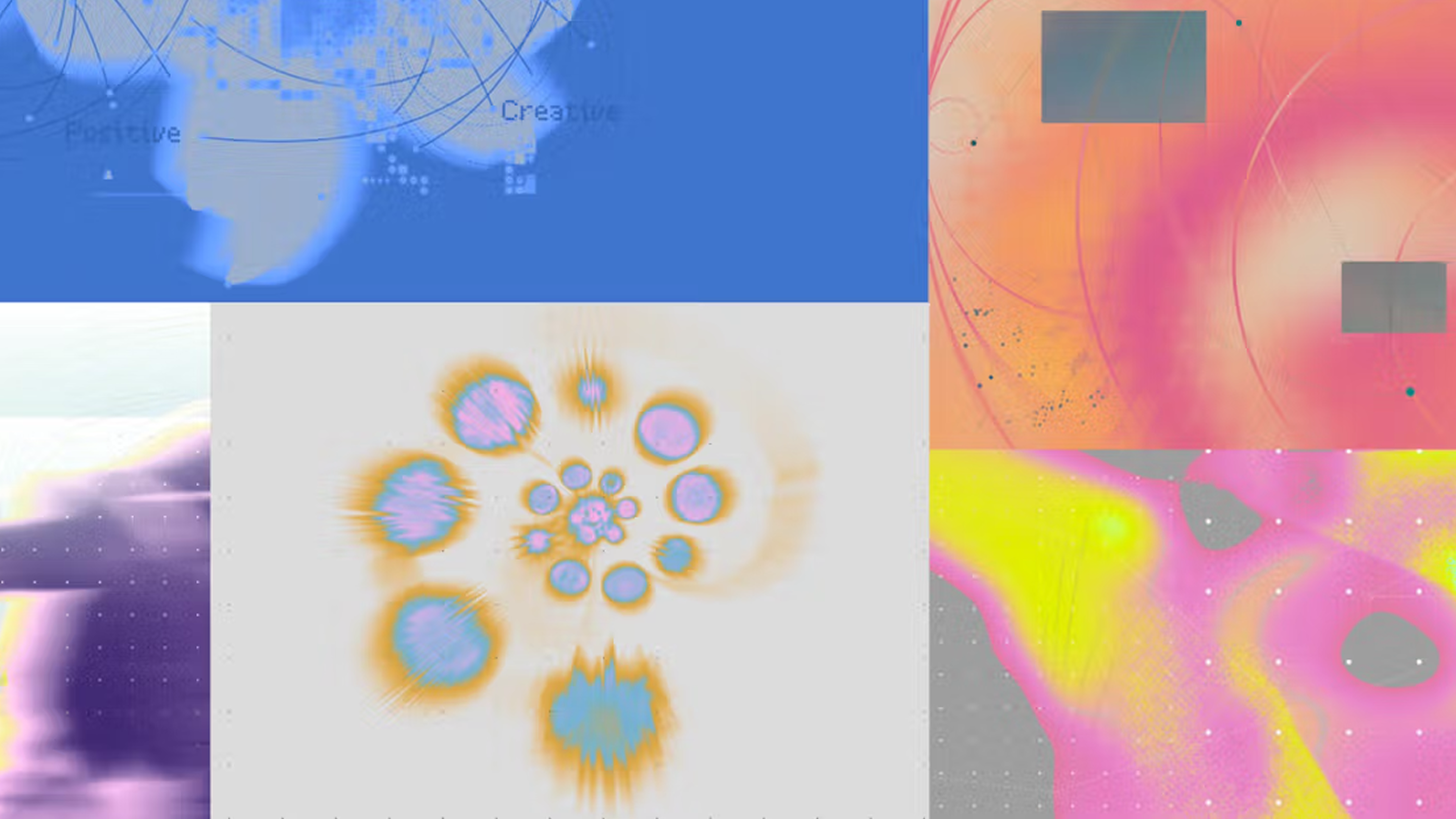
What an operating system is for is still changing, and Nothing OS 5.0 is built for where that goes next.
As software becomes more intelligent and contextual, personalisation goes much further than wallpapers, colours and layouts. The operating system understands more of your context, adapts to what you need and gives you more ways to shape the experience around yourself.
That’s why Nothing OS 5.0 needs more flexibility, depth and room for expression. Four years spent building an identity people recognise instantly, and a design system that now leaves room for everyone using it to take that identity somewhere different.
Our ambition is to build the most personal software experience.
Not one operating system designed the same way for everyone.
One billion operating systems for one billion people.
—


