Ali Fakhruddin Hi Ali Fakhruddin,
You’re doing an amazing job with the Nothing community – it’s clear that you’ve put a lot of thought and creativity into this notes app design. I can see the attention to detail and the minimalist aesthetic that aligns well with Nothing’s vision. I wanted to share a few ideas that might take the app to the next level and make it even more engaging and user-friendly. Hopefully, you’ll find these suggestions useful, and they might inspire some new features!
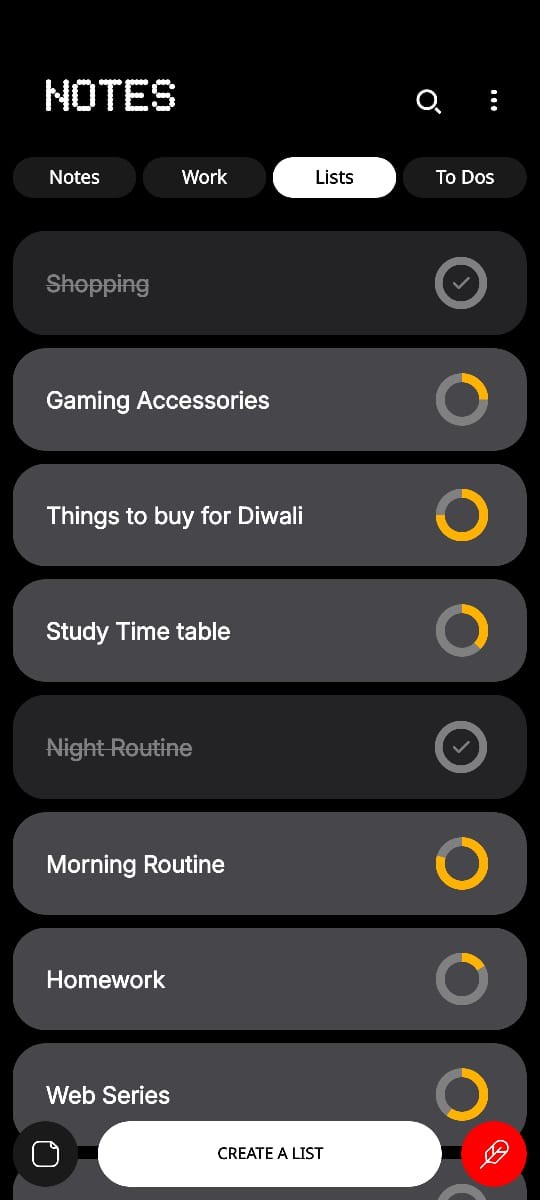
First off, color coding different categories or list items would be a great way to help users differentiate their notes at a glance. Customizable icons next to each list item could also add a nice touch, giving users visual cues based on category – imagine a shopping cart icon for a shopping list or a book icon for study lists. This could really make the interface more intuitive and visually appealing.
Adding a more detailed progress indicator, like a percentage or bar, could give users clearer feedback on their tasks’ status. Instead of just showing an incomplete or complete circle, this could provide a more accurate sense of progress. Alongside that, allowing users to pin important lists to the top would make it easier to access frequently used notes without having to scroll.
More theme options would also be a great addition – perhaps different modes, like sepia or high contrast, to suit varying preferences. A distraction-free writing mode could be another option, hiding non-essential elements to help users focus on their content. And for users who like to get into the details, supporting sub-tasks or nested lists would help them organize tasks hierarchically, breaking down each note into smaller parts.
Integrating reminders with deadlines would bring a new level of functionality. This way, users could get notifications for important items, making the app not just a notes tool but a mini task manager. A drag-and-drop feature for list reordering would make prioritization more straightforward, especially for users juggling multiple lists.
For a quicker way to add items, a small “+” button in each category could make it super easy to add new items directly from the main screen. Adding subtle animations when users check off tasks or open a list could enhance the experience and give the app a polished, modern feel.
To keep it Nothing-inspired, consider adding a minimalistic text formatting toolbar that appears only when needed, keeping things clean but functional. Embedded images, voice notes, or quick sketches could display as small, expandable thumbnails, reducing clutter. A floating, transparent widget could show recent or pinned notes on the home screen, while an intelligent summarizer could help condense long notes into a quick overview.
Adding in haptic feedback could make actions feel more engaging, and a Spotlight-style overlay for quick search would let users find keywords or tags without leaving their current view. For personalization, gradient-based progress bars and inline widgets for dates and reminders could bring subtle color shifts to indicate status.
It’s all about keeping it clean, simple, and intuitive – and I know you have the vision to pull it off. Keep up the amazing work, Ali, and looking forward to seeing where you take this app next!