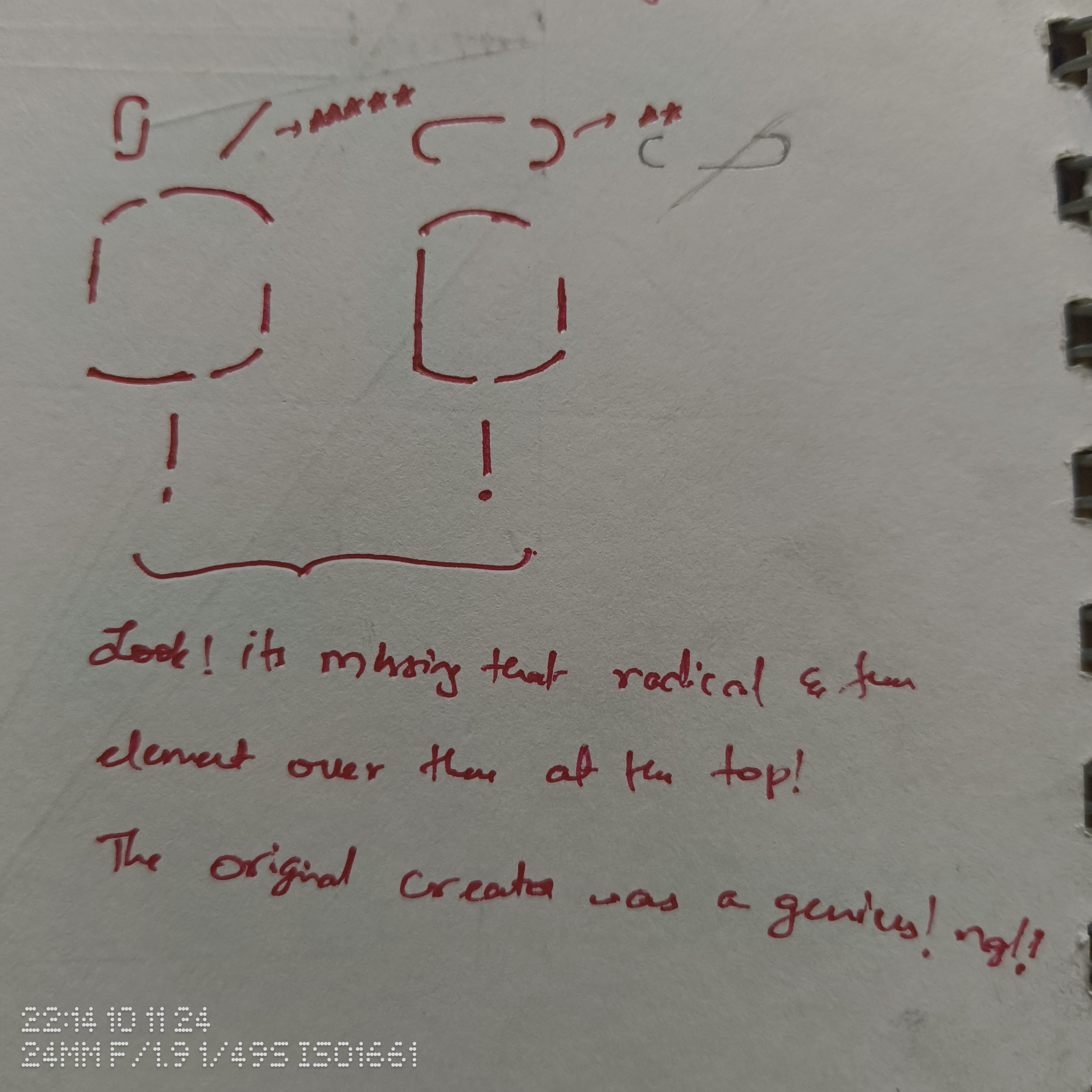
Hey guys! I need your inputs. Although this is turning out to be a really good concept, there is still one part that I am not completely satisfied about. This image should sum it up:

In case you find my handwriting hard to understand, it says:
“Look! It’s missing that radical and fun element over there at the top! The original creator was a genius! ngl!”
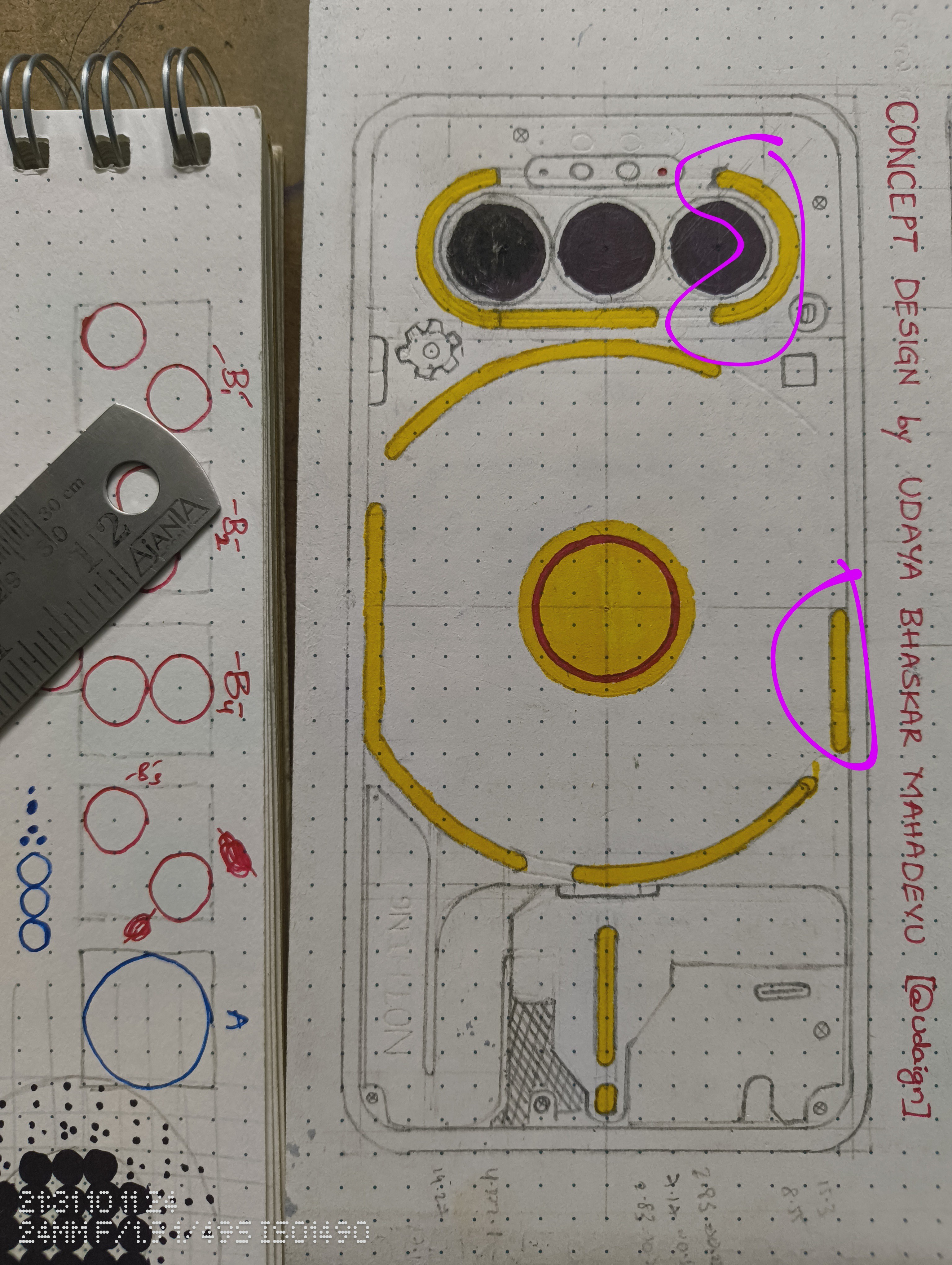
So basically, this horizontal three camera setup fails to accommodate the diagonal glyph that plays a key role in bringing that slick look to the glyph interface. Also, it is the current essential glyph indicator.
My current thought is that this concept design could still get normalised eventually, and people will get used to it, and I could assign the essential glyph function to one of these two segments:

Please consider sharing any thoughts or ideas that you might have.