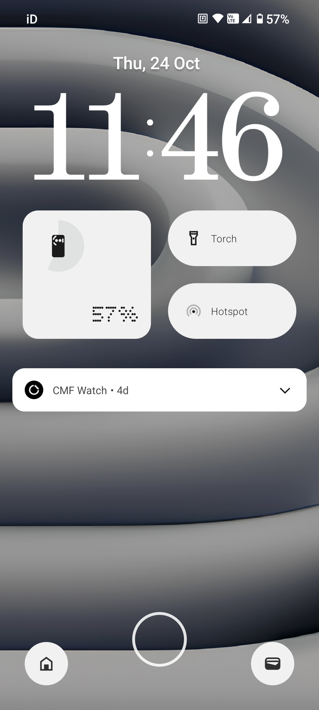
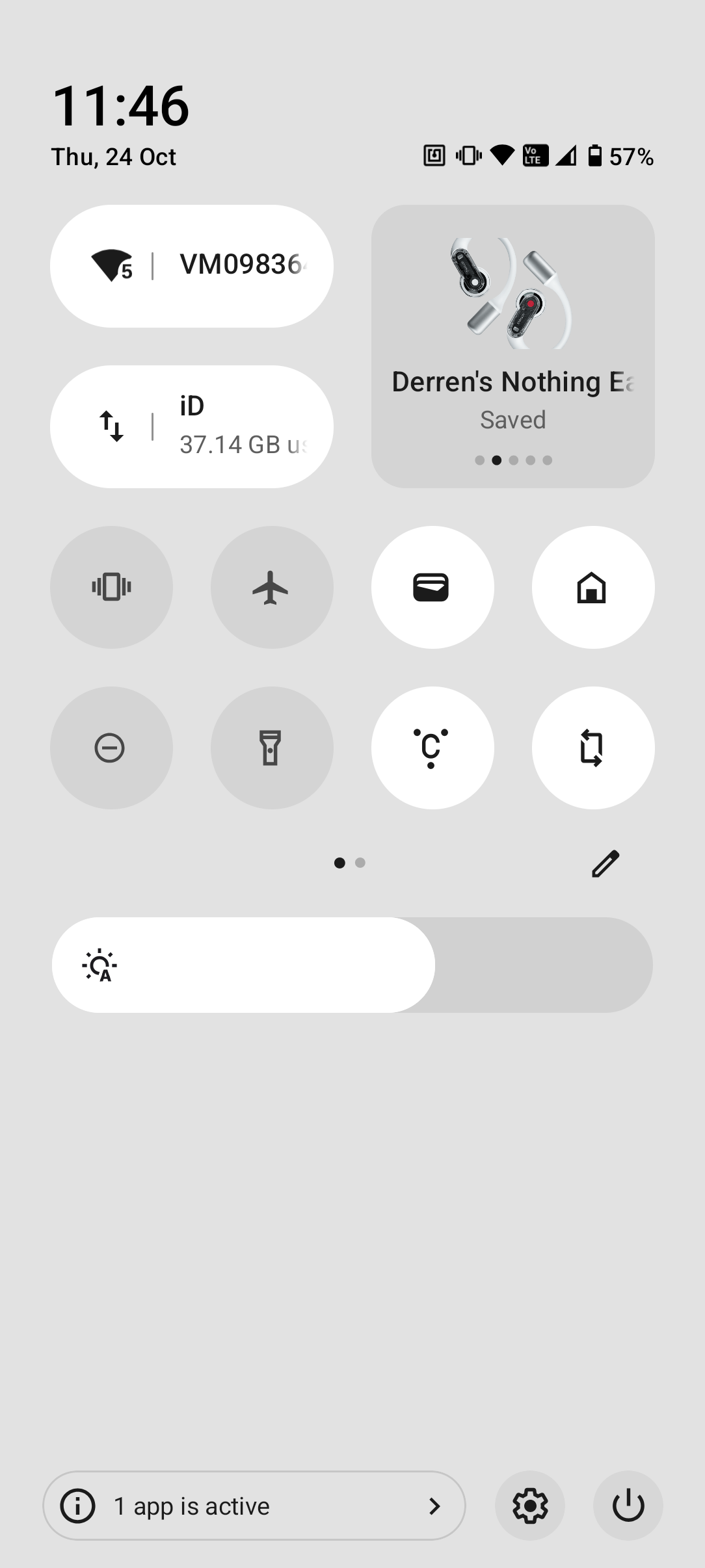
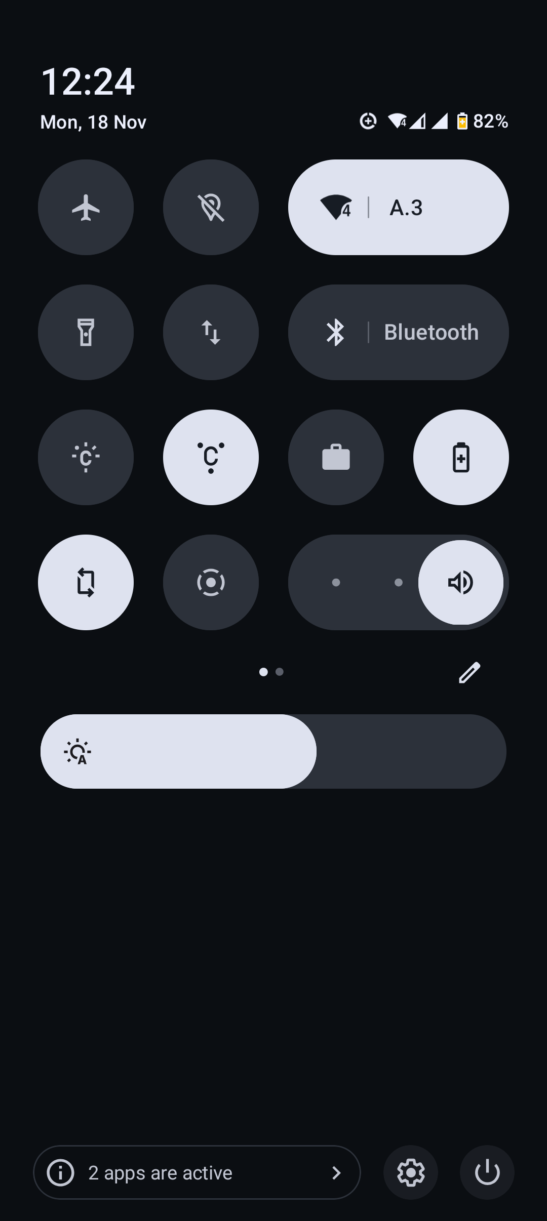
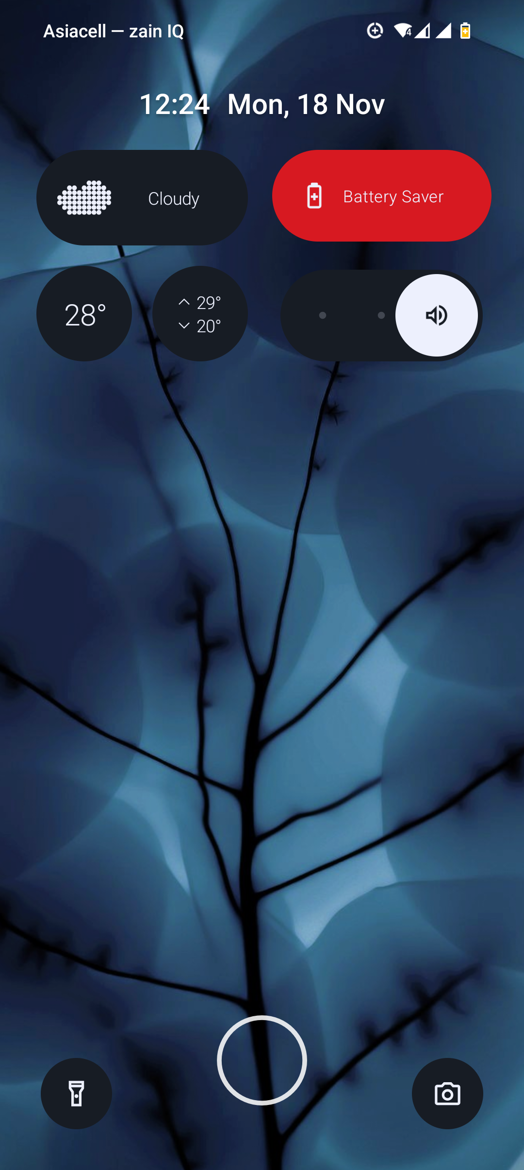
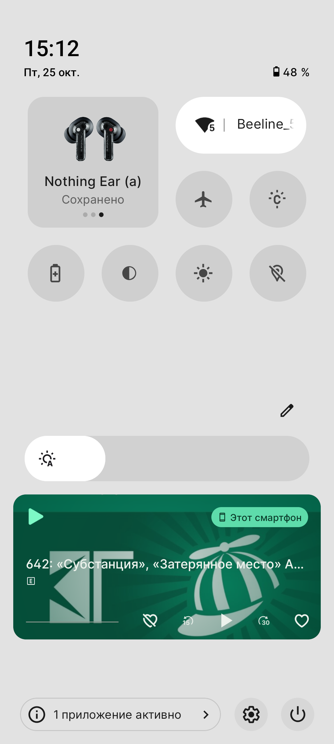
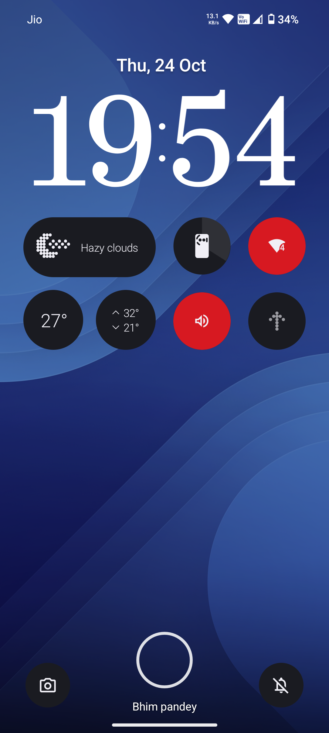
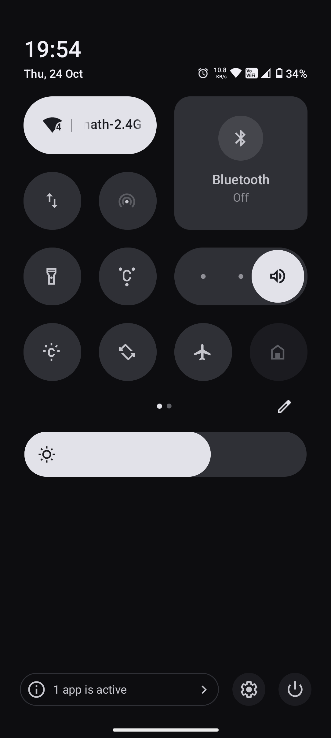
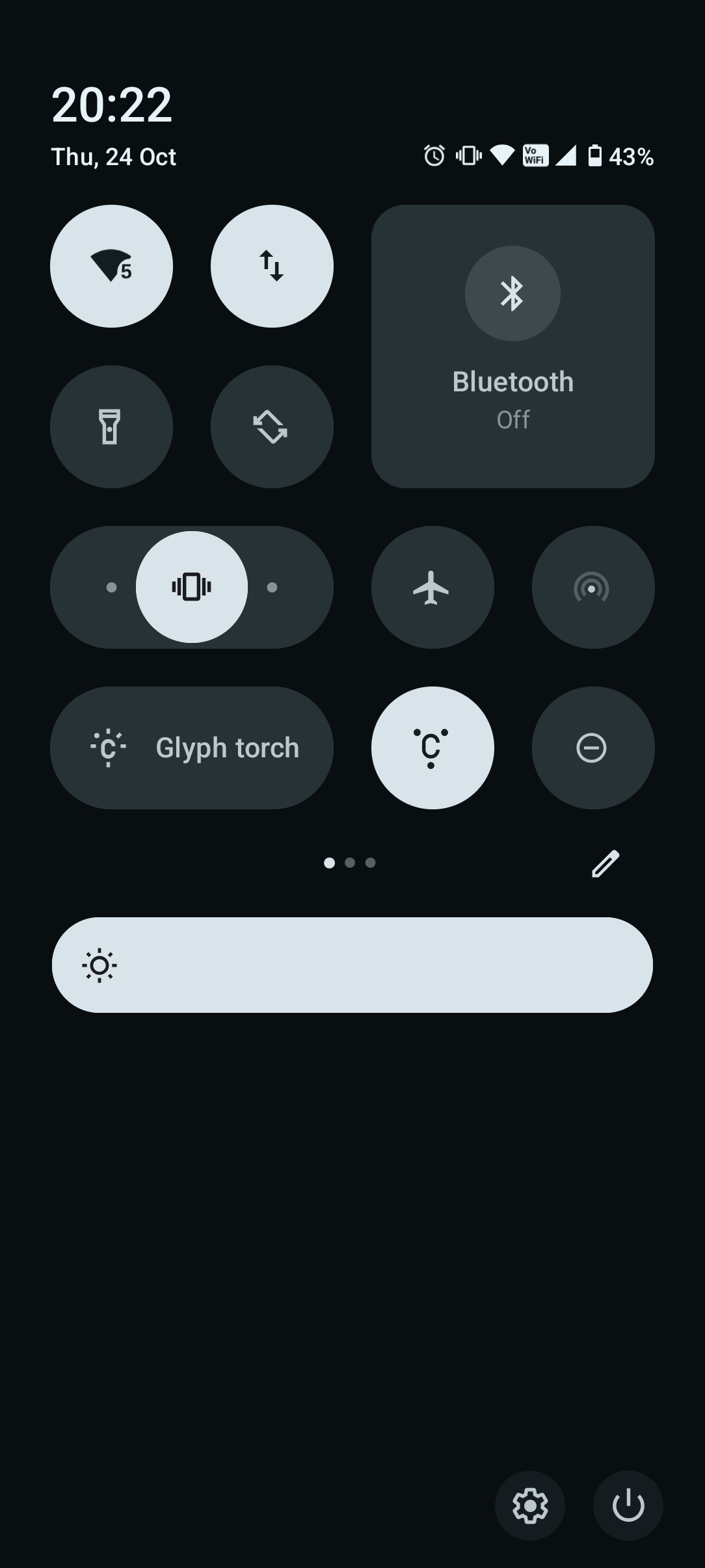
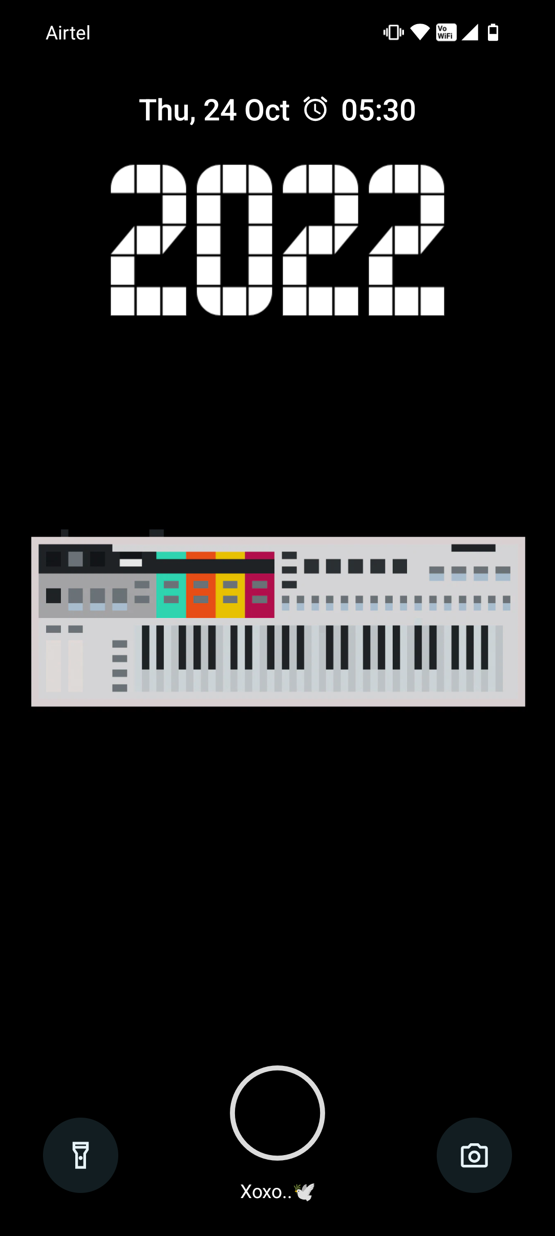
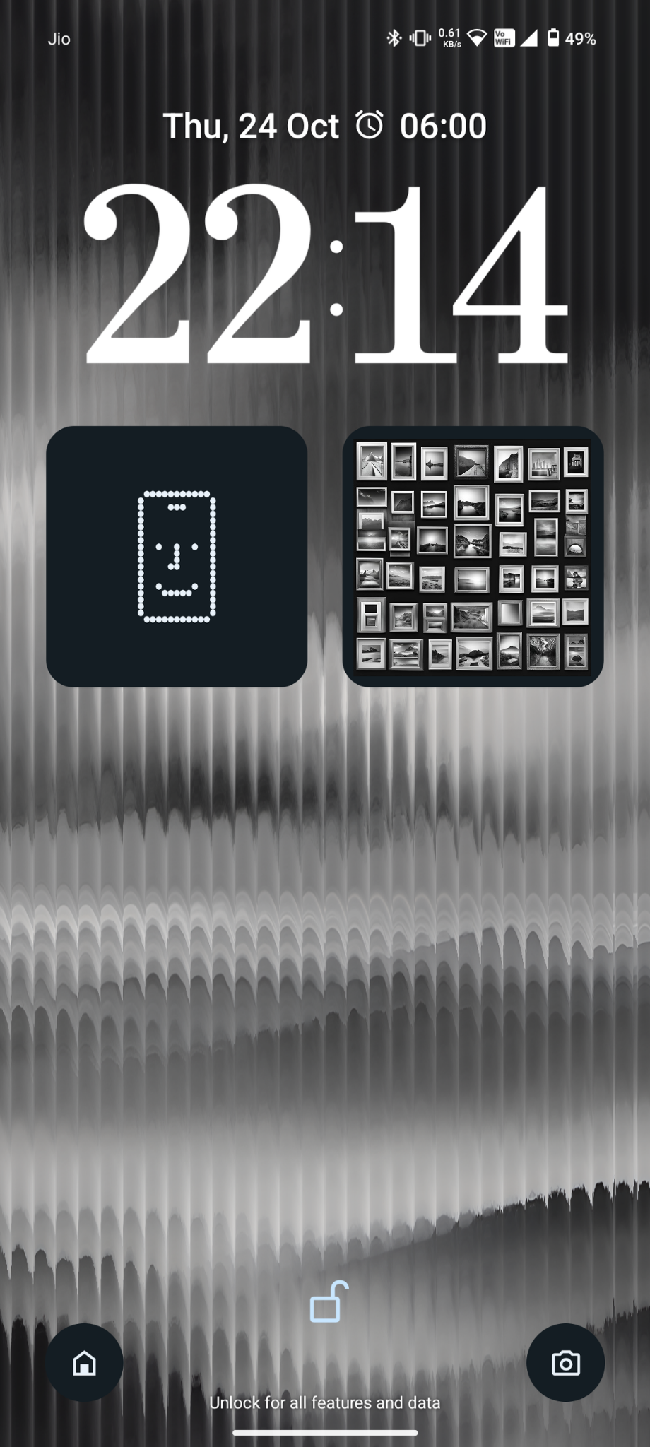
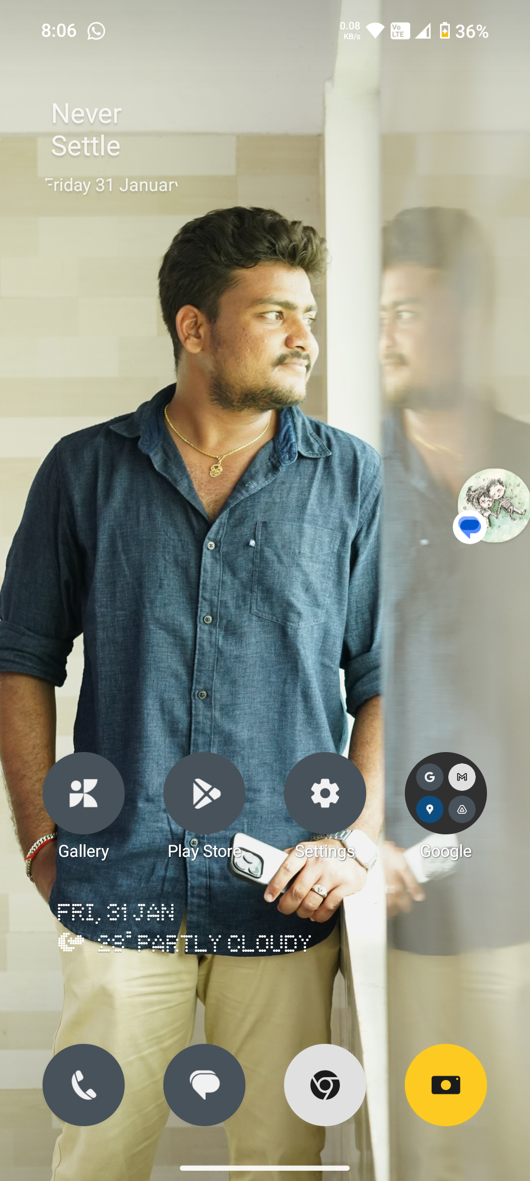
With the release of the Nothing OS 3.0 beta for Phone (2a), and availability on other devices coming soon, one of the biggest, and most visually different changes, is the new lock screen and quick settings panel.

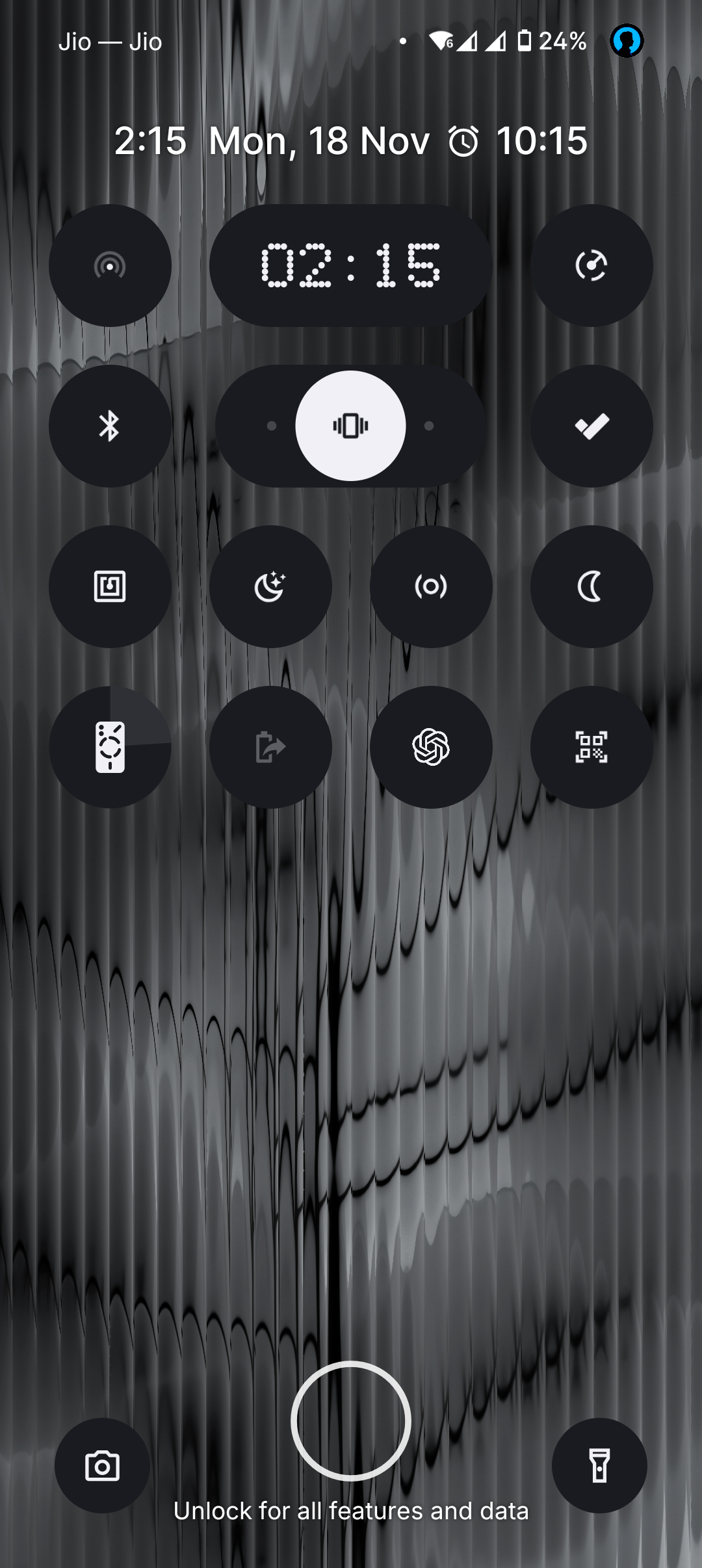
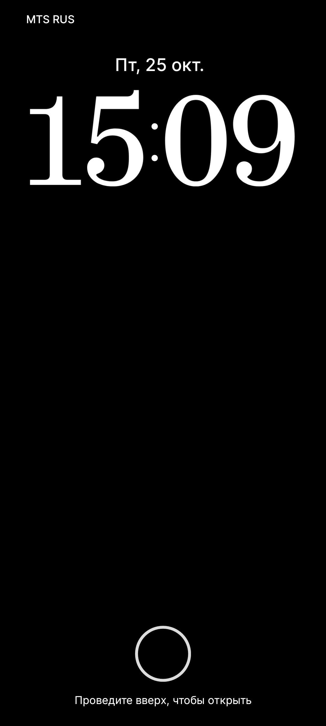
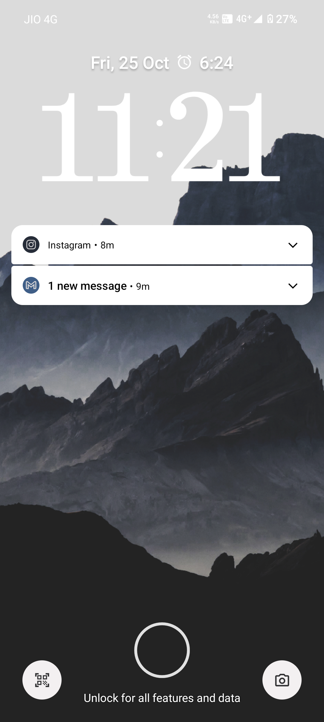
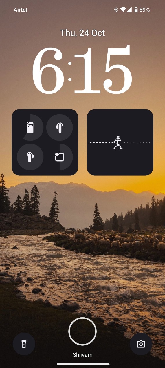
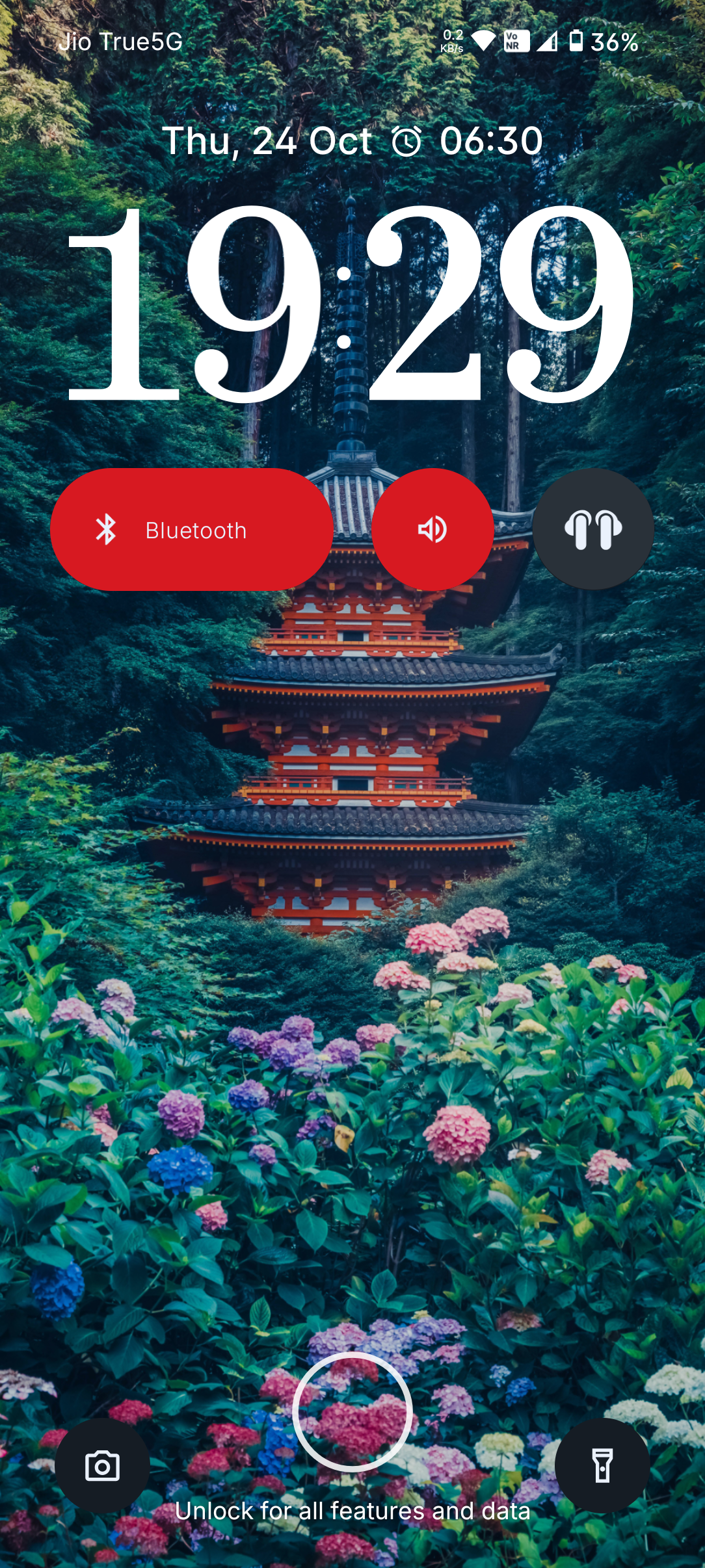
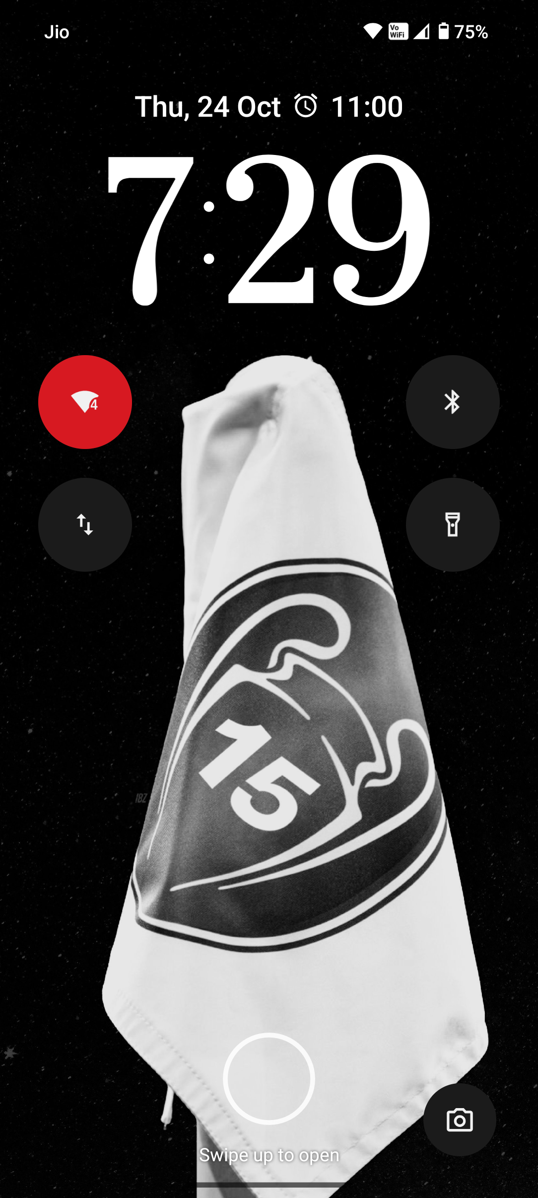
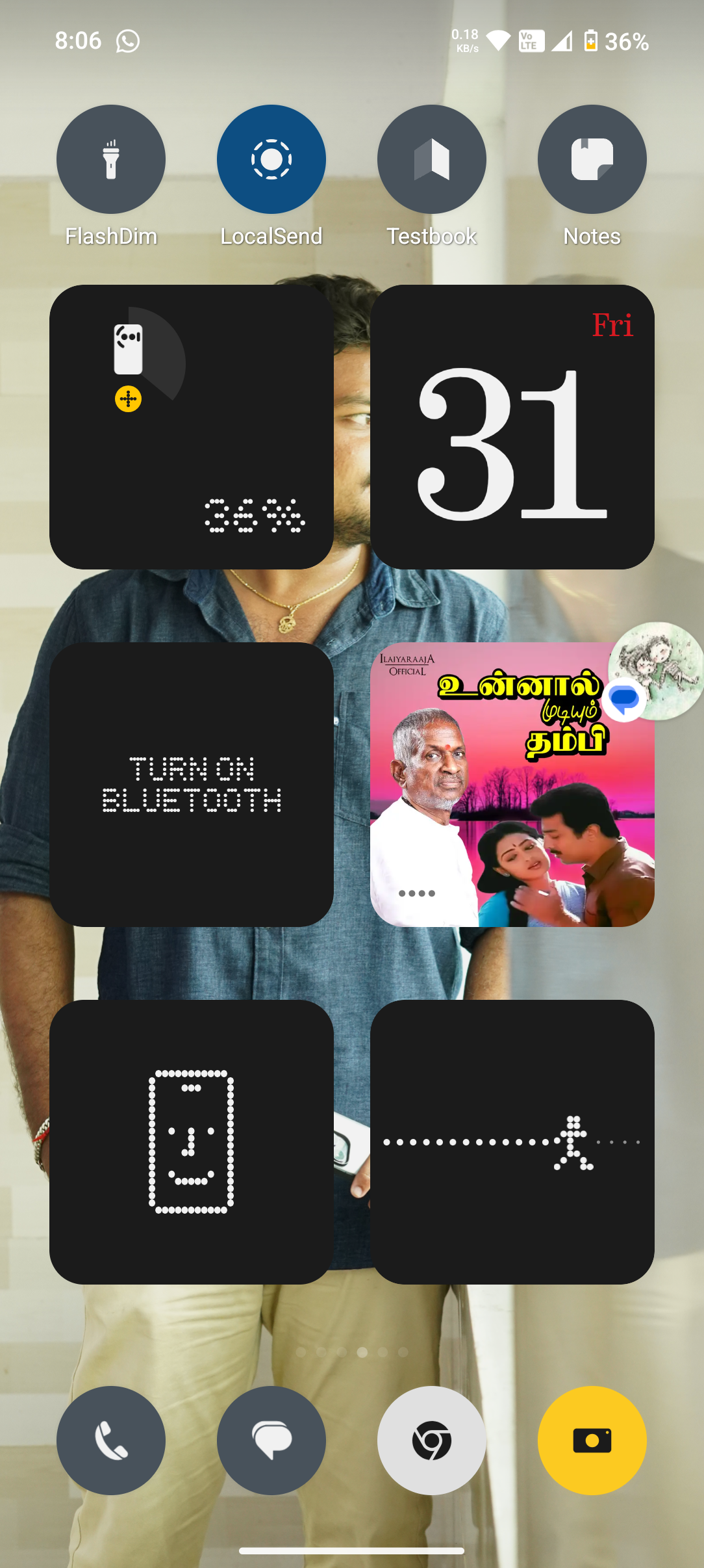
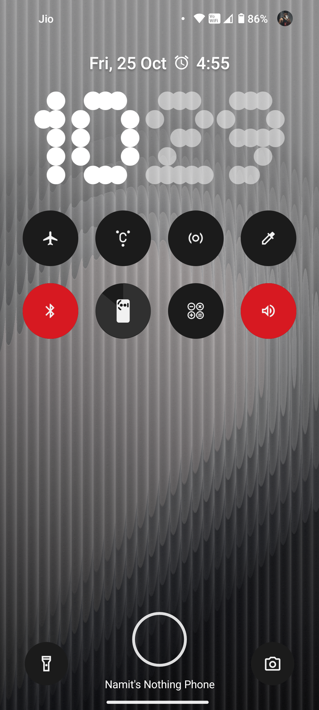
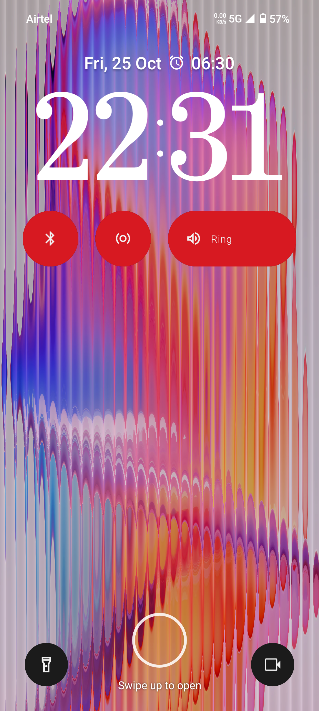
The lock screen has all new clocks to choose from, and more customisation/grid options for widgets and quick settings.

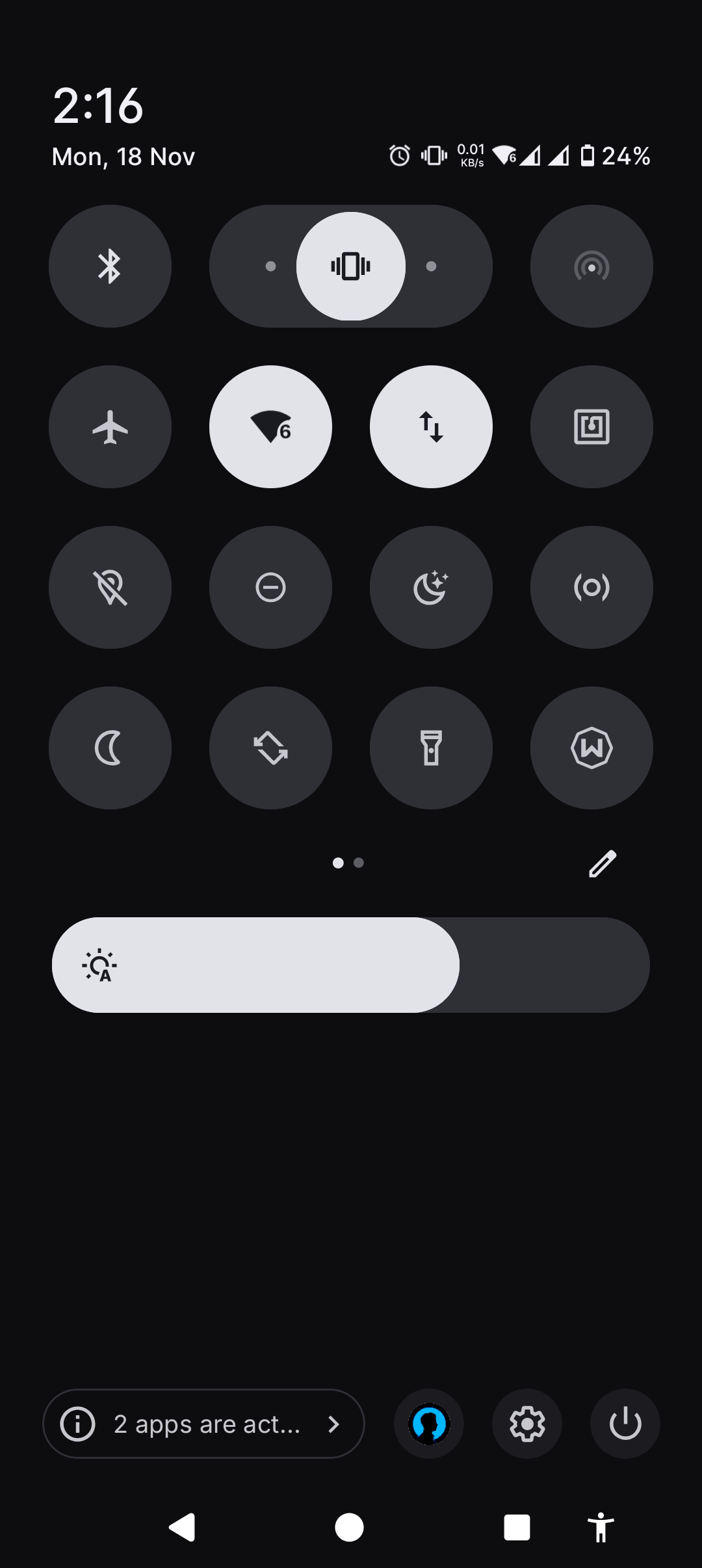
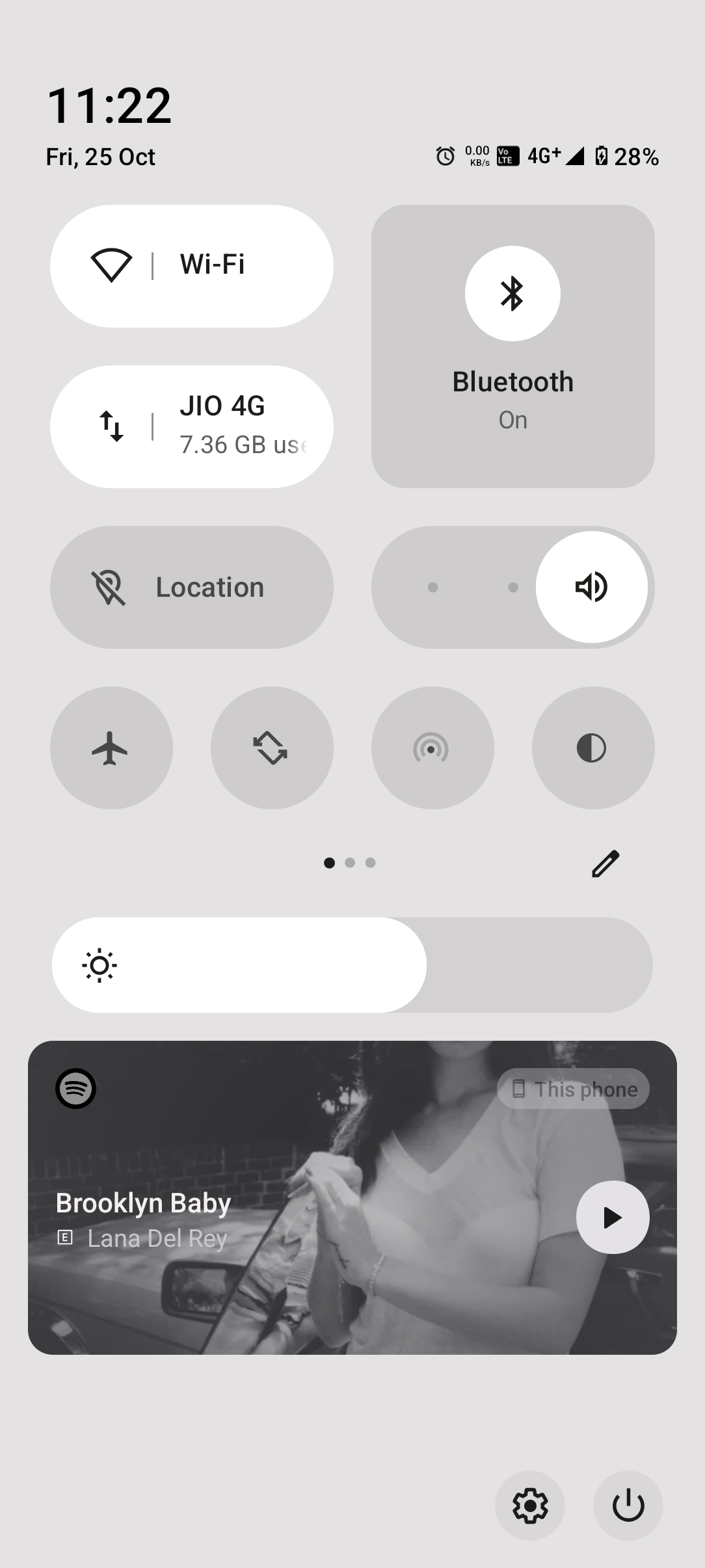
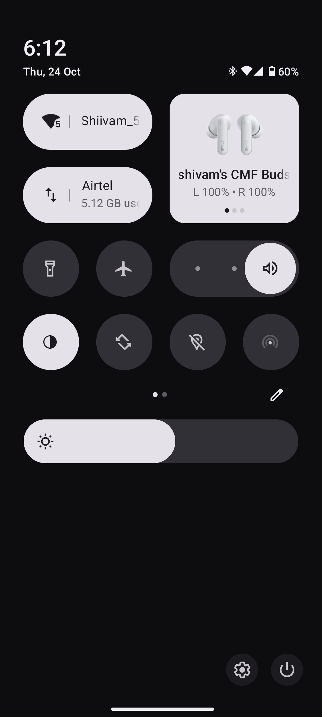
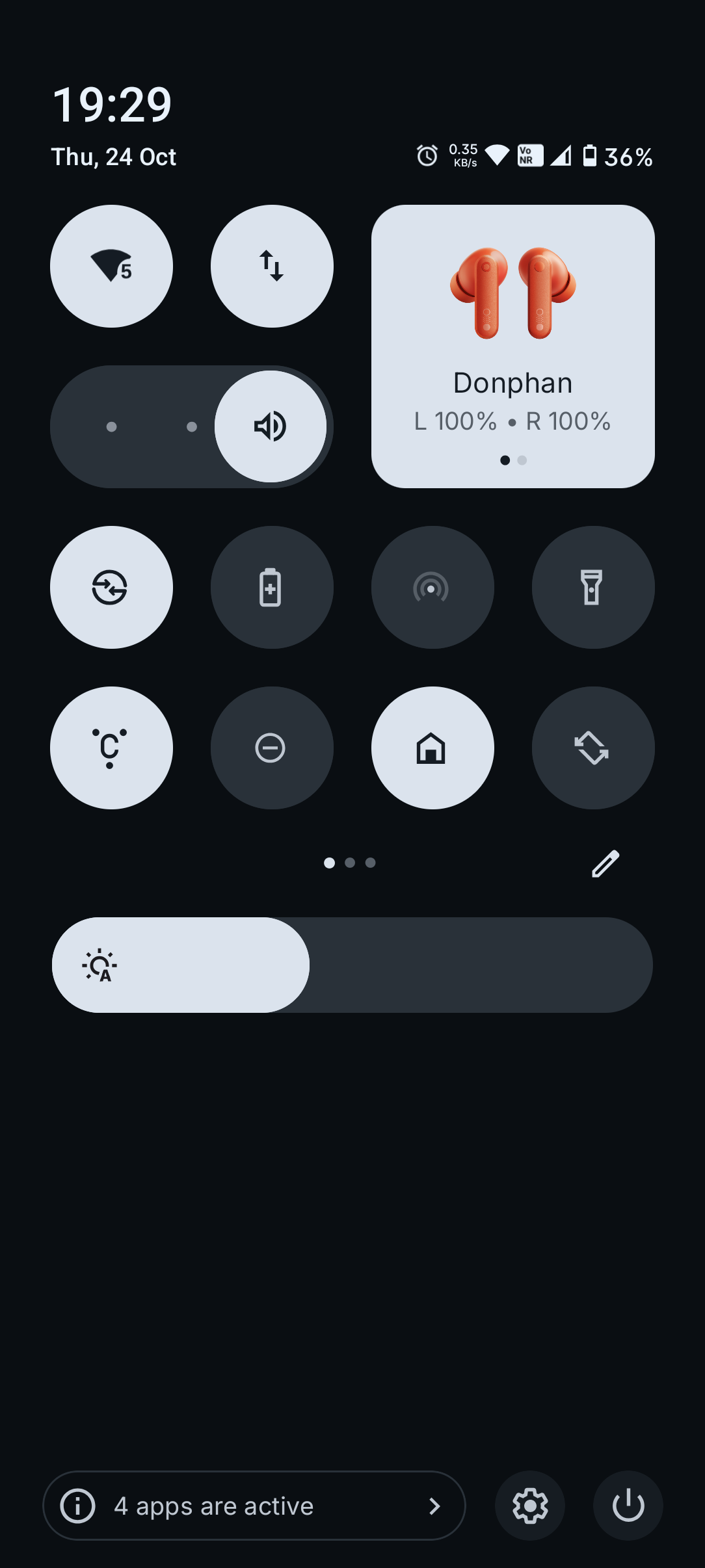
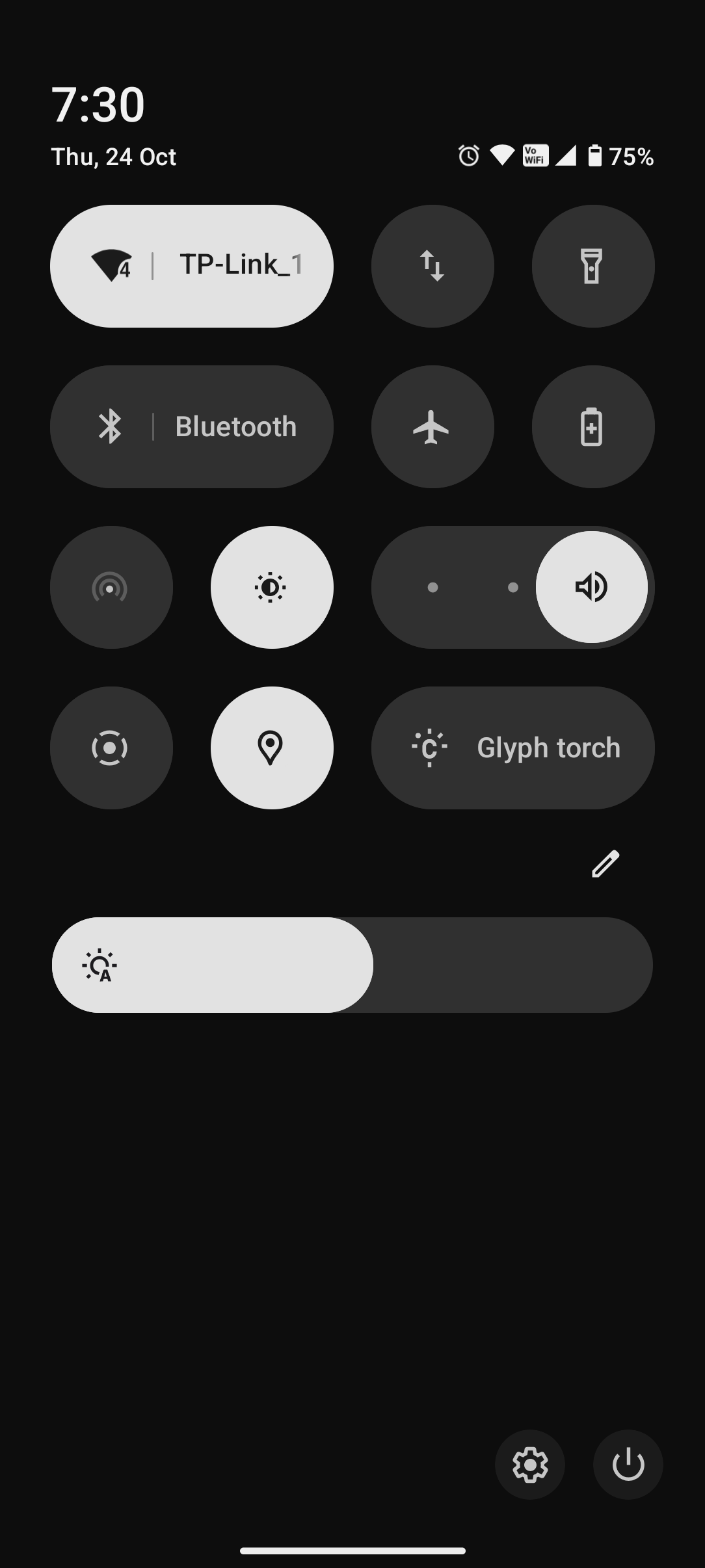
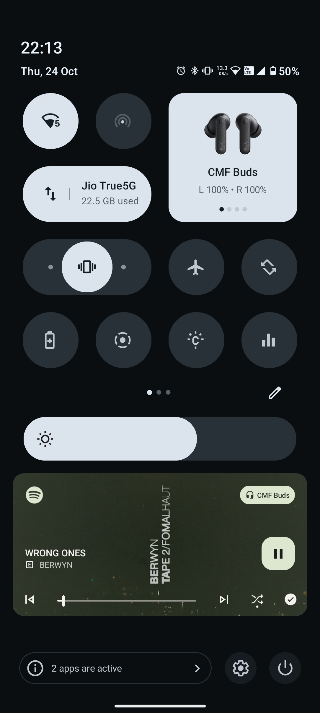
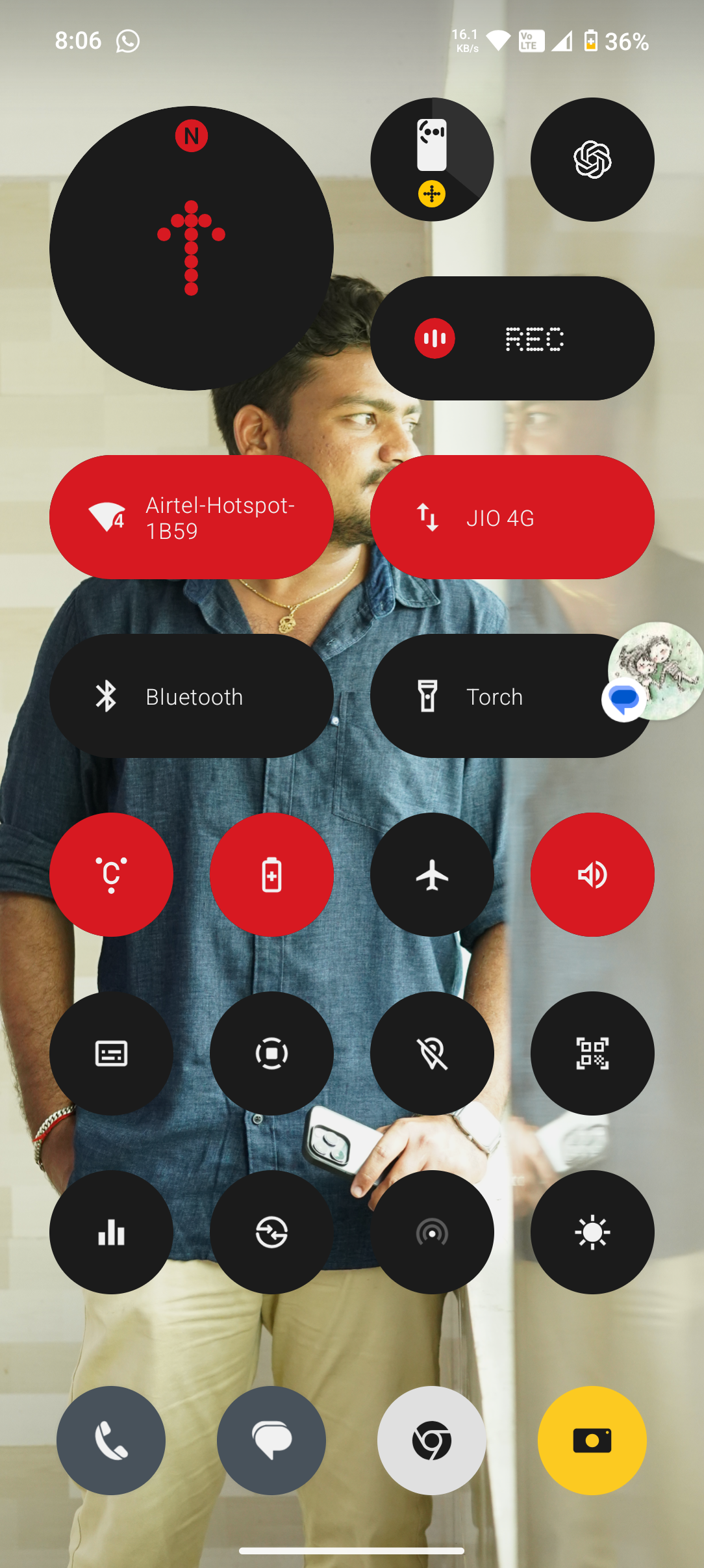
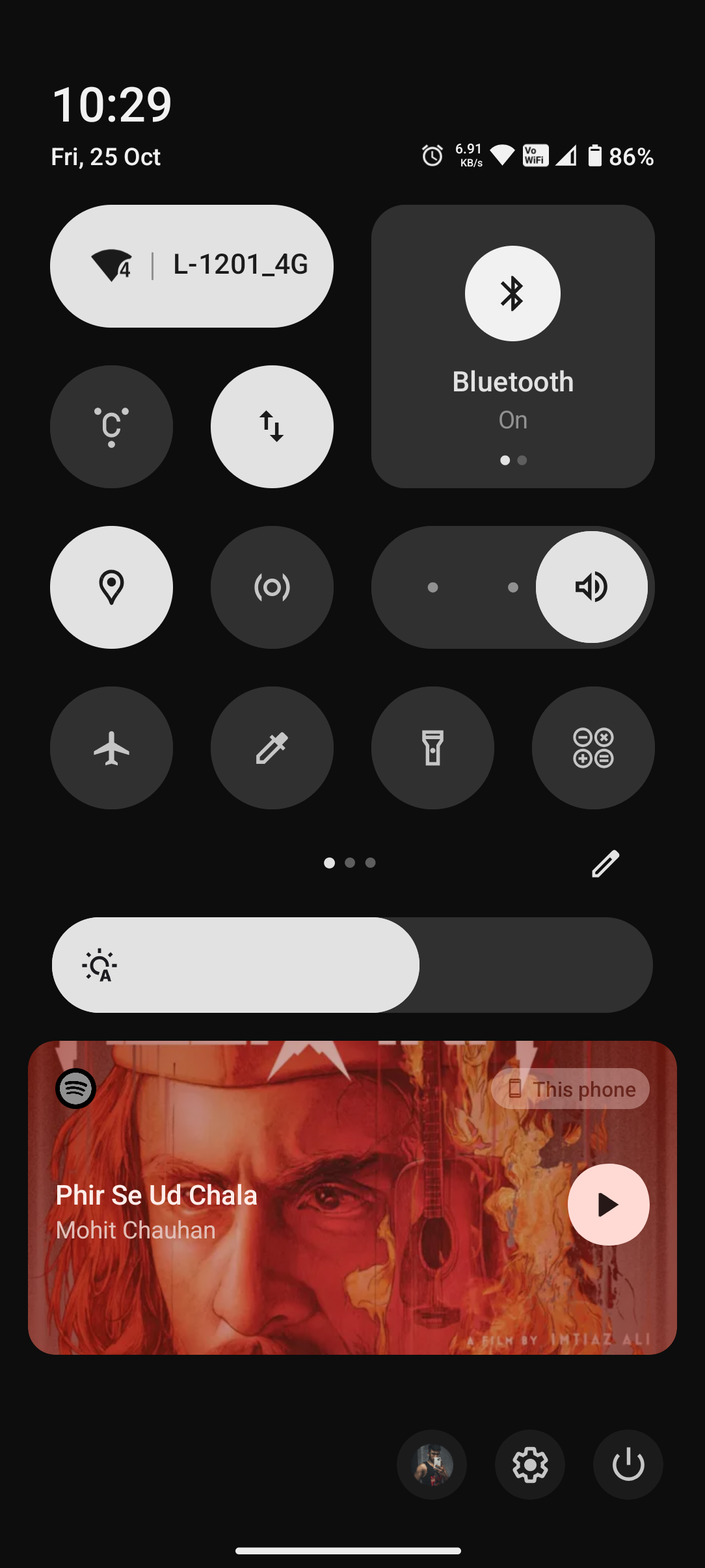
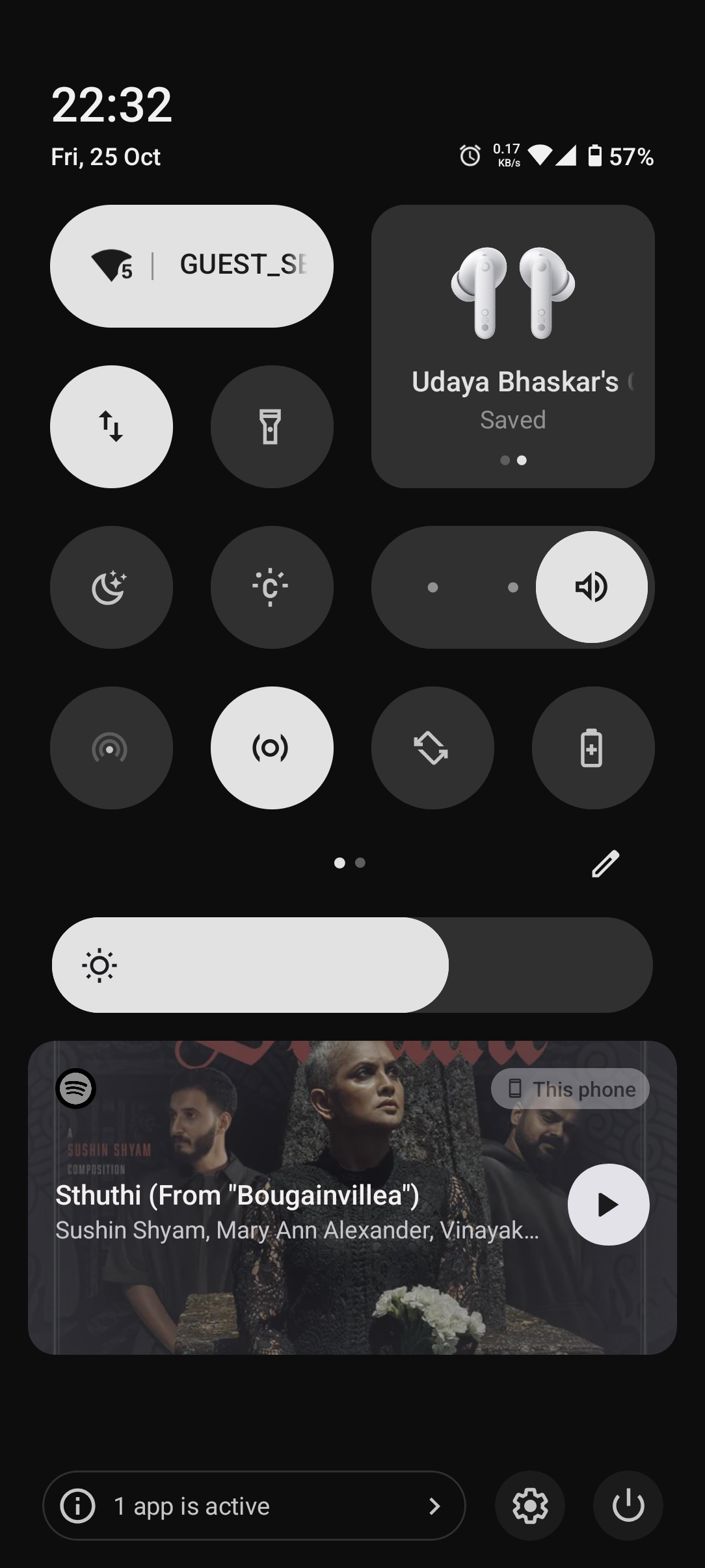
Similarly, the quick settings panel has had a visual overhaul, with new options and more customisation available to the user.

With this in mind, I though it would be really great to see how our community members have set these up based on their preferences. It would be great to hear of your reasoning too, maybe it’s style and aesthetics, or maybe it serves a functional purpose.

So with that being said, let’s see what you’ve got!

    With my examples above, I’ve got for simple and functional.

    My lock screen is neat, tidy and visually pleasing to me but also offers my most important information and functions at a glance. I always forget to keep track of the battery life of my headphones and case, the battery widget reminds me every time I pick up my phone.

    The torch and hotspot are also functions I use regularly, but prefer not to navigate through my phone to access them.

    In regards to quick settings, I’ve kept it mostly stock because I don’t spend much time there, and I feel that the stock layout offers quick access to some of the features and settings I use the most, while also remaining visually pleasing.

      I have been using Nothing OS 3.0 beta for a long time now!

      As per now my Lock Screen & Quick Settings Setup is working flawlessly without any glitch

      suggestions:

      1. While using the light mode theme on my device, it’s difficult to distinguish which toggle is on or off.
      2. I believe there shouldn’t be separate toggles for turning the Touch and Glyph on and off.
      3. When I turn on the AOD, it’s too dim and barely visible.

        I agree, the widgets in the light theme have poor contrast for the progress indicators (for example, the battery usage widget). And indeed, perhaps it would be worth somehow separating the notification panel from the quick settings shortcuts with some color solution, contrast, or transparency?

        Simple and clean I’d say and yeah mobile data and hotspot together is very handy I think

        Rob ⚡️ Could we please have the default clock face we have pre 3.0 as well. I, along with a lot of others I have spoken to would appreciate it if the N Dot clock face was still available. Cheers Rob !

        I personally would recommend more default clock styles and more customisation options, I’m sure the team could find a unique way to implement it. And as for the control center, users must be given an option if the want to see the labels of the buttons (alternative option: change the button icons which look similar eg- glyph and glyph torch, CMF watch and screen recorder) I also get confused on the video access toggle if it’s for screen recording. So users must be able to turn on/off label option.

        We also couldn’t add the fully expanded toggle in the (2nd and 3rd column), i just tried for a good layout but it didn’t work because of this.

        Rob ⚡️ bruh please take this note, in light mode its very hard to distingurised b\w which qs panel toggle is on or off. If possible true to make it to red as its also the iconic design element of nothing os