Wassup Community,
Your boy is back, and this time I’ve been deep-diving into how Nothing OS can get even better. I’ve been sketching out and experimenting with some redesigns, from core apps to system UI and even thought of a few new features that I feel are both exciting and genuinely necessary.
This isn’t just about making things look cooler (though, let’s be honest, that’s part of it 😏), it’s about making the whole experience smoother, more intuitive, and more aligned with what we as a community actually want from Nothing OS. So buckle up, I’m about to walk you through some fresh concepts, some bold ideas, and a few tweaks that might just make you think, “Why isn’t this already a thing?”
And let’s start with apps,
Apps
Dialer
First up on the list of apps is Dialer.
The Google Dialer feels like an afterthought plain, clunky, and out of place on the phone. It works, but it’s not fun to use. It’s not designed with purpose, and it definitely doesn’t match the style or philosophy of Nothing OS.
So, I decided to fix that.
This redesigned dialer brings a fresh perspective. The layout is clean and simple, with a color palette that feels both functional and visually calming. The typography, spacing, and interaction patterns are all tuned to match Nothing’s design language balanced, bold, and unique.
It’s not just about looking better it’s about feeling better every time you open it. Whether you’re typing in a number, checking your call history, or managing contacts, the experience now feels like it belongs. Like it was made for this phone, not copied from another one.
It’s simple, refined, and most importantly, it’s Nothing.
Recents
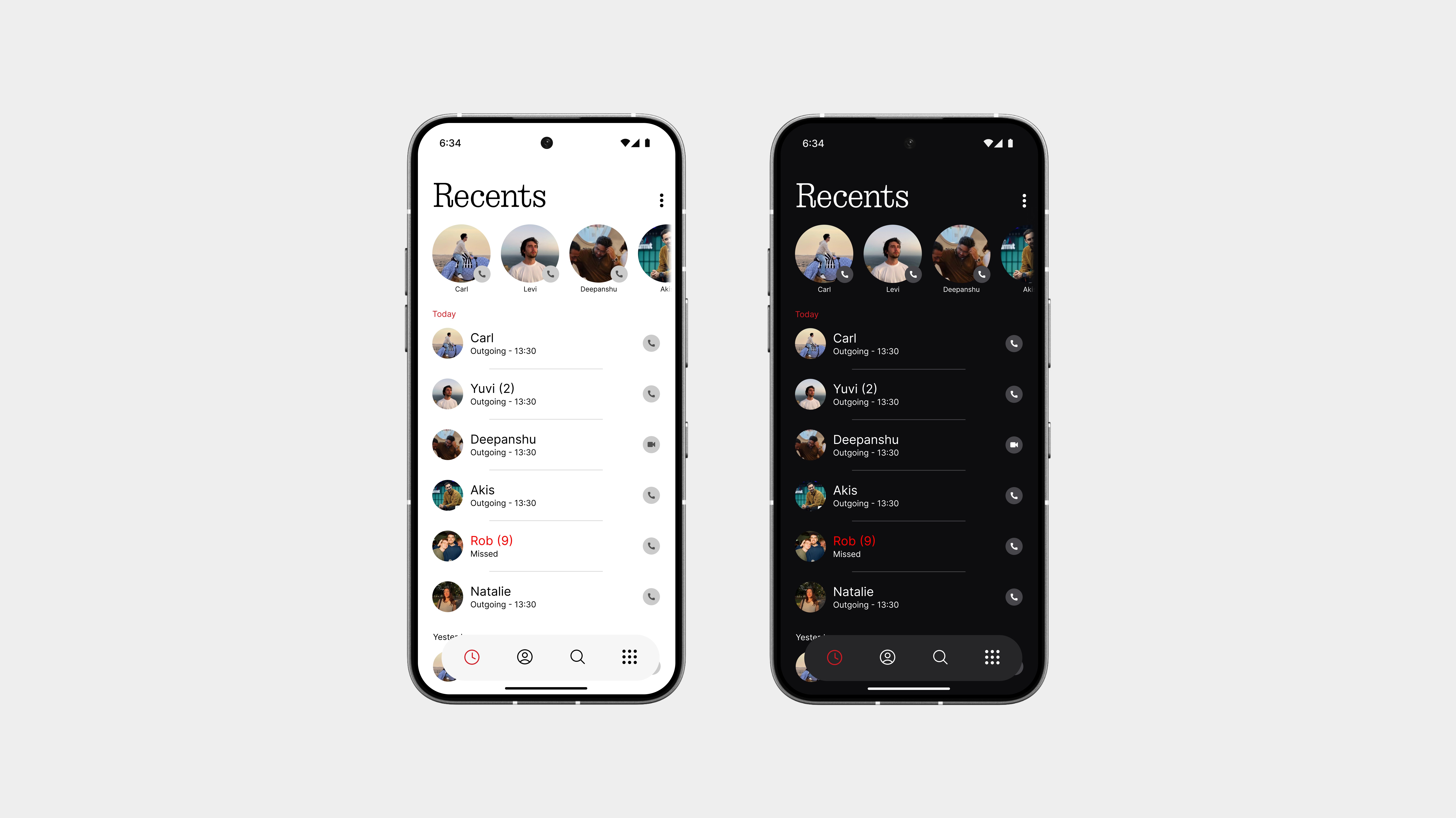
The recent page has been revamped for better clarity and functionality. Say goodbye to confusing bubbles and disconnected call logs. This new, detailed view makes it easier to keep track of your calls.
Your favorite contacts are always at the top for quick access. And there’s a call button on the far right for even faster access without any extra steps.
The dark theme is truly dark this time. It’s not just a color change it feels more intentional, with better contrast and a design that has meaning. Every element has its place and purpose.
Contacts
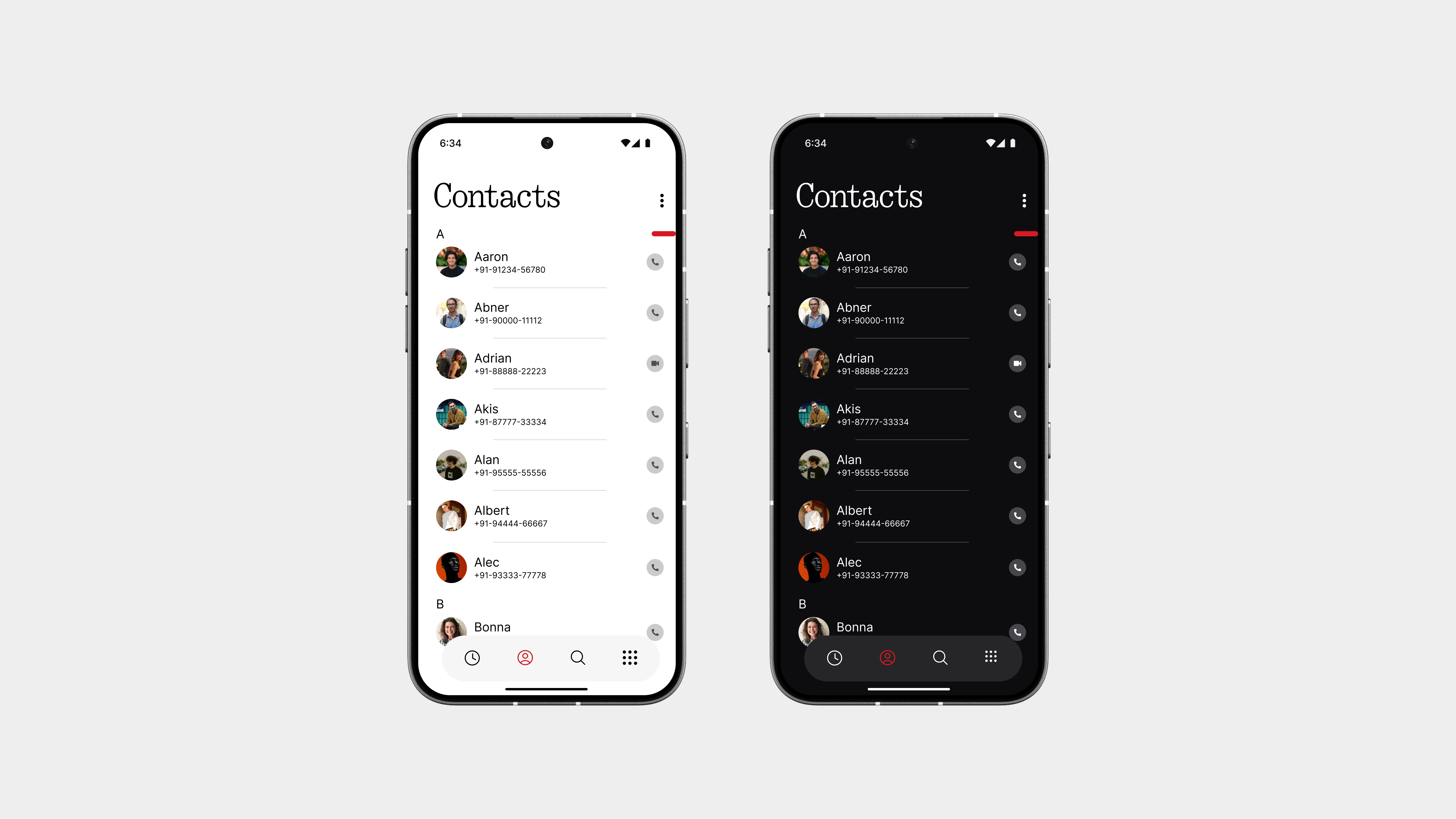
The contacts page looks similar to the recent list, but with some minor tweaks to make it look more functional.
Now, contacts are displayed in a clean, easy-to-read list with better spacing, softer dividers, and more balanced typography. It feels more intentional and easier on the eyes without being too complicated.
On the right, there’s a red slider for quick scrolling through names. It’s bold, precise, and adds just the right amount of contrast to the layout.
Oh, and I almost forgot there’s now a bottom navigation bar to switch between recents, contacts, and the dial pad. Inspired by the gallery app, it brings a smoother flow and a more unified experience across the interface.
Call Interface
This one I’m especially proud of.
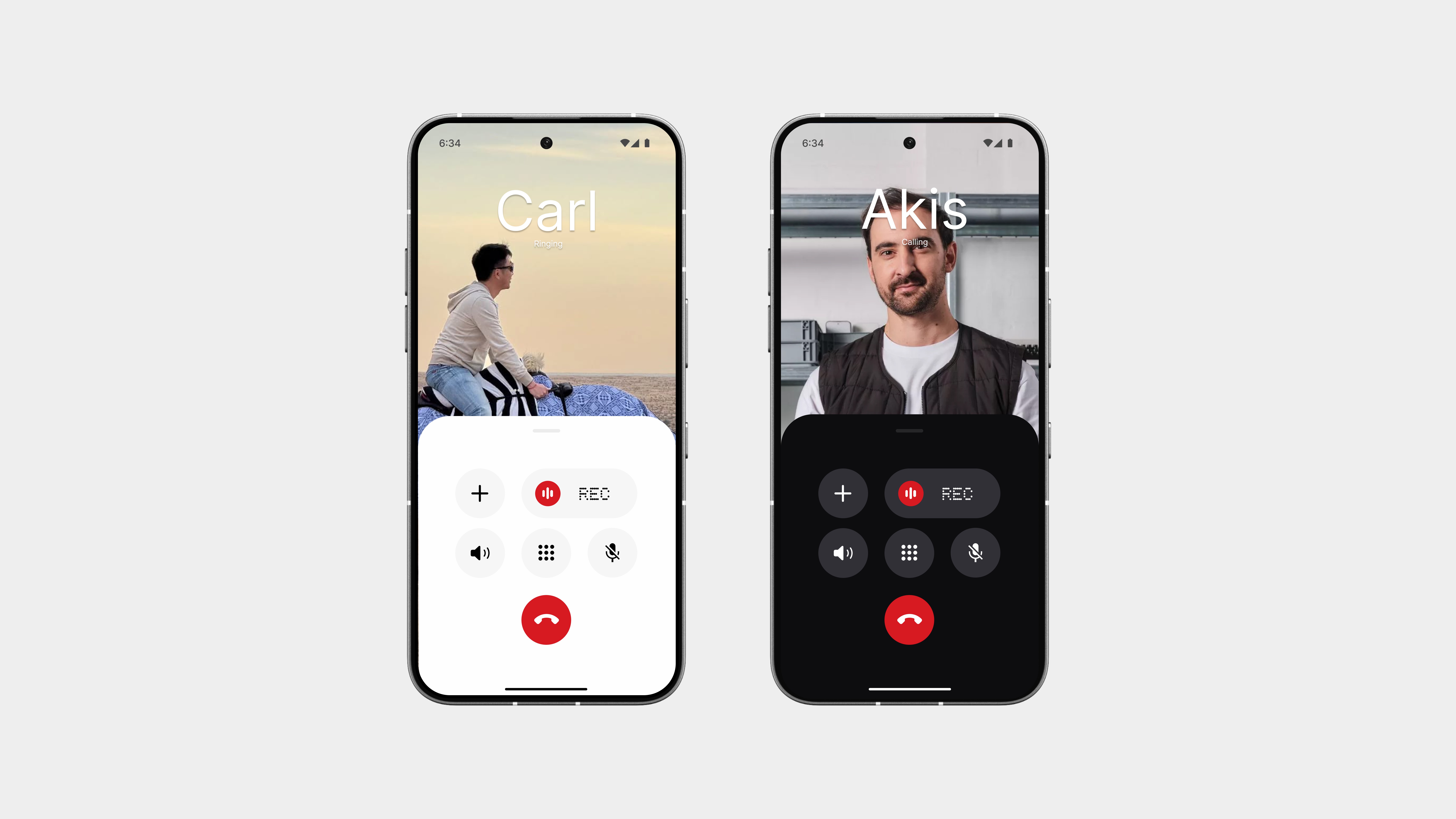
The layout might look simple at first glance—but it’s easily one of the most unique and functional call interfaces I’ve ever seen. It strikes the perfect balance between clean aesthetics and smart usability, something the default Google version completely misses.
Let’s be real Google’s call screen has always felt like a lazy afterthought. The controls are cluttered, the layout is awkward, and recording a call feels more like hunting for a hidden feature than something you’re supposed to use. It’s not built with intention, it’s just built to exist.
This redesign flips that, every button is placed with purpose. The layout is clean, the actions you need most (mute, speaker, keypad, record) are always visible and easy to reach. No weird swipes. No hidden menus.
Visually, everything is stripped back to just what’s needed no noise, no distraction. Just a smart interface that looks great and feels even better to use. And most importantly, it stays true to the overall design direction without sacrificing functionality.
Call Interface
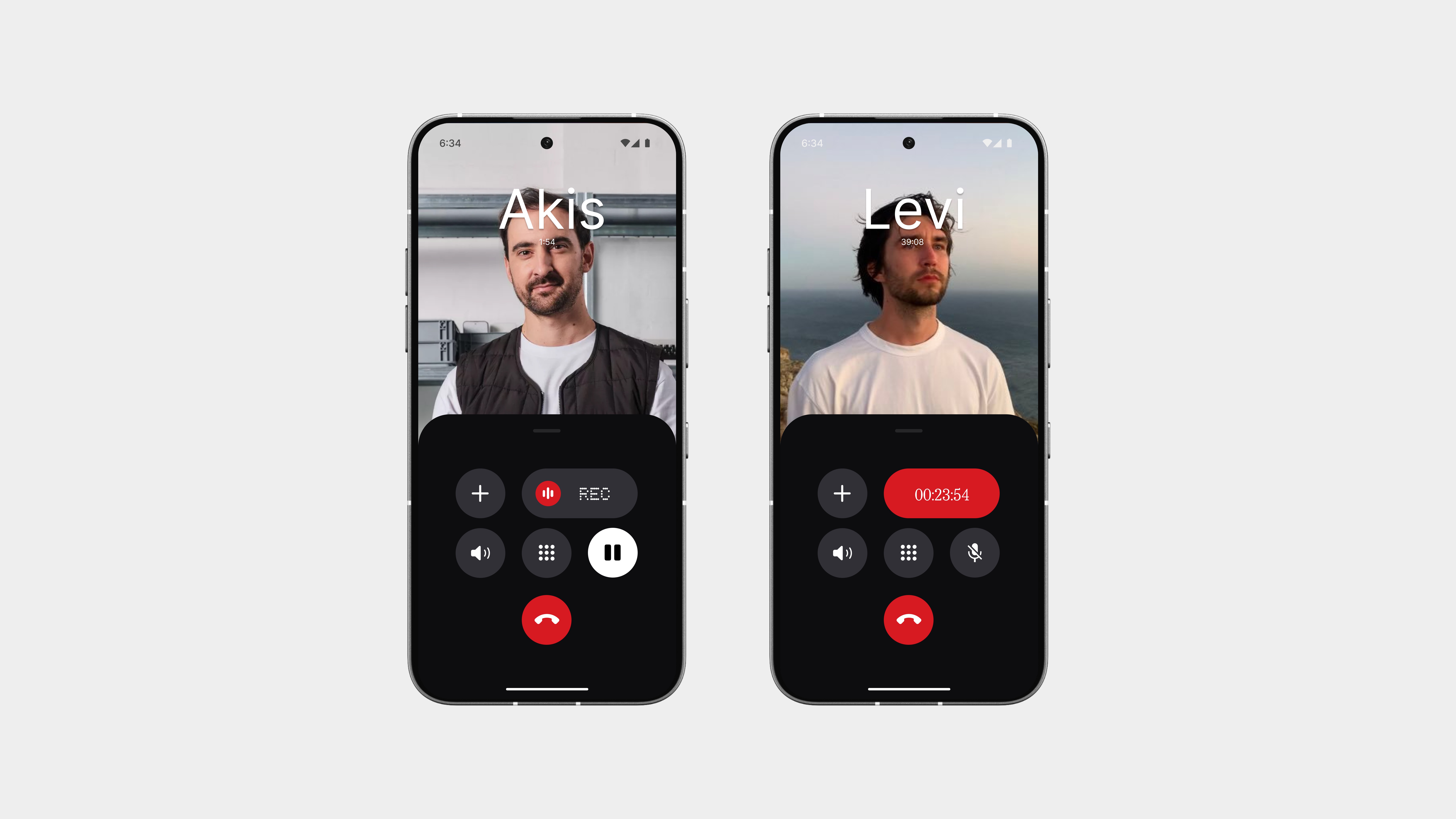
The recorder now has its own dedicated button easy to see and easy to use.
No digging through menus or guessing if it’s even there. Just one tap, and the recording starts, with a clean red timer showing the duration.
Also, press and hold the mute button to place the call on hold. It’s a small but smart change that keeps the interface clean while giving you more control.
Simple. Functional. No nonsense.
Incoming Call Screen
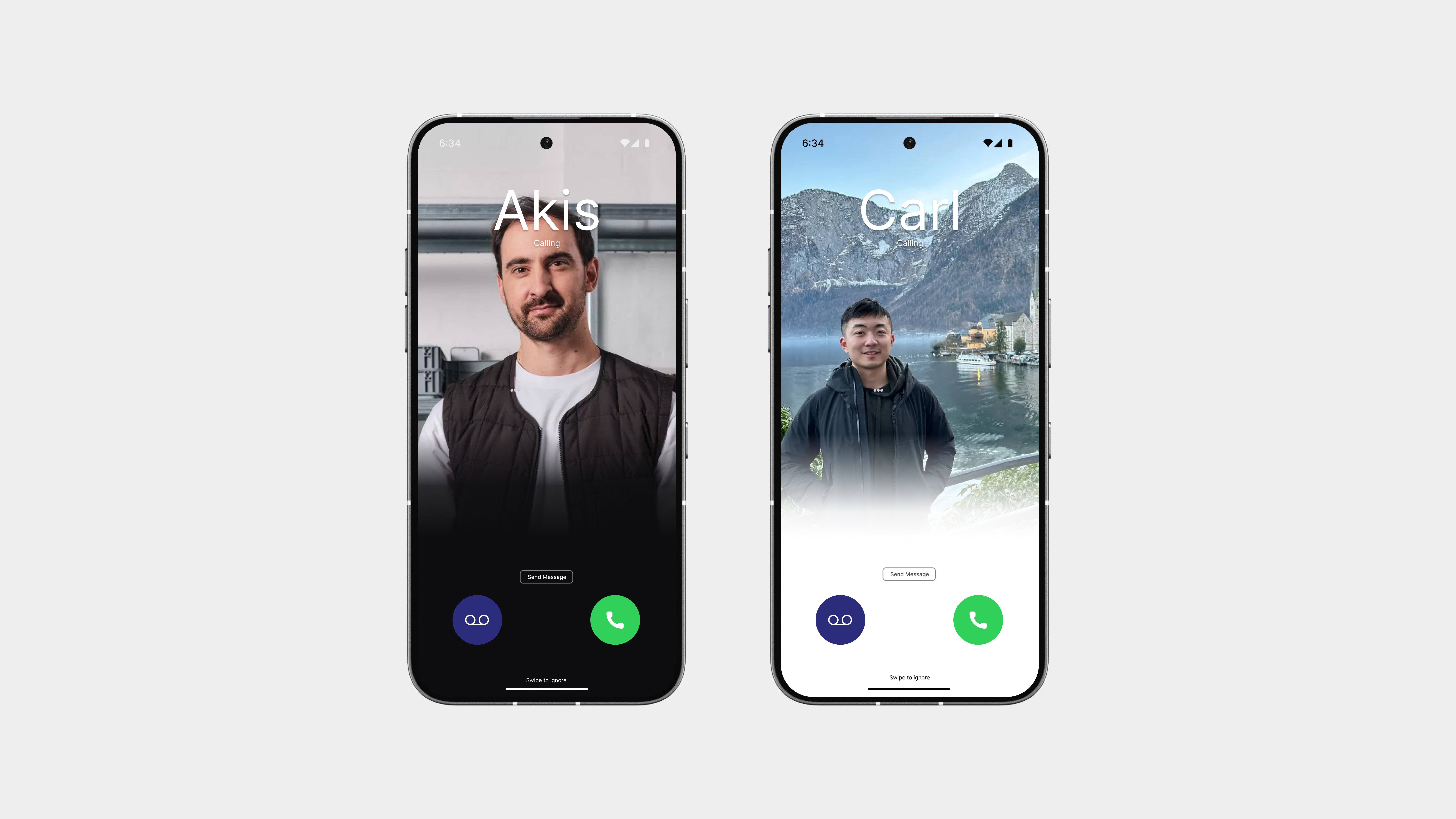
The recorder now has its own dedicated button easy to see and easy to use.
No digging through menus or guessing if it’s even there. Just one tap, and the recording starts, with a clean red timer showing the duration.
Also, press and hold the mute button to place the call on hold. It’s a small but smart change that keeps the interface clean while giving you more control.
Simple. Functional. No nonsense.
Keypad
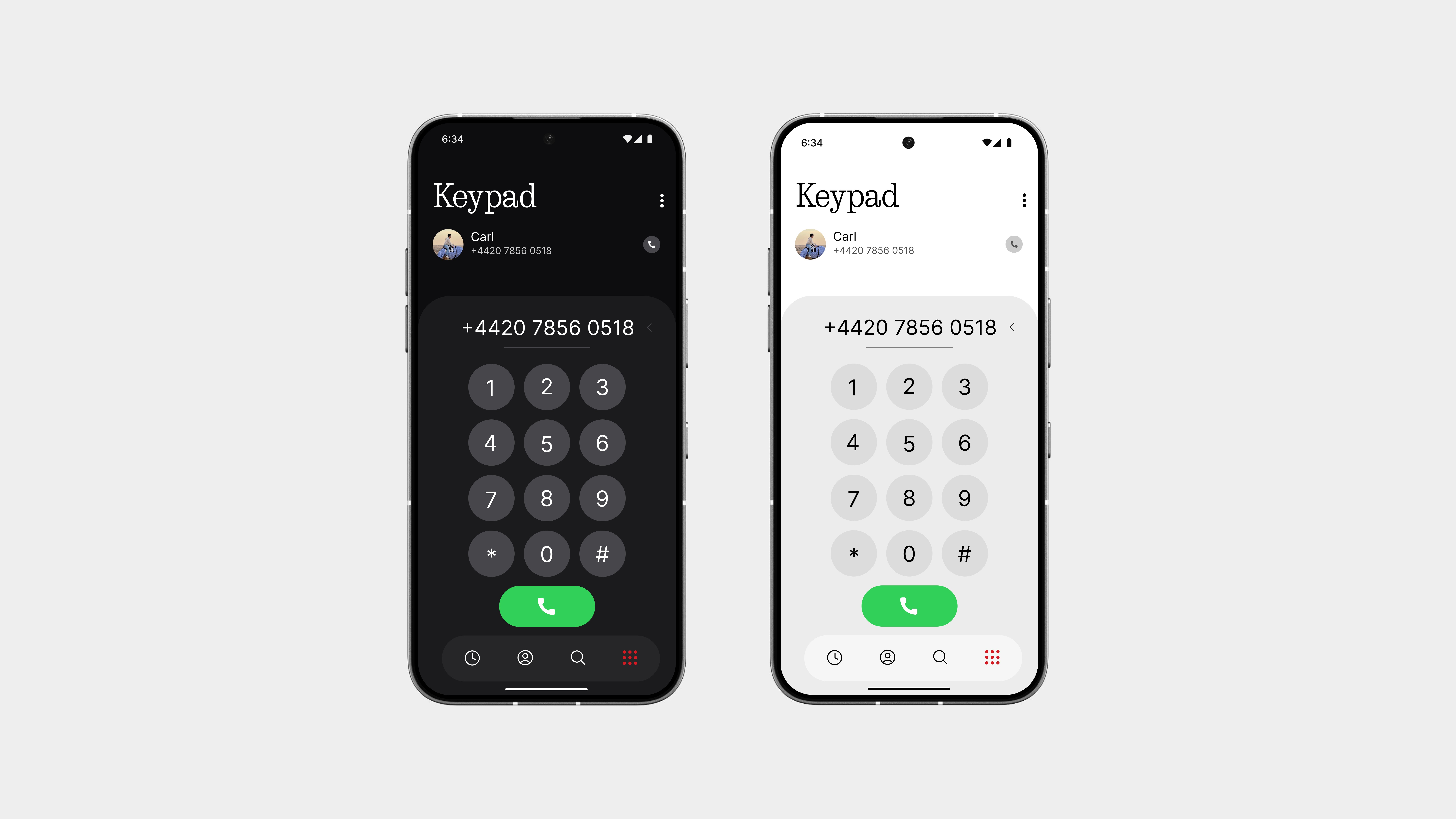
The keypad retains the classic layout you’re accustomed to, but it’s been given a touch of whimsy and refinement to make it feel more vibrant.
The buttons are precisely spaced, with clean typography that enhance the dialing experience. It’s familiar, yet it now exudes a sense of belonging.
And here’s the best part you don’t need to press the back button just to switch between the keypad, recent calls, or contacts. You can navigate seamlessly using the bottom bar, which significantly improves the user experience compared to the cumbersome flow in Google’s dialer.
Sometimes, it’s the subtle adjustments that make the most significant impact. This is one of those instances.
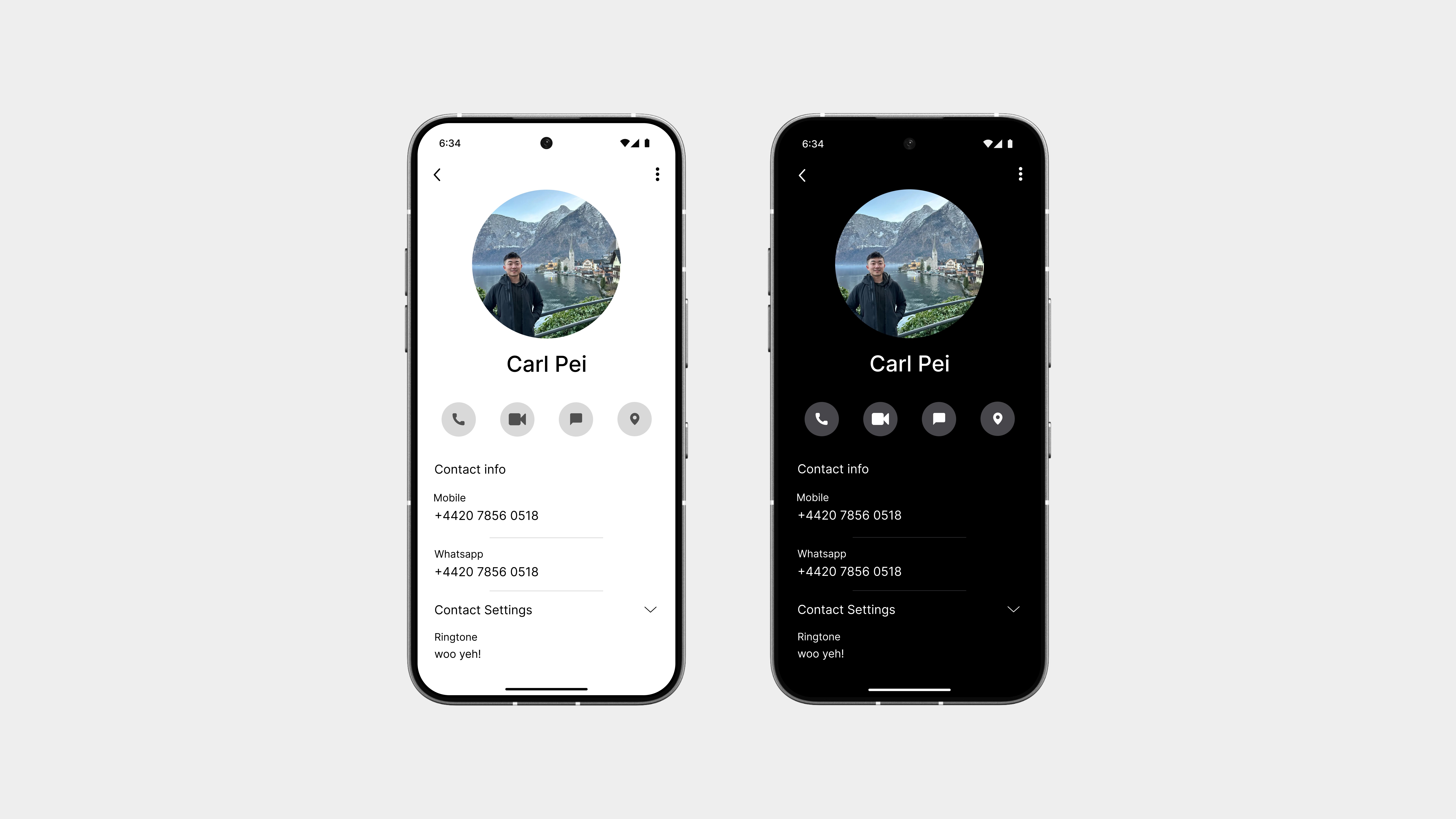
Contact Card
The contact card has been cleaned up with a simpler, more useful layout that actually makes sense.
No more cluttered info or endless scrolling. You now get a layout that highlights the most important actions first call, message, and location sharing followed by a clear view of all your saved numbers, emails, and other details.
It’s more appealing visually, with better spacing, iconography, and structure. Everything you need is right where you expect it, without anything getting in the way.
Straightforward, functional, and way easier to use than before.
So yeah,
This entire experience is just… better.
It’s not trying to reinvent how calling works. It’s just designed to feel more natural, more focused, and way more in tune with how we actually use our phones every day.
Looking ahead, I’d love to see this same interface applied across the board—not just for regular calls, but for WhatsApp, Telegram, Signal, and all the other calling platforms we use daily. A unified, clean layout that doesn’t break when you switch apps would be a game-changer.
Also, something as simple as muting a call with the volume button, why has no one made that standard yet? It’s fast, it’s discreet, and it’s something even WhatsApp never bothered to add.
Texts
This is a messaging app that actually makes sense.
It’s got a cleaner layout, better spacing, and feels way more focused than Google’s version, which honestly just feels off. This one keeps things simple but meaningful with a design that’s easy to read and nice to use.
Nothing fancy. Just better where it matters.
Home
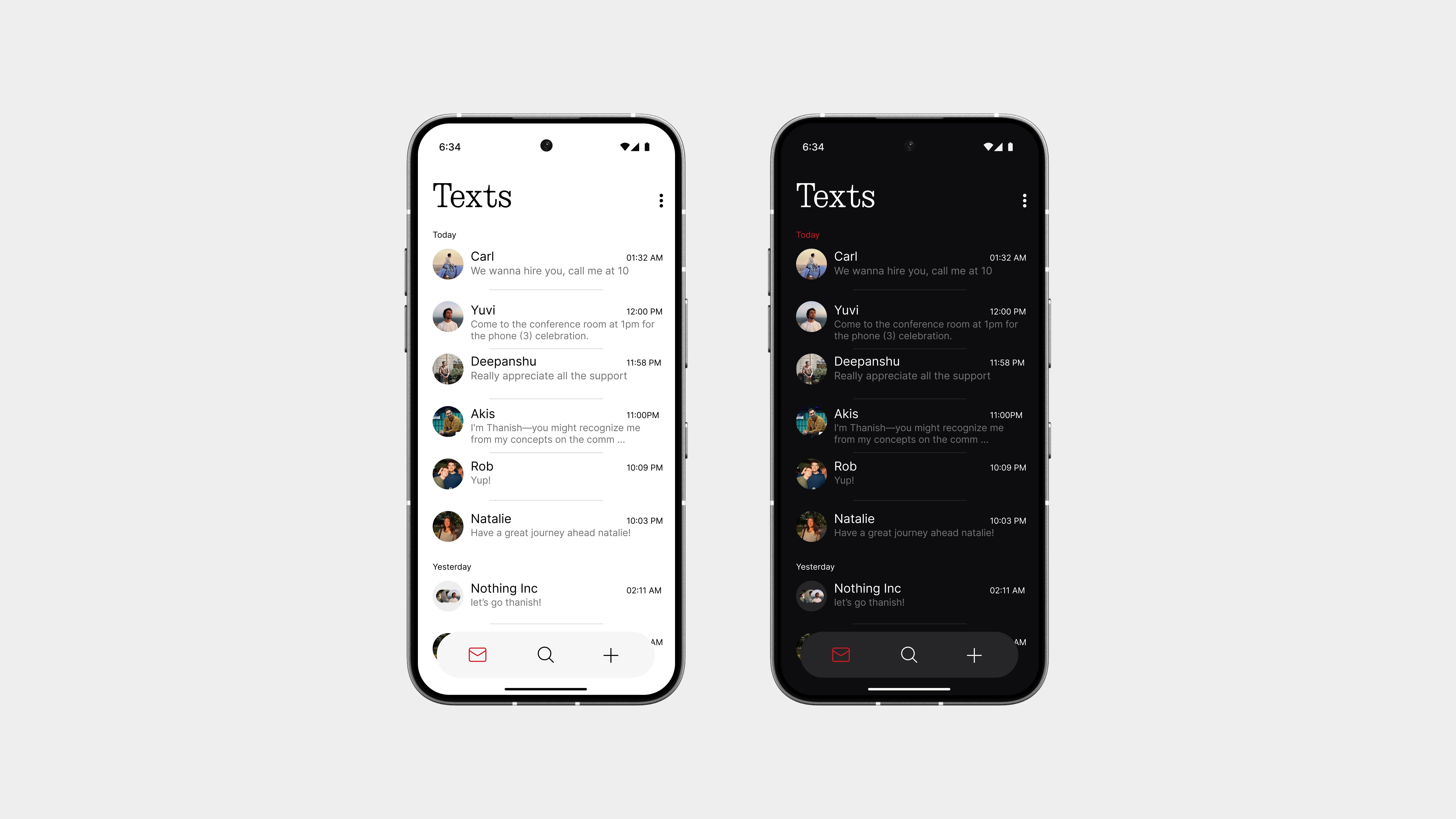
The home page is simple but noticeable, it doesn’t try too hard, but it still stands out.
You get a clean view of all your recent conversations, with just the right spacing and focus on what matters: the people you’re talking to. No distractions, no extra layers just your chats, front and center.
At the bottom, there’s a three-button navigation bar with:
Home to view your chats
Search to quickly find messages or contacts
Plus (+) to start a new conversation instantly
Chat View
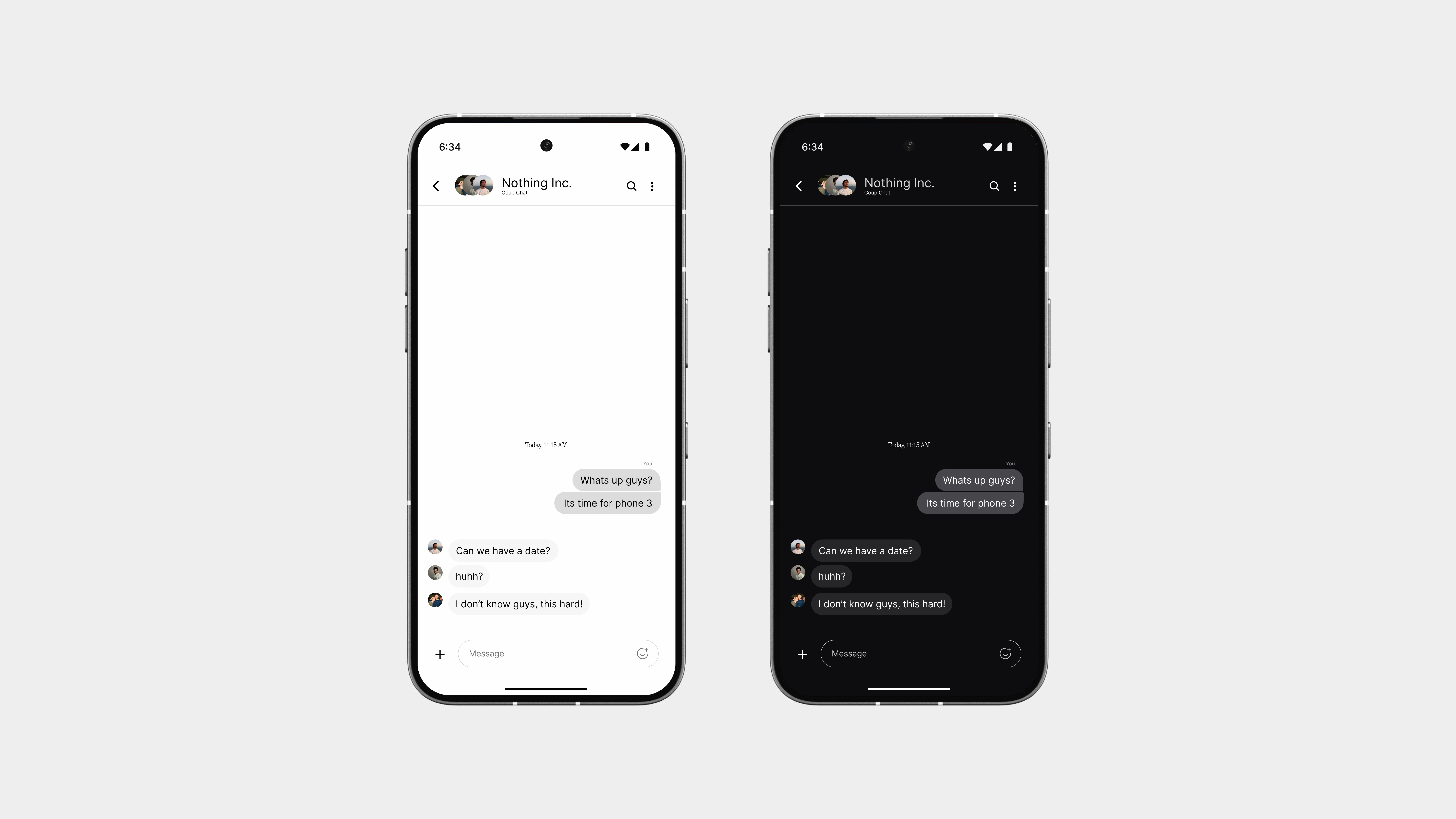
The chat view keeps things simple and focused, just like it should be.
The layout is clean, with better use of colors to separate messages without overwhelming the screen. Text is easy to read, spacing feels natural, and everything just flows better.
At the bottom, you’ll find a super minimal reply bar no bulky bubbles or overdesigned elements. Just a clean space to type, send, and keep the conversation moving.
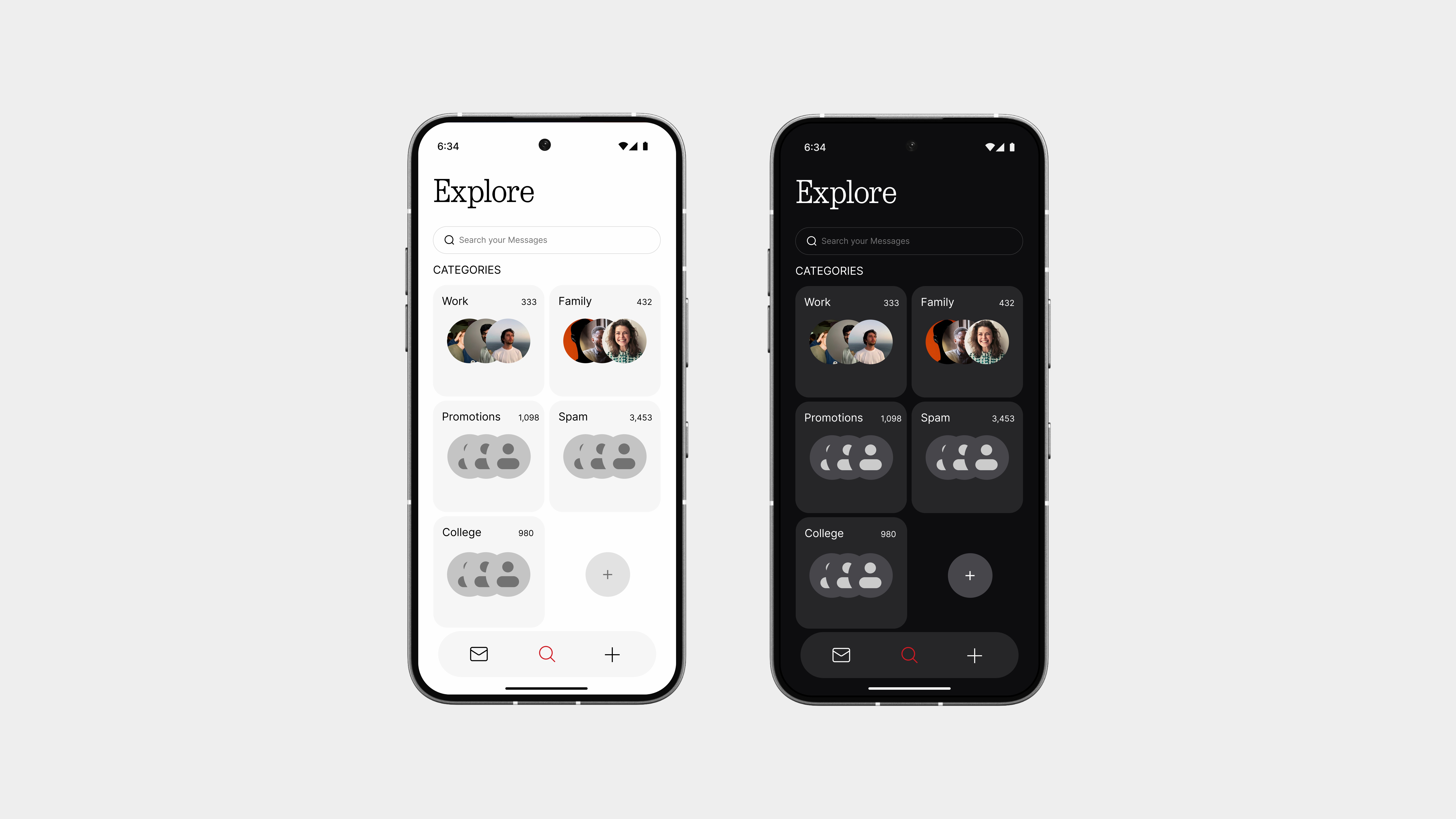
Explore
The Explore page helps you find what you actually need—fast.
Whether it’s a bank message, an important text from a friend, or a code you forgot to copy, this page makes it easy. Just search, and everything shows up clearly right when you need it.
But it doesn’t stop there.
You can also organise your conversations into categories like:
Friends
Family
Work
Promotions
Other
Chatbox
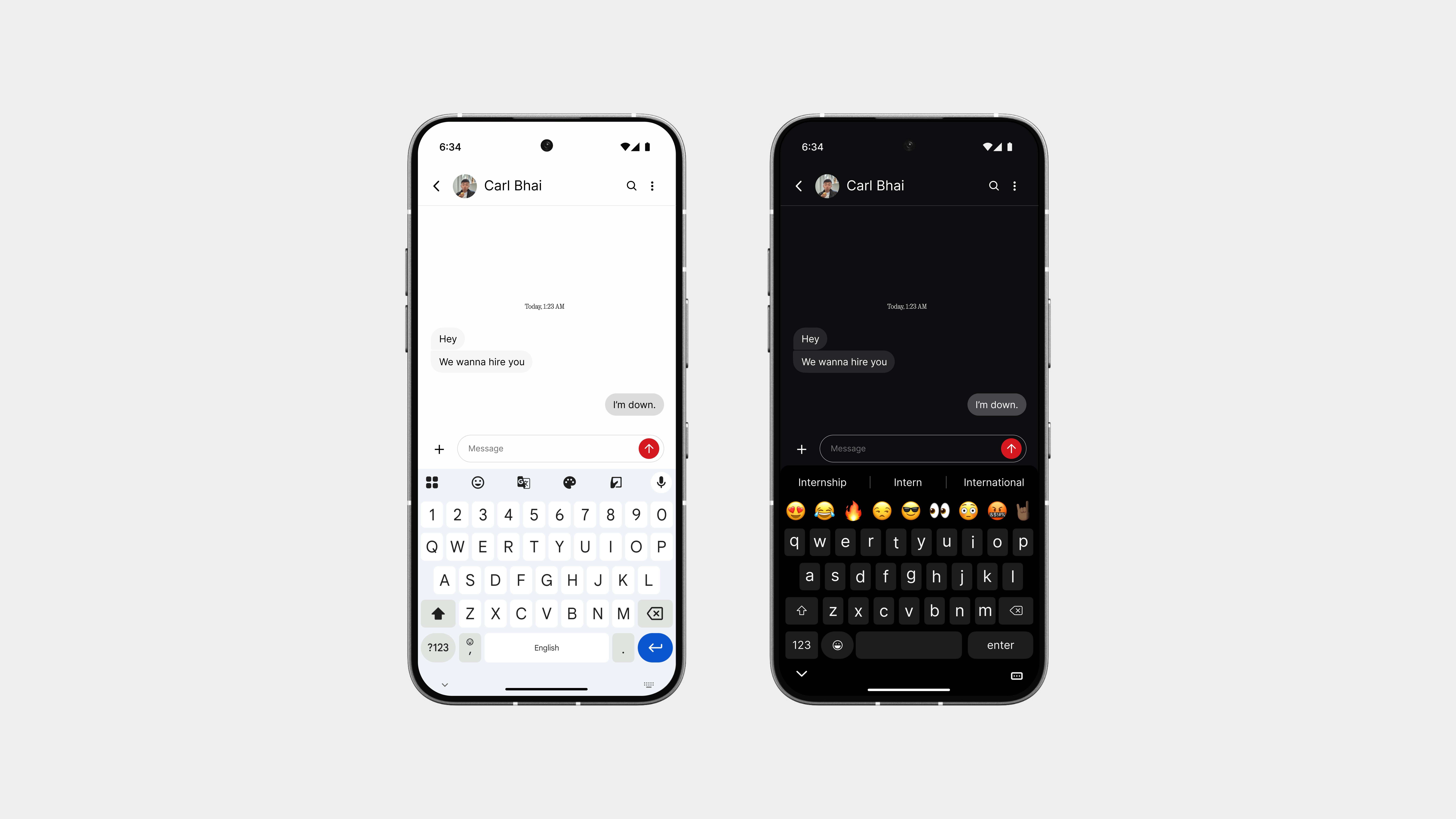
The chat box sticks to a familiar layout, so there’s no learning curve but everything feels tighter and more refined.
The keyboard fits right into the flow, and the red send button adds that bold Nothing-style touch. It’s clean, simple, and just the right amount of standout without being loud.
Also, on dark theme? The keyboard looks awesome, seriously. More on that later in the book.
So yeah,
Texts brings back meaning to messaging.
It’s not overloaded with features or distractions. It’s just clean, fast, and designed to make everyday conversations easier to manage and nicer to look at. From the home layout to the chat view, everything feels more intentional, something the default Google app never really got right.
The red accents, smart filters, and subtle layout choices give it a distinct character, without ever getting in the way. It’s simple where it needs to be, powerful when it counts.
This is what messaging should’ve always felt like.
Files
Next up is Files, because managing your stuff shouldn’t feel like digging through a messy drawer.
Most file manager apps feel clunky or overloaded. This one is the opposite. It’s built to be fast, clean, and actually helpful. With a layout that makes sense and categories that are easy to browse, you can find what you need in seconds, whether it’s downloads, documents, or photos.
It’s simple, but not basic. It does what it should, and it looks good doing it.
Browse
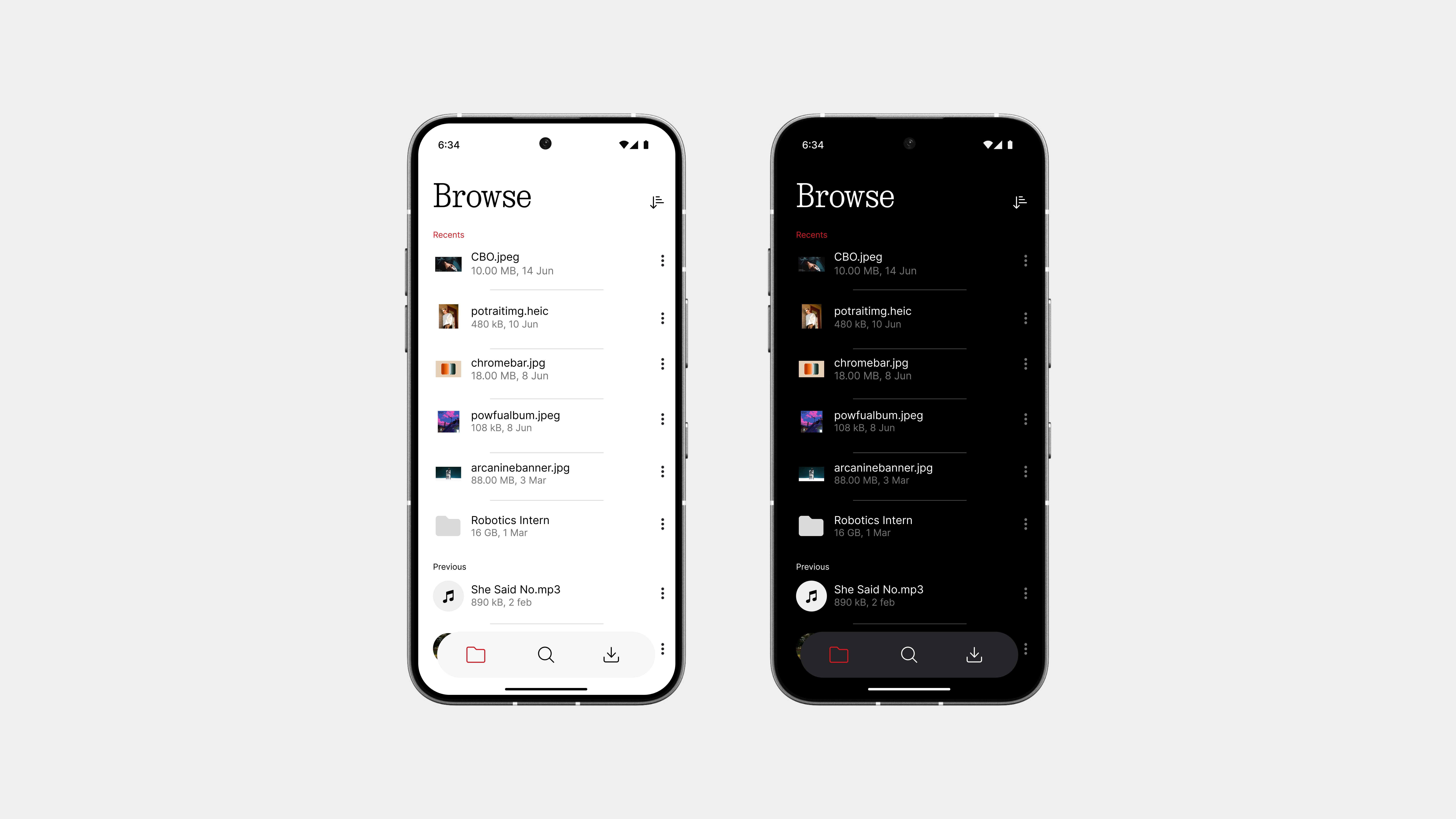
The Browse page is where it all starts.
It gives you quick access to all your recent files, so you don’t have to dig around or guess where things went. Everything is laid out clearly, clean thumbnails, smart labels, and no clutter.
At the bottom, you’ll find a three-button navigation bar with:
Browse – your recent files and folders
Explore – a deeper search through categories
Share – a space for sending files instantly
The browse view also makes it easier to search within your recents, so if you just downloaded something or opened a doc, it’s right there waiting. Fast, focused, and way easier than the usual file managers.
Explore
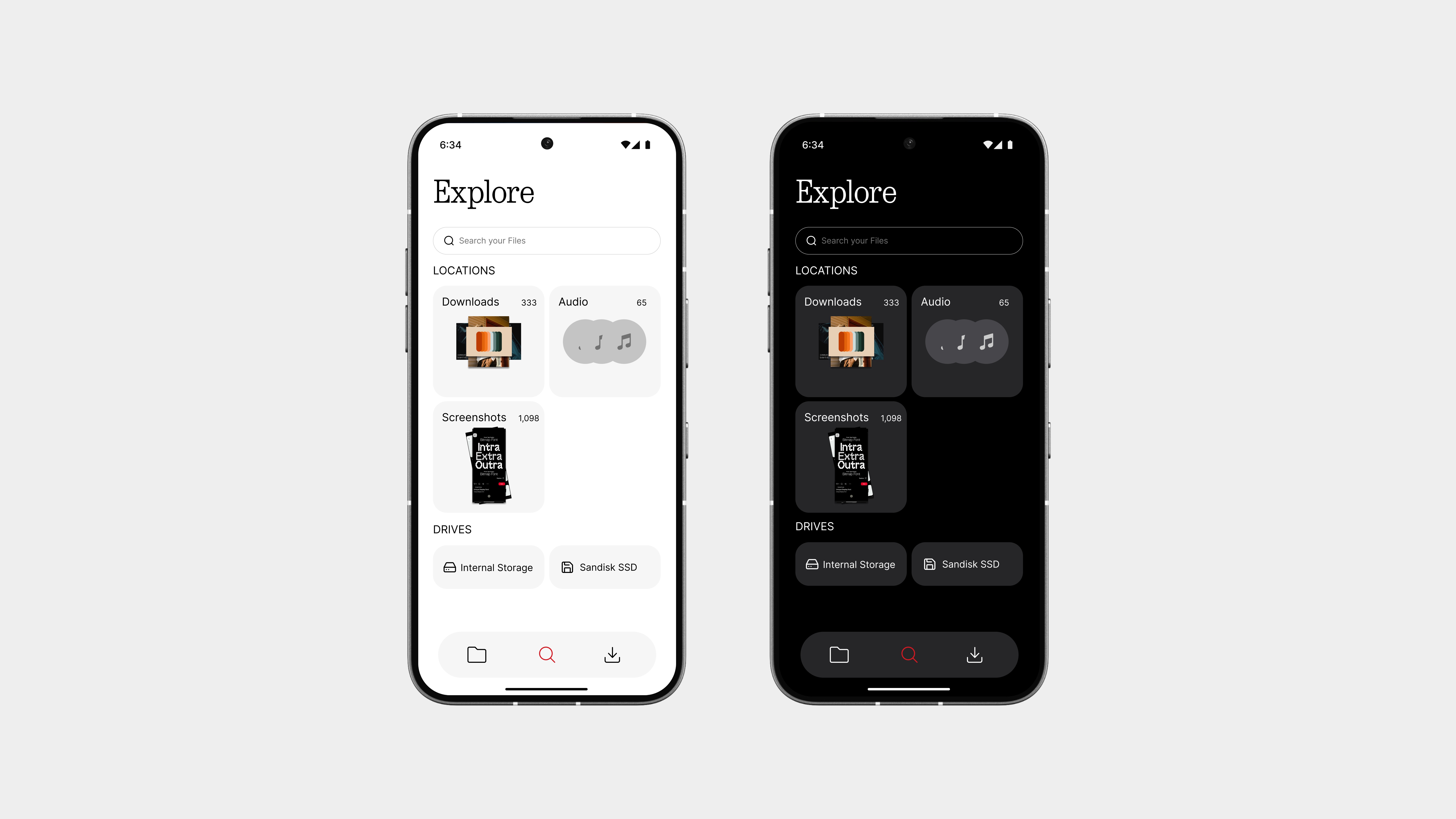
The Explore page is your full-access view of everything stored on your device.
Instead of random folders and confusing paths, everything here is sorted into clear categories, like Downloads, Images, Videos, Documents, and more. It also shows Internal Storage and any External Drives you’ve plugged in, so you never have to guess where your files are.
Whether you’re trying to find a screenshot, dig up a PDF, or access something on a USB drive, this page makes it simple. It’s organized, fast, and finally makes file browsing feel like less of a chore.
Share
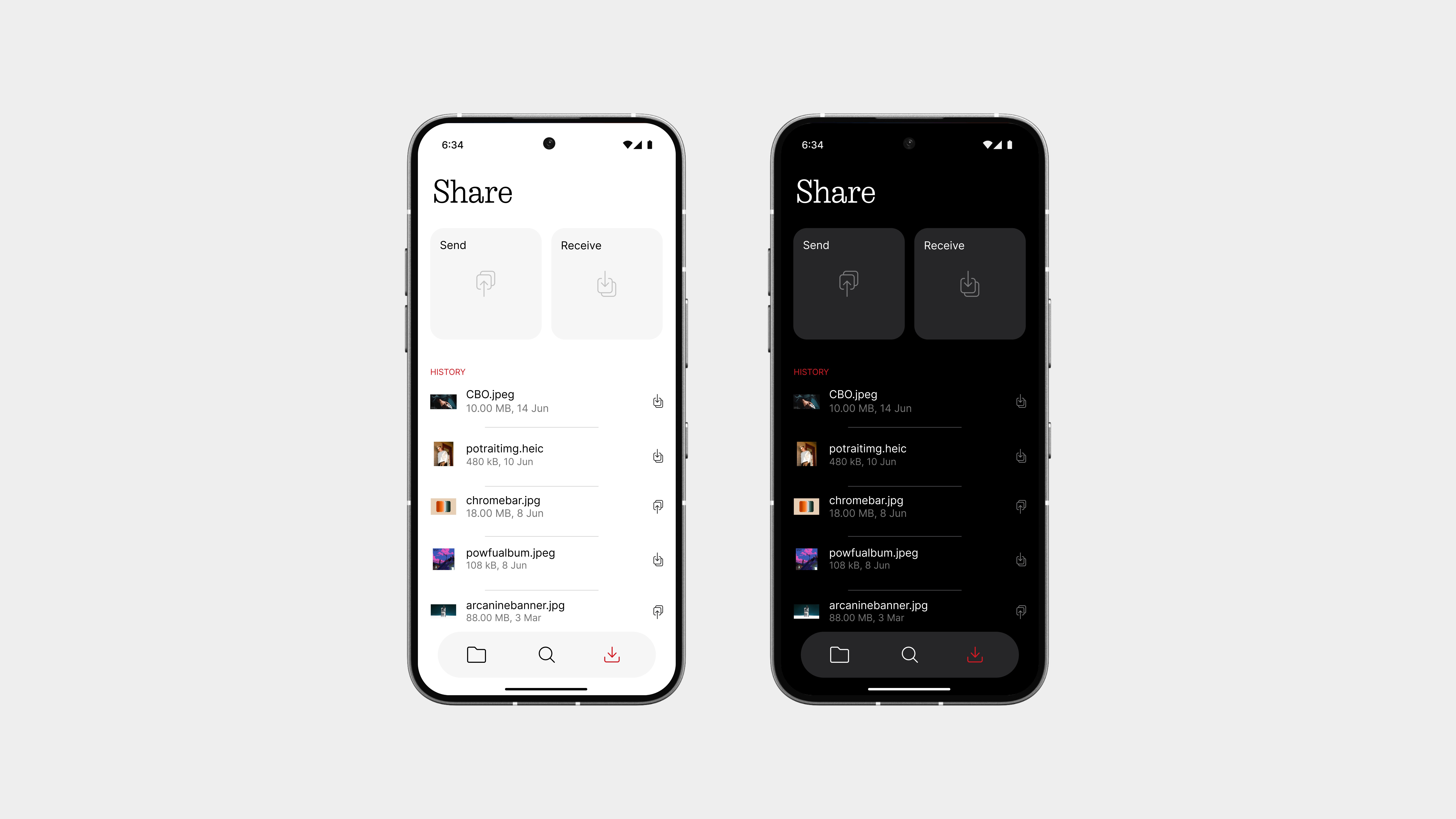
The Share page is built to make sending and receiving files fast, easy, and hassle-free.
Just pick a file, tap share, and it’s on its way. Whether you’re sending something to a friend or getting a file from another device, it just works, smooth and simple.
Below, you’ll see your Share History and Received Files, so you can always find what you sent or got without digging through folders.
This experience is designed to be fast, reliable, and exclusive to Nothing phones, built right into the system, without needing another app. Sharing has never felt this effortless.
So yeah,
This Files app isn’t trying to do too much, it just does what you actually need.
From quickly browsing recent files to diving deep through categories in Explore, everything feels clean, fast, and well-organized. And with the Share page, sending and receiving files becomes smooth, instant, and fully built into the experience.
Calculator
Next up is Calculator, because even something this simple deserves good design.
Most stock calculators feel outdated, bloated, or just plain boring. This one is different. It’s built with a minimal layout, a better color palette, and clear, bold keys that make every tap feel intentional.
It does the basics right, looks clean, and finally fits in with the rest of the system. Nothing extra, just what you need, without the noise.
Basic Mode
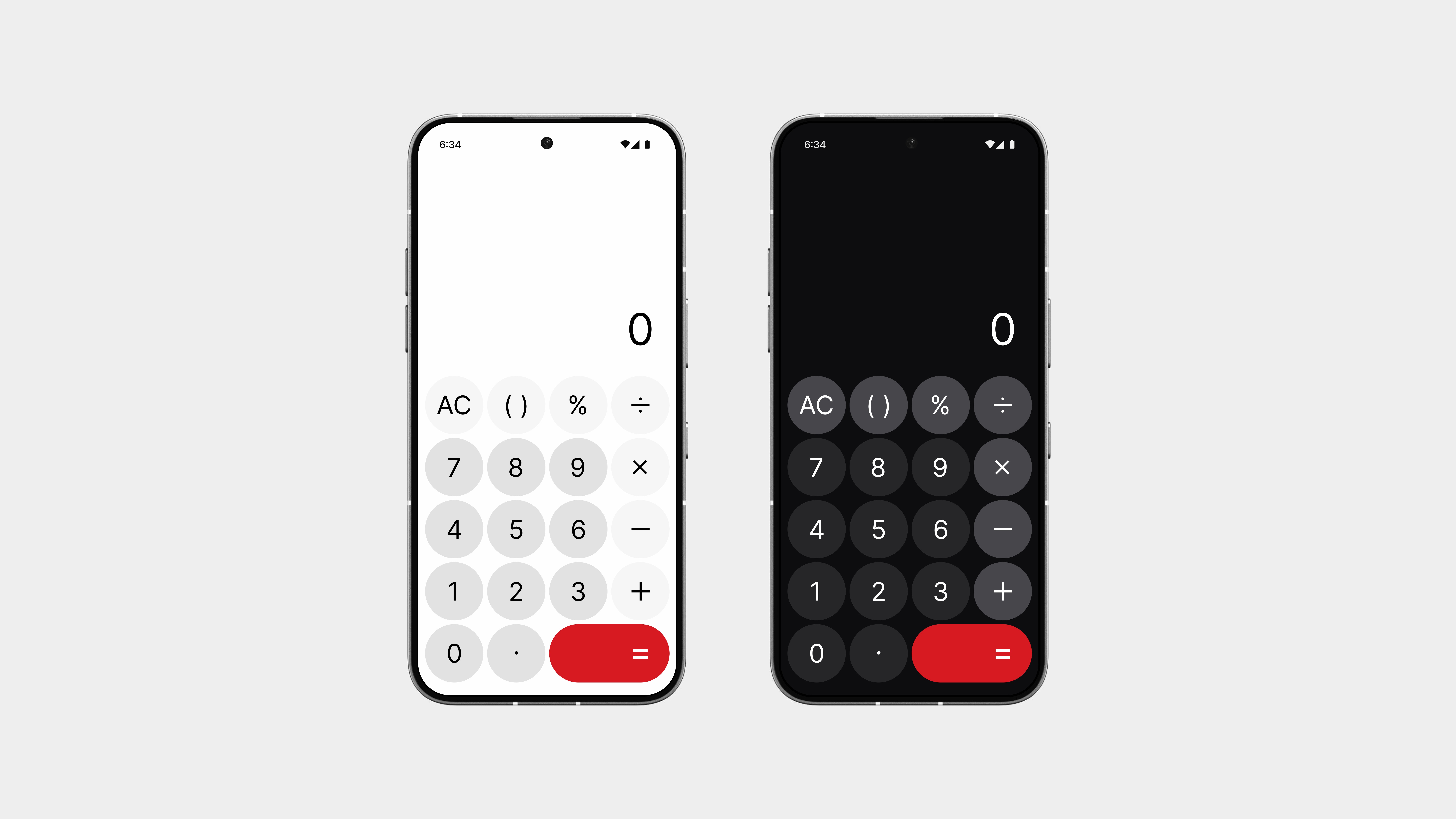
The basic calculator gets a clean refresh, with a layout that’s simple, sharp, and easy to use.
The color palette is more refined, with soft tones and contrast where it counts. Every key is spaced just right, making quick calculations feel smooth and natural.
And the “=” button? It’s slightly larger and finished in Nothing’s signature red—not just to stand out, but to feel more satisfying to tap. It’s a small detail that gives the interface a little more personality without overdoing it.
Scientific Mode
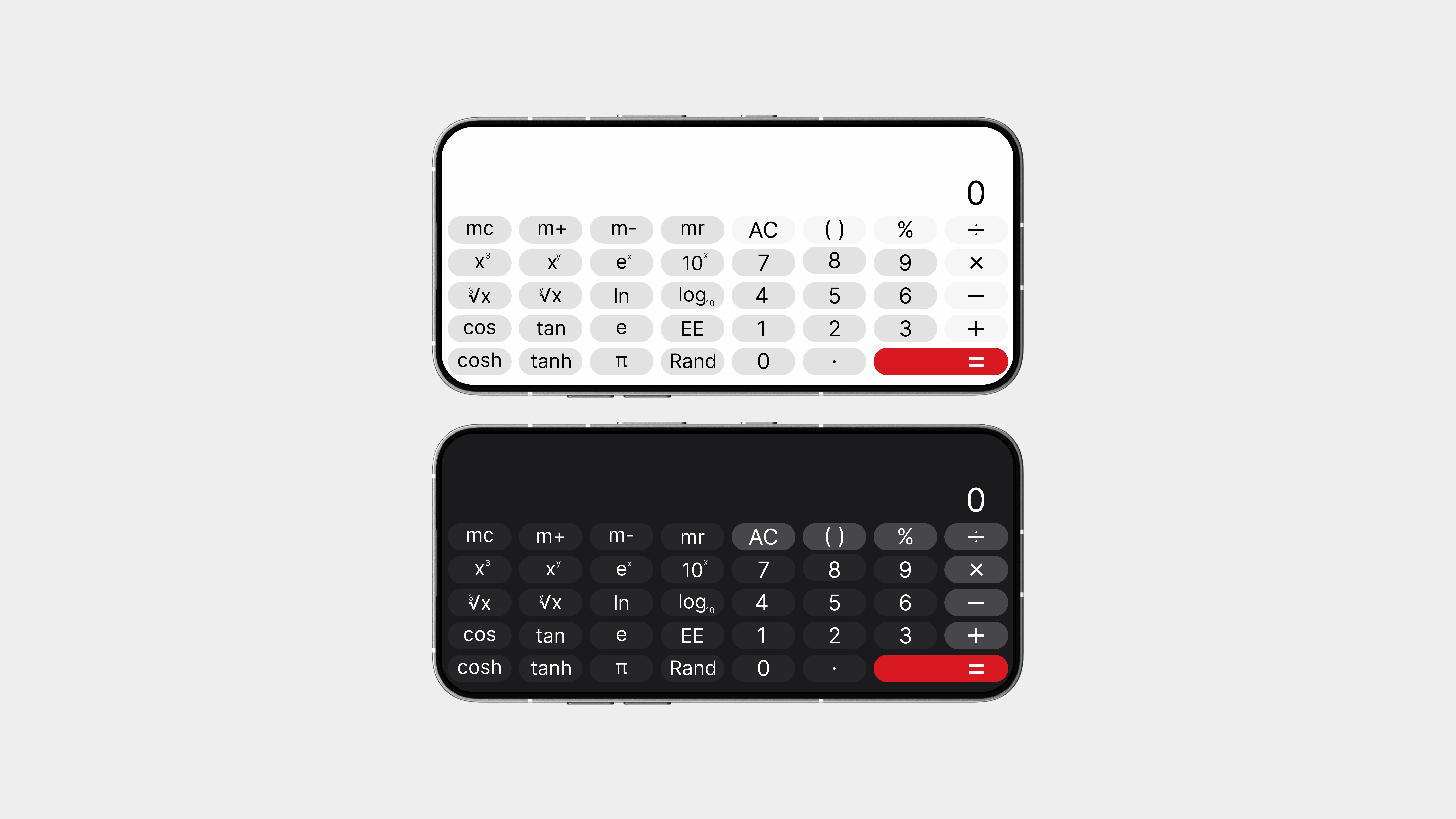
Flip your phone sideways, and the calculator instantly switches to Scientific Mode, no toggles, no menus, just a smooth and automatic transition.
This mode adds all the advanced functions you need, like sin, cos, tan, log, exponentials, brackets, and more, without messing up the clean layout. Everything stays neatly spaced and easy to use, even with the extra buttons.
It’s powerful when you need it, and invisible when you don’t.
Exactly how it should be.
So yeah,
This calculator proves that even the simplest tools deserve thoughtful design.
With a clean basic mode, a bold red equals button, and a seamless landscape transition to scientific mode, it’s both functional and visually balanced. No clutter, no distractions, just a tool that works beautifully and feels right at home in the overall experience.
It’s not about adding more features, it’s about making the right ones feel better to use.
Clock
The Clock app has been redesigned to be simple, intentional, and actually a bit fun.
It still has everything you need, alarm, timer, stopwatch, and world clock, but with a cleaner layout, a refined color palette, and small touches that make it feel better to use every day. It’s not trying to be flashy, it’s just smart, well-organised, and easy on the eyes.
And yes, there’s a little fun in there too. Because even something as routine as checking the time shouldn’t feel boring.
Alarms
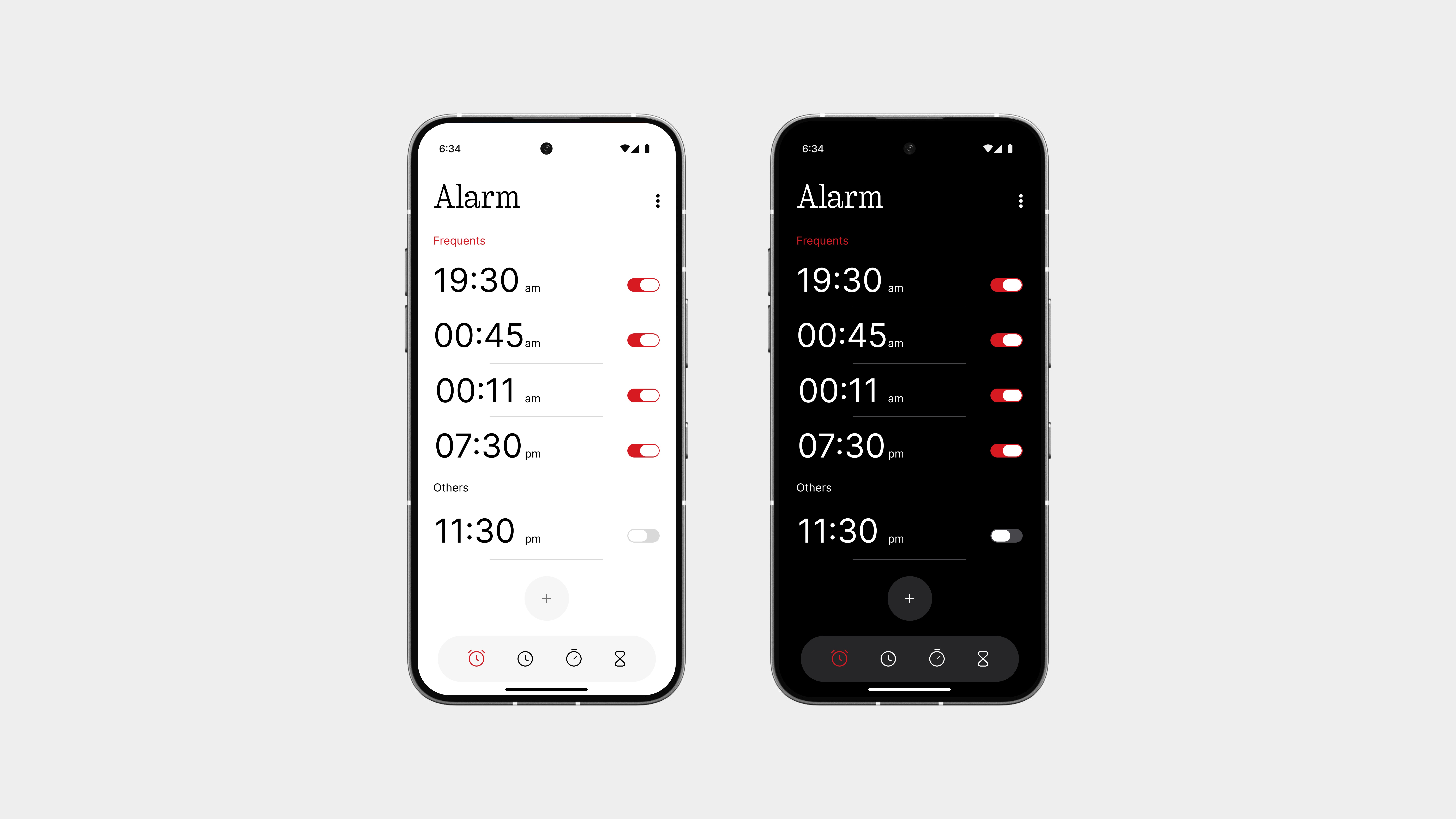
The Alarm page has been cleaned up for a much better experience.
You get clearer toggles, a faster way to add alarms, and a layout that’s easier to read and manage. No more bubbly alarm cards, just a clean, structured list with proper spacing that actually looks good.
And when you switch an alarm on? The toggle turns red, a subtle nod to Nothing’s iconic color accent, making the action feel more deliberate and instantly noticeable.
At the bottom, a 4-button navigation bar lets you move between Alarm, Clock, Timer, and Stopwatch with ease, no swiping, no guesswork.
It’s still the same alarm you use every day, but now it actually feels designed.
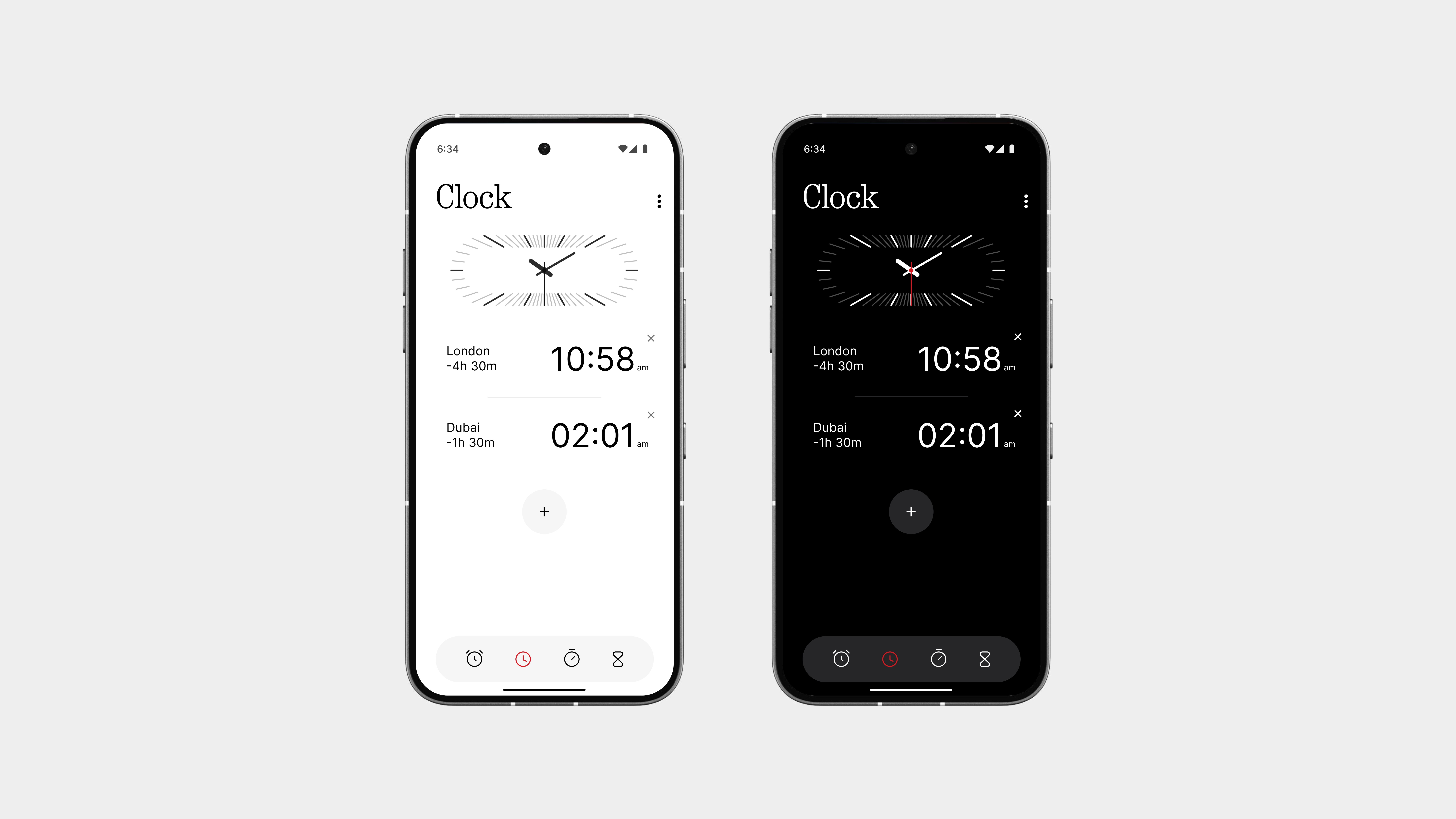
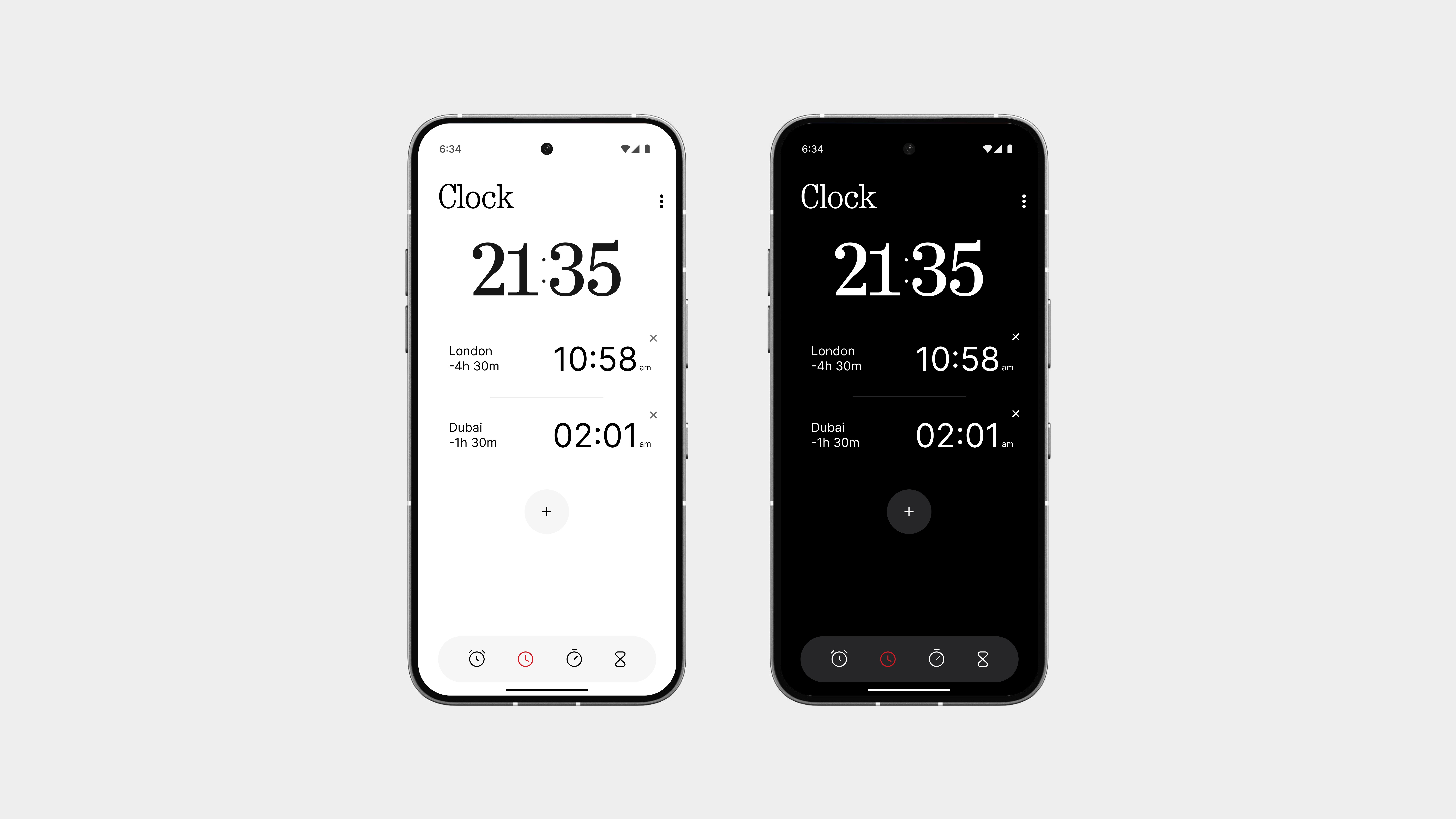
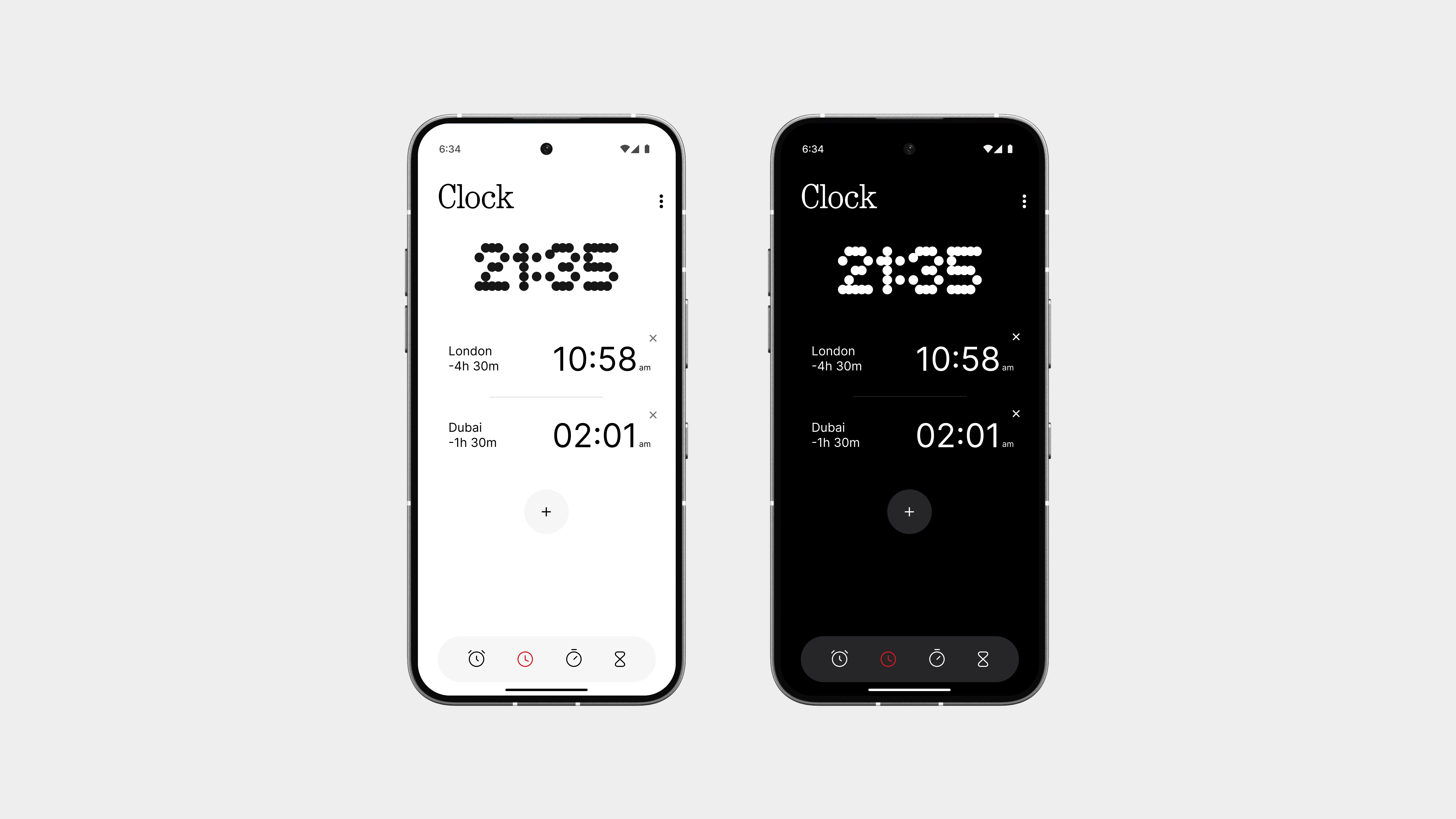
Clock
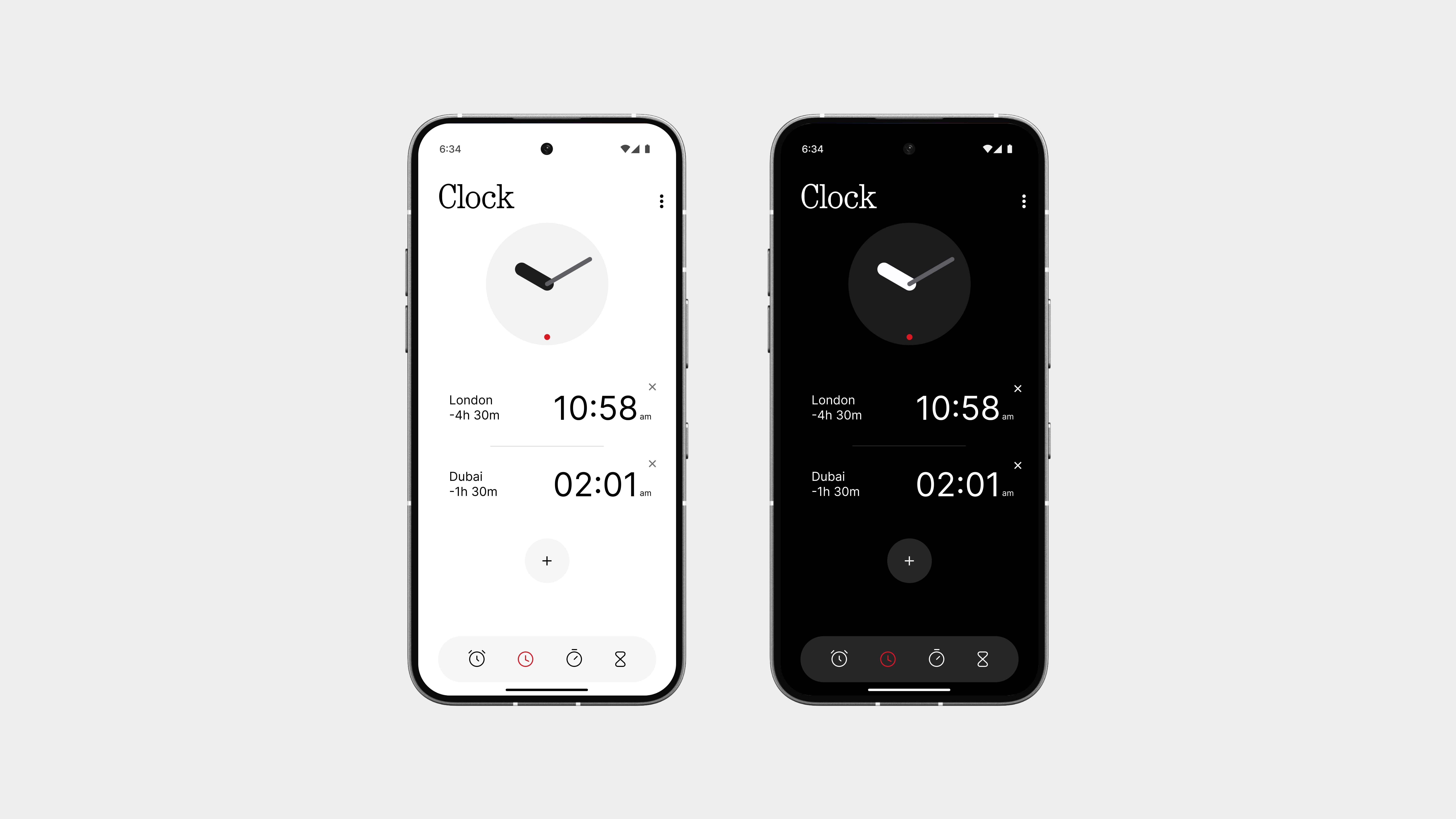
You know how this works, it shows your local time and lets you add world clocks for different cities and time zones. That part stays the same, because it works. But I looked at it and thought, maybe this deserves a little more love.
So, here’s what’s new:
Along with being able to see the time across the world, you can now change the style of your region’s clock display, just like how you’d pick a lockscreen clock face. Whether you want something bold and chunky, minimal and modern, or even retro and digital, the choice is yours.
It’s a small addition, but it adds a bit of fun and personal flair to something you look at every single day.
Stopwatch
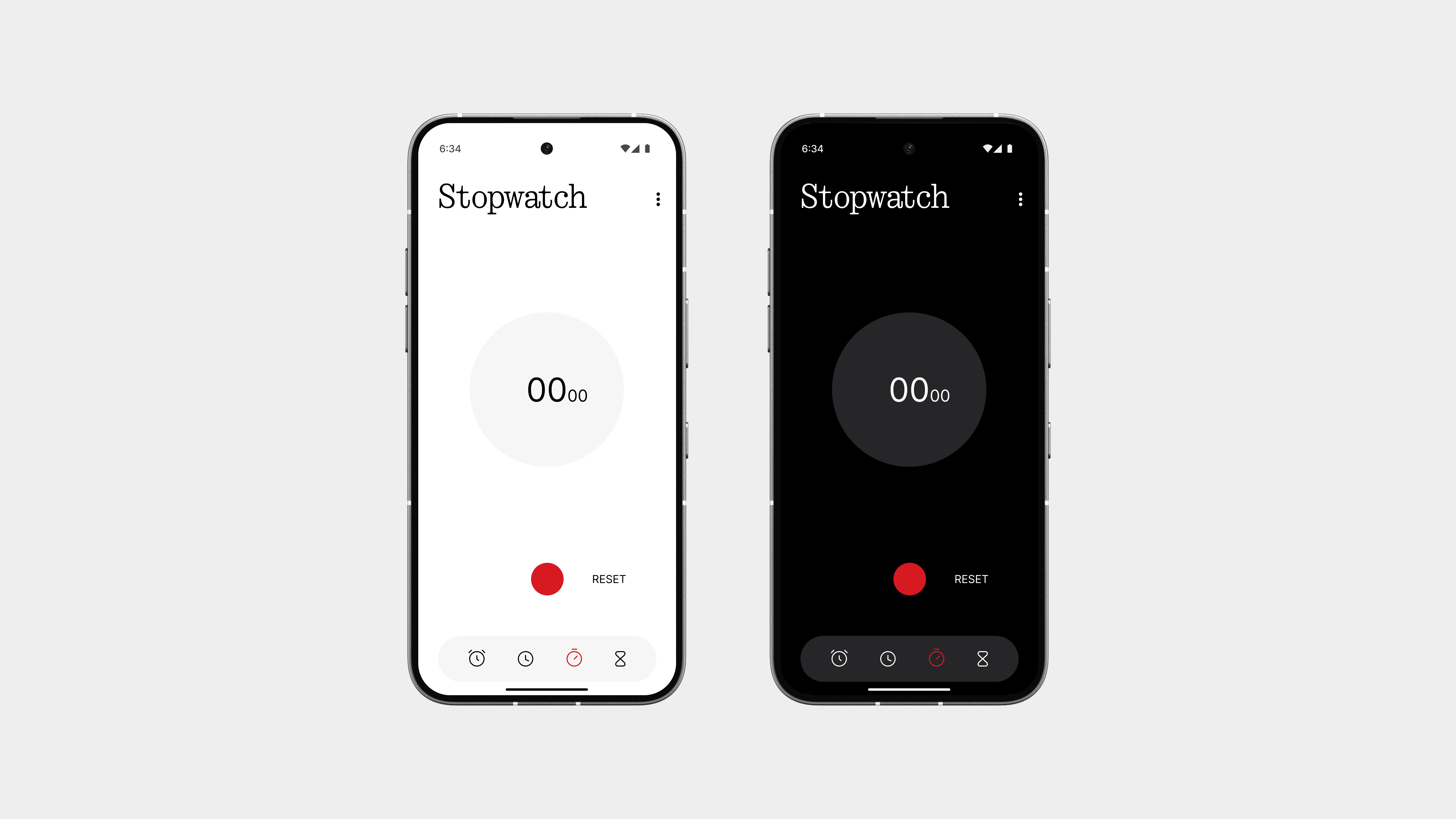
The Stopwatch is as simple and clean as it should be, no extra visuals, no clutter, just pure focus.
You’ve got a bold red Start button front and center, giving it that signature Nothing touch. Once running, the Reset button appears to the right, making it easy to clear and start again without confusion.
The UI is clean, easy to read at a glance, and feels intentionally designed, not just thrown together. It does exactly what it needs to, and looks good doing it.
No distractions. Just time, measured right.
Timer
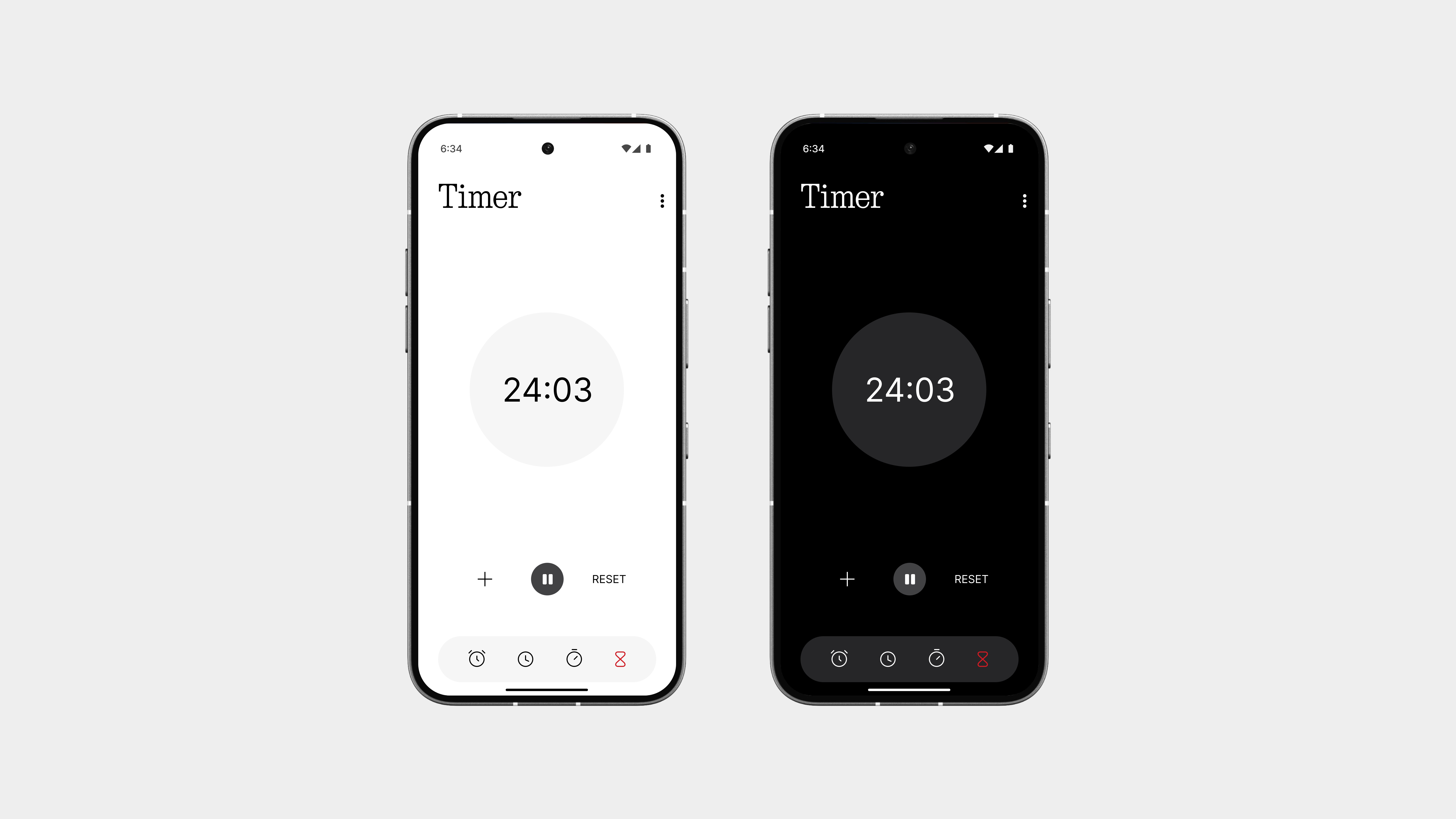
The Timer keeps things clean, simple, and fast, just the way it should be.
Setting a timer is now quicker and more intuitive, with a layout that makes adjusting hours, minutes, or seconds feel effortless. No clunky wheels or confusing scrolls—just tap, set, and go.
The bold red Start button stands out with purpose, and once the timer is running, a Reset button appears neatly to the right—keeping the interface clean and functional at all times.
Everything is laid out to be easy to read and easy to use.
It’s the same timer, but now it finally feels like it was designed with some thought.
Alarm Screen
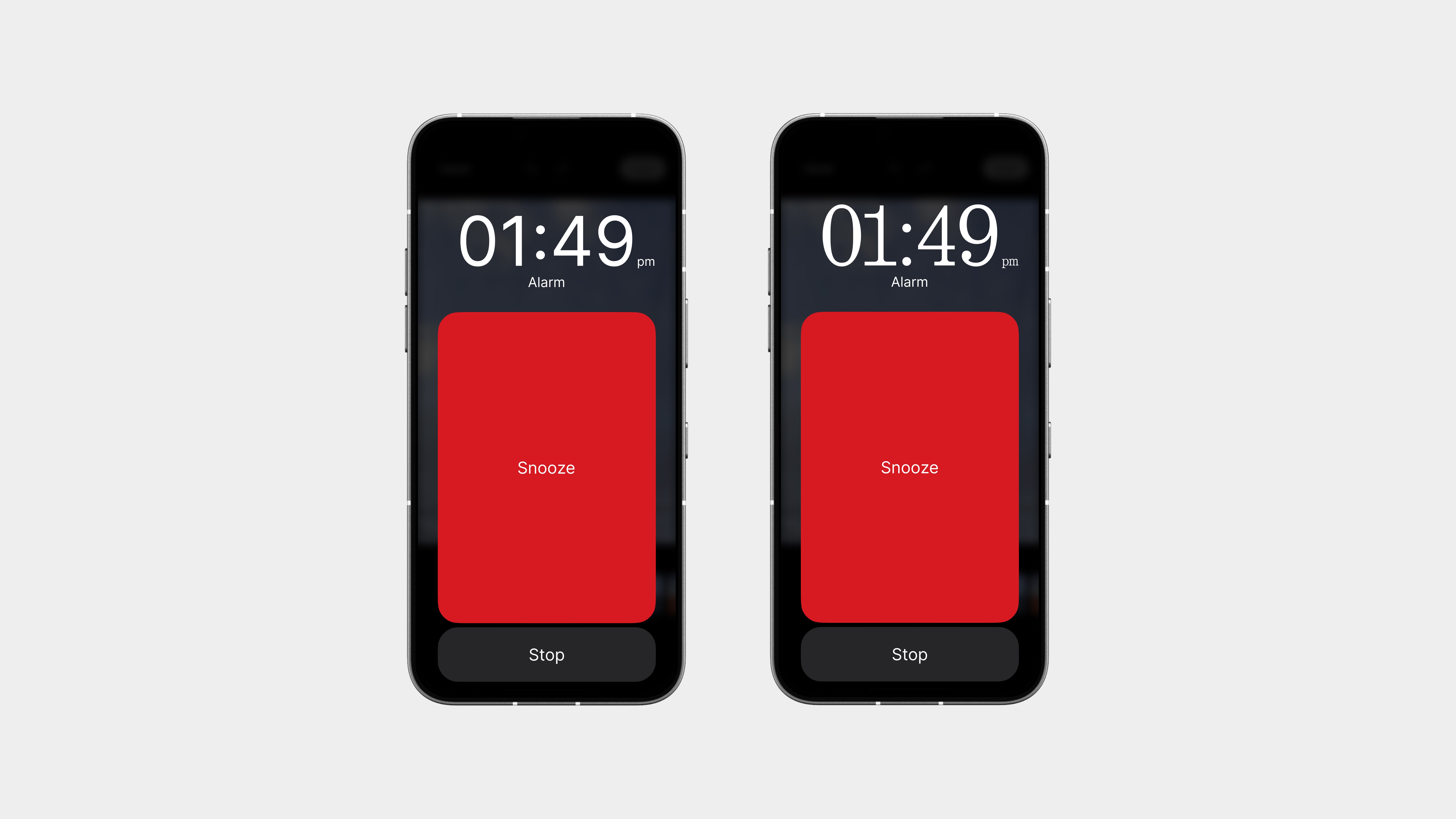
Let’s be honest, Google’s alarm screen sucked. Cluttered buttons, random colors, and not a single ounce of personality. So I thought, why not make this part fun too?
Now, when the alarm rings, you get options.
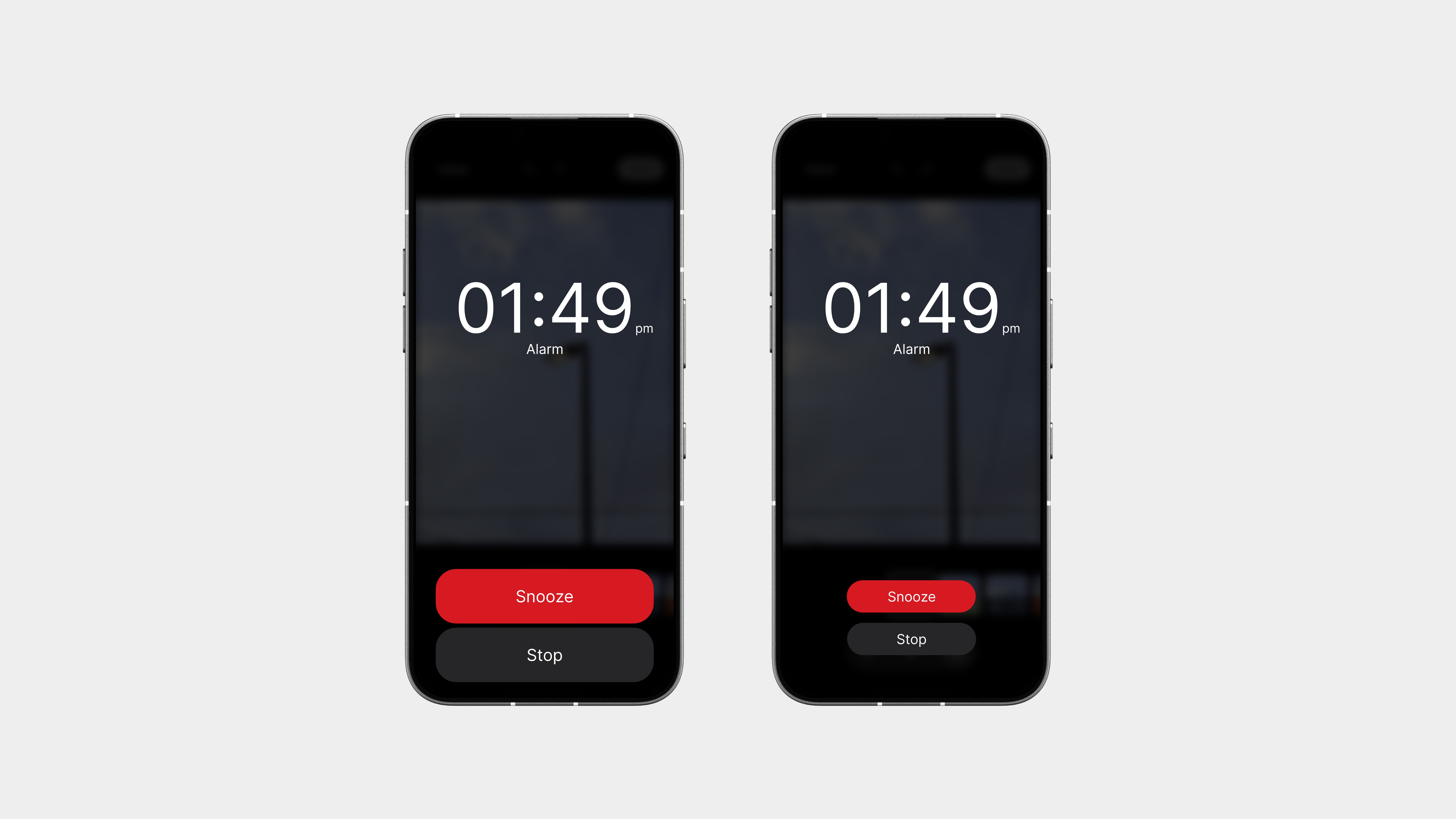
If you’re the type who loves a few extra minutes, there’s a huge snooze button front and center, can’t miss it. Prefer something more balanced? Go with a medium-styled layout, where snooze and stop sit side by side with clean, rounded buttons. Want it minimal? You got it, a small, stripped-back layout with subtle buttons and nothing extra.
Even better? It all matches your chosen clock style, so the screen still feels like you, not just some random pop-up that ruins your morning.
So yeah,
The Clock app doesn’t try to do too much, it just does everything better.
From a smoother alarm setup to a more flexible alarm screen, from clean stopwatch and timer layouts to a clock that finally lets you add some style, every part has been redesigned with purpose.
No mess. No random visuals. Just a clock that’s easier, smarter, and yes, even a little fun.
What was once one of the most boring apps on your phone now feels like something you’d actually want to use.
Community
This is the deserved one.
While the current mobile web version works, it’s far from ideal. It’s not as smooth or immersive as it could be, and it doesn’t fully reflect the energy of the Nothing community.
This app changes that. It’s designed with purpose, made to feel native, and built to bring users together in a way that’s clean, fast, and actually enjoyable to use.
This is the one that’s long overdue, a proper Community app that feels right at home on a Nothing phone.
Home
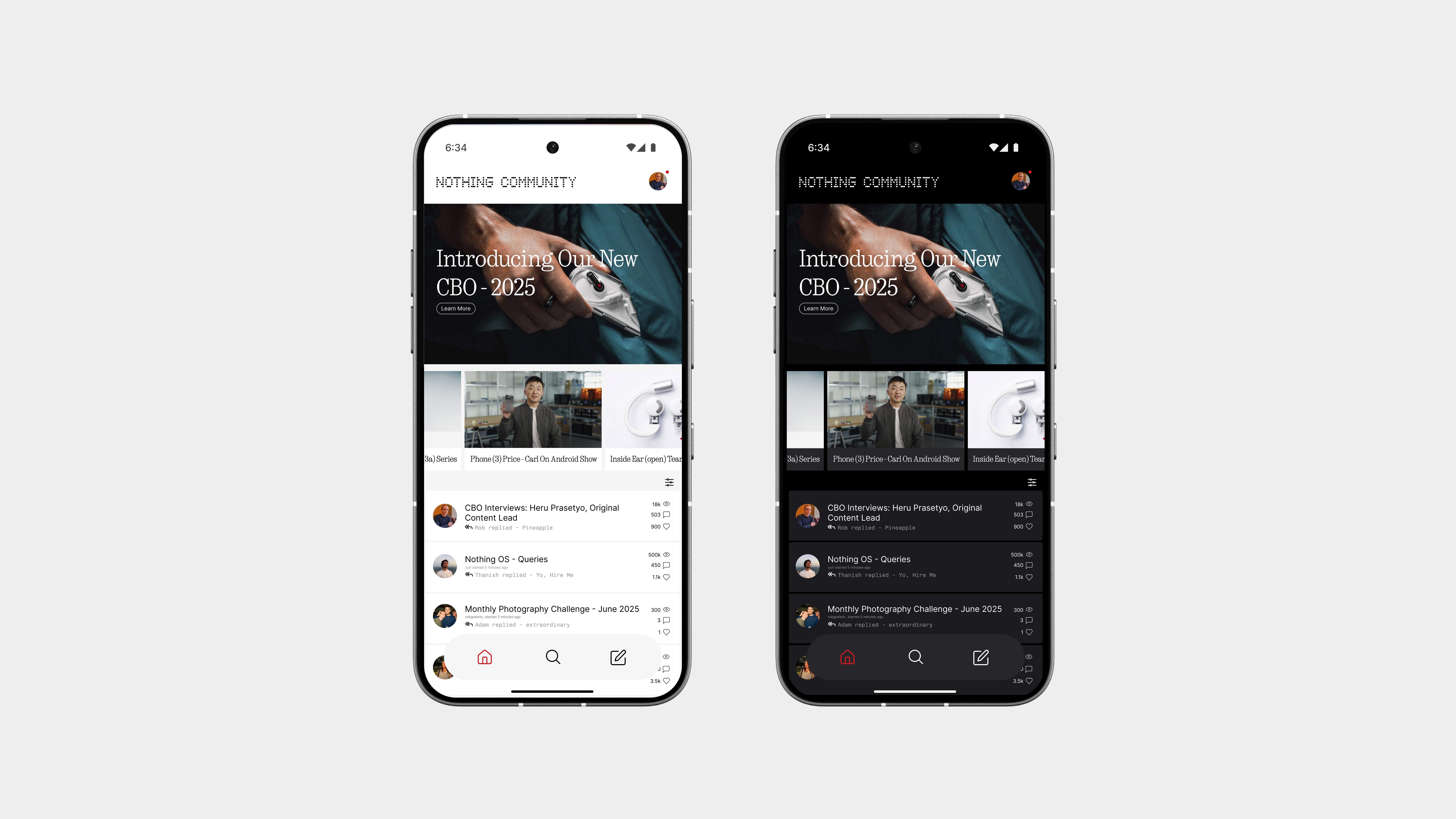
The home page sticks to the raw layout style from the web version, because honestly, it just works.
At the top, you’ve got all the official posts, from product updates to announcements, kept in focus where they should be. Below that are the pinned discussions, followed by all other threads and conversations from the community.
Everything is now refined for mobile, with better colors, sharper icons, and cleaner fonts to make the experience easier to follow and nicer to use. It keeps the spirit of the original, just sharper and smoother.
At the bottom, a simple nav bar gives you quick access to:
Home – for the main feed
Explore – to discover trending or new posts
Post – to quickly start a new discussion
Discussion
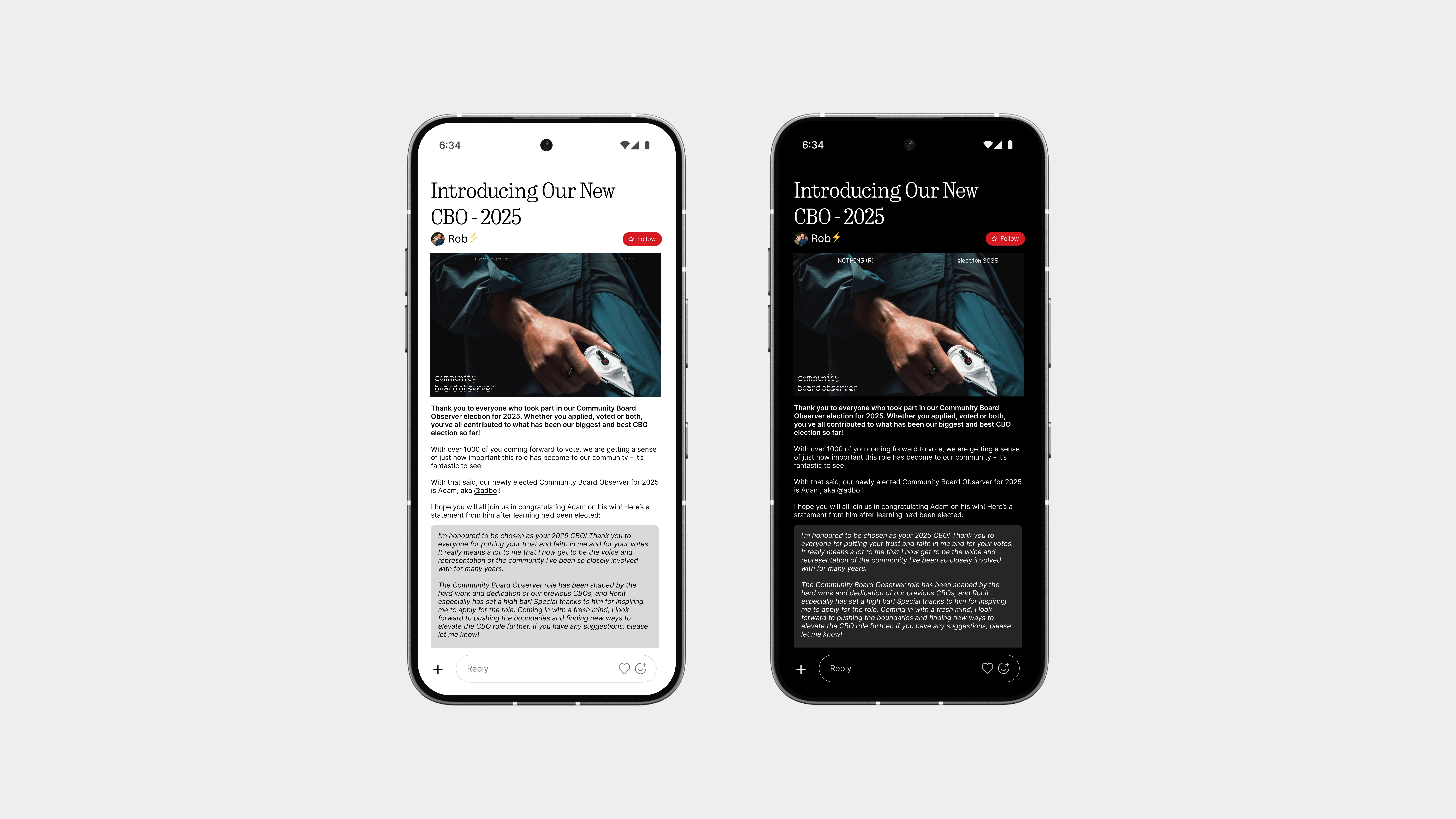
The discussion page keeps the same familiar structure but cleans it up where it matters.
Replies are now easier to follow, with better spacing, smoother flow, and a layout that feels more natural to read, visually perfected without losing the raw feel of community threads.
The biggest upgrade? The reply bar.
Instead of that old clunky comment box where you had to scroll to find your spot, this one’s been reworked to feel more like a messaging app, always accessible at the bottom, clean, focused, and ready to type when you are. No searching, no awkward taps, just reply and go.
It’s still the discussion format you know, just finally done right for mobile.
Profile
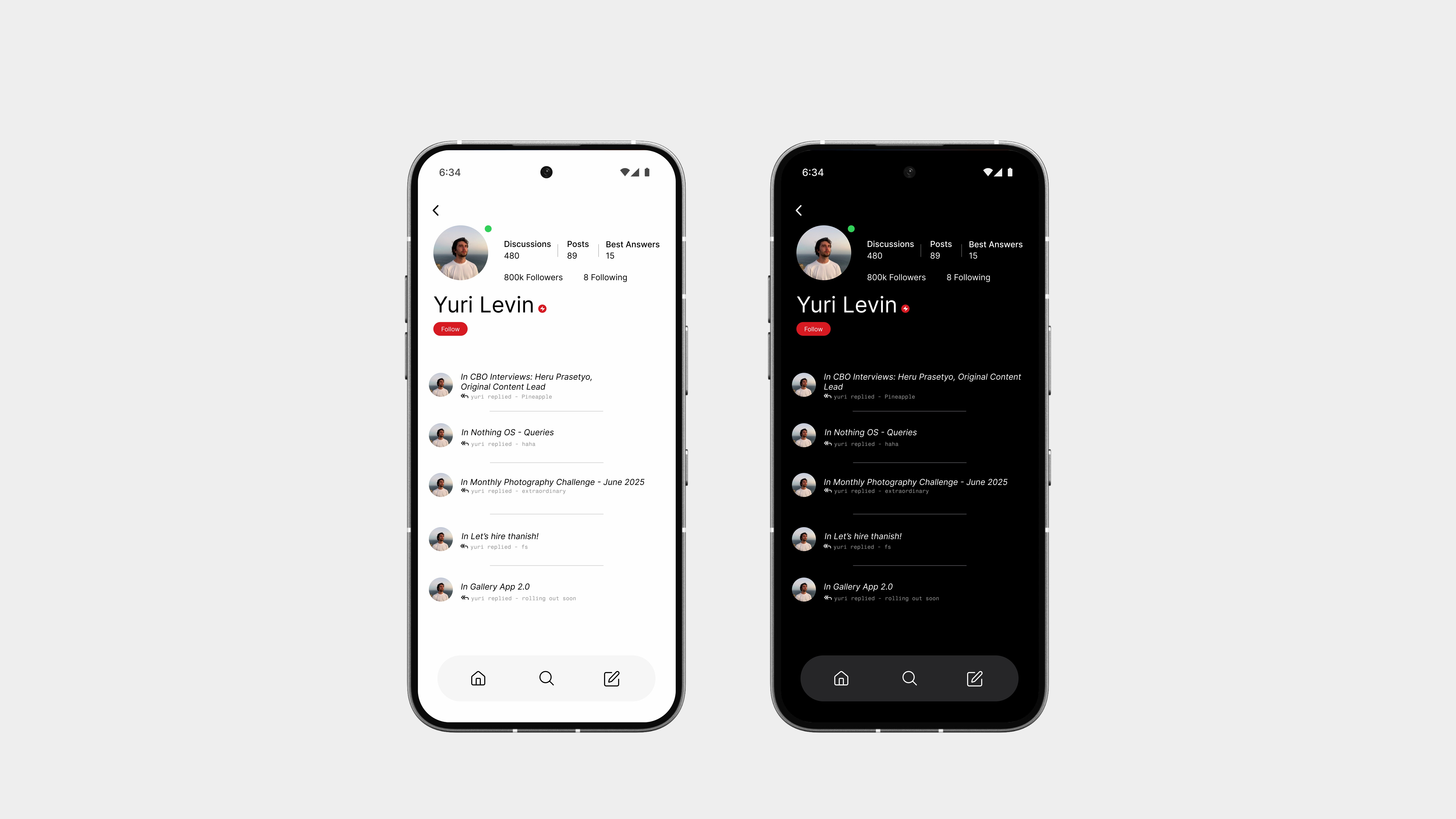
The profile page gets a full redesign, this time, built to feel more like the social apps you already use on your phone.
Right at the top, you’ll see the user’s name, bio, and a clean Follow button if you want to stay updated with their posts. Below that, it’s straight into their discussions and replies, neatly organised so you can scroll through everything they’ve shared.
It’s way more structured, more visual, and just feels natural to use.
Compared to the old version, this one’s a big step up, and honestly, it finally feels like a proper profile.
So yeah,
The Community app finally gives Nothing users a space that feels like it belongs.
From a homepage that highlights what matters, to a better discussion flow, a proper reply bar, and clean, social-style profiles, it’s everything the web version wanted to be, but never quite nailed.
It’s faster, smoother, and more intentional, built to match the rest of the OS and actually feel good to use on a phone.
The community deserved better, and now, it has it.
Notes
The Notes app follows the same simple and intentional design language seen throughout the system.
No clutter, no unnecessary features, just a clean space to write down your thoughts, lists, or ideas. The layout is straightforward, with a focus on clarity and ease of use, making it feel instantly familiar but still refined.
Everything from the font choice to the spacing sticks to the overall system style, keeping it consistent and minimal, just the way it should be.
Sometimes, less really is more, and this app proves it.
Home
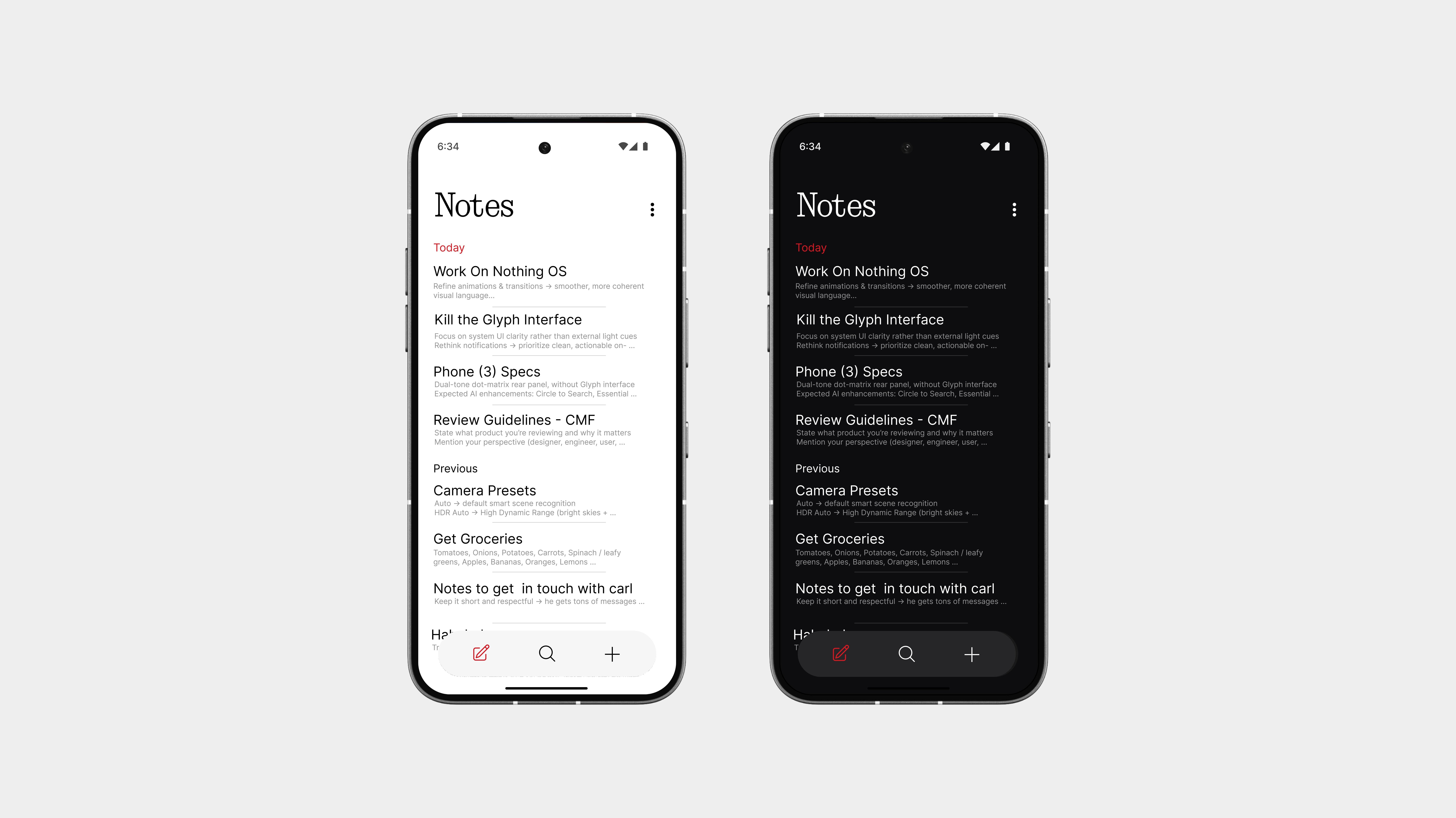
The Notes home page is designed to be simple, clean, and actually usable.
All your notes are shown in a straightforward list view, organised like messages, with clear titles, short previews, and timestamps. It’s fast to scan and easy to manage.
And yeah, no more tile layouts. They never looked great and only made things harder to read. This design keeps everything aligned, focused, and functional.
At the bottom, you’ve got a three-button nav bar:
Home – for all your notes
Explore – to view pinned or filtered notes
New Note – tap to start writing instantly
Notes
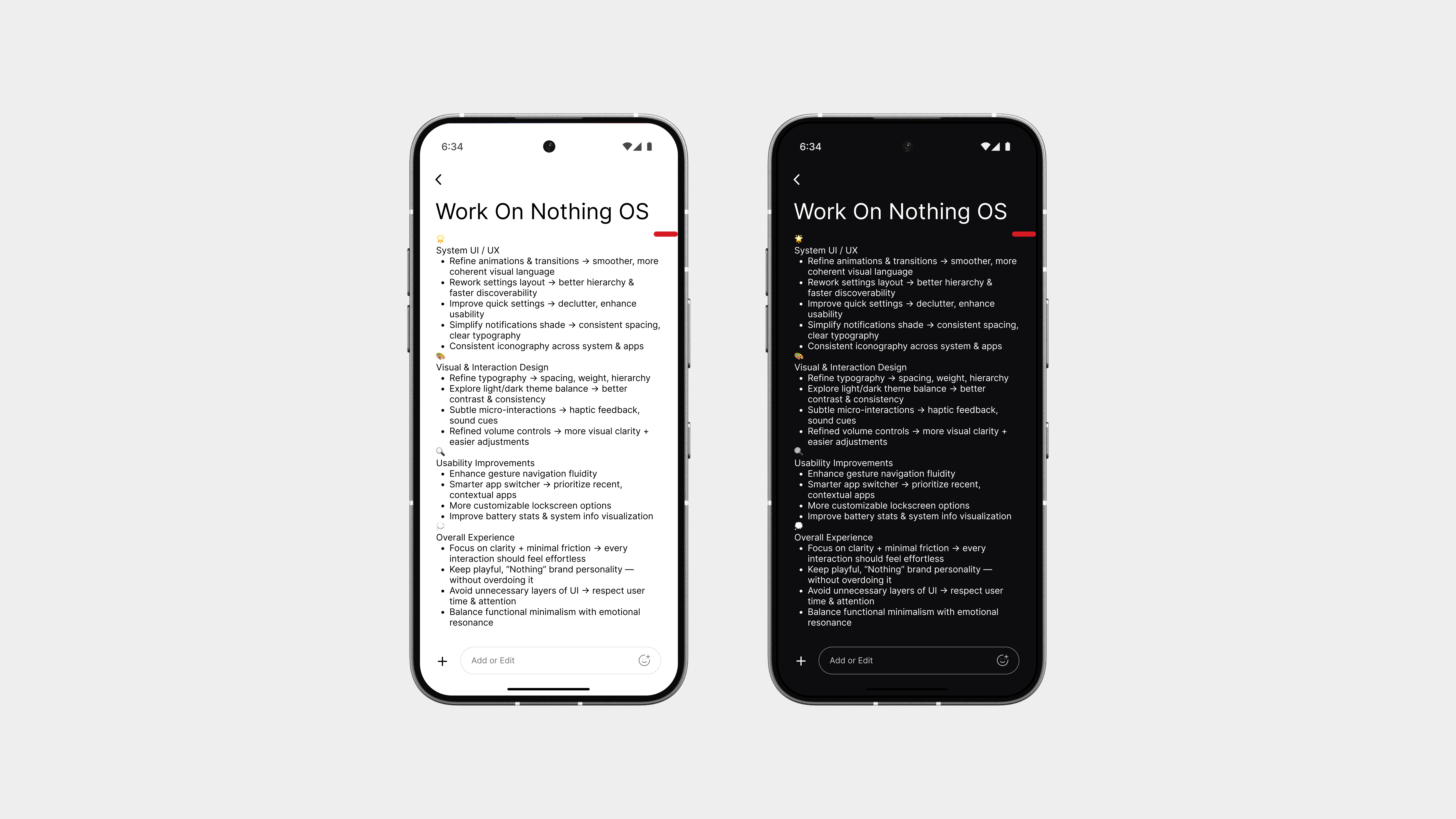
The note page is as clean and focused as it gets.
Just you and your thoughts, no distractions, no floating buttons, no extra clutter. The layout is minimal, with clear typography, consistent spacing, and everything styled to feel natural and intentional.
At the bottom, there’s an add notes bar, just like a message input field. It stays fixed in place, making it easy to jot down quick thoughts or add to your existing note without jumping around the screen.
It’s simple, smart, and fits perfectly into the rest of the system, exactly how a note should feel.
Explore
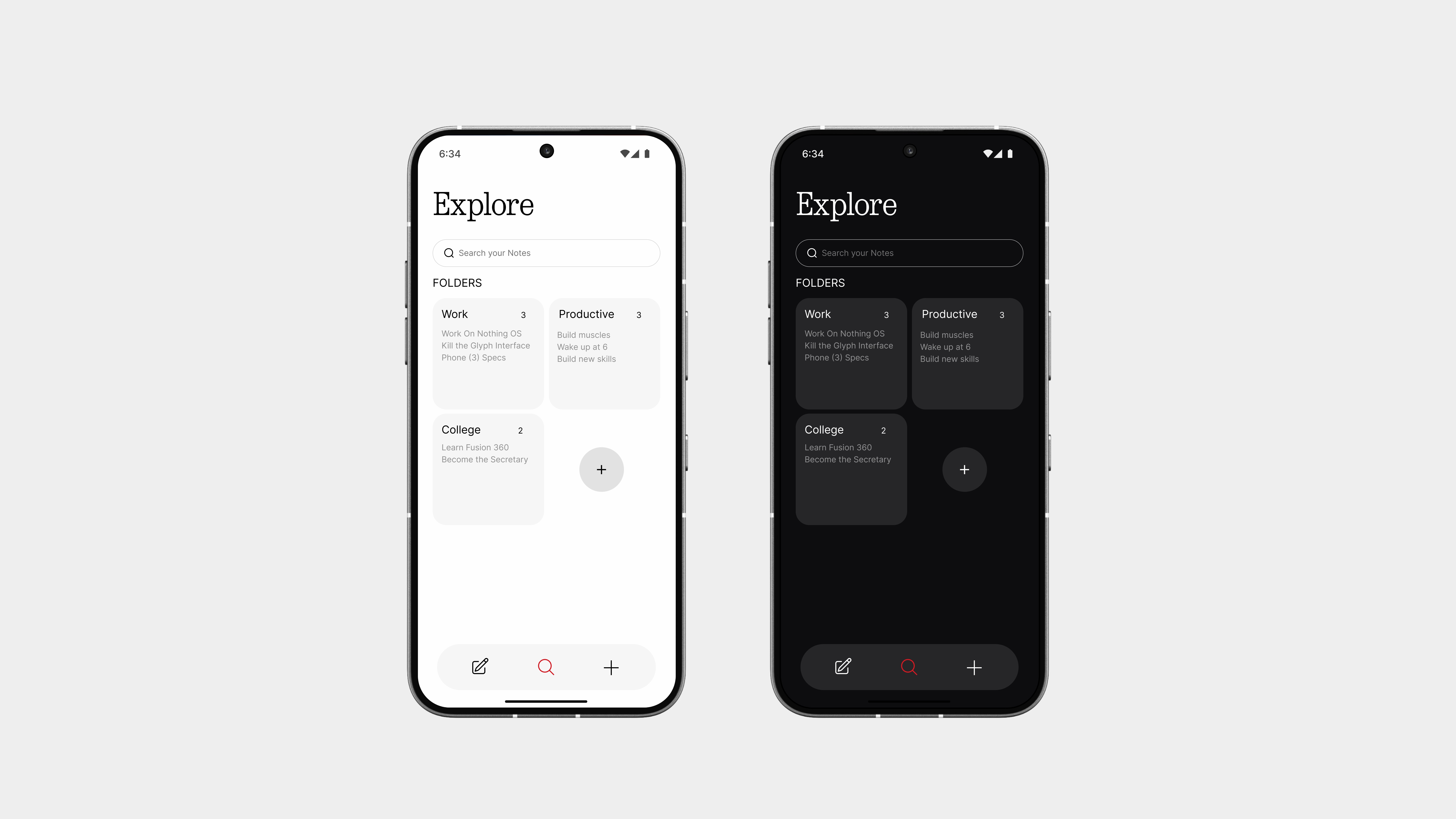
The Explore page helps you find exactly what you need, even if it’s just a single word.
You can search through your notes easily, and everything is shown clearly, letting you browse and sort the way you want. To keep things organised, you can also create your own custom folders like:
College
Life
Work
or anything else that fits your world
So yeah,
The Notes app proves that simplicity can still be powerful.
With a clean layout, an easy way to create and manage notes, a message-style input bar, and smart features like folders and search, it finally feels like something made for everyday use, not just thrown in.
It doesn’t try to overdo anything. It just focuses on what matters: writing things down, finding them fast, and keeping them organised, all while fitting perfectly into the rest of the system.
Redesigning System UI
Volume Control
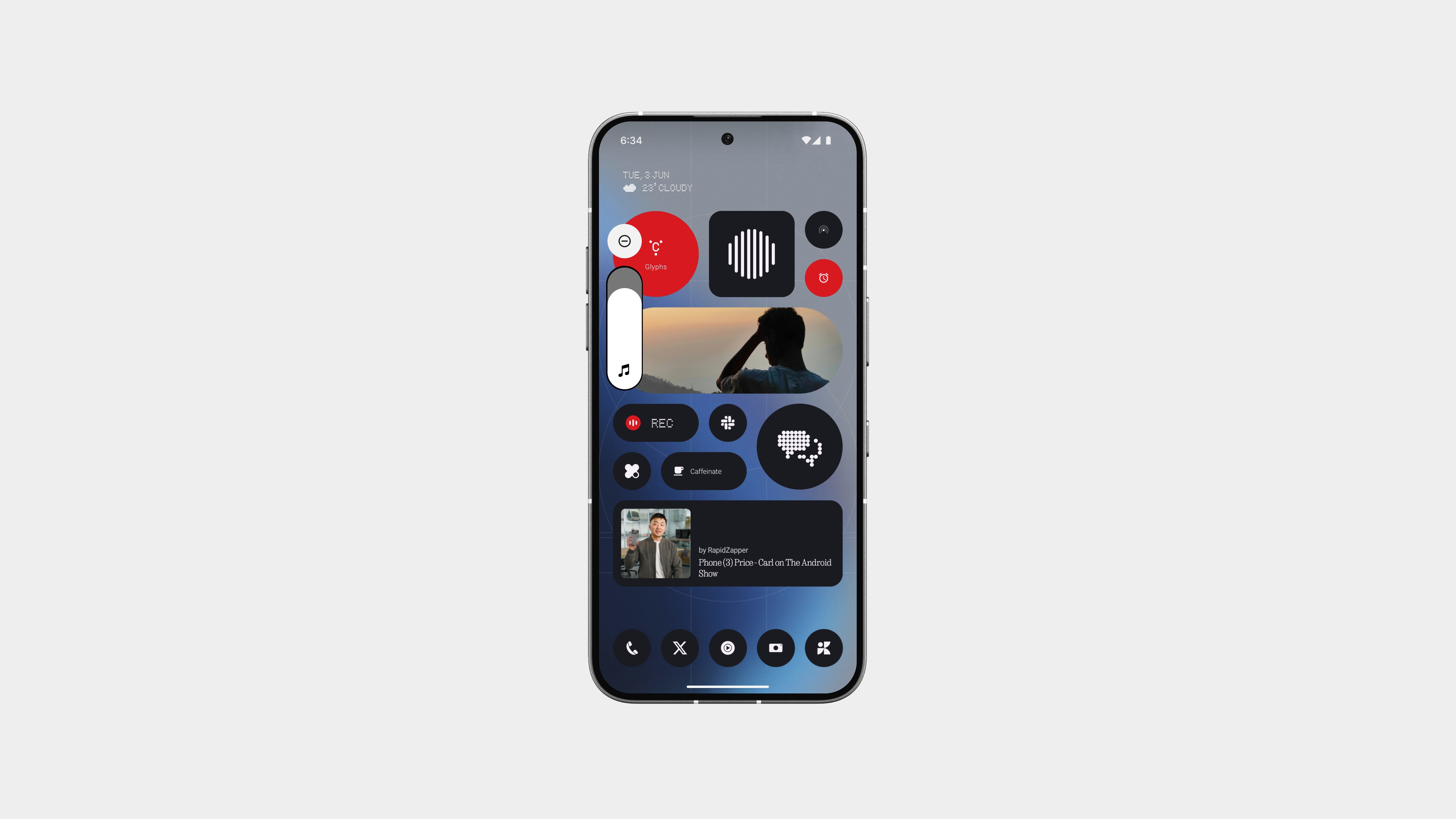
The volume UI has been redesigned to be minimal, intentional, and functional.
It’s now smaller in size, but still gives you full control over media, call, and notification volume. The layout is cleaner, the icons sharper, and everything feels more considered.
The slider sits neatly on the side without getting in the way, and fades in and out just when you need it. No extra visuals, no wasted space, just a smarter layout that fits better with the rest of the system.
Same function. Better form.
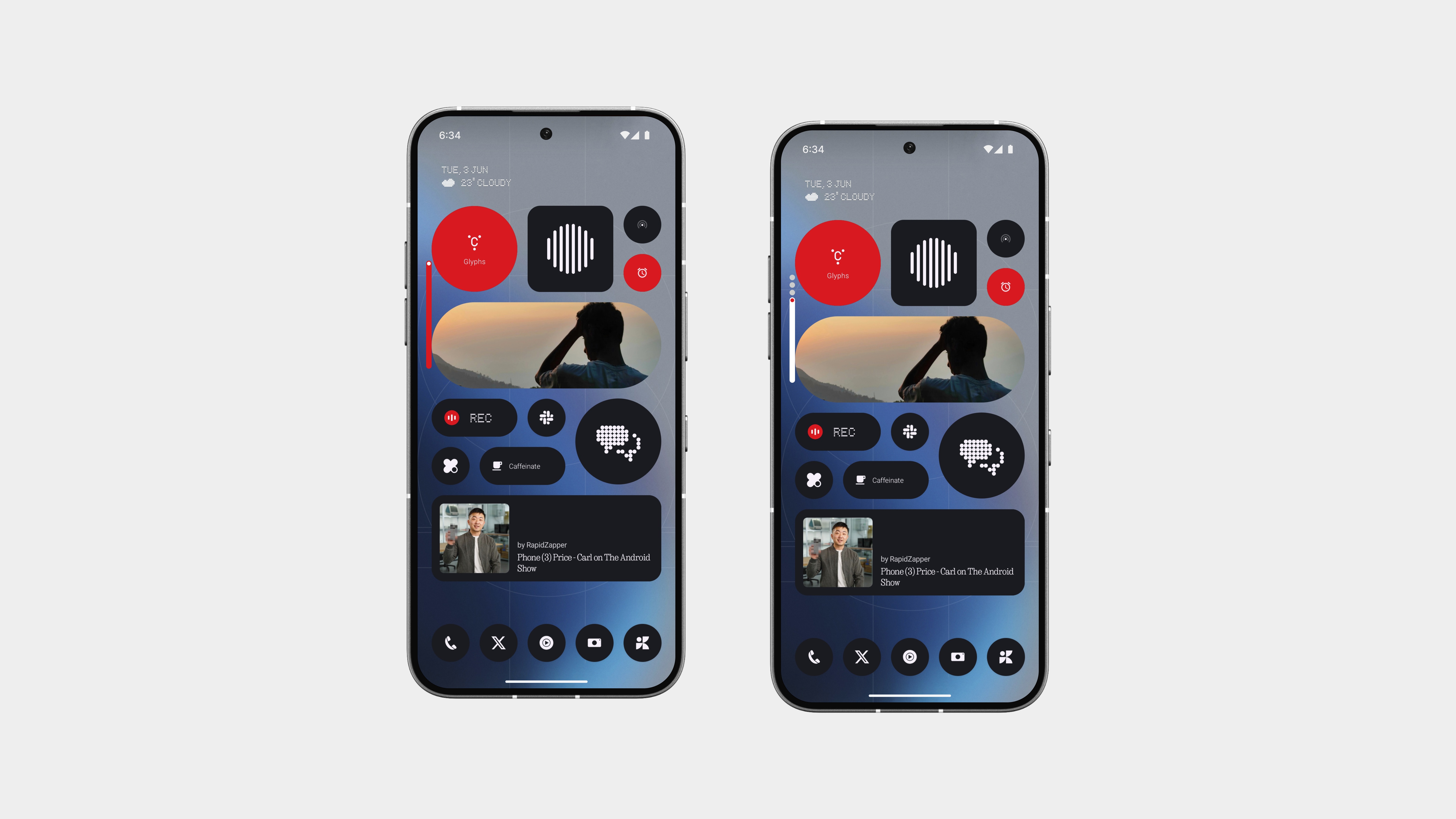
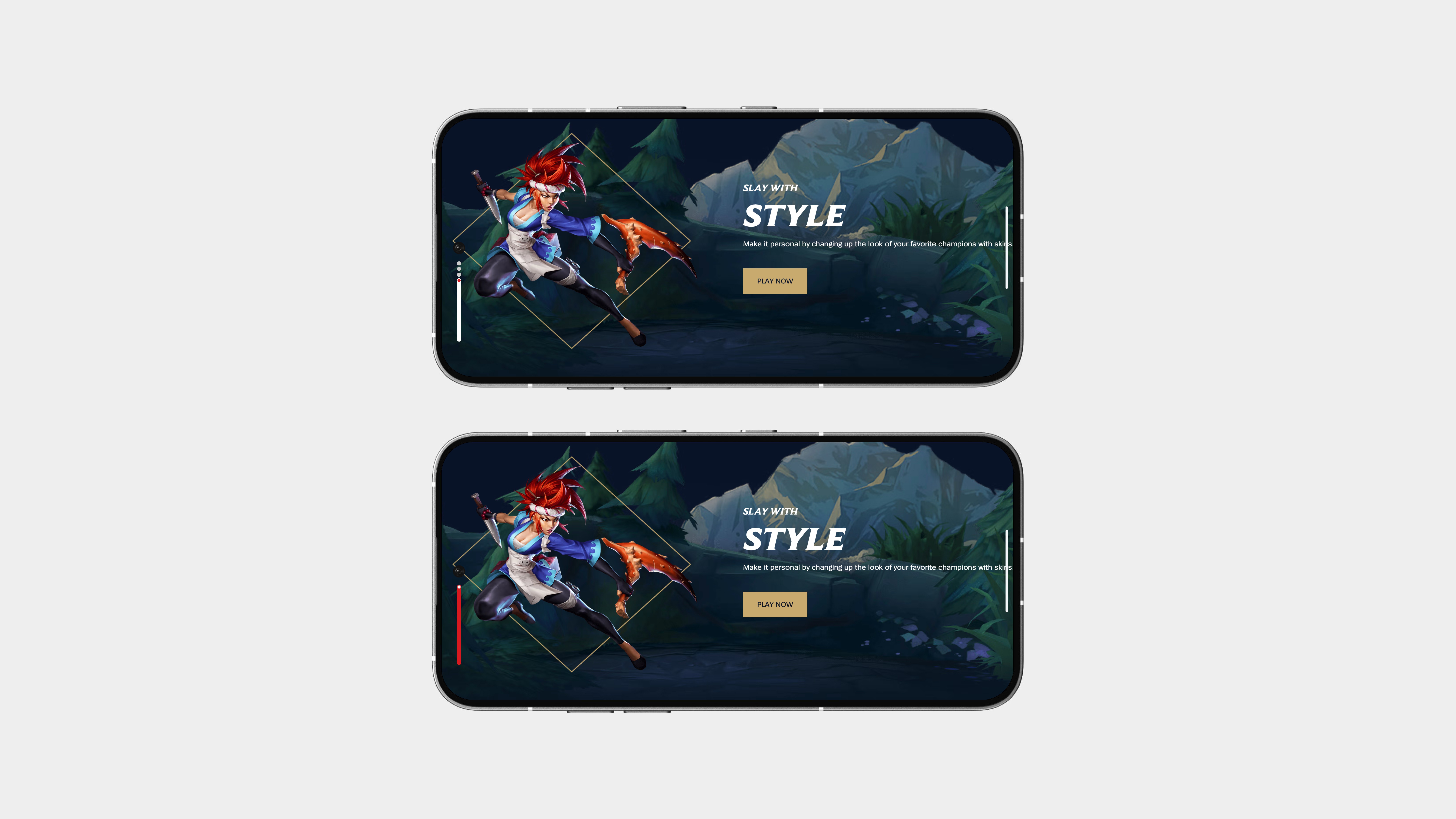
Initial Volume Popup
The initial volume popup has been redesigned to be a single, minimal line—quick, clean, and distraction-free.
It appears as a thin horizontal bar when you press the volume buttons, staying out of the way but still giving you the feedback you need. And when the volume hits the max, a subtle touch of red indicates it’s full, simple, visual, and on-brand.
This isn’t just about looks, it’s practical, too. Whether you’re watching content or gaming—yes, even League of Legends like Carl—this layout keeps your screen clear and your focus where it should be.
Screenshot Capture
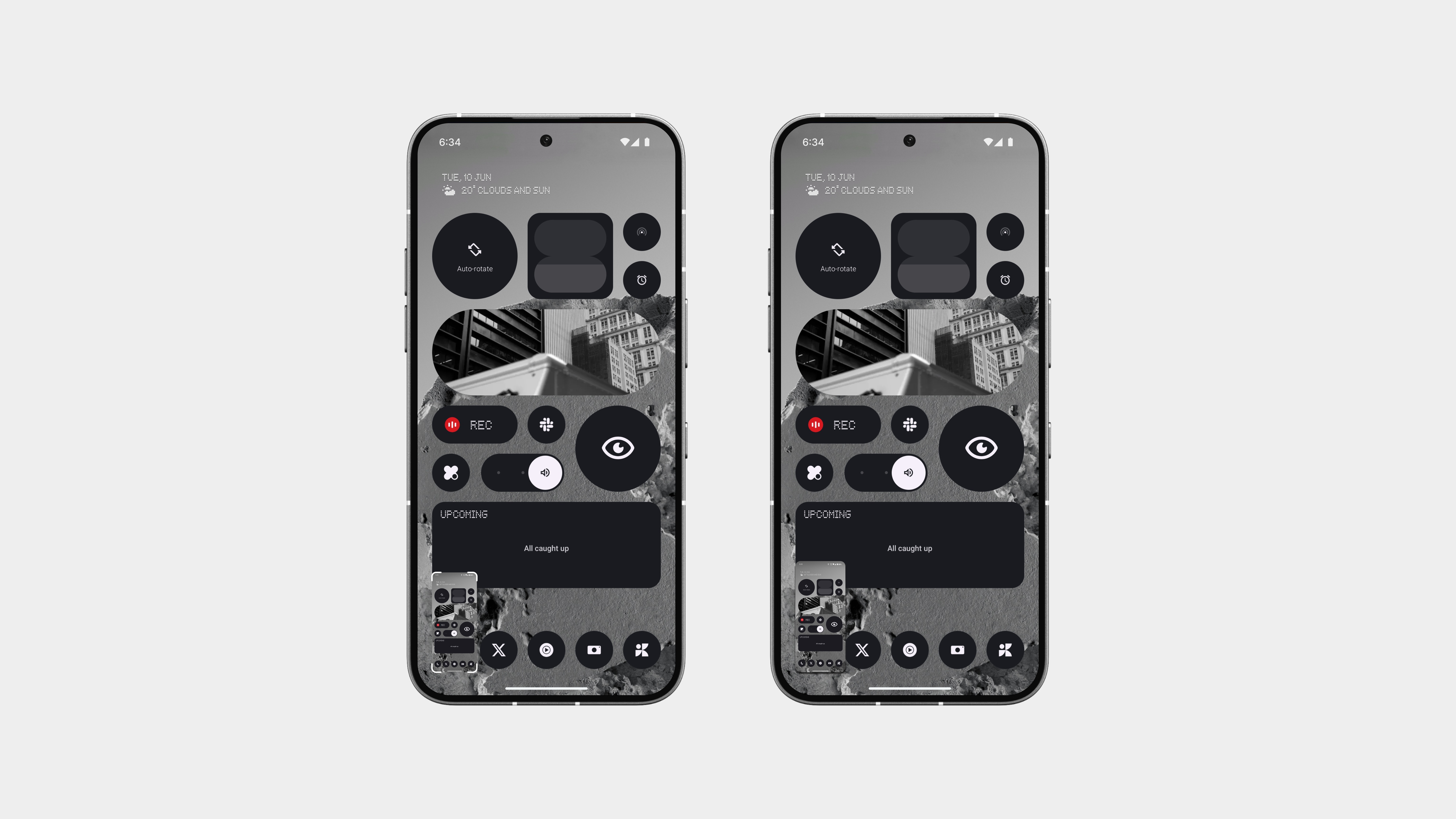
The old screenshot UI? Chunky and in the way.
This new version? Clean, minimal, and way more refined.
There are two approaches here:
One with thin white corner borders, just enough to highlight the screenshot without taking attention away from what’s behind it.
And one that’s even more minimal, using soft shadows to subtly lift the screenshot from the background.
Both are designed to feel lighter, less intrusive, and visually clear.
And here’s the best part: press and hold to instantly share.
No menus, no hunting for buttons—just hold, choose, and done.
It’s faster, cleaner, and way more functional than what came before.
App Unlock
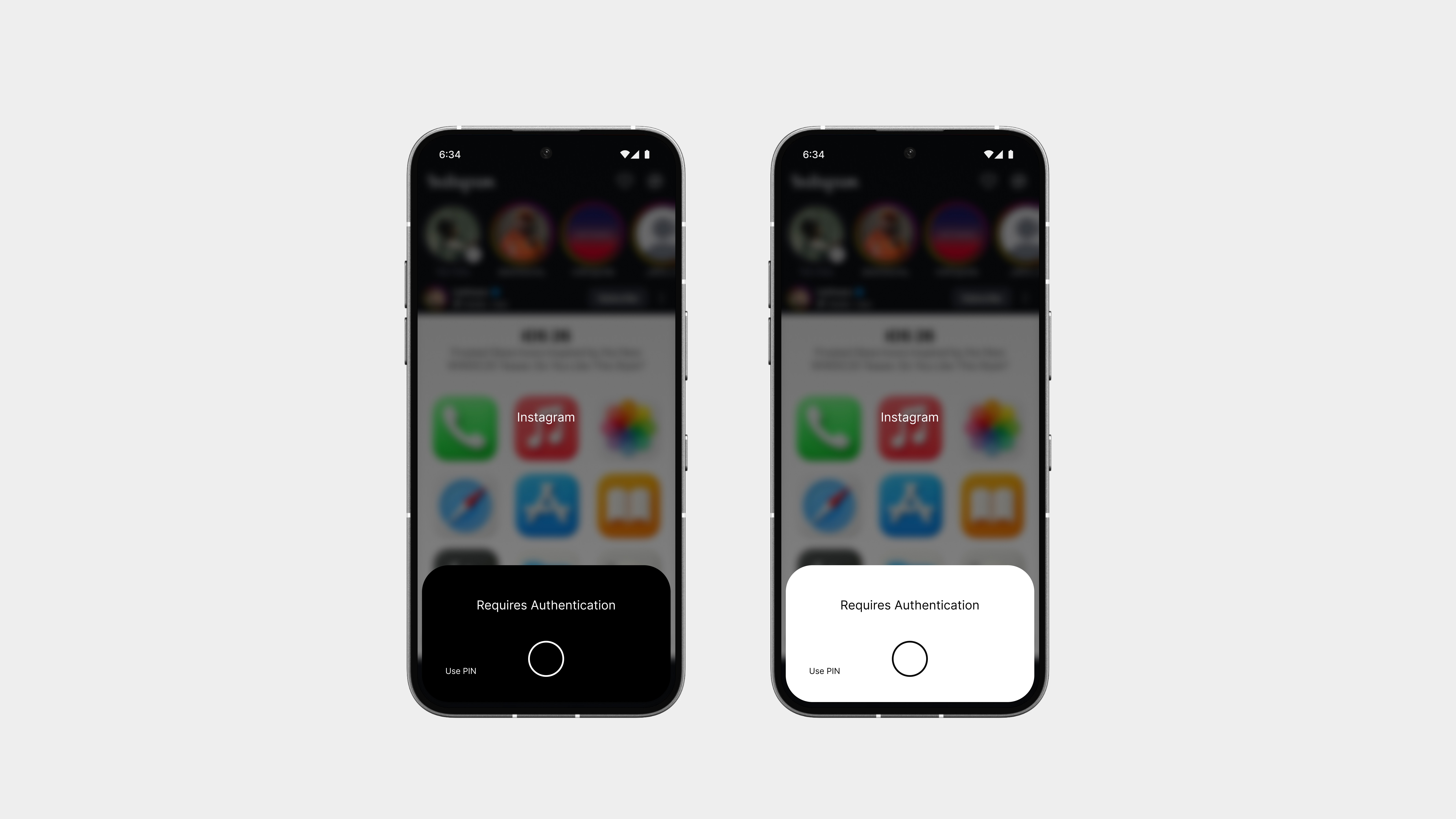
The App Unlock Page has been completely redesigned to feel more natural and less intrusive. The old version was bulky and honestly, not great to look at. Now, when you open a locked app, the screen gently blurs behind, so you can’t see what’s underneath, adding both privacy and polish.
Instead of a clunky popup, the unlock prompt elegantly rises from the gesture bar, making it feel like a part of the system, not something slapped on top. It’s clean, minimal, and fast, everything the old version wasn’t.
Keyboard
The keyboard gets a complete rethink, simpler, more efficient, and easier to use.
It now features a cleaner layout, with improved spacing and a refined font that feels more readable and less cluttered. No unnecessary outlines or bulky buttons, just the essentials, done right.
And when you’re in the numbers layout, there’s a subtle upgrade: a compact emoji bar sits right on top. No more switching back and forth just to react or respond quickly, it’s all right there, built into the flow.
Everything feels more balanced, intentional, and fast.
No gimmicks, just a better keyboard that does exactly what you need.
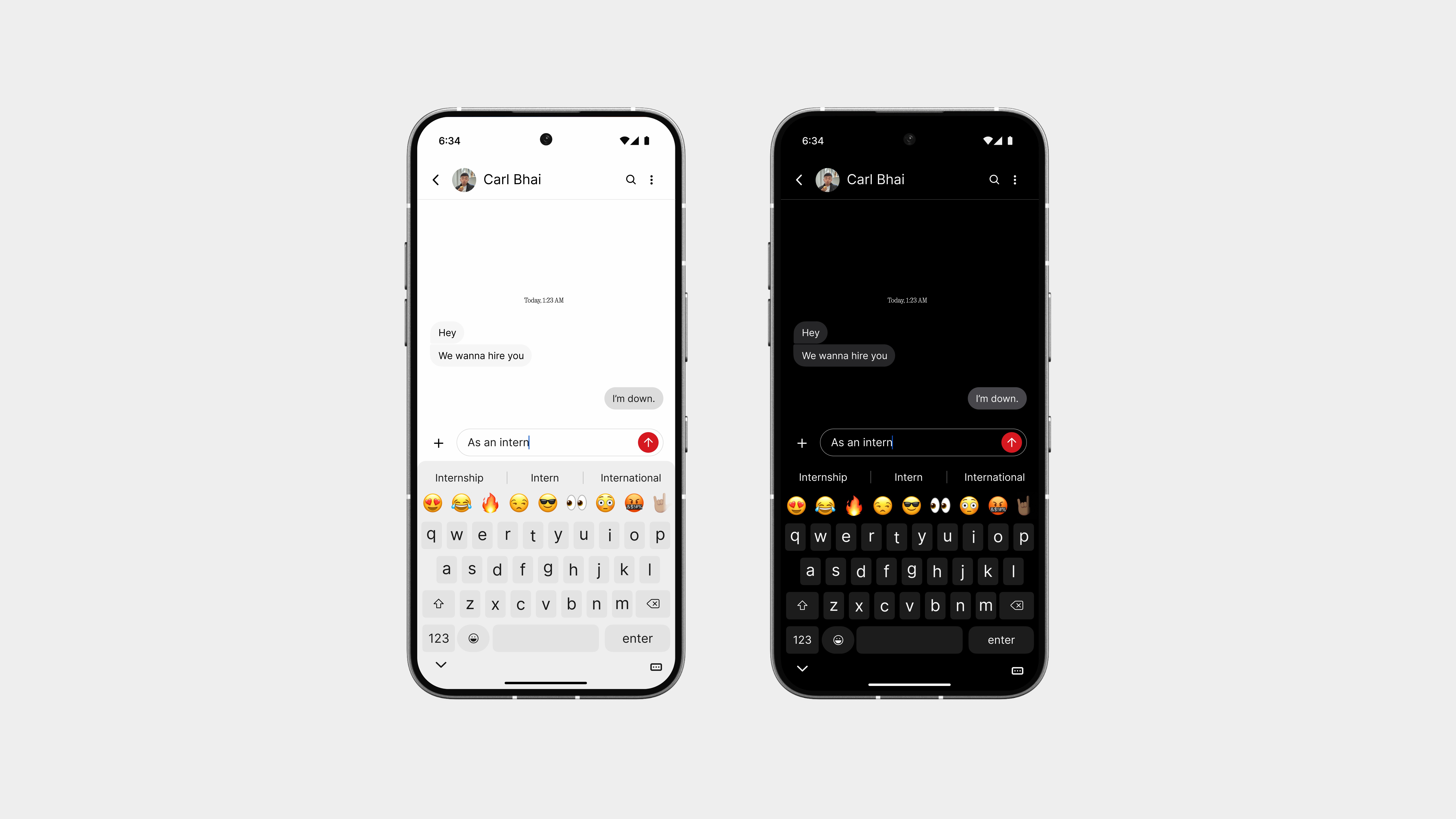
Keyboard
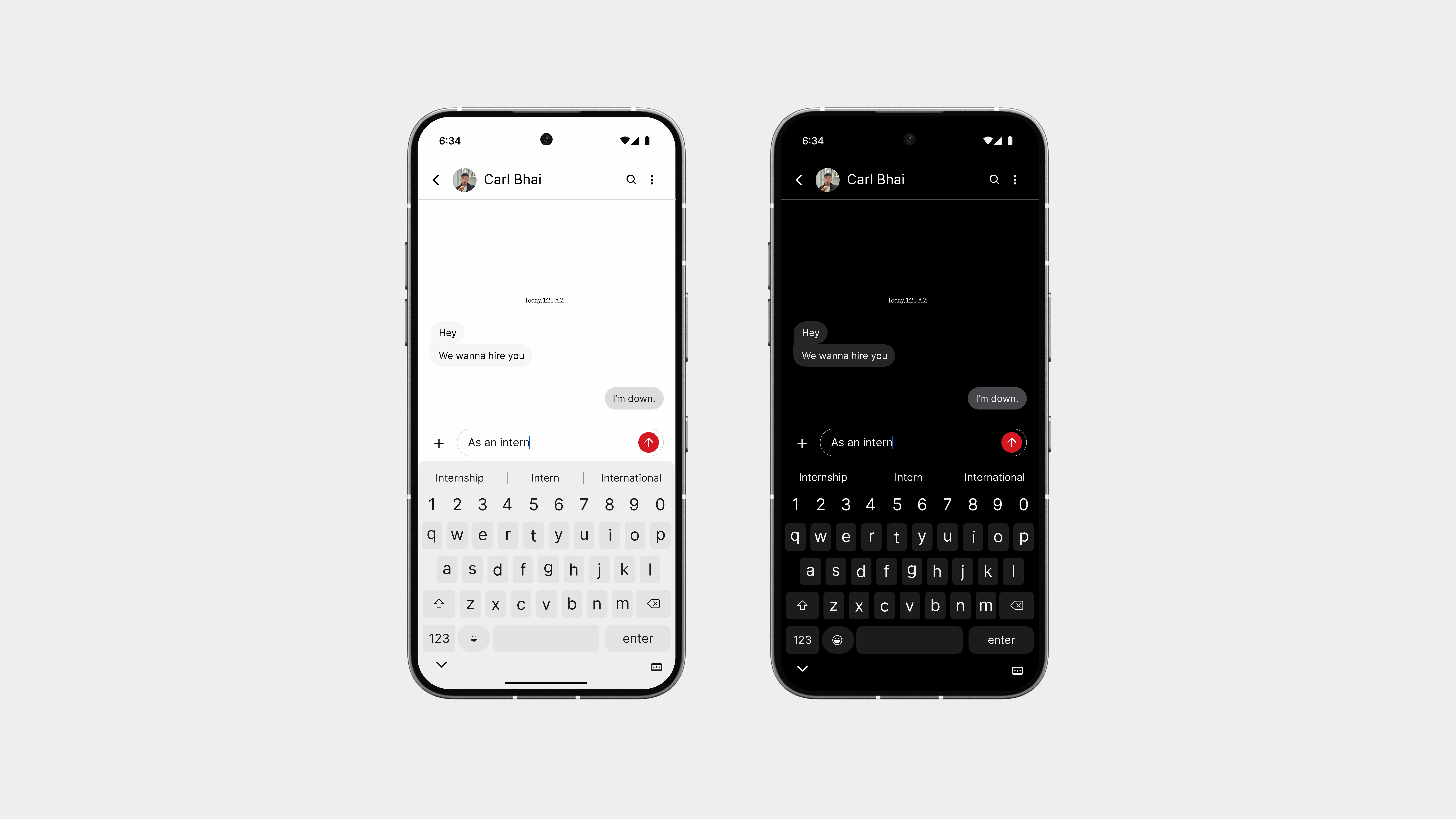
The keyboard also gets better themes, more refined, more intentional, and fully in sync with the rest of the system. Whether you’re in light or dark mode, everything looks and feels just right, without any jarring contrasts or outdated styles.
There’s also a quick-access number row placed at the top, so entering digits is faster and smoother than ever. No need to switch layouts just to type a few numbers, it’s built right into your flow.
And you can switch between different emoji sets. It’s responsive, intuitive, and removes the awkward back-and-forth you’d usually deal with.
It’s a keyboard that respects how you actually type—clean, smart, and ready to go.
Numeric & Symbols
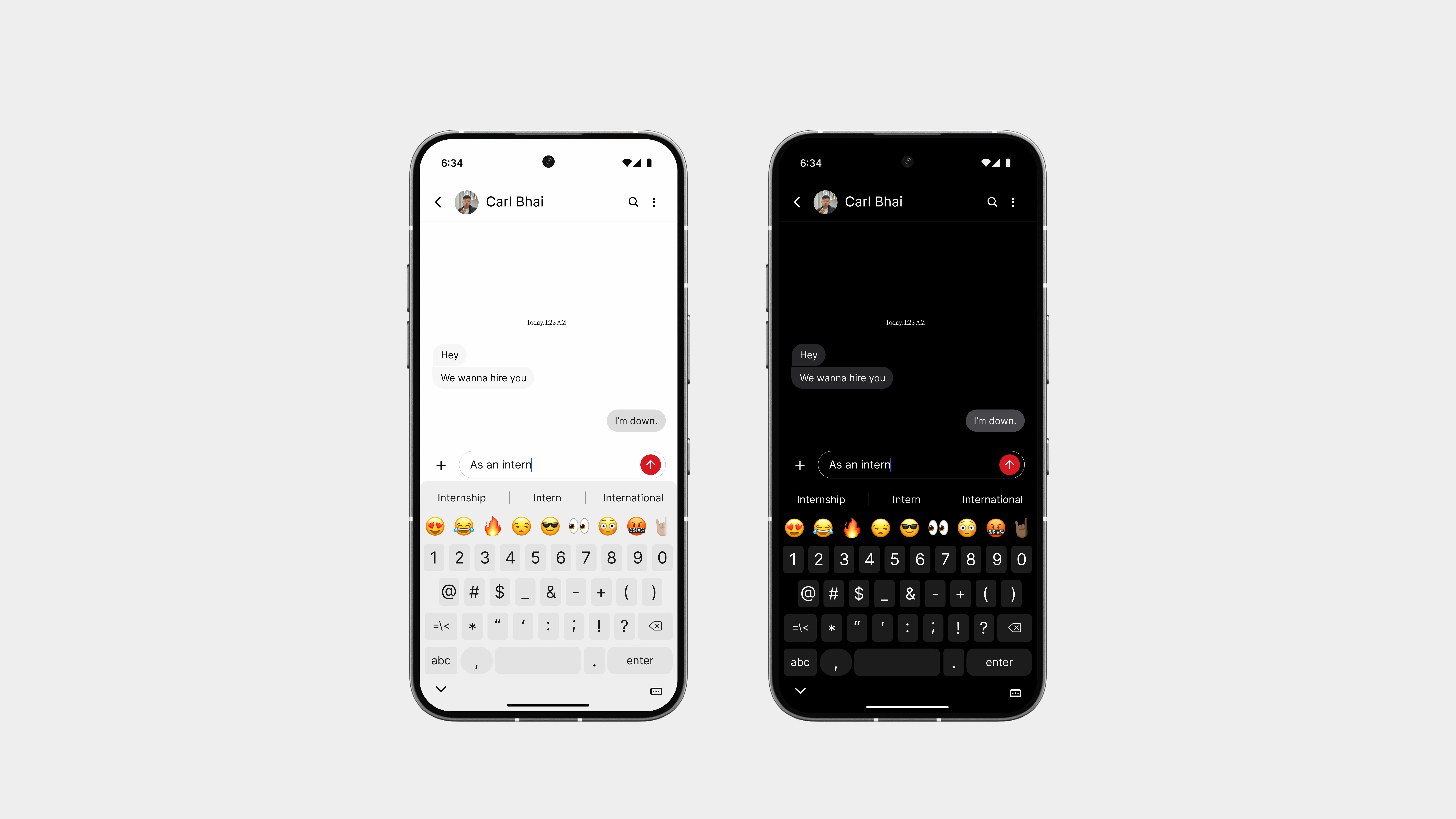
The numeric and symbols layout has been redesigned to be just as thoughtful as the main keyboard. Everything is arranged with balance and ease of use in mind, no more crowded grids or inconsistent sizing.
Numbers sit clearly, with symbols grouped logically so you can find what you need without second-guessing. Whether it’s typing out a passcode, a price, or some punctuation-heavy message, it all feels faster and more natural.
The layout avoids the usual visual noise, better spacing, consistent shapes, and smoother transitions between pages. It’s not just functional, it’s pleasant to use.
Number Pad
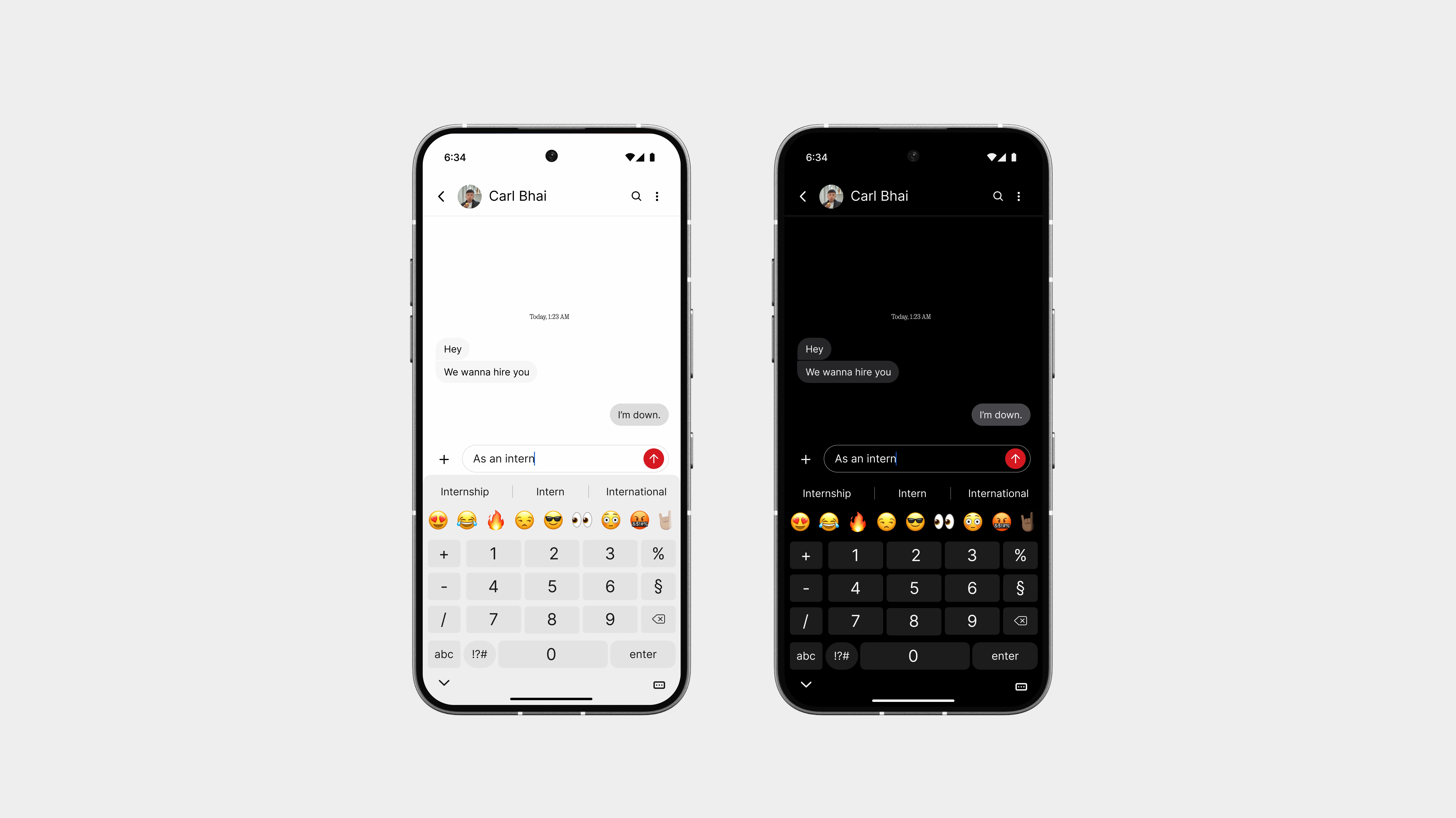
The Number Pad is built for those moments where you just need to enter digits, quickly and without distractions.
It follows a simple grid layout, similar to a traditional dialer, but redesigned with better spacing, clearer font, and smoother touch zones. Whether you’re typing in a PIN, a price, or a quick calculation, every key feels just right.
There’s no extra clutter, just numbers, a backspace key, and that signature red highlight to keep it in line with the rest of the system design.
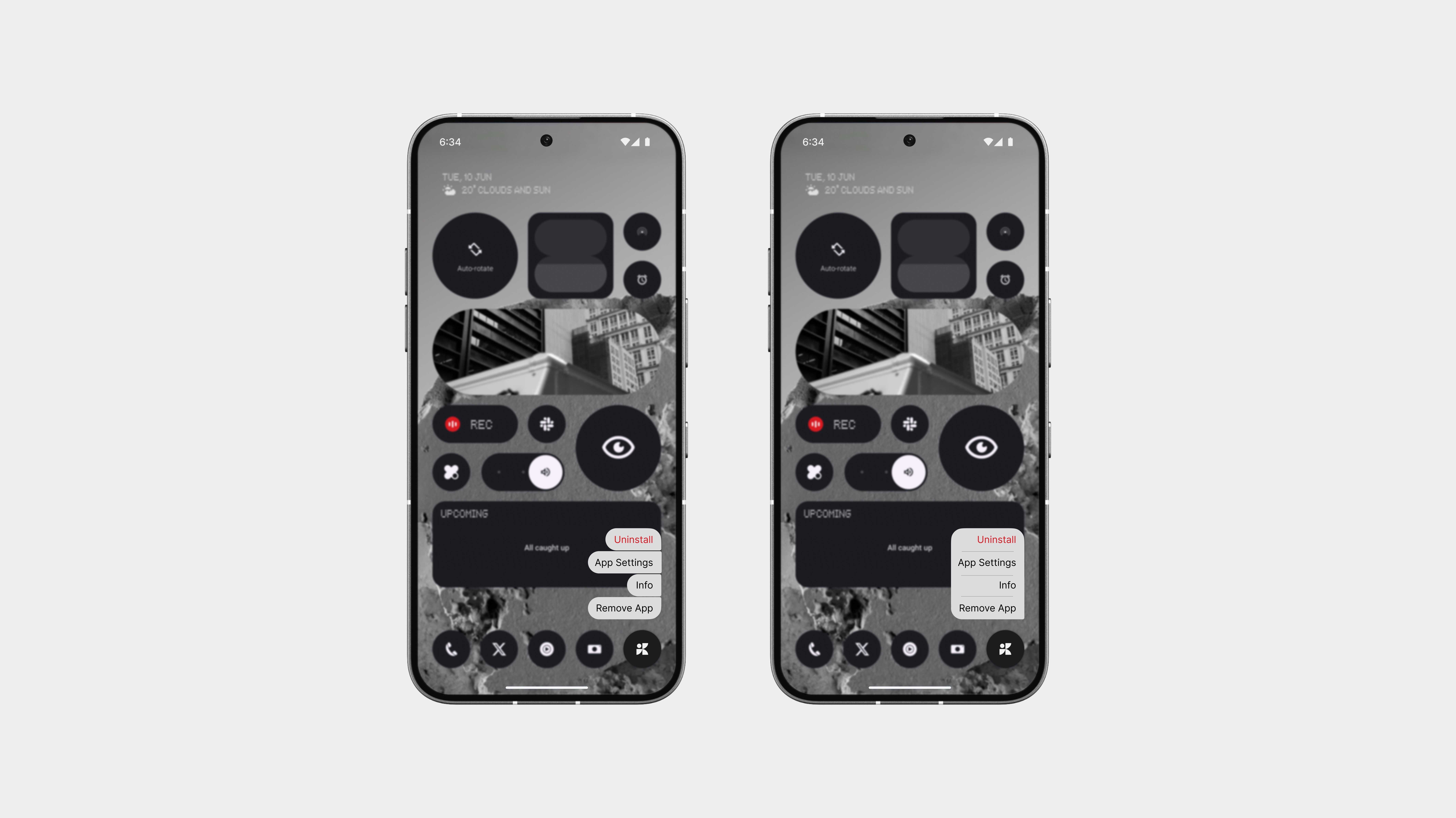
App Info
The old App Info screen you got when long-pressing an app? Let’s be real, it was ugly and took up way too much space. So I gave it a much-needed redesign. Now, it’s cleaner, smaller, and way more intentional.
There are two layout approaches:
One features a single, rounded bubble with key actions inside—like info or uninstall simple and quick.
The second, my personal favourite, takes inspiration from the messages UI—a more vertical, chat-style layout with clear spacing between each action. It’s super easy to read and interact with, without overwhelming the screen.
Both versions keep it minimal and refined, with just the right amount of detail. A huge improvement over the old one.
Switch Apps
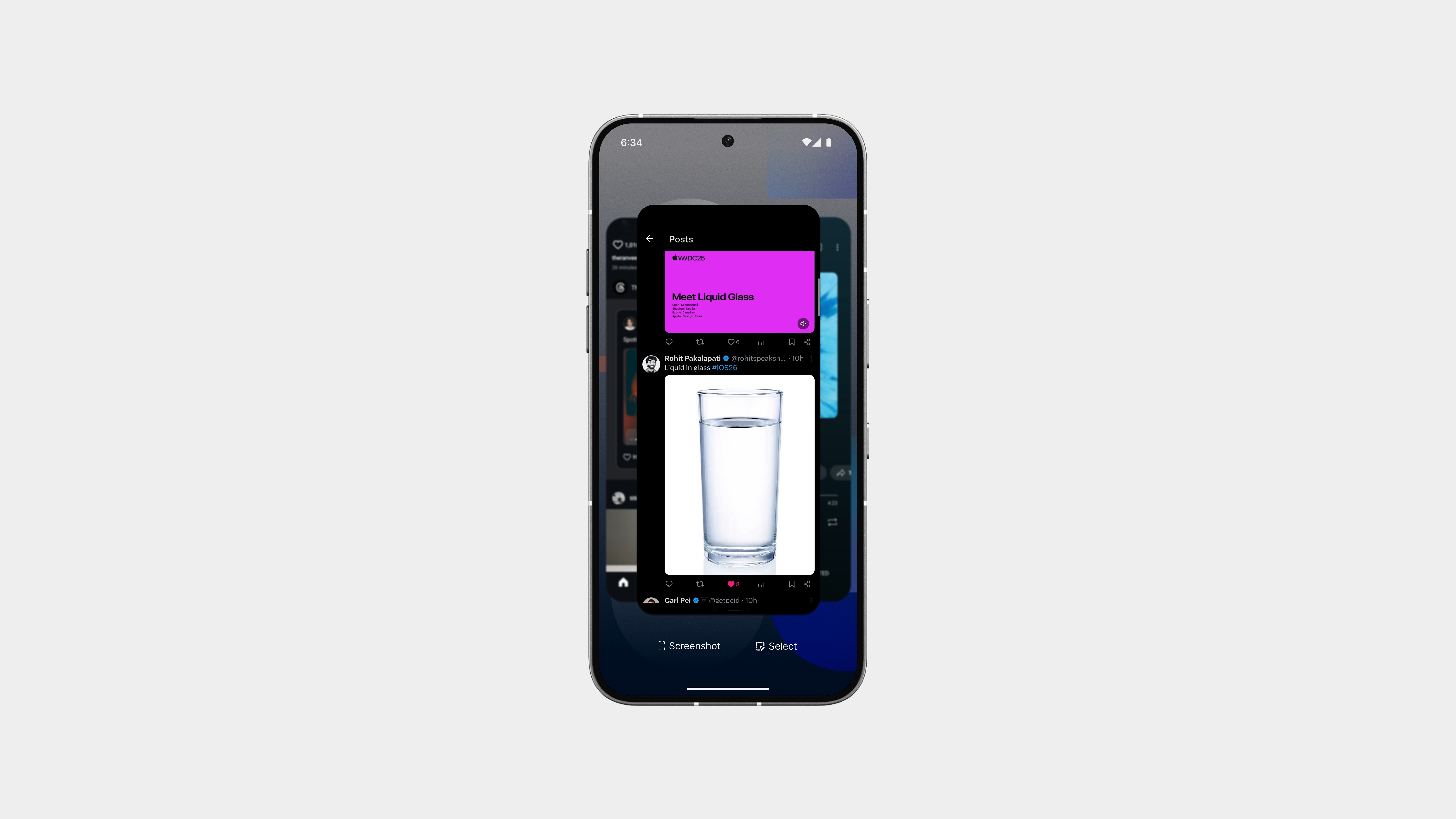
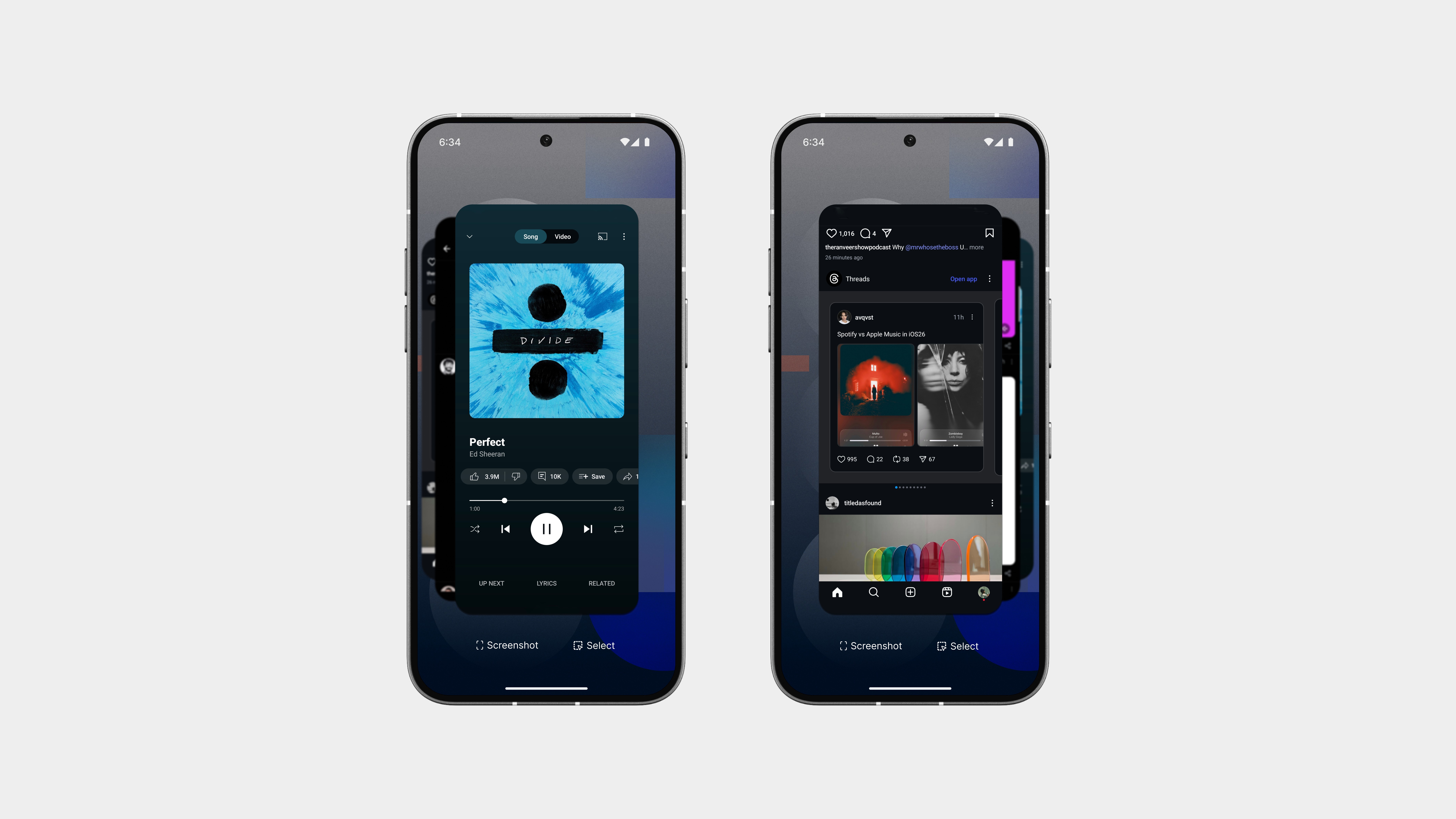
The Switch Apps page has always been one of those places where things tend to get… messy. The old version took up too much space, with wide cards and inconsistent spacing that just felt clunky and bloated.
This redesign takes a totally different approach, clean, stacked, and structured.
Instead of stretching across the whole screen, apps now appear in a tighter vertical stack. Each card is slightly overlapped in layers, letting you see more at once without feeling crowded. The focus is on clarity, not clutter.
You can swipe through them easily, close what you don’t need, and even jump into split-screen mode smoothly. Everything feels lighter, faster, and more intentional.
Icon Pack Alingment
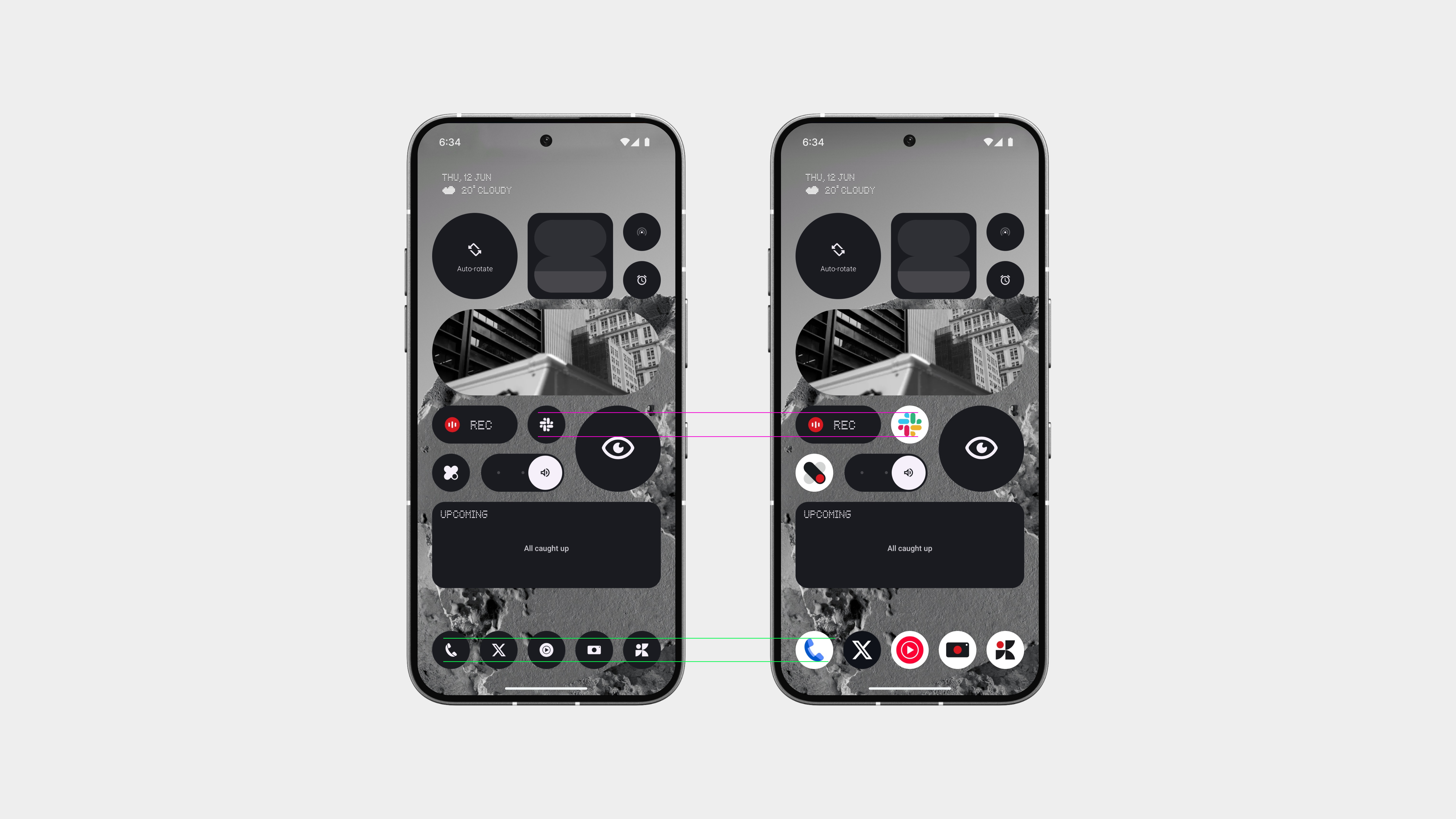
I love the direction you’re taking with the distraction-free icon pack, it’s clean, minimal, and really aligns with the overall design language. But here’s the issue: when the icon pack is applied, the icons get noticeably smaller.
Without the icon pack, the size is perfect, clear, readable, and easy to tap. But as soon as apply the pack, everything shrinks, and that hurts usability. It’s harder to find out apps, and whole layout starts to feel slightly off.
The minimal look is great, but not at the cost of clarity or comfort. This really needs to be fixed, same size, cleaner shape. That’s all it needs.
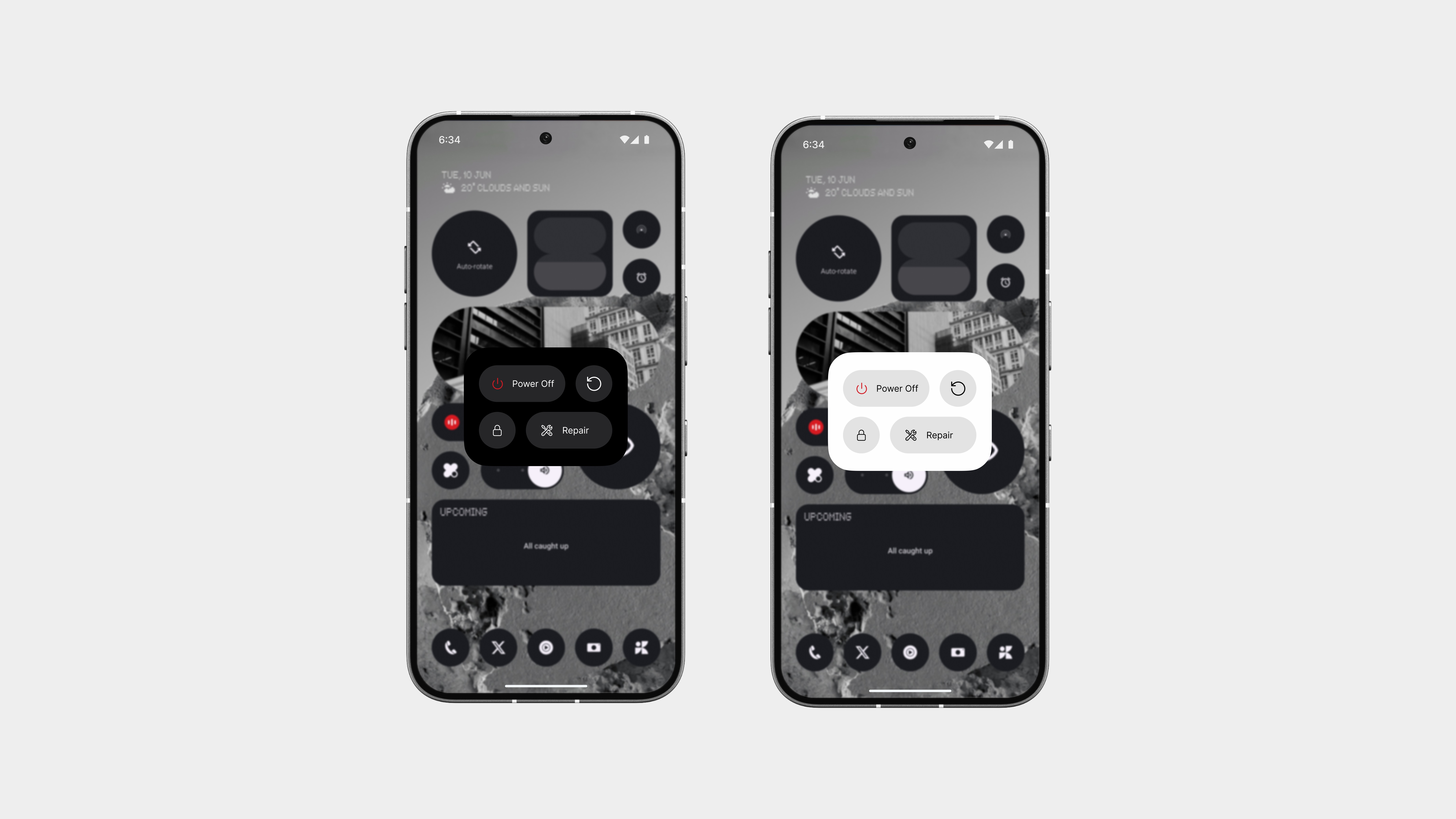
Power Menu
The power menu gets a complete refresh with a clean, widget-inspired layout. It’s compact, balanced, and fits perfectly into the rest of the system’s design. The improved colour palette helps separate each action clearly, without overloading the screen.
And here’s something new, Repair Mode.
If you’re handing your phone in for service, you can enter this mode with a tap. No more giving out your password or worrying about privacy. It locks down your data while still letting the service team do their job.
It’s not just about turning off your phone anymore, it’s smarter, safer, and better designed.
Status Bar Alingment
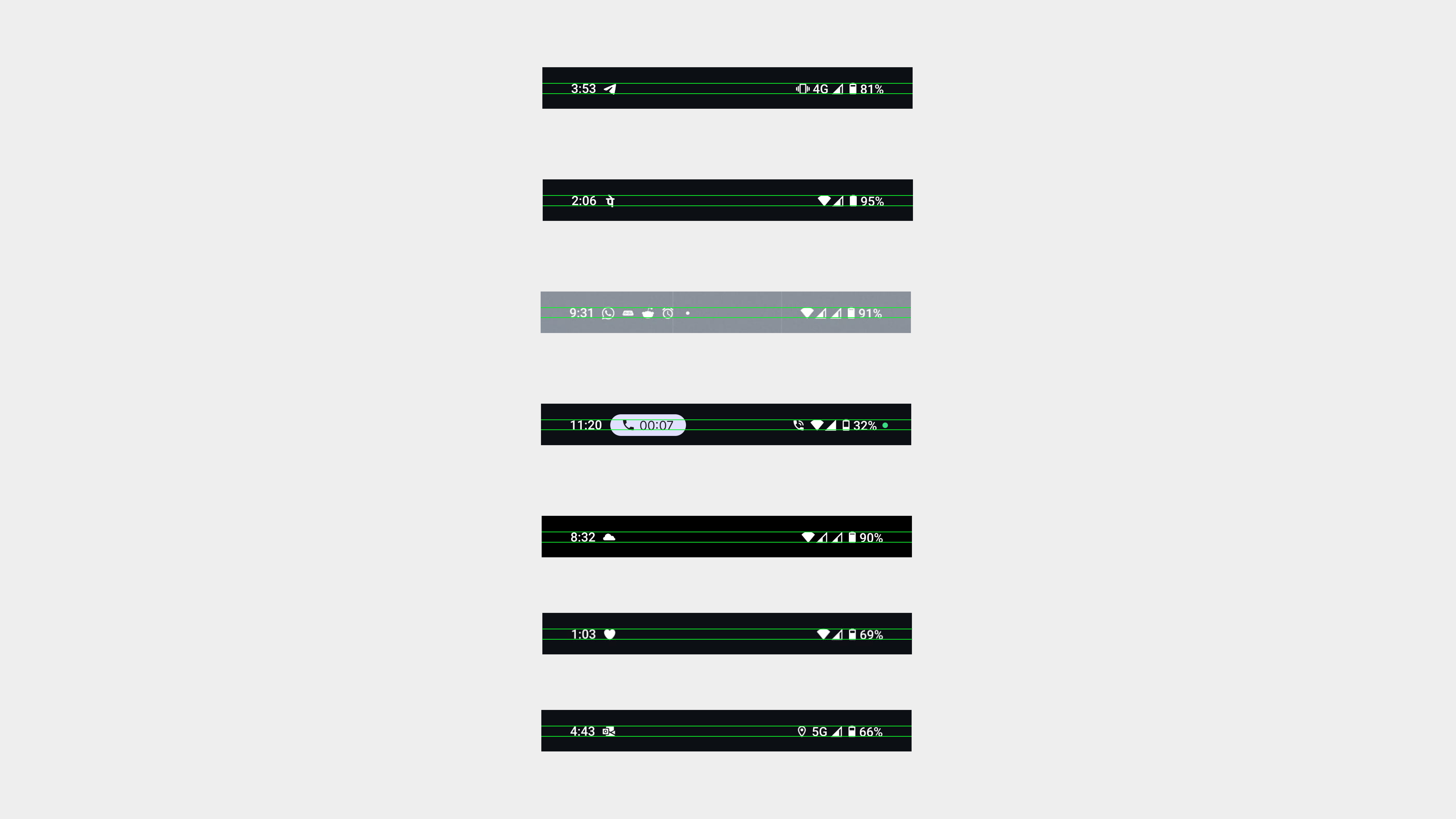
As Akis always says, consistency is key, and that includes the status bar.
Right now, if you really look at it, the notification icons and status indicators (like Wi-Fi, battery, mobile data) are all slightly different in size and and alignment. Some sit higher, some lower, and it just doesn’t feel as polished as the rest of the system.
It might seem small, but details like this are what make a product truly great. Alignment, sizing, and visual balance, they all play a role in how clean and intentional the UI feels. And for a brand that prides itself on design, this is one of those things worth getting right.
Let’s not overlook the small things. They matter more than we think.
New Features
Gesture Superpowers
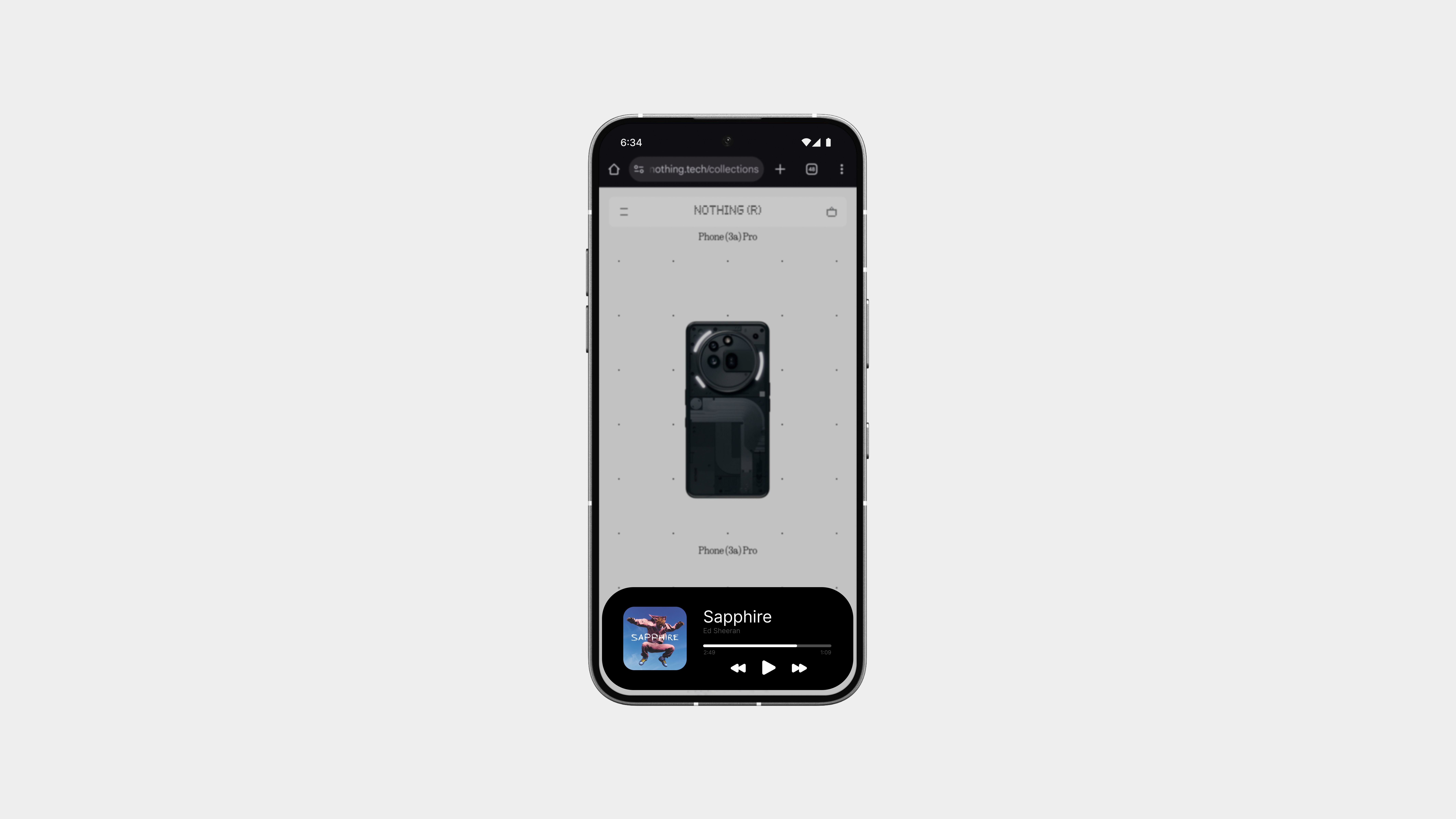
The gesture bar has always been about simple navigation, but it has the potential to be much more.
With Gesture Superpowers, that small strip at the bottom becomes a smart, interactive space. Imagine it showing live activities in real-time, like ongoing music playback, delivery updates, call duration, or timers, ight on the bar, where it’s easy to glance without interrupting what you’re doing.
It adds a whole new layer of functionality without adding clutter.
Subtle. Useful. And always there when you need it.
Charging Feedback
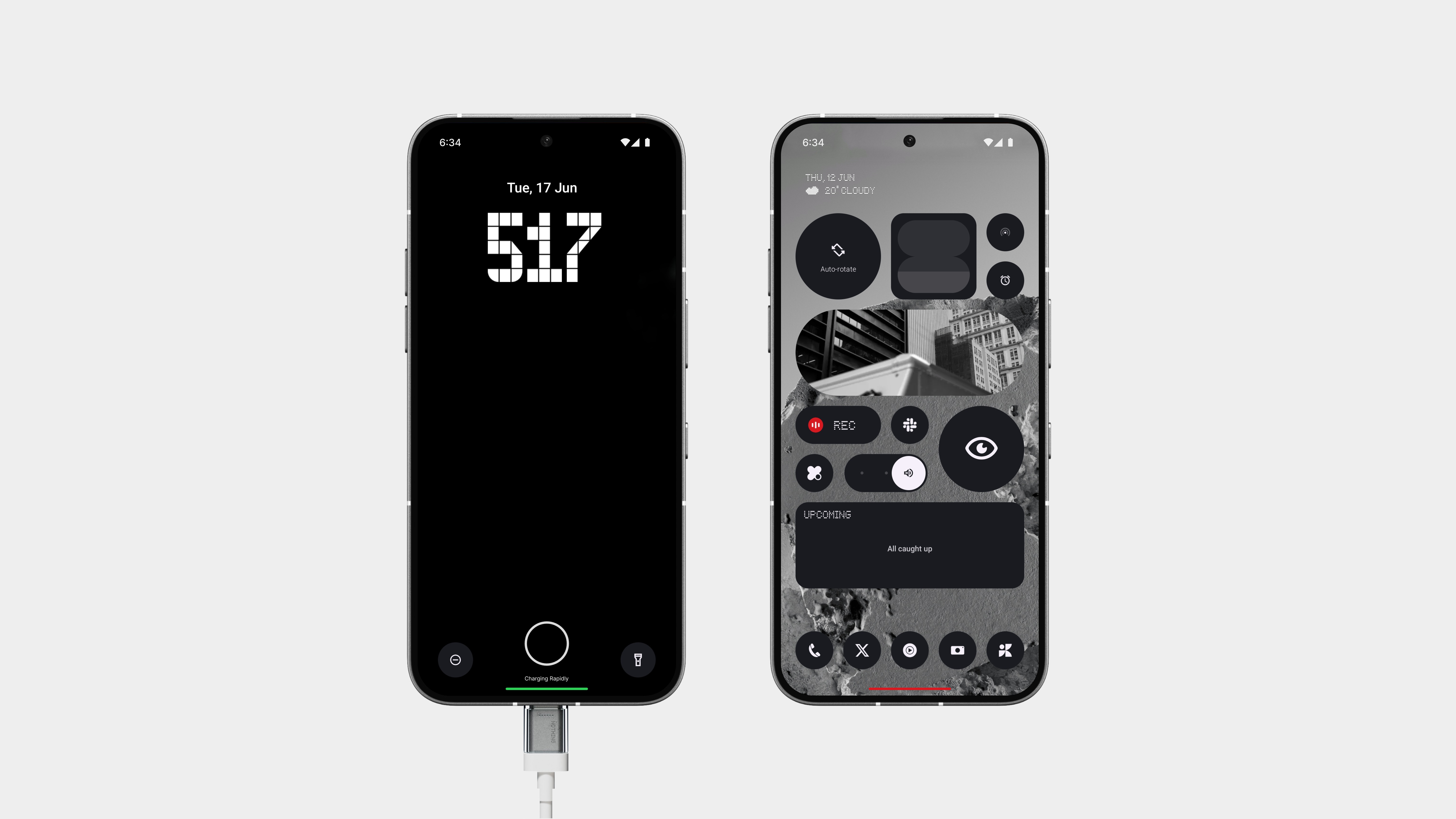
When the phone is charging, the bar glows a subtle yet noticeable green, making it instantly clear that power’s flowing in. No extra animations, no distractions, just a clean, minimal cue that fits the Nothing aesthetic.
And when your battery hits critically low, the bar fades into a deep red, giving you a quiet but urgent nudge that it’s time to plug in. It’s less invasive than pop-ups and far more useful than a small icon lost in the corner of the screen.
It’s the kind of change you feel more than see, adding intelligence to an area of the UI that’s always there but often ignored.
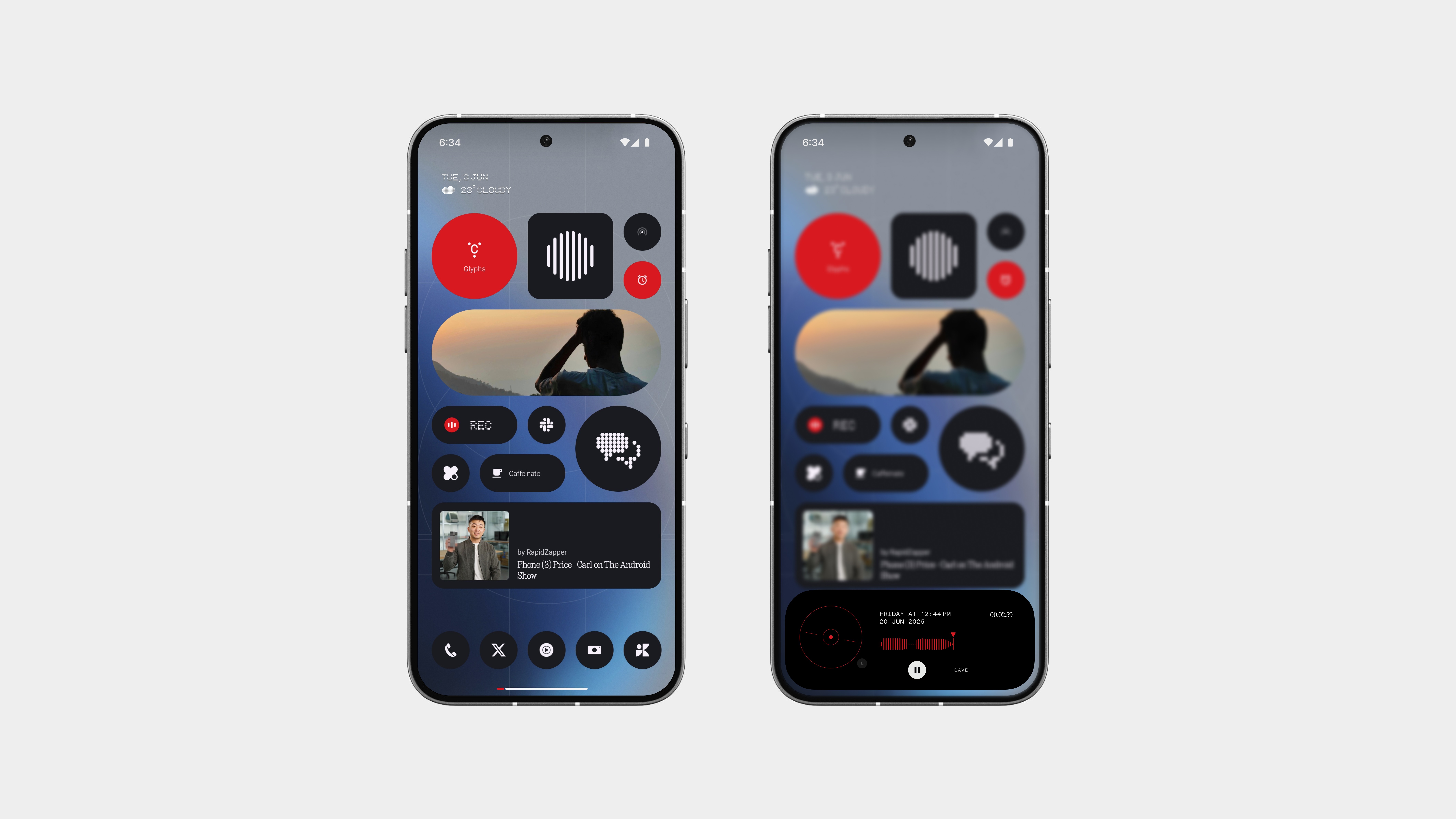
Recording Indicator
Recording should feel effortless, but you should always know it’s happening.
When you start a screen or voice recording, a small red dot appears near the gesture bar, tucked neatly into the lower UI without getting in the way. It’s subtle, intentional, and fits perfectly into the flow of Nothing’s clean design.
Tap the dot, and it expands into a small preview, showing what’s being recorded, along with quick controls to pause or stop the session. No more guessing, no cluttered overlays, just a clear, minimal indicator right where your attention already is.
Delivery Progress
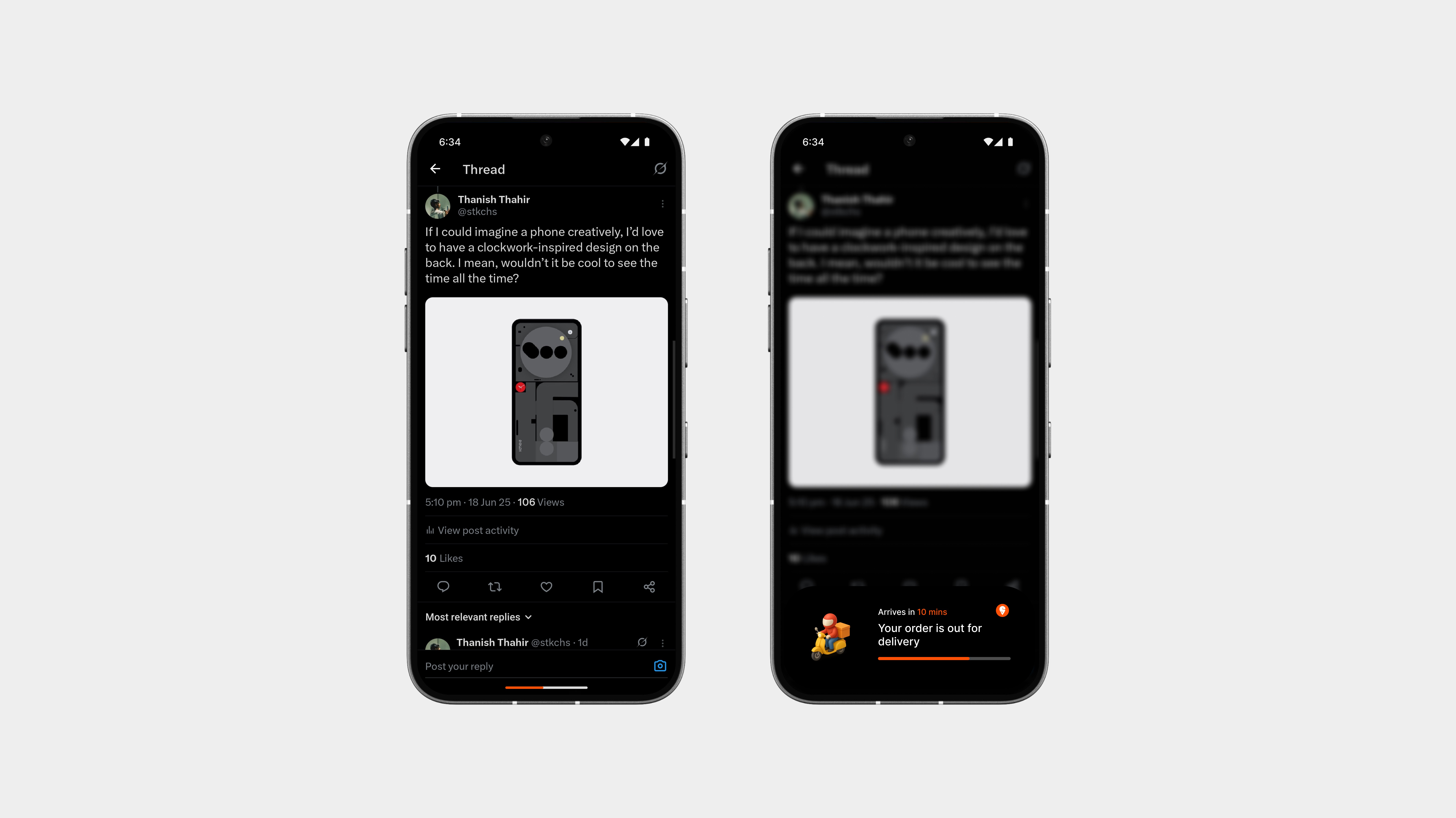
Waiting for food? The gesture bar now lets you track it in real time.
As your order moves from the restaurant to your doorstep, the gesture bar becomes a progress indicator, filling up gradually to show how close your delivery is. No need to unlock an app or check notifications, it’s always just there, quietly updating.
And honestly, one of the coolest things about iOS is the Dynamic Island. But this?
This feels even better. No weird shapes, no visual clutter, just clean, subtle feedback that fits the phone’s design. Especially on the Phone (3), which might even have a rear display for live activities (not confirmed yet, but hey, it’s a cool idea).
And here’s one right on the front. No gimmicks. Just good design.
Docked Mode
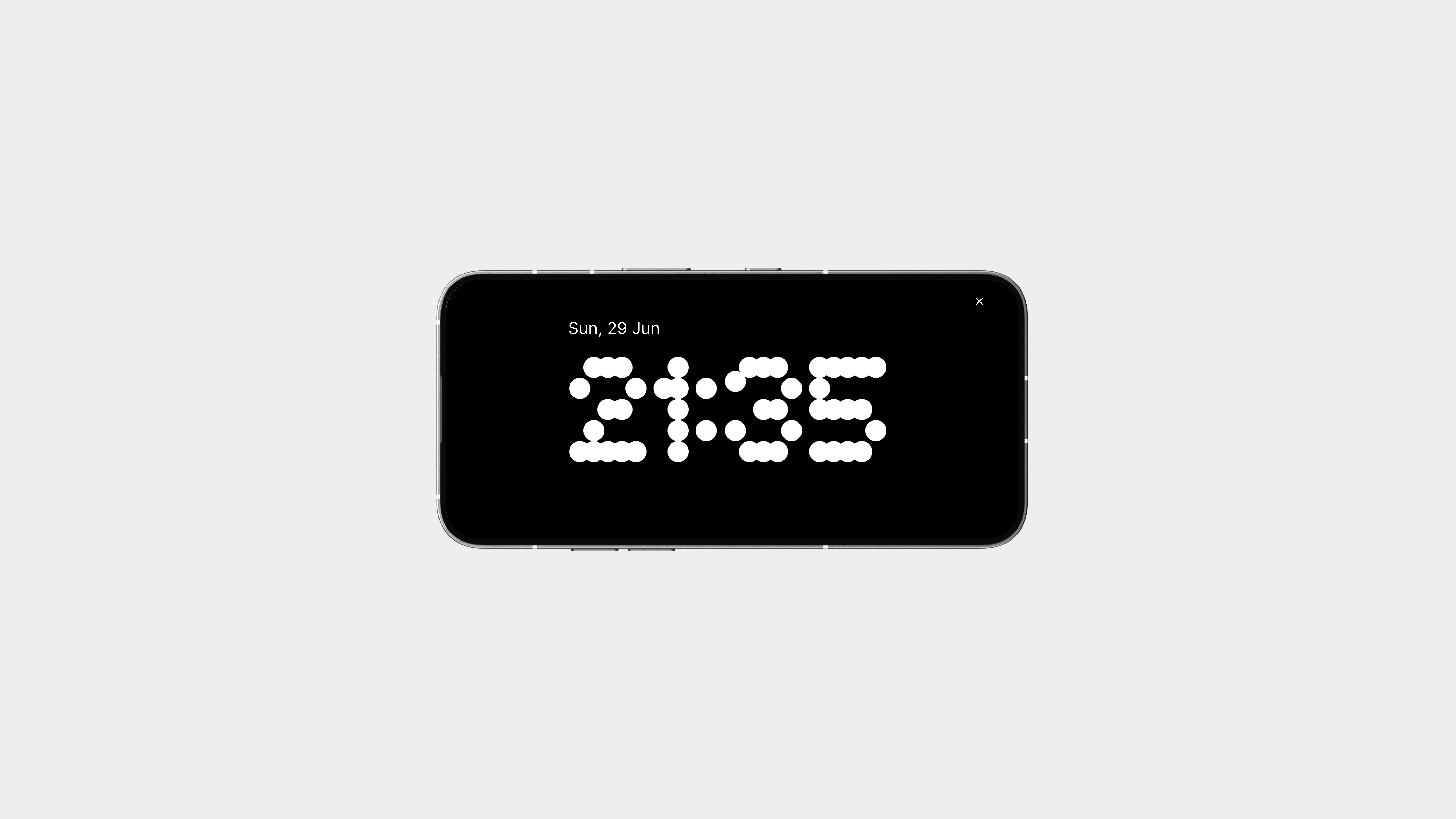
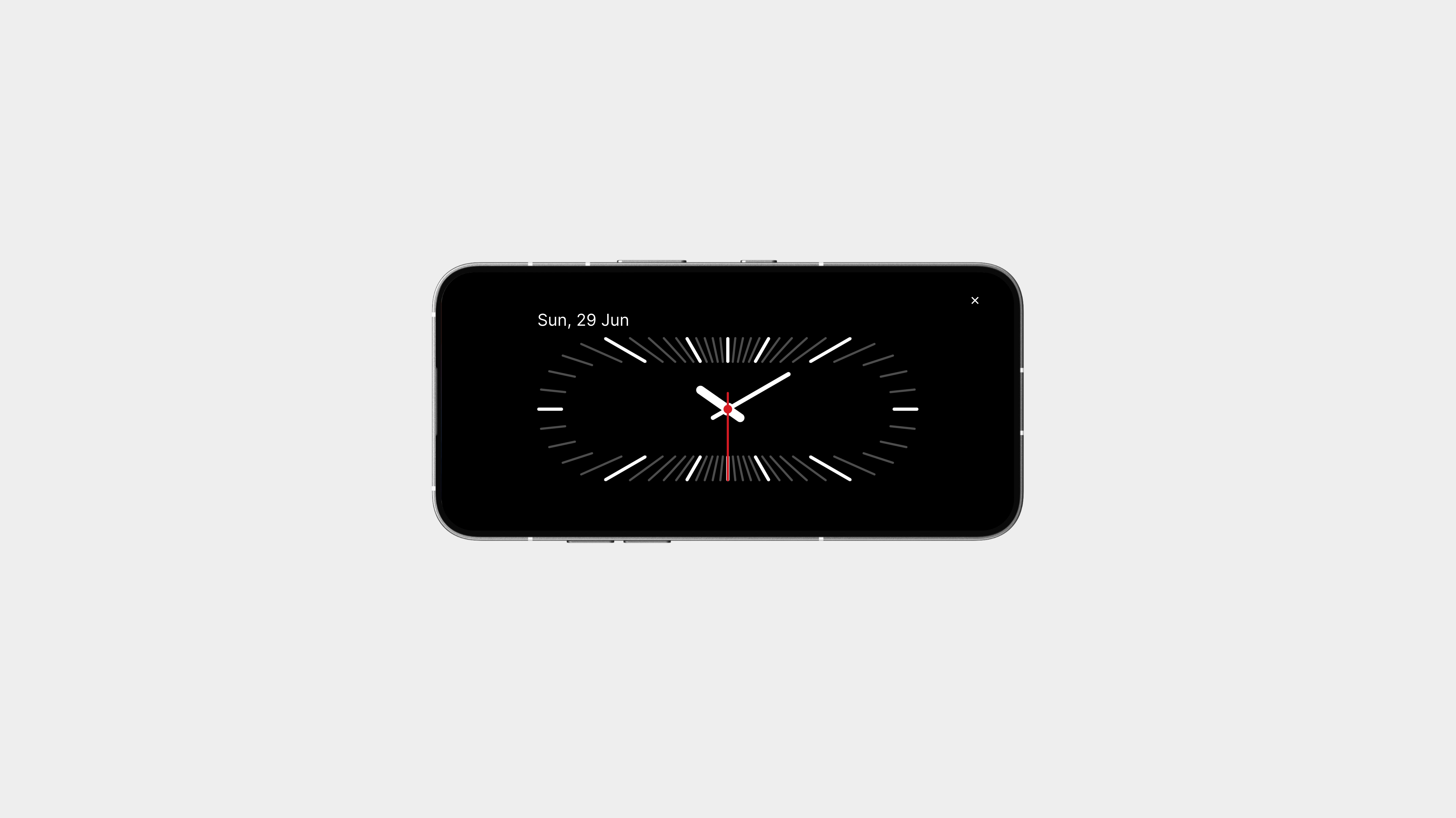
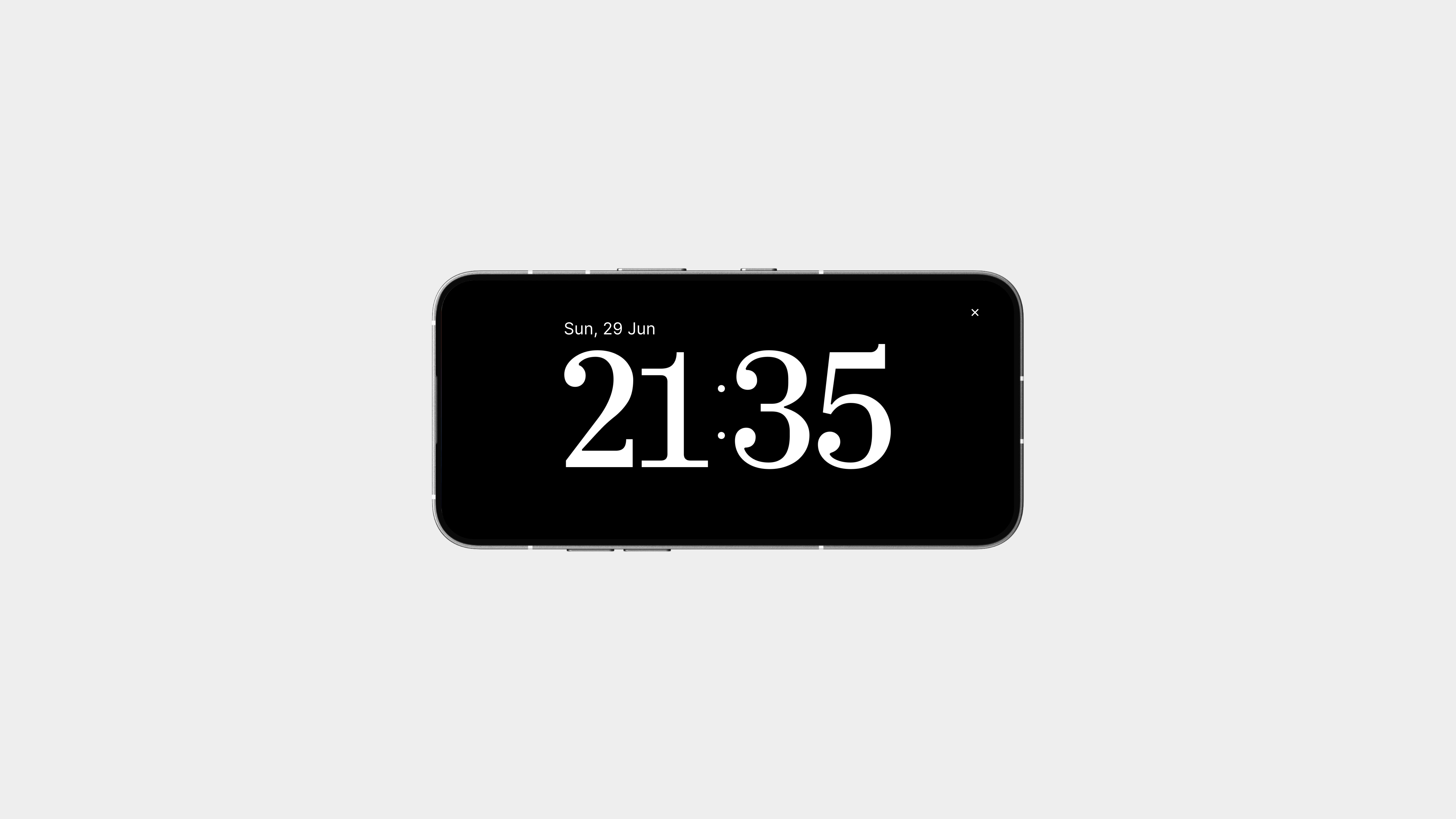
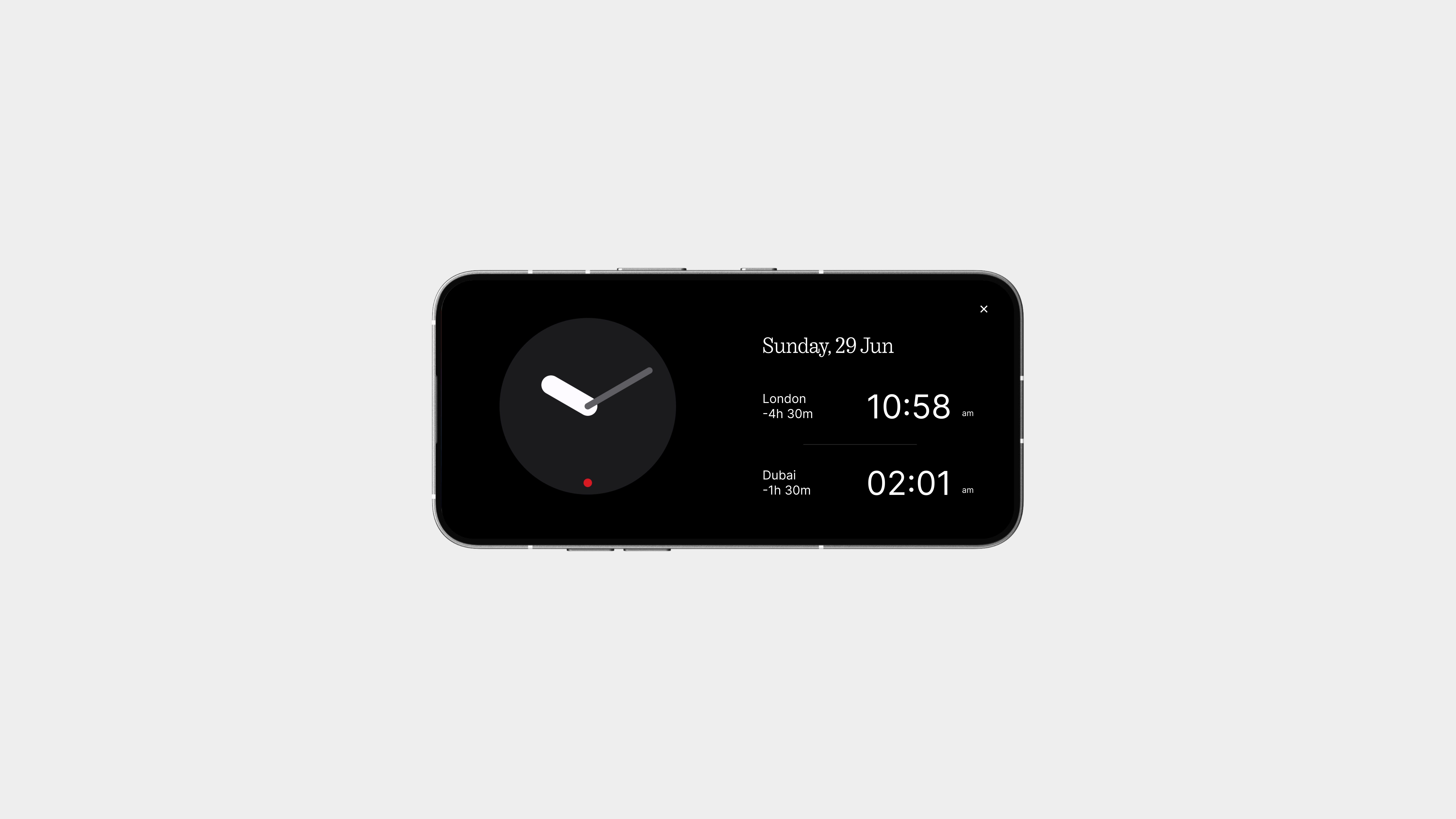
Whether you’re studying, working, or just need to glance at the time while focusing, Docked Mode turns your phone into a beautiful, functional desk clock.
Place your phone in landscape, and the display transforms into a clean, full-screen clock, bold, minimal, and distraction-free.
And just like the lock screen, you can choose from multiple clock styles. Want something bold? Retro? Ultra-minimal? It’s all there. These styles match the lock screen clockfaces, so everything feels consistent, intentional, and well-designed.
Stickers on Lock Screen
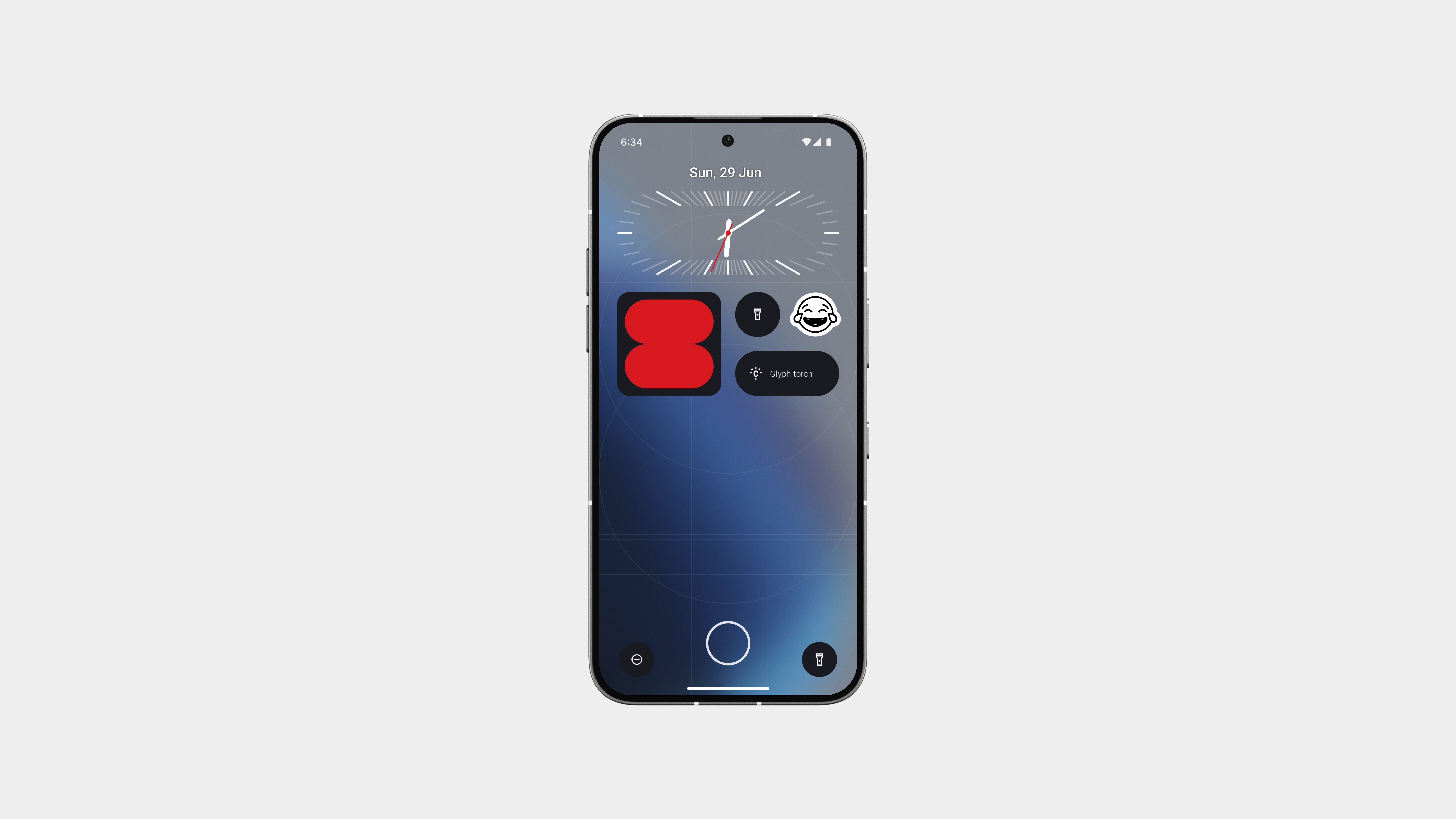
Your lock screen just got a little more you.
With support for stickers and emojis, you can now customise your lock screen with expressive little touches that reflect your mood or personality. These aren’t loud or flashy, they’re designed to fit the aesthetic, all in black and white, straight from Nothing OS 3.0.
You can place them anywhere on the screen, stack a few together, or keep it subtle with just one. They’re minimal, clean, and honestly, they look dope.
It’s a small detail, but one that makes a big difference.
Lockscreen Presets
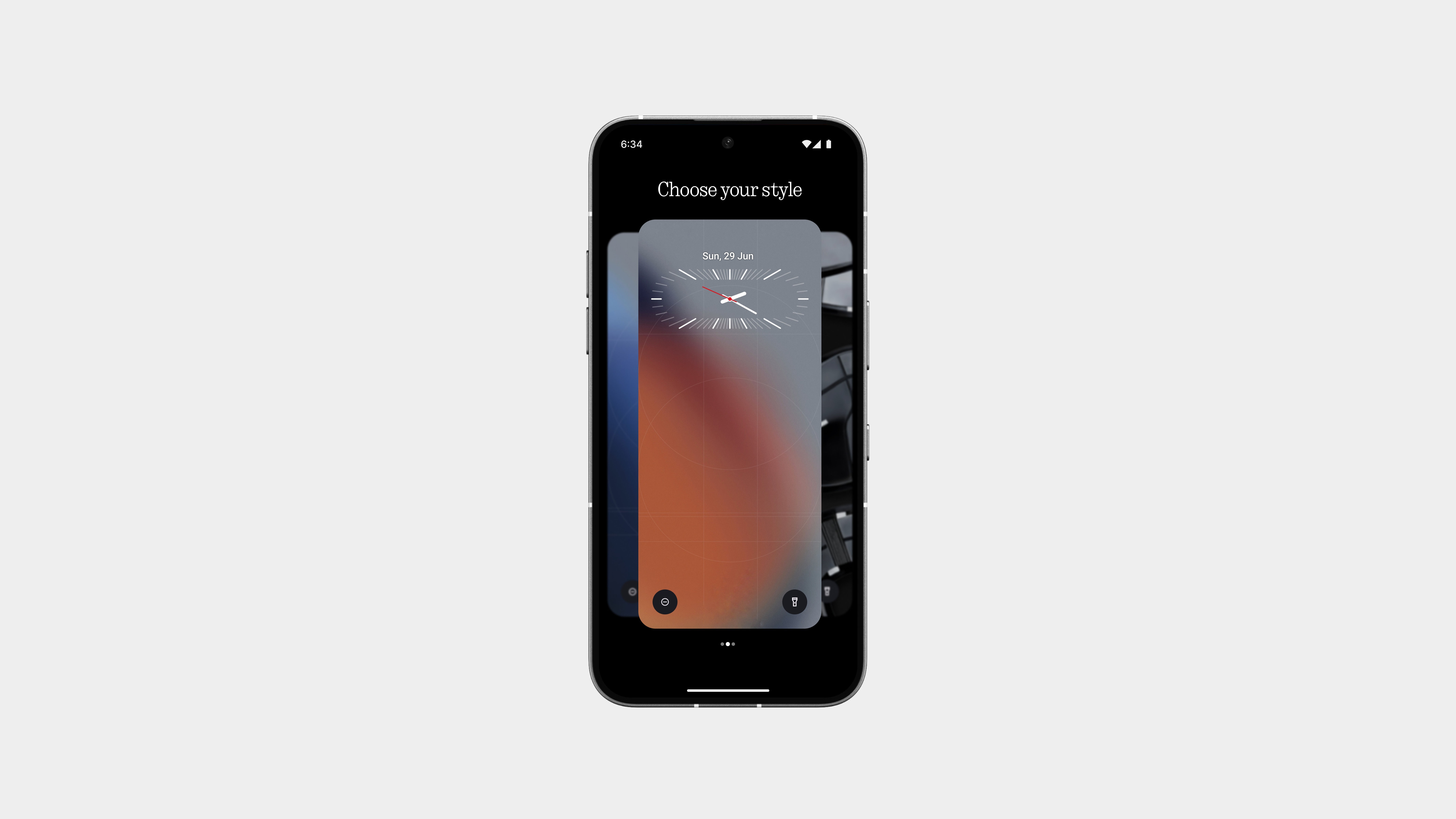
Sometimes your phone should match your mood, and now it can.
With Lockscreen Presets, you can save your favourite styles and switch between them effortlessly. Whether it’s something bold for the day, calm for the night, or clean for everyday use, you’ve got the freedom to customise and return to what feels right.
Each preset can include your chosen clock face, layout, wallpaper, and font, so you’re not starting from scratch every time. Just pick, apply, and you’re good to go.
Gesture Controls
The Essential Key already proves how useful physical interaction can be, but let’s take that even further with gesture controls, specifically when the screen is off.
Instead of swipes or overly complex inputs, keep it simple with press-based gestures:
Single press to play/pause music
Double press to skip tracks
Long press for essentials like the flashlight or even launching the assistant
No need to wake the screen, no awkward motion gestures—just intentional, physical control that feels natural and reliable.
It’s the kind of quiet feature that adds a huge amount of everyday convenience, whether you’re in your pocket, on a walk, or just need quick control without touching the display.
Find My Nothing
Nothing is building an ecosystem, phones, earbuds, accessories, and it’s time that ecosystem had a proper device-finding system to match. A native Find My Nothing that works across all your devices, even when they’re locked, offline, muted, or in another room.
Right now, we have to rely on Google’s Find My Device. And sure, it exists, but let’s be honest:
It’s clunky, slow, inconsistent, and honestly, it just doesn’t feel like it was made with the user in mind.
Nothing could do this so much better.
A clean interface that fits the design language.
Precise location tracking that actually works.
Optional sound alerts.
And maybe even proximity indicators to help you find a device when it’s close but not visible.
If someone misplaces their earbuds, or a phone slides between couch cushions, or a bag with your device inside goes missing, you should be able to locate it confidently even when powered off.
Better Security
This is seriously needed.
Right now, if someone steals a Nothing phone, they can reset it and use it without any consequences. This security gap is alarming.
Apple’s iPhone requires the owner’s iCloud password for reset, providing real protection and preventing stolen phones from being used.
Nothing devices should offer similar security.
We need:
- A reset protection system linking the device to the owner’s account
- A mandatory login after reset to access the phone
- A clear status indicating the phone is locked and reported lost, making it unusable to others
This isn’t just about software; it’s about trust. I should know my phone is still mine, even if it’s lost.
Please prioritize this. It’s not optional; it’s expected.
Deep Modes
It’s time for something more sophisticated than just the “Do Not Disturb” feature.
With Deep Modes like Focus, Sleep, or even custom ones, your phone can adapt to your specific needs. These modes can automatically cut off calls, silence notifications, dim the display, and even send auto-replies.
Whether you need to study, sleep, or work out, simply switching to the appropriate mode will handle the rest.
The key is control, peace, and staying present, all without the hassle of constantly digging through settings.
This is one of those things that once you have it, you’ll wonder how you ever lived without it.
That’s pretty much it.
This has my whole heart, honestly some of my best work yet. Thank you, community, for getting me here and inspiring me. That’s pretty much it. What goes up must come down. Might be my last post… or maybe not. Let’s see what the future holds.
Love you all.
Until next time - peace! ✌️