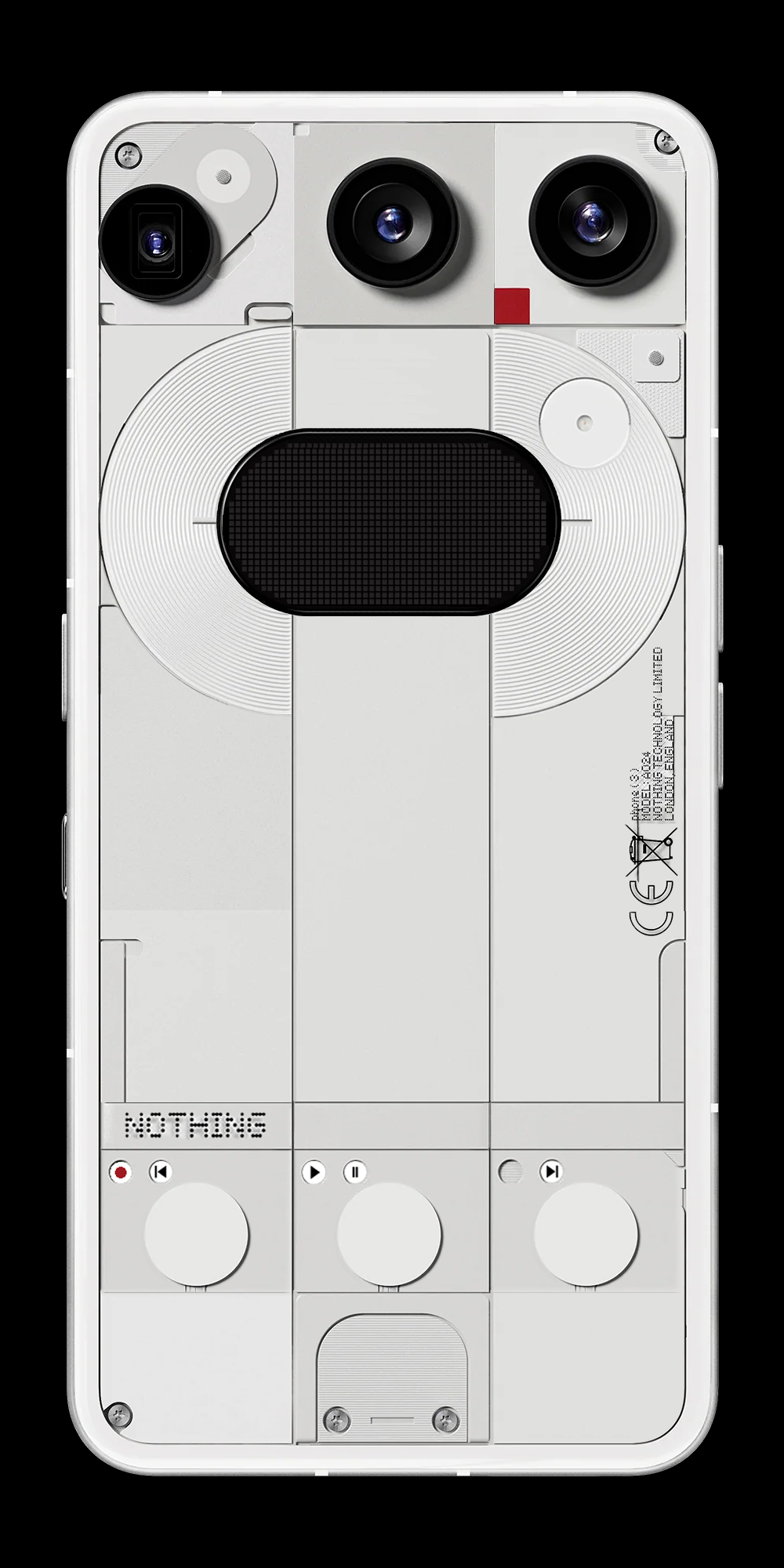
So today i spent some time on photoshop to work out an idea i had about how to evolve the Phone (3).
In the same way the Phone (2) utilized the same idea (the glyphs) as the Phone (1) and made it more advanced i decided to take some of the features i really enjoyed about the Phone (3) and think about the next step up.
In my opinion a great thing about the Phone (3) is the ability to have some basic phone controls available without using the screen using glyph toys. I would like to expand on that and make more options available without using the screen.
Firstoff i made the glyph matrix bigger, instead of a 25×25 circle grid i upgraded it to a 50×25 grid, this gives it the ability to display longer words as well if that would be needed (think about song titles for example, or written reminders)
The placement of it is more centered in the phone as a nod to the centered cameras of the Phone (2a) and the Phone (3a).
Then to control the whole thing i added 2 more capacitive buttons and moved them all to the bottom of the phone which (designwise) was a little bit empty on the Phone (3).
These buttons have been styled like the buttons on a field recorder, cassette deck or any sort of media player/recorder.
these buttons will obviously be able to start, pause, skip or rewind your media, but will also allow for more in-depth glyph toys and make them more usefull, again working towards the goal of using your screen less, and having less opportunities to get distracted.
I’d be very interested to hear what you think!
