Hey everyone - Thanks for all the great comments on the recent Phone (2a) design story post with Chris! This time I’m sitting down with Frank to get some details on the design story for Ear (a)…let’s get into it!
R - Welcome Frank, thanks for joining me to share some insights - how about a quick intro?
F - Sure - Hi, everyone - I’m Frank. And for those of you who I haven’t met, I’m a member of the Industrial Design Team here in London. Today, I’ll be sharing a bit about the process behind designing Ear (a), a project that I, and many of my colleagues spent a lot of time on.
R - Thanks Frank, so where did the Ear (a) (aka Cleffa) project really begin?
F - To begin with, every time we start a new project, we always think about how we can evolve the Nothing design language. For this particular product, we challenged ourselves to develop the most compact TWS product in our lineup.
Starting with some of our inspirations, the team was particularly drawn by these blister packs and contact lens cases. They’re seemingly quite ordinary products, but we actually found them quite fascinating because the little bubbles house everything inside perfectly, so you can begin to see where the final product’s case got its inspiration from.

R - This is great, I would never have assumed something so disposable or unassuming could inform our industrial design…OK, what comes next?
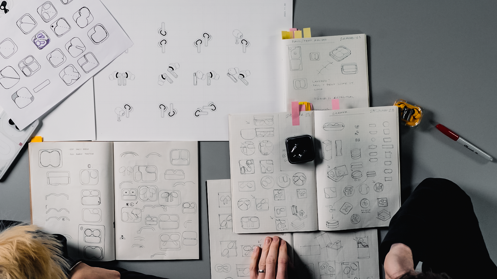
F- We also looked into the best way to align the buds inside a case. As you can see in this image (below), going from Ear (2) to Ear (a), we’ve changed the orientation of the buds. That’s because we found that, by actually putting them side-by-side, you can make the smallest package possible.

From this, we moved onto the early sketches of this case. In this image (below) you can see this area which is where the earbuds would sit. Firstly, that creates the overall silhouette of the case, and secondly helps to inform where the battery can fit and, where the hinges can be placed.

R - Alright, so you’ve worked out the placement of everything to create the most compact package, how do you then bring this from paper into the real world?
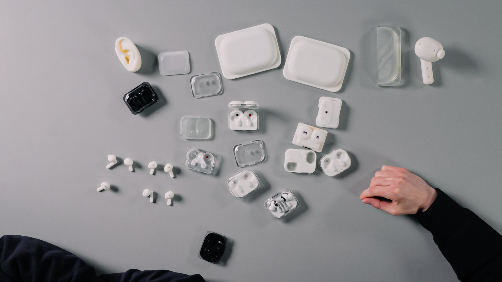
F - We then use the great facilities here at the London Design Studio where we can create resin SLA prints. These are created to test the ergonomics for the earbuds and the prints allow us to try the fit in many different people’s ears. This also gives us the ability to test different stem lengths and how they fit into the case.
We also created a lot of prints to explore options for the charge case; this print here, as you can see, is much larger than your normal Ear (a) case. Sometimes when we’re working with products that are very small scale, we create larger scale versions to check the surfacing and refine details that we may have otherwise missed.
I can’t stress enough how important it is to prioritise making and prototyping. Here you can see only six out of hundreds of prototypes that we made. We wouldn’t have arrived at the final result if we didn’t make so many models!

R - I love seeing these giant versions! But they’re all white at this stage, when do we introduce colour in this process?
F - Once we get to a place that we’re happy with, we can begin looking into the colour, materials and finishes of each, of each component. We explored lots of options, we and our team worked very closely with our suppliers to get each detail correct. For example, getting the FPCs (Flexible Printed Circuits) really white and not yellowing, to ensure the best final outcome for the users.

R - With all those tiny, macro-level details considered, it must be important for you to make sure they are celebrated in the marketing?
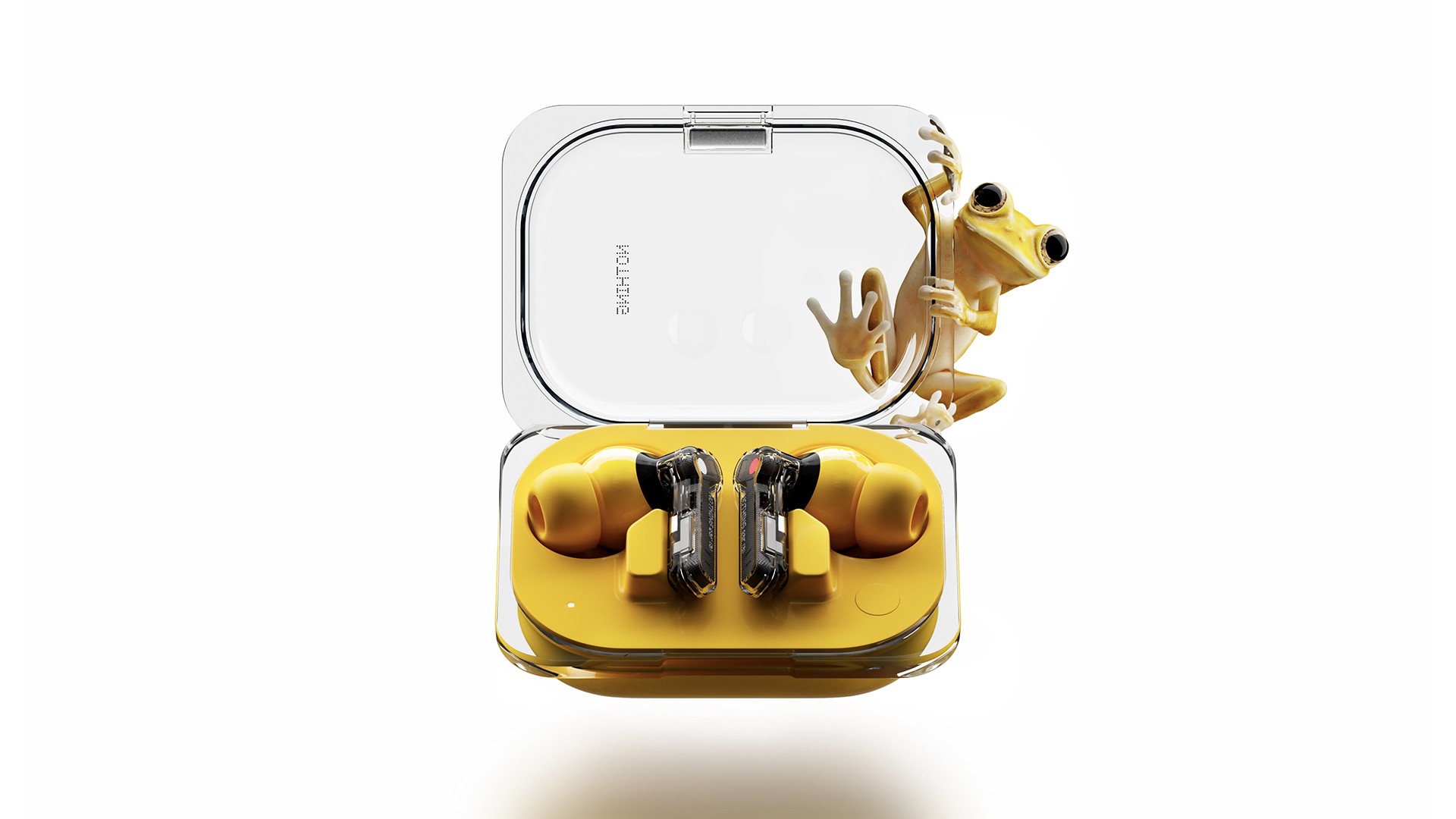
F - We work very closely with the Brand & Creative team here in London to make sure that the renders we create are the best possible representation of the final product. These are then used on product packaging, but also any of the assets that you see online or in print.


R - Frank it’s been a pleasure, thanks for telling us a little bit of the process!
F - Thanks, Rob - that was just a quick glimpse of what goes on behind the scenes. I would just like to thank everyone at Nothing that was involved in this project - it was a really good experience. And, the end result looks great. So well done, everyone!
Another insightful chat there with our ID team there - we’ll try to keep doing these with future products! 🤩
The accompanying images to this conversation were taken from a video with Frank and Adam on our YouTube - be sure to check it out for more info on the design of Ear (a)!
What’s your favourite design detail of Ear (a)?
See you in the comments below! ⬇