Check [Post #12 for Ver.2 Image]
Hi, I’m Jun, and I’m a UX designer. I’m posting for the first time in this community. I’m a fan of Nothing Brand, and I use Phone 1 daily. I can’t wait to use Nothing OS 3.0.

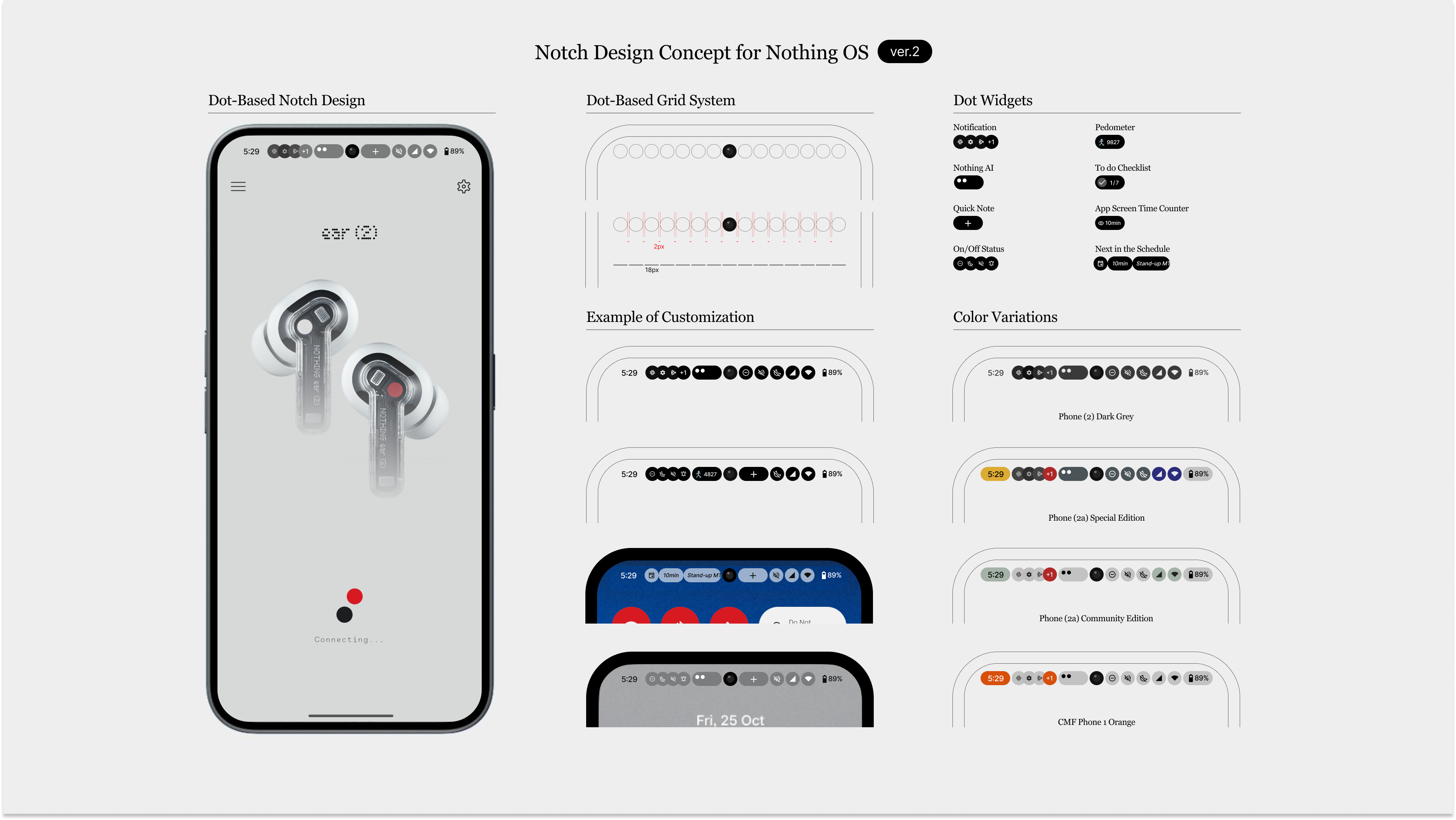
Recently, I encountered some discussions about reducing the use of N-dot fonts. As a designer, I think the N-dot font shouldn’t be used frequently in the UI. However, I also believe it’s necessary to communicate the brand through UI.

So, I want to suggest the new Notch Design Concept for future OS updates. What do you guys think?

Removing notification icons
→Align with the concept of reducing distractions from the phone and making the device feel like “Nothing”

Dot-grid Notch
→Using the dots as a grid, humbly communicate Nothing’s visual identity. Also, it blends the camera into the UI design.

Would love to hear your feedback! Thanks!

    I like this design, it looks clean and simple and importantly, easy to understand. My worry with removing app notification icons would be that you might miss something important, and/or need to check your notifications panel a lot more often as a result. What are your thoughts?

      adbo While I get your sentiment with the removal of app notification to further buttress the nothing philosophy, that will be overreaching and over-simplification. Granted, Glyph can act as a notification indicator, but how feasible is it to keep flipping my phone to check for notifications? your guess is as good as mine. Whilst the opportunity to contribute as a community member is available, Nothing still needs to keep to certain traditions that distinguish it from others.

        Even though I respect the UX exploration, I think that UXwise this is not a good move, and that feels more like a UI experiment.

        For years and years we have been trained to look left to quickly eyeball the clock, instead in your concept you have to actively look for it, making me feel uncomfortable.

        I guess the hierarchy of the informations makes no sense displayed in this way.

        I’m sorry for being so explicit when expressing my POV, but I feel that honest feedbacks are the best way to show respect, much better than the ones who just claps their hands.

        I would love to see more iterations of this concept ❤️

          Looks clean, and this is a well produced concept. Well done!

          I agree with other thoughts, with regards to how it would change behaviours to viewing notifications and the readjustment to where we have learnt certain UI elements to live, like the time.

          My concern, however, is the spacing next to the centre camera, it all feels a bit too busy for me. Something that is nice about the notifications being to the left of the camera, and the status bar to the right, in its current form, is a nice separation from each other.

          Keep up the great work! 🔥

            I am an amateur when it comes to ux design, but as Ealesy101 said, I find it strange that the same type of icons are separated by the front camera.

            I think your concept would be a good idea if the camera were embedded in the screen.

            Keep up the good work.

              JunFunakawa

              I love this concept..

              Aligning notifications with camera notch and only allowing notifications ont he lock screen, I would love to have these features on my phone 2

              I like this quick settings transpent on the top looks very simple and clean, little changes that makes whole design more functional and great.

              JunFunakawa welcome to the forums. Maybe it’s me but I’m not quite understanding the concept? Is it that the notification icons are simply center aligned to the camera?

              ver. 1 → What if top-notch can communicate Nothing’s identity?
              Thanks to the community’s feedback on this post, I was able to refine the concept. Thank you so much!

              Improvement Points in Ver.2

              1. Revamping the UX of the Status Bar
                Everyone has different statuses they want to check frequently, such as their phone, earbuds, body,(watch) or car. What if we made it possible to customize these freely?

              2. Balancing with the Traditional Status Bar Layout
                Fixing the time to the top left and the battery to the top right ensures the UX remains intuitive while introducing new elements.

              3. Synchronizing Hardware Colors with the UI
                Even when the device is being used face-up, users can feel the personality of the hardware through its design integration.

              4. Enhancing the Functionality of Space
                Adding a shortcut to notes, an AI assistant that stays within the user’s field of view to encourage usage, and more. If you have any additional ideas, feel free to share them!

              What do you guys think?

                This is by far one of the best concepts I’ve seen on this community! I love the idea. I’m not a developer at all, so I don’t know if this would be possible to carry out on Android, but it would definitely bring some extra identity to the brand.

                I really hope the developers see this and take some notes, but maybe they are busy developing widgets, or trying to find new ways to avoid addressing the dot fond controversy 🤔

                Merged 2 posts from [Updated]Notch Design Concept ver.2.

                Too distracting right? It looks cool but we need to think of day to day practicality of UI/UX.

                I almost feel bad to reply, I see the enthusiasm and the effort but in my opinion, from a user experience perspective is a big no-no.

                All those icons on status bar make me feel anxious, and adding actions directly on status bar may be in conflict with status bar gestures (one and two fingers to drag down the notification panel).

                It is overall good looking, but not very practical.

                JunFunakawa You’re overthinking a lot here. And in the attempt it loses the core value of what it can offer. The approach is good, but keep the key essentials. Also you have to consider its a fairly big display for a one handed use and the icons are quite tiny for the info.

                It’s so clean and defined. This is inside the top tier community concepts, in my opinion.

                And from my POV it’s by far better than the current notification bar, which lacks this style and doesn’t look as professional. Your looks more rounded and visually, it stands out.

                I’ll keep an eye on your next concepts. Greetings.

                By the way, could you share this top notch as a png? I want to edit it into my homescreen, to visualise how kewl it will look.

                Can you share more about the problem you are trying to solve or what new experience you are trying to bring? anyway I really appreciate the effort you put into bringing a new perspective to something that is not evolved for many years.