
If you would like to just see the end result, please scroll to the bottom to see the final design and renders. If however you are interested in the process and my challenges, feel free to read through. The truth is i could write an almost unlimited amount about this project in particular, so it was very difficult to get it as short as it is now, i’ve certainly felt very passionate about this one.
Jumping back into Blender
For the past few months i’ve been so invested in my latest hobby 3D printing, that i’ve almost spent no time in blender making a proper product design and render (3D printing is amazing by the way and i encourage everyone interested to get involved) I recently got a notification on my phone that it had been 2 years since i posted one of my first phone concepts, this was very shortly after i joined the Nothing community.

^ This is the render
Seeing this, as well as all the buzz surrounding (3a) series as well as Phone (3) really made me want to dive in and show myself how far i’d come since that original render.
Metal, thin, and premium
I decided to start off with some key words; metal, thin and premium. I took a look through some old drawings i had created some time ago for a 2a related project, which i feel i had not given enough attention to at the time, and i wanted to use these as a starting point.

The middle design specifically spoke to me the most, almost giving the effect of a window, peering into the internals of the phone. The only thing i didn’t like was that it almost took on the form of human organs with the ribbon looking like an intestine. I took this opportunity to improve upon the design, and started testing different kinds of metal materials and finishes.
Altering the texture of the frame
At this point i had already started to capture that premium feel and was really happy with the materials that i had chosen. I decided i needed to do something a little different, something that most manufacturers don’t tend to do, and thats alter the texture of the frame of the device. For this i tried out a ribbed look, very reminiscent of the OnePlus X (except the ribbed texture on my concept was much more profound) along with a dip/shallow cutout along the sides of the frame where the buttons would sit.

^ OnePlus X


^ My renders
This finish looks incredibly premium, and would also provide a unique in-hand feel with added grip. I was incredibly proud of these initial test renders and knew straight away that i wanted to continue to build this out, there was just something so satisfying about it.
Im stuck… where is this going?
Fast forward several busy weeks, and i found myself a bit stuck. I knew what path i was on, and i loved my initial material renders and early concepts, but i was struggling to bring it together, especially the cameras. One thing i always stand by is that i will only proceed with a design if i’m passionate about it, and this just wasn’t cutting it. It was at this point i decided to ask a few community members for their opinions on these early designs.
While i did receive some great compliments regarding the materials and ribbed texture, one criticism that these community members shared was that it lacked character, and the glyph was just too simple. So what did i do next? i scrapped it and started again!
Starting over
While starting again can seem drastic, it’s also a chance to start a clean slate and approach your goal from a different angle. Continuing to take inspiration from the OnePlus X and ribbed texture, i immediately started refining the original frame design, making the ribbed elements cleaner, and decided to incorporate some sharper chamfered edges where the front and back glass meets the frame. This was the teaser that i then uploaded to X to gather insights into what colours people would like to see for a Nothing phone. I even decided to mockup some of the colours you guys had chosen.


My initial material tests and renders were really promising. This new path was much more refined and closer to a product that actually felt like it could be real.
The back design
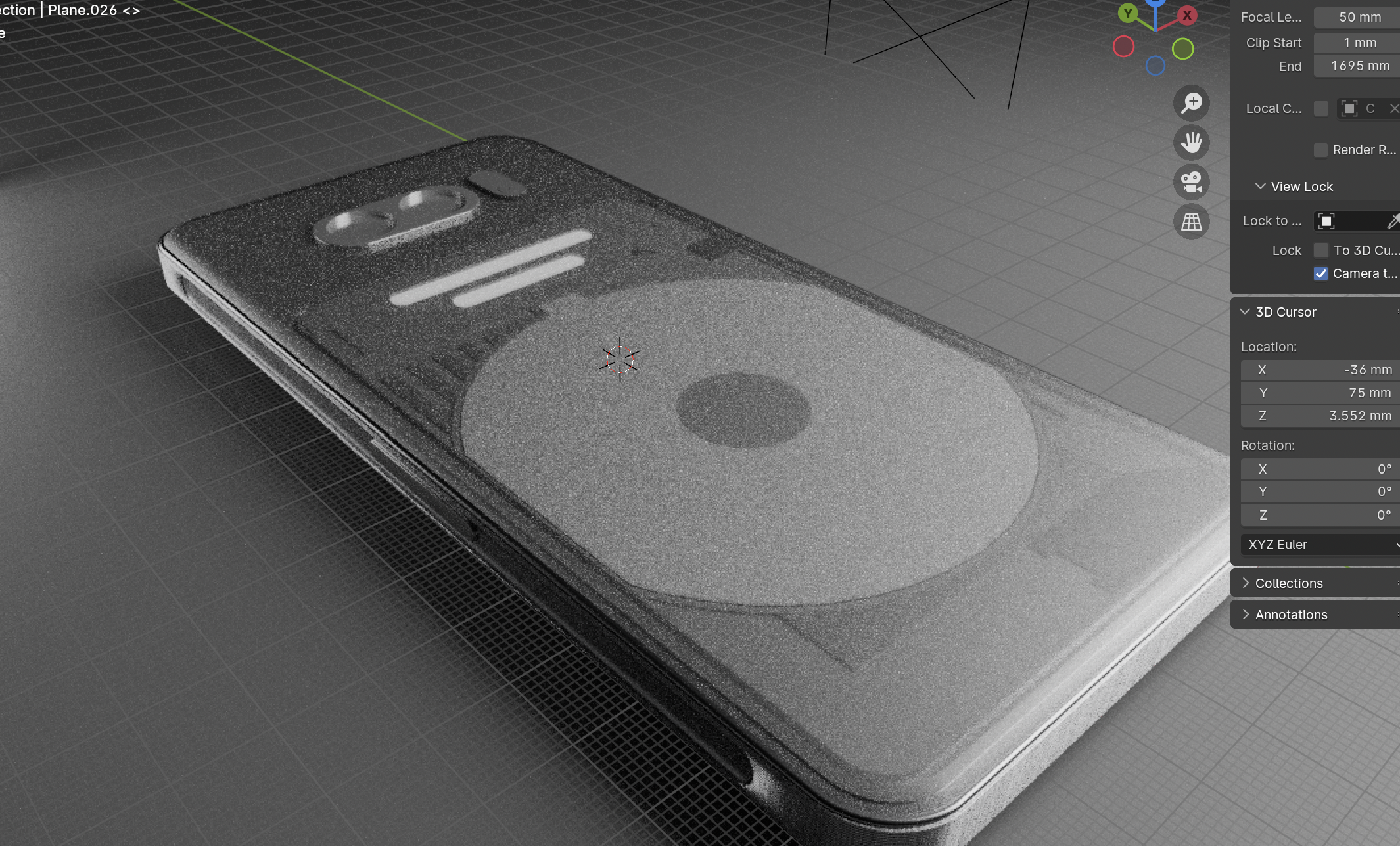
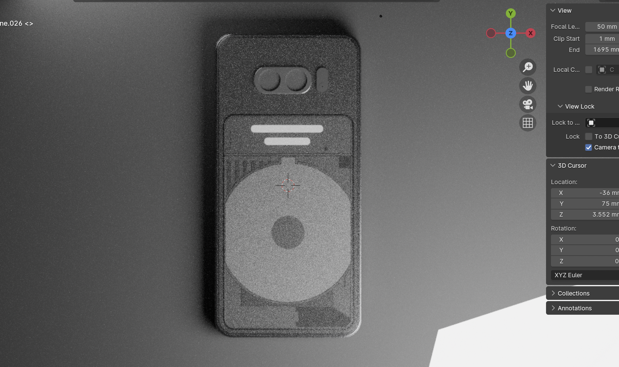
After sitting on these frame renders for a few days and receiving lots of engagement and praise, i decided it was time to tackle the back design. When it comes to Nothing products (phones specifically) this is the main attraction, the make or break, the main event. I knew this part needed my full attention, time, and dedication. The main element i wanted to tackle first was the cameras, i knew i wanted three, and i feel that this is what most people would expect. The actual layout of these cameras took a lot of thought but i settled on a circular camera bump, with complimenting glyphs, but left it blank initially while i decided how i wanted to align the lenses themselves. While in this thought process i started crafting individual pieces and details for the back, taking some inspiration from my earlier drawings to create two distinct sections.


What felt comforting during this phase of the design is that i have a lot of Nothing products around the house, including phones, which meant i could look at them and study all the elements down to the finest details. You can see some of these elements starting to carry over into my design, while still trying to differentiate it as a whole, creating a familiar, but unique design.
This is where i began testing my materials, and the intensity of the glyphs. I would also like to thank @3DPrintedCat for the bump/dot texture that you can see in the main top half piece. For those who know Nothing phones well, you will know that this type of texture is commonly used.

Fine details & inspiration
Over time i began to add the raw shapes that would make up the rear design of this phone. As mentioned above, some of this consisted of familiar elements from previous devices, altered slightly to remain fresh, and some new elements to fill the canvas. The main ribbon and the smaller sub-ribbon form the shape of an R. Inspiration for this came from the Red Rocket logo from the Fallout games, with a little bit of Team Rocket in there too from Pokemon.


If you look closely at Nothing phones, specifically the ribbon, you will see that there is a very fine trace-like pattern. I tried to replicate this but unfortunately struggled. As you can tell with the render, while it did reflect the light nicely, it just didn’t look quite right. I eventually decided to scrap this, but have tasked myself with eventually learning how to do this properly!

Another thing you may have noticed, which was also referenced in a recent Nothing video, is that each phone has a small easter egg element such as Phone (2)'s switch.

Continuing this trend i decided to add my own element, a coin of sorts. This is loosely inspired by the coins we see in the Super Mario games. It’s a simple, yet distinct shape that reflects the light nicely, especially with the chamfered edges i gave it to match the frame of the phone.


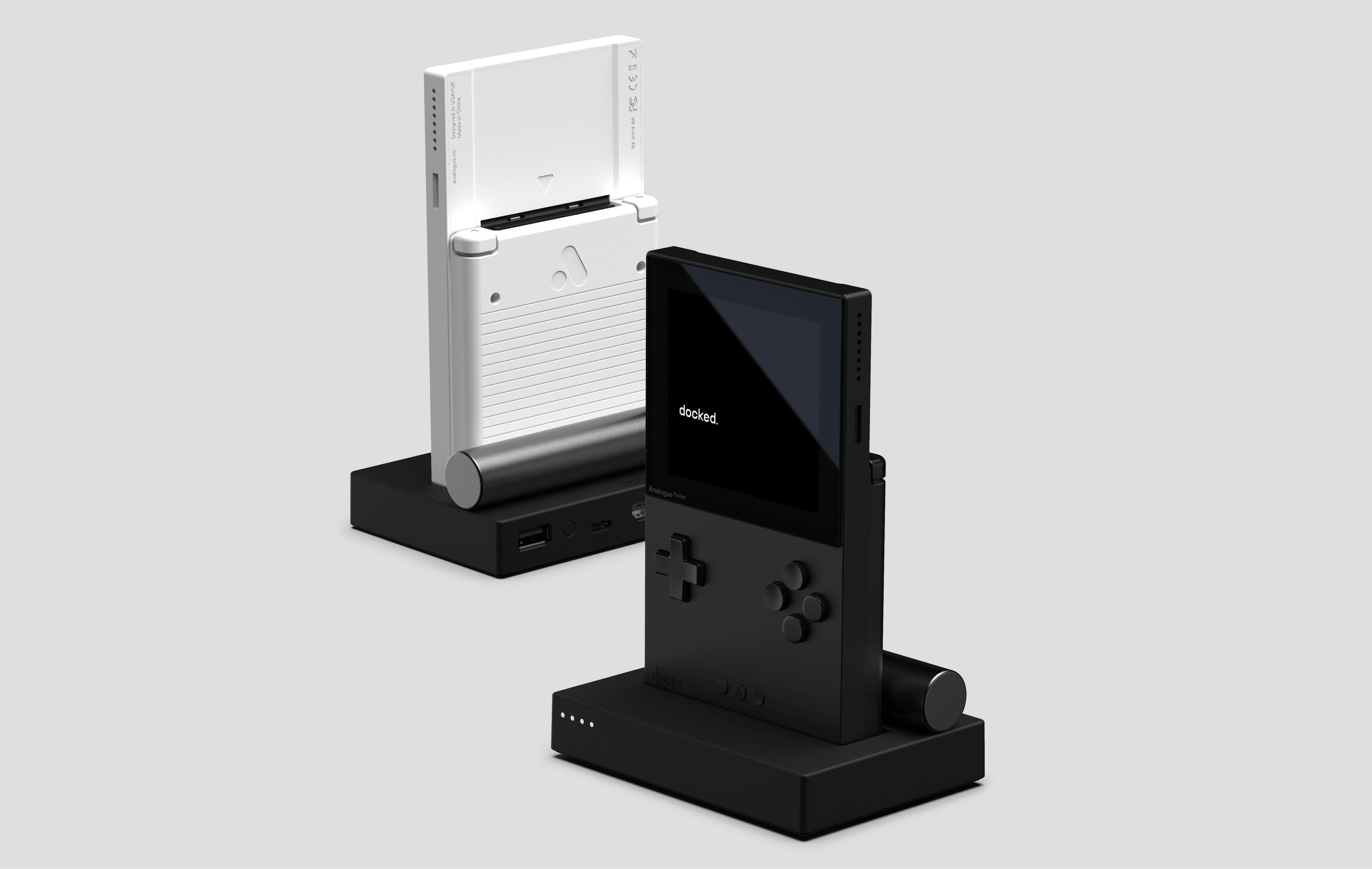
As you can see from some of the previous images, i also finally decided what my final layout for the cameras would be. For this i took inspiration from the Analogue Pocket, specifically Analogue’s logo. This logo perfectly fits three circles, which in my case would be the cameras, and sits neatly in the centre of my circular camera bump.

The camera was probably the most difficult element to make, i just couldn’t seem to model it correctly and realistically. At one point i was planning to just put a screenshot under a piece of glass but ultimately decided that this was not at the level of the rest of the model, or that at which i hold myself to. I eventually came to something that looks effective, but this is something i’d like to practice.
With the frame done, the details in place, and the camera layout decided, i was almost at the end of this project… or so i thought. After talking to @3DPrintedCat again, showing off some of my latest test renders, he gave me a crucial piece of advice “Not a single thing has a sharp edge”. In blender if you create a shape, for example a cube, the edge will be mathematically perfectly sharp, and i had already created a lot of my concept without paying much attention to that fact. At first i didn’t realise how much of a difference it would make, but i decided to go through a lot of the elements, bevelling or chamfering the edges of them a very small amount, in some cases even 0.006mm. The next render i did after that really blew my mind, these changes really did add to the realism, creating highlights, shadows and small glints of light. This can be seen in the below render, especially where the cutouts are and around the edge of the piece.

This single piece of advice had a huge impact, but at the same time i found myself falling down a rabbit hole, and this is where the largest part of the process began. After this point i just kept refining, and refining, and refining, and refining. The smallest details really do make a difference.
As i finally did come to the end, i had moved a few pieces to make them feel more purposeful and connected, i added fine textures to some of the pieces to add to the realism, i experimented further with materials to get the perfect finish, this was especially true with the metallic pieces as i wanted to ensure that they looked the right way under different lighting conditions. The final touch before starting to render out my final images was to add screws.
Final Renders
The theme for my renders was very much in line with my key words metal, thin, and premium. I also wanted to add a bit of mystery and tease the final product before releasing the final images. This involved some fun with cloth physics!


Thoughts since the release of Phone (3a) Series
I started my concept weeks before the unveil and release of Phone (3a) Series, and while there are some similarities, including the triple camera setup in a circular camera bump, and the sharper corners of the frame/display, there are also some additions to the 3a which i wasn’t expecting. The new periscope camera takes stunning photos, the Essential Key paired with Essential Space provides a fun and helpful AI experience, and the design of both phones is truly unique. With these things in mind i definitely want to take more risks with future concepts.
Please feel free to drop your feedback below, and thank you for checking out my latest concept.
