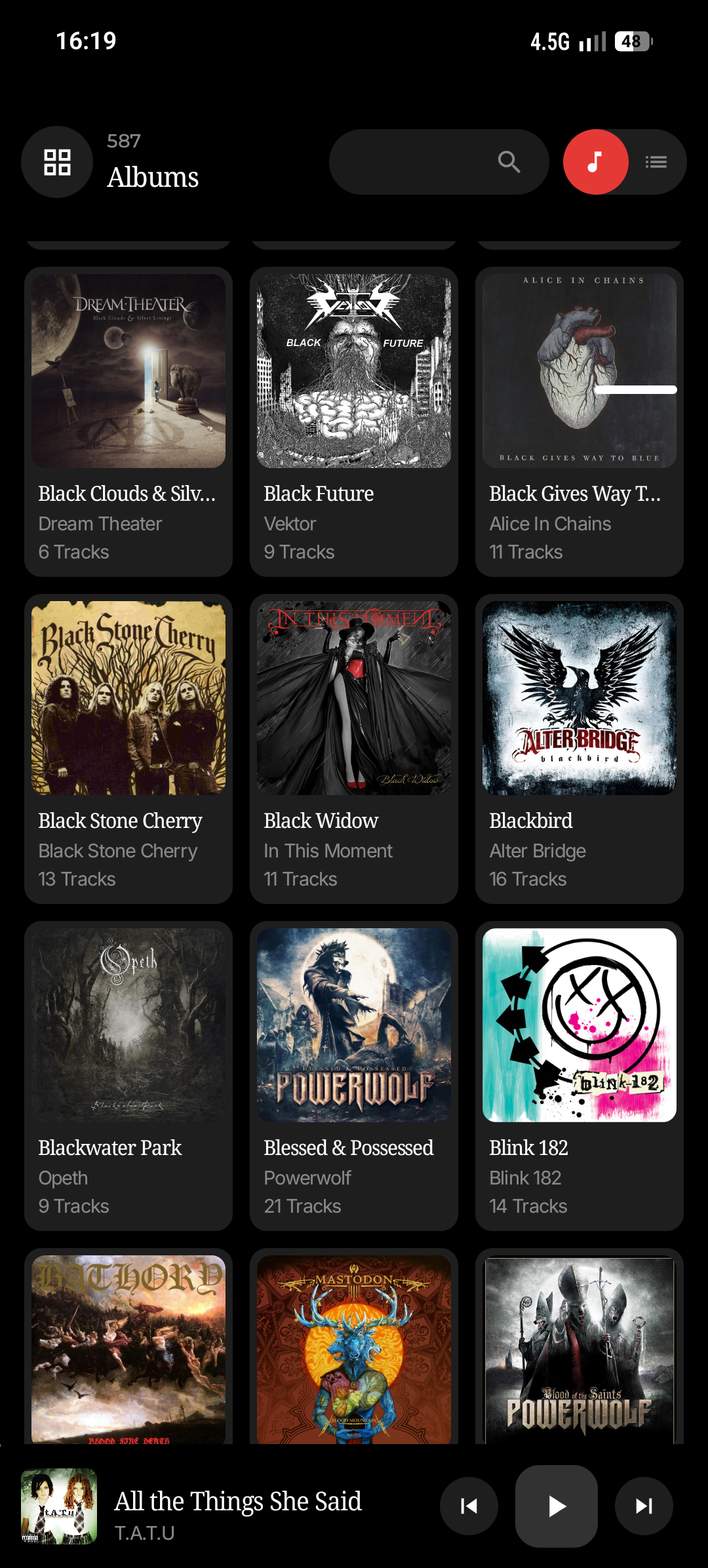
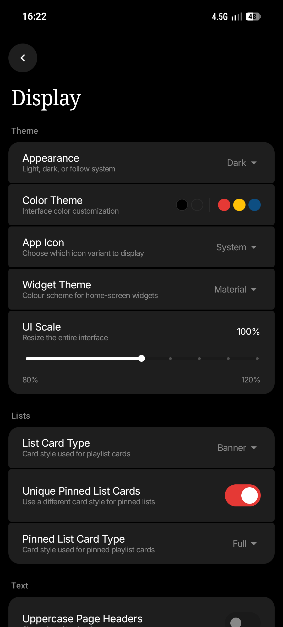
Hey everyone! As many of you know, we’re lucky enough to have lots of talented developers and designers in our community, who help bring us apps and projects that enhance our Nothing product experiences.
Yet, despite the community asking for official brand guidelines for years, Nothing doesn’t have any easily referenceable guidelines for developers to access ad-hoc. This is where I come in!
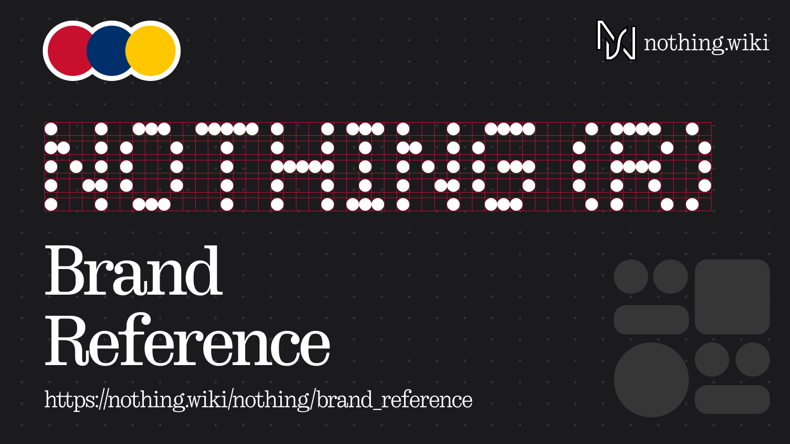
Introducing the unofficial Nothing brand guidelines quick-reference. That’s a bit of a mouthful, but here’s what it covers:
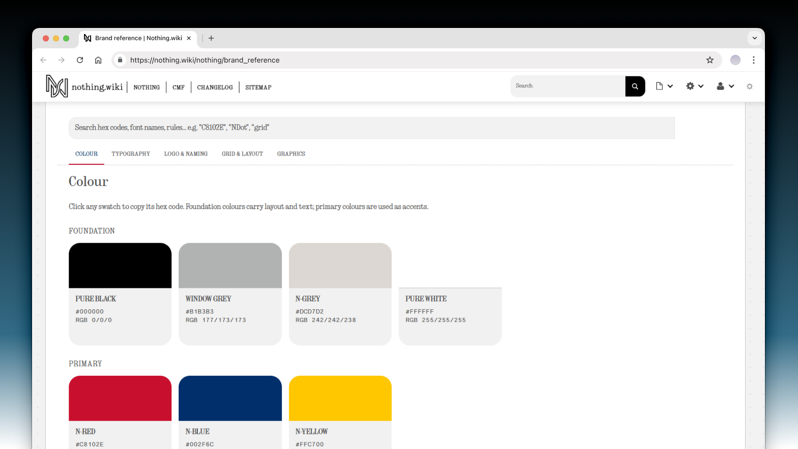
Brand colour palette
Covering core colours + alternatives seen in various applications.
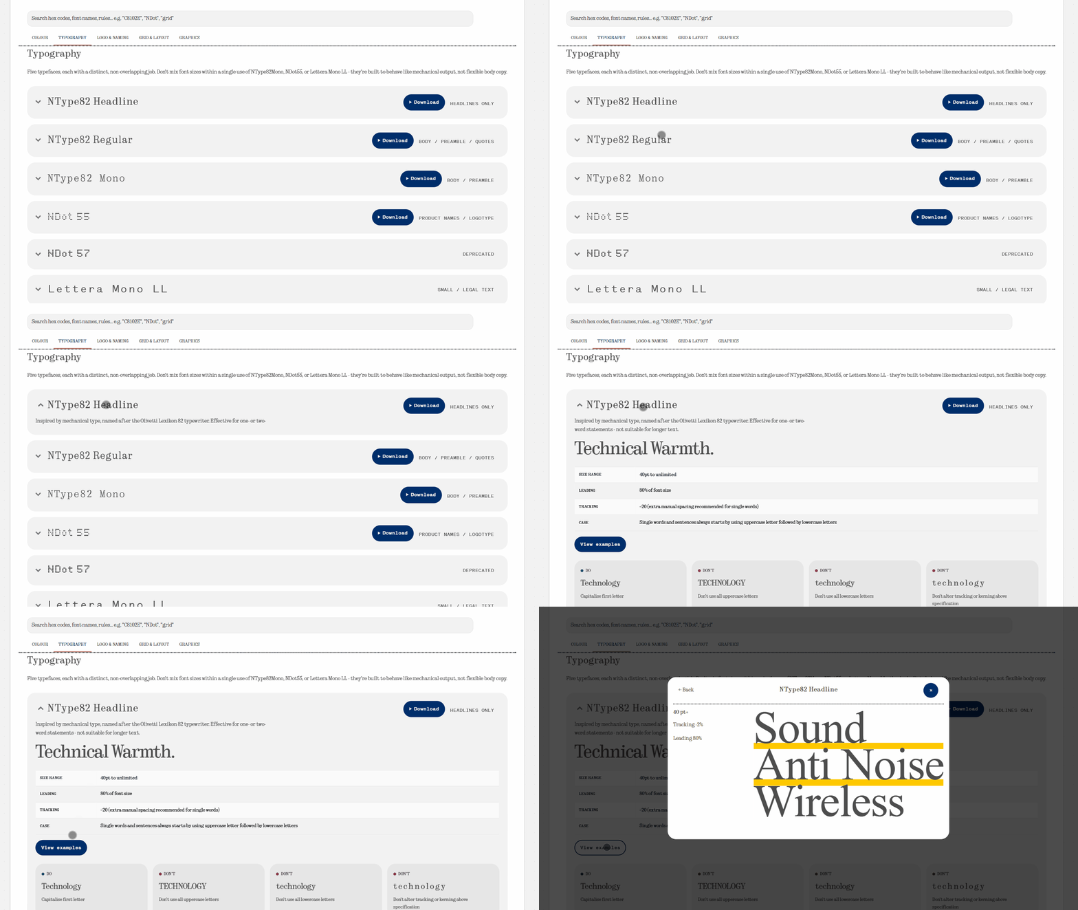
Typography & fonts
Their typography guidelines (such as sizing, leading, tracking and cases), with example usages. This includes fonts, like NDot55 and NType82, with downloads.
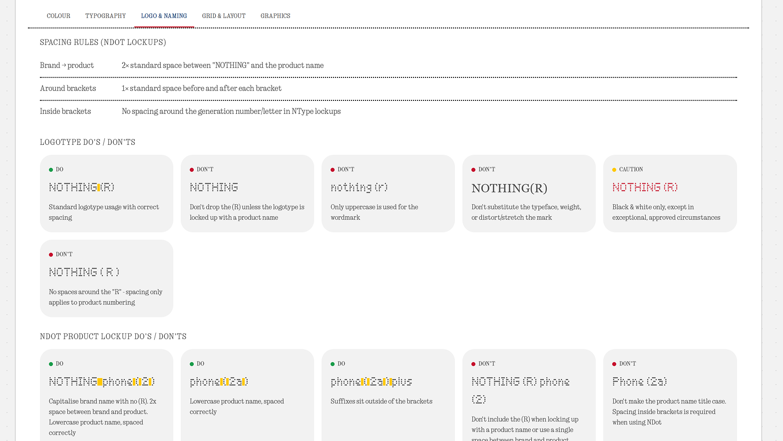
Logo usage & product naming
How to use their logo and product naming conventions, such as font choice, spacing and correct layout.
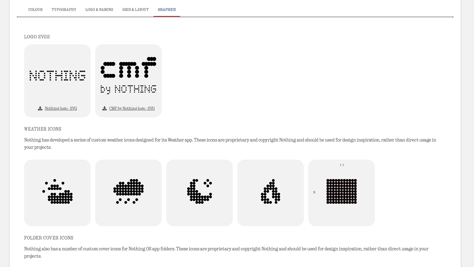
Graphics and guidelines
How to use and create your own Nothing style graphics, such as dot icons.
All of this aims to help those building Nothing-inspired tools and projects.
I haven’t pulled this information out of thin air, or made it up - it’s based on official brand guidelines documents which have been released as part of community campaigns. These 100+ documents can be overwhelming to some, so this quick-reference serves as a simple solution to refer to while your main focus stays on building your project.
This will be kept up to date as more guidelines are released or evolve over time, and this thread will serve as a changelog too. If you have any feedback or suggestions for improvements or additions, please let me know!
Check it out here: https://nothing.wiki/nothing/brand_reference