Astoko

  • Nov 22, 2024
  • Joined Nov 8, 2024
  • 1 discussion
  • 2 posts
  • 0 best answers
  • 0 Followed0 Followers
  • vovan-v Heyo!! So i think personally if the battery icon was made like the clock and showed an procetage and kinda made a little more meaningful buttons in the tray i think it would have worked way better and looked even better but at least for now it will stay like that as i do need to make menus and stuff in the design and including an web browser that i wanted for a while to design again.. as i made before designs for web browser concepts for fun so i thought might as well do it..

    Also i want to give out an notice i made this design like.. in a day as i didnt really know how to go for it and then kinda stopped so yeah.. it might look rough..

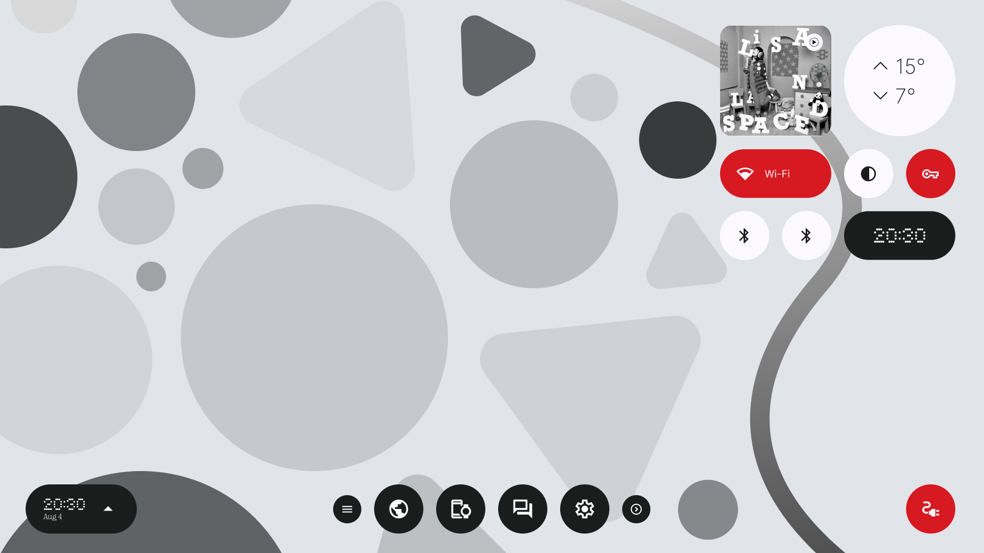
  • So i thought what if Nothing made an Linux Distro for its laptops.. then i thought what if they just wanted it to be touch screen friendly and then i just made this user interface..

    Following Image Shows Desktop UI:

    Yes, It is an simple and flawed UI that will make anyone from the windows 8 and 8.1 era just run away but honestly i would use it or at least i give it a shot… i haven’t made a huge progress so i thought might as well post it here and see if anyone had any ideas to add, I would gladly listen for them and maybe make some kewl stuff 😛

    Anyways, See you in the comments to learn how i have destroyed how it actually looks and i should delete this post
    jkjk i am glad i hear feedback!

    Also.. Yep that is 2 Bluetooth icons because…. to be honest i just forgor