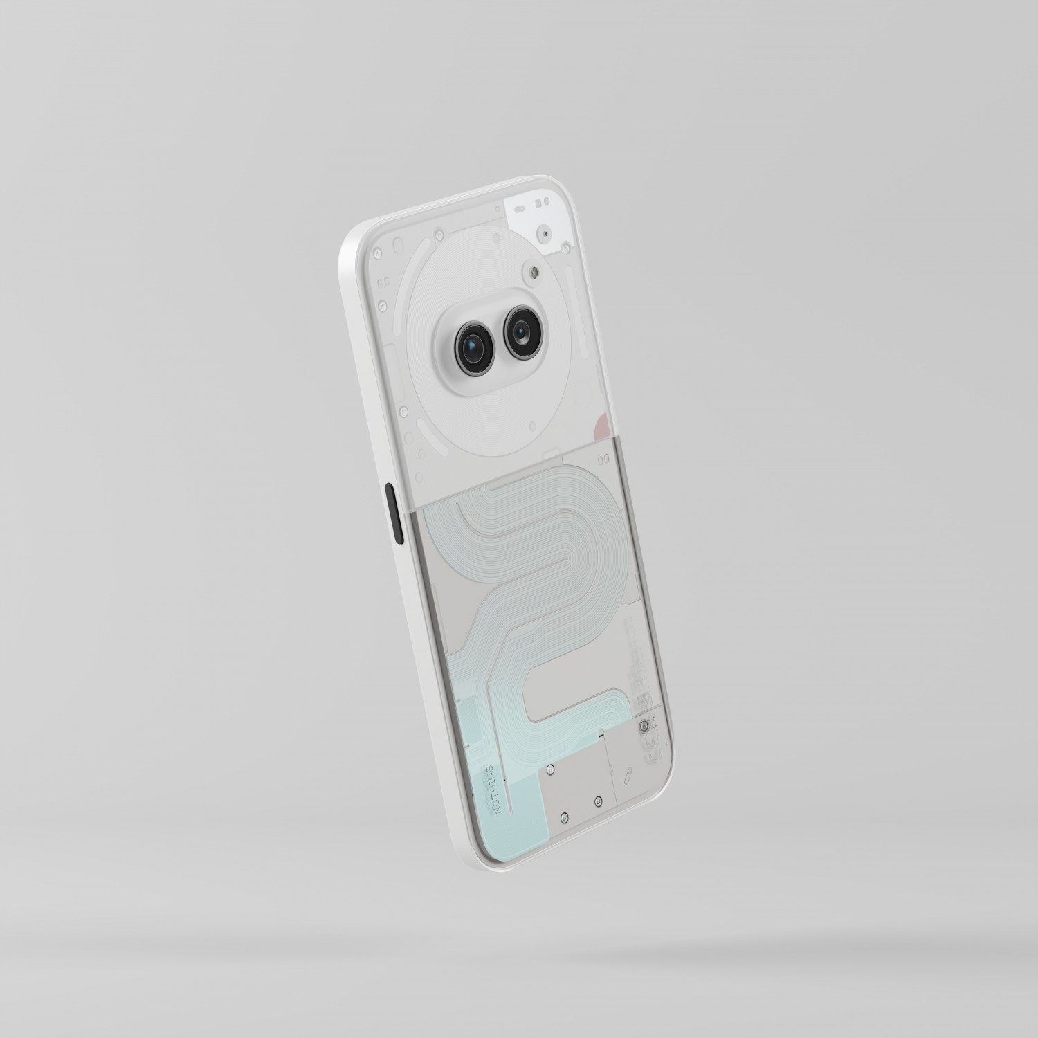
Have just gone through all the entries and i must say there are a lot of lovely and inspiration worthy designs and attempts. love how some have presented an idea through sketch, some with cardboard models, and all the magic. I have not seen any other brand attempt such a gorgeous attempt at engaging its fan in this deep way ever.
Really excited for whats to come, which design would be taken forward and how this whole experiment moves and comes to a fruition.
loved this idea by Martin. extremely simple, subtle and yet brings a freshness that is only possible with the transparent shell of the nothing. ended up voting for this (it was really hard to pick just one among so many)
https://community-edition.nothing.tech/gallery/972900/141100/711331274

meanwhile, i have submited an idea too. it plays along the fluted glass texture that nothing has embraced in its wallpaper aesthetics since phone 1 and tries to turn into a tangible piece of tech. This textured glass/polycarbonate shell with a gradient of colour respects nothing’s design language while adding a distinct texture and feel to hold it. A signature style that you can know just by touch.
https://community-edition.nothing.tech/gallery/972900/141100/71322487


Vote for it, if you want to see something beautiful, classic and stunning to become a reality.